A kitchen partition can screen the washing-up, give a dining area a clear edge or separate everyday activity without closing off every view. The right choice depends on how much separation you actually need and what must remain easy to reach.
These real rooms show glazed enclosures, open shelving, low walls and cabinetry at the kitchen boundary. They offer visual inspiration rather than construction specifications. Have structural changes, glazing, services and appliance clearances assessed for your particular home before committing to a layout.
PART 01
Separate spaces with glass and light
IDEA 01 / 17
Frame the Kitchen with Clear Glass
 SaveSupport Non AI Creator
Image credit: Gregory Abbate / NOMADE ARCHITETTURA INTERIOR DESIGN
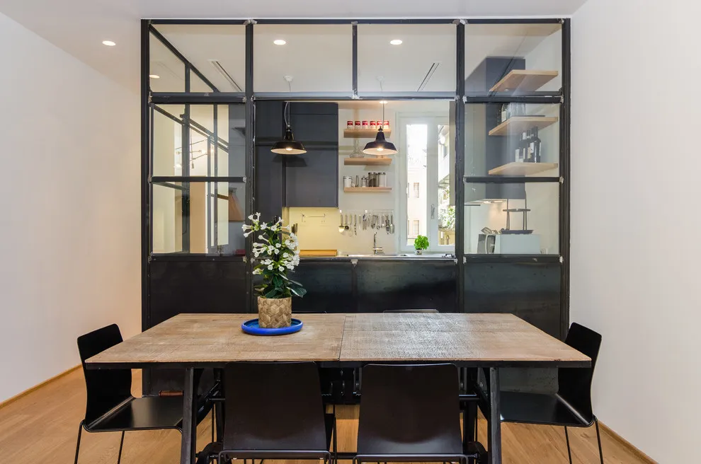
The black grid gives this kitchen a distinct outline behind the wood dining table. Clear upper panels preserve views to the work area, while solid lower sections create a stronger boundary near floor level. Dark chairs and pendant lights repeat the frame color on both sides.
Decide whether seeing the kitchen is part of the appeal before choosing clear glazing. It will also reveal dishes and countertop activity. Check the door arrangement, cleaning access on both faces and the glazing specification with a qualified installer; a photograph does not establish a suitable glass type or fixing method. If visible supplies are the main concern, hidden pantry ideas may address that clutter alongside the room partition.
IDEA 02 / 17
Turn a Glazed Enclosure around a Corner
 SaveSupport Non AI Creator
Image credit: Athos Burez / Hélène Van Marcke
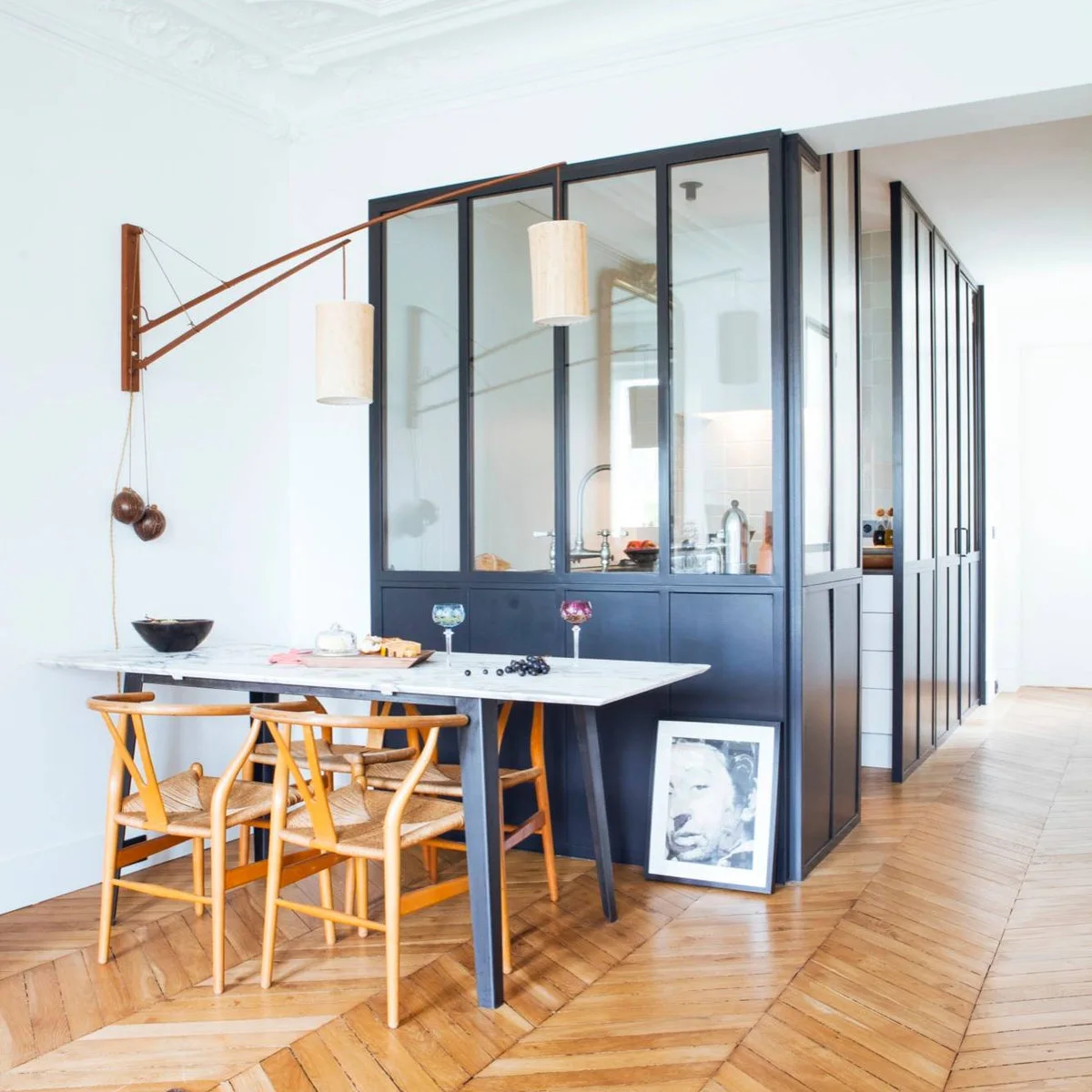
The glazed enclosure wraps around the kitchen rather than stopping at a single flat screen. Tall narrow panes and dark lower panels give the small room a clear perimeter. The nearby table remains outside that boundary, with its pale top and wood chairs softening the strong frame.
Allow for the door swing and the space diners need to pull out their chairs. A corner enclosure introduces more joints and glazing to clean, so keep the geometry purposeful. Plan extraction and access to switches inside the kitchen instead of assuming a transparent boundary makes the whole room function as one space.
IDEA 03 / 17
Blur the View with a Pale Glass Screen
 SaveSupport Non AI Creator
Image credit: Project: American Frameless Glass Enclosures (via Houzz)
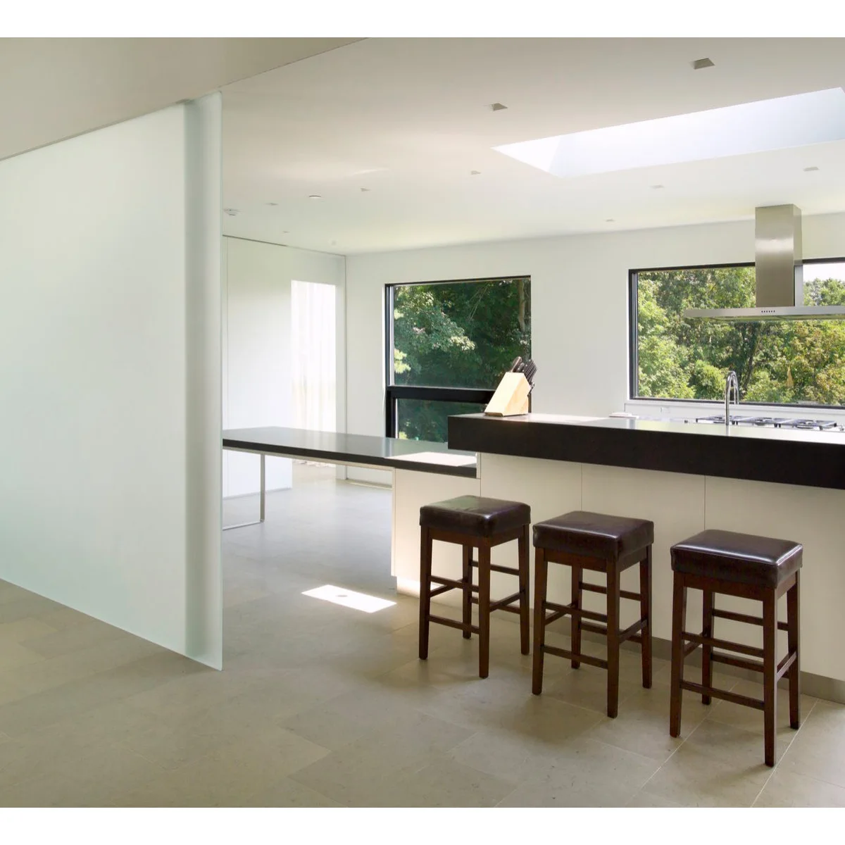
A pale glass screen softens the view into the adjoining area while allowing a sense of brightness through it. The kitchen remains open at one side, with three stools along a dark counter. Its quiet surface suits the white cabinets without introducing another busy pattern.
Request a sample and look through it at different distances before choosing a translucent finish. Shapes may still be visible, especially with lights behind the panel. Leave a generous route beside the screen and check how its edge will be made visible to people moving through the room.
IDEA 04 / 17
Use Operable Panels above the Sink
 SaveSupport Non AI Creator
Image credit: Project: Best Cabinets (via Houzz)
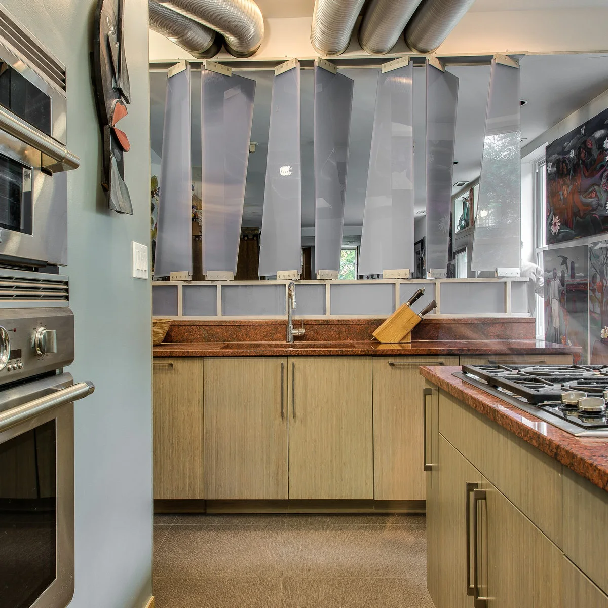
A row of angled translucent panels sits above the sink counter, giving this kitchen an adjustable boundary to the dining area. The repeated vertical pieces contrast with the long lower cabinets and exposed ceiling ducts. A solid lower section provides a more continuous backdrop directly behind the faucet.
Operable panels need space to move without hitting the faucet, nearby objects or one another. Confirm their heat, moisture and cleaning suitability for the exact location, with professional assessment of the cooking equipment and ventilation. Check pinch points and hardware access before choosing a moving screen for a busy kitchen.
PART 02
Keep a useful connection above a low boundary
IDEA 05 / 17
Hide Counter Clutter behind a Simple Half Wall
 SaveSupport Non AI Creator
Image credit: Scott Hargis / building Lab, inc.
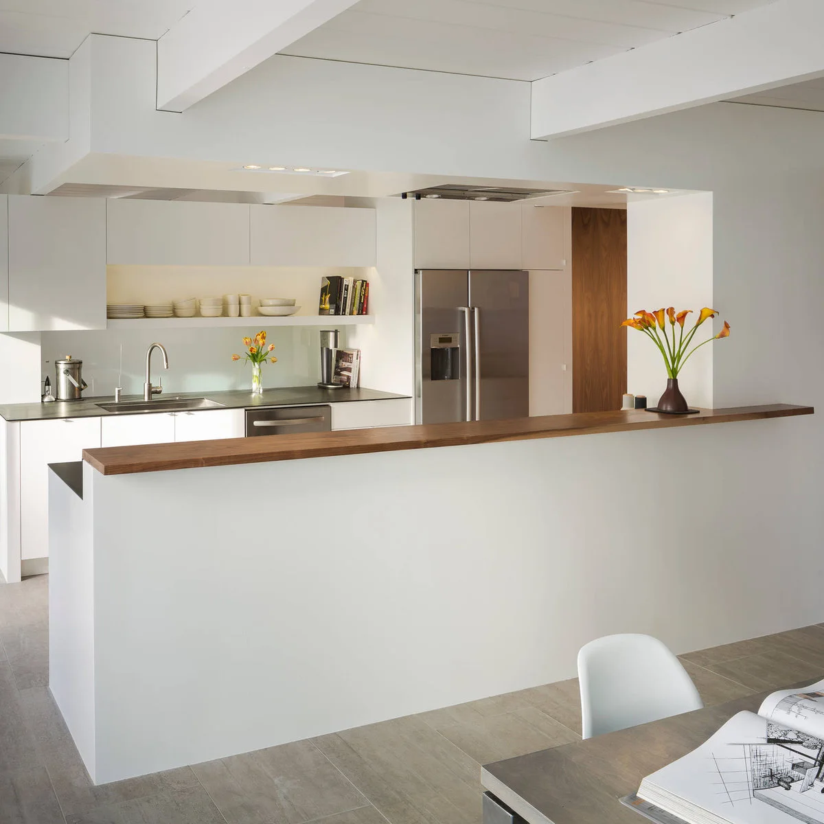
A plain white wall creates a calm front to the kitchen, with a wood cap adding warmth along its top. Cabinets and the sink remain visible above it, so the room still feels connected. The higher front edge screens more of the working surface from a seated dining position.
Our mid-century modern kitchen ideas show more ways to combine clean lines and warm wood. Here, test the wall height from both standing and seated positions. Keep the cap easy to wipe, and avoid turning its narrow ledge into storage that regularly needs moving before a meal.
IDEA 06 / 17
Keep an Arched Opening above the Sink
 SaveSupport Non AI Creator
Image credit: Larry Malvin Photography / Sterling Wilson Design
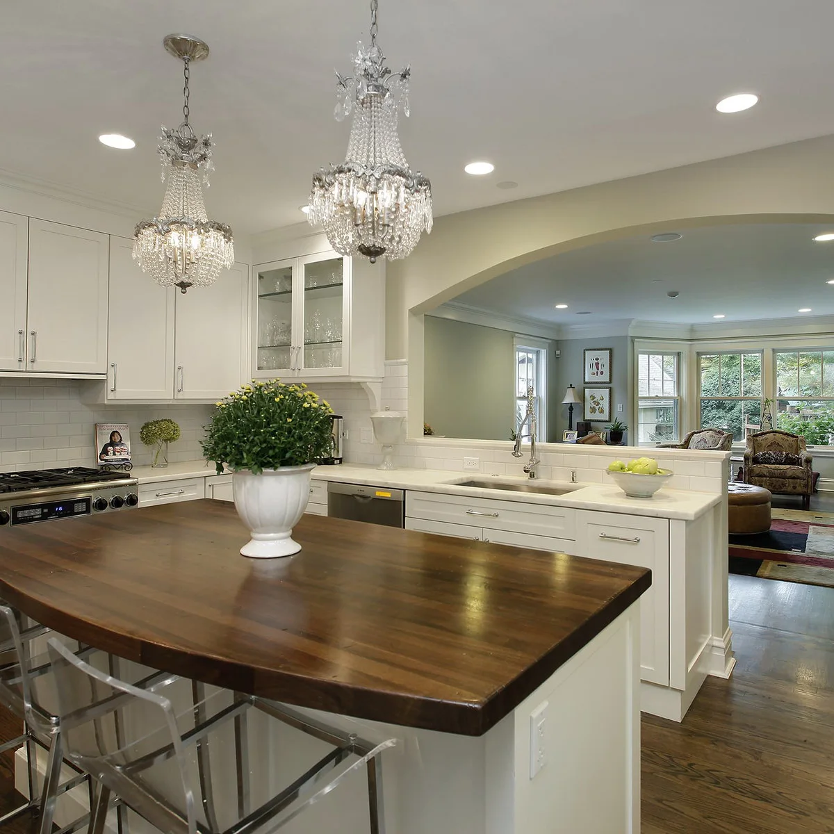
The broad arch frames the sitting room above this kitchen sink. A low tiled wall creates a small buffer behind the faucet, while the opening keeps daylight and conversation connected. Cream cabinetry and pale tile make the boundary feel continuous with the rest of the kitchen.
Check splash protection where a sink faces another room, including the back of the counter and any electrical fittings. Have the opening and support assessed before altering an existing wall. The arch is a visual choice; the load above it and any hidden services determine what can be changed safely.
IDEA 07 / 17
Make a Raised Breakfast Bar the Boundary
 SaveSupport Non AI Creator
Image credit: Eric Roth / Cummings Architecture + Interiors
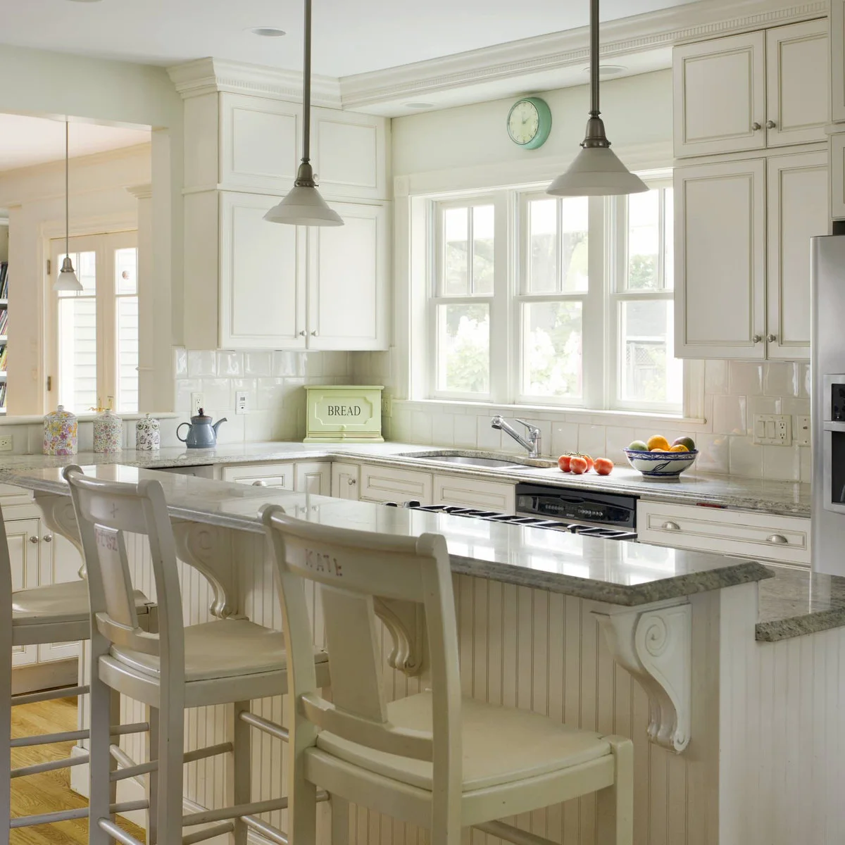
The raised bar places a higher edge between the working counter and the white stools. Decorative brackets and a paneled front give the boundary the same traditional character as the cabinets. Pendant lights mark the seating side without requiring a full wall above it.
Match stool height to the actual bar and leave enough knee room beneath the overhang. Check the supporting details rather than copying decorative brackets as a structural solution. A raised level can screen dishes, but it also reduces one broad uninterrupted work surface, so choose that tradeoff deliberately.
IDEA 08 / 17
Cap a Compact Galley Wall with Wood
 SaveSupport Non AI Creator
Image credit: John Hession / Misiaszek Turpin pllc
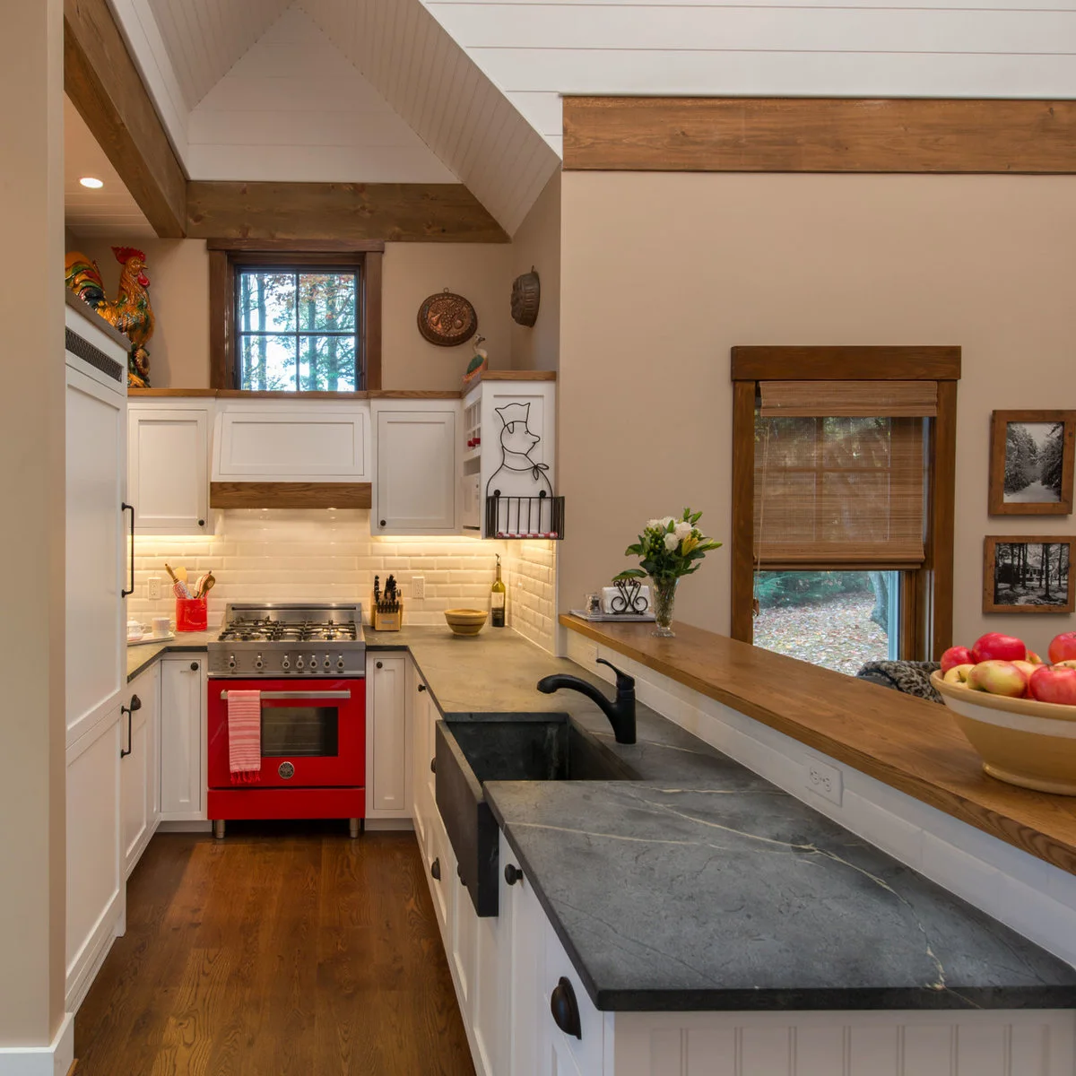
A wood cap warms the low wall along this compact galley kitchen. It separates the dark sink counter from the room beyond while leaving the window and upper wall visible. The red range provides a separate focal point at the end, so the divider itself stays simple.
In a small kitchen, preserve the working aisle before adding depth to a ledge. Choose an edge treatment and finish that can cope with the location, and wipe up water promptly around the sink. Keep decorative bowls and tall vases away from the passage if they are likely to be knocked.
IDEA 09 / 17
Let a Sink Counter Define the Room Edge
 SaveSupport Non AI Creator
Image credit: Erin Holsonback / Laura Burton Interiors
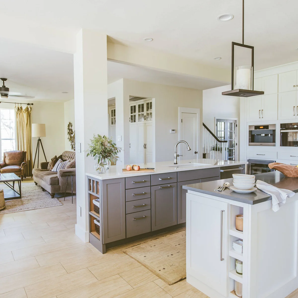
The sink cabinet forms a practical boundary to the living area, with a tall white post marking one end. Gray fronts distinguish it from the surrounding white cabinetry. Small end shelves make use of the exposed side without adding another freestanding unit in the passage.
Keep the living-room side finished as carefully as the kitchen side, including exposed panels and service access. Test the route around the end with the dishwasher open. Use the small shelves for a limited number of useful items, since a narrow opening can become visually busy very quickly.
PART 03
Put the dividing line to work
IDEA 10 / 17
Build Storage below an Open Room Divider
 SaveSupport Non AI Creator
Image credit: Seth Benn Photography / Fluidesign Studio
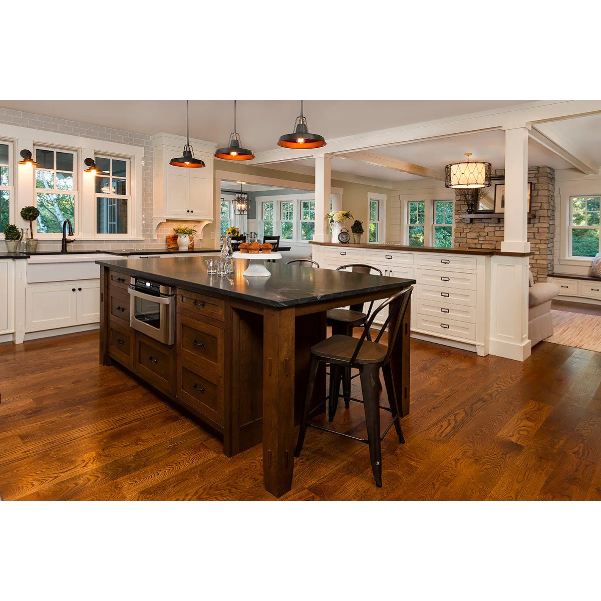
A long run of white drawers forms the lower part of this divider, with two posts defining the opening above. The wood cap relates to the darker island, connecting the pieces without making them identical. Views to the stone fireplace preserve a strong connection with the sitting room.
Our kitchen pantry ideas can help decide which supplies deserve this easily reached storage. Measure drawer travel and keep handles outside the main walking line. Have posts and overhead structure assessed before changing them; an open appearance does not tell you which elements carry loads in the house.
IDEA 11 / 17
Use a Low Cabinet to Separate Activities
 SaveSupport Non AI Creator
Image credit: Jeremy Bittermann / Hammer & Hand
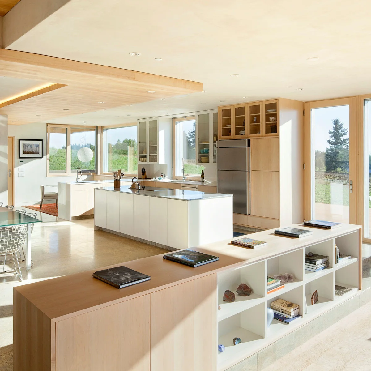
This low cabinet creates a separate edge in front of the kitchen while keeping the windows visible above it. Closed wood doors occupy one end and open white cubbies the other. Books and a restrained collection of objects give the facing side a purpose beyond concealing the kitchen.
Choose the storage layout for the side where it will actually be used. Keep deeper or heavier items in appropriate supported compartments, and secure the unit as specified. Allow access around both ends where the plan requires it; a low cabinet should organize movement rather than create an obstacle course.
IDEA 12 / 17
Combine a Tall Spine with Lower Storage
 SaveSupport Non AI Creator
Image credit: Aaron Leitz / CCS ARCHITECTURE
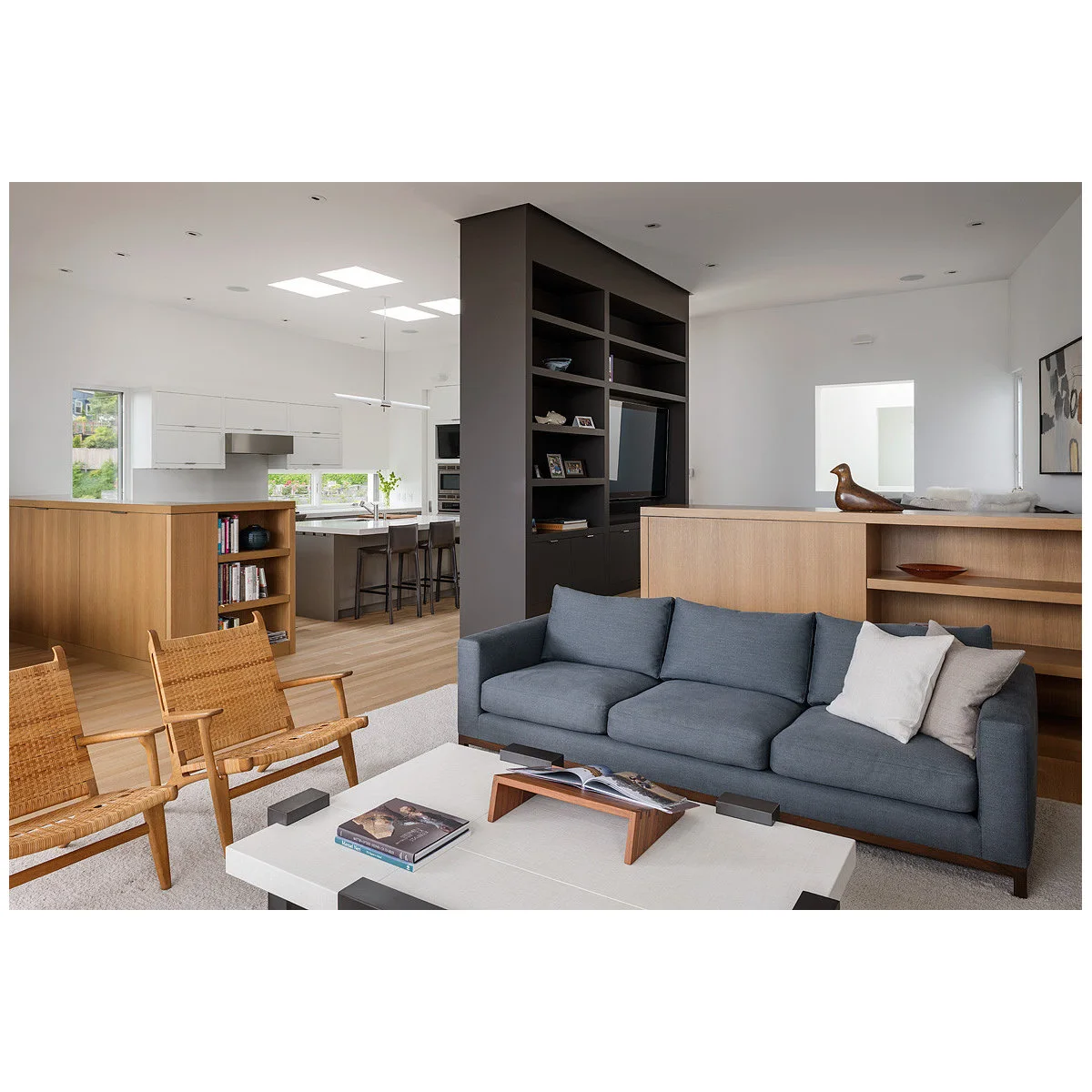
The dark central unit gives this open room a strong vertical boundary. Lower wood cabinetry continues the division behind the blue sofa, while an opening keeps the white kitchen visible at the left. The changes in height distinguish functions without making every edge a full-height wall.
Use height where screening is needed and keep lower sections where views matter. Check television sightlines, daylight and access to both sides before fixing the layout. Open display compartments collect kitchen dust and deposits, so choose a manageable number of objects and leave room to clean the shelves.
IDEA 13 / 17
Keep a Solid Section beside a Pass-Through
 SaveSupport Non AI Creator
Source: houzz.com
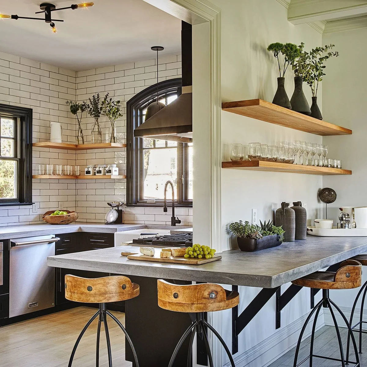
A solid wall section gives the wood shelves a backdrop, while the adjacent opening keeps the cooking area visible. The pale counter wraps below both parts and has stools on the outer edge. Black brackets and window trim connect the boundary with the kitchen beyond it.
A partial opening can preserve a useful wall for storage instead of removing everything. Check the weight and fixing requirements for shelves and counter supports separately. Keep seating and decorative objects clear of the cooking area's required safety distances; the photograph is a layout reference rather than a clearance specification.
PART 04
Give the partition a place in the room
IDEA 14 / 17
Screen a Compact Kitchen with Vertical Slats
 SaveSupport Non AI Creator
Image credit: Project: Fisher & Paykel (via Houzz)
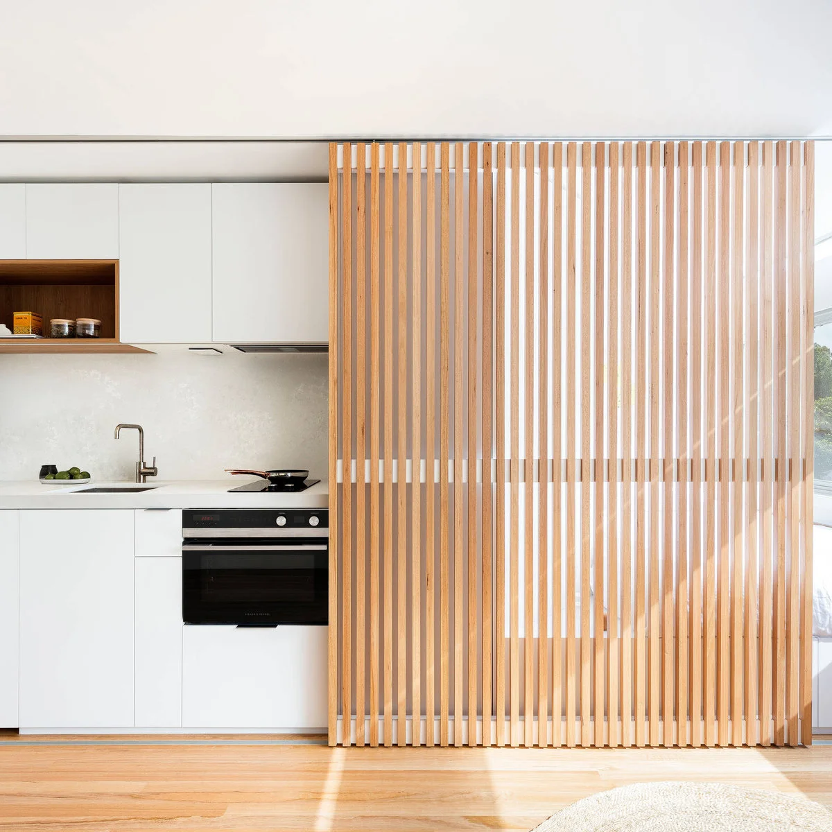
Closely spaced wood slats give this compact kitchen a warm vertical screen against the white cabinets. The repeated narrow pieces relate to the wood floor, while the sink and oven remain visible at the side. The screen provides a stronger visual boundary than a change of paint alone.
Check what the screen conceals and how appliances remain accessible in every position. If choosing a moving system, confirm its travel, guides and safe operation with the installer. Slats need cleaning along their edges, and they should not interfere with appliance ventilation, heat clearances or the route through the room.
IDEA 15 / 17
Give a Wood Divider a Working Kitchen Face
 SaveSupport Non AI Creator
Image credit: Clark Dugger / Hsu McCullough
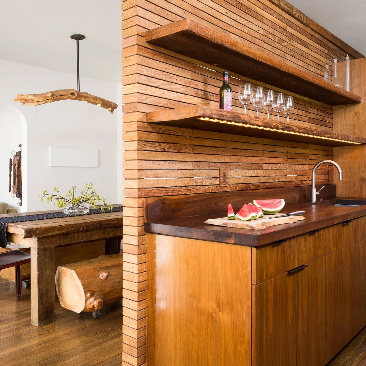
Horizontal wood strips form the divider behind this sink counter, with narrow gaps allowing glimpses into the dining area. Thick wood shelves provide storage on the kitchen face. The shared warm tones connect the cabinetry and dining furniture while the partition gives the working area its own backdrop.
Choose the finish and detailing for cleaning around a sink rather than judging the wood only by its color. Gaps and shelf edges can collect dust or splashes. Have the wall, shelving and electrical details designed for their actual location, and leave enough counter space for everyday preparation below the display.
IDEA 16 / 17
Place a Dining Bench along the Dividing Line
 SaveSupport Non AI Creator
Image credit: Project: DiFiore & Partners (via Houzz)
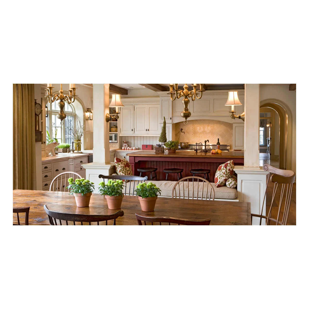
A cushioned bench occupies the boundary between the wood dining table and the kitchen beyond. White posts frame the opening, while the red island remains visible above the bench back. This gives the dining area a settled position without a separate full-height partition.
Test the bench seat depth and the distance to the table before choosing fixed furniture. Leave a comfortable route to the open side and make cushions easy to remove for cleaning. A bench on the kitchen boundary needs a practical back and finish where daily traffic or splashes may reach it.
IDEA 17 / 17
Retain a Solid Anchor between Openings
 SaveSupport Non AI Creator
Image credit: Project: Davis Group (via Houzz)
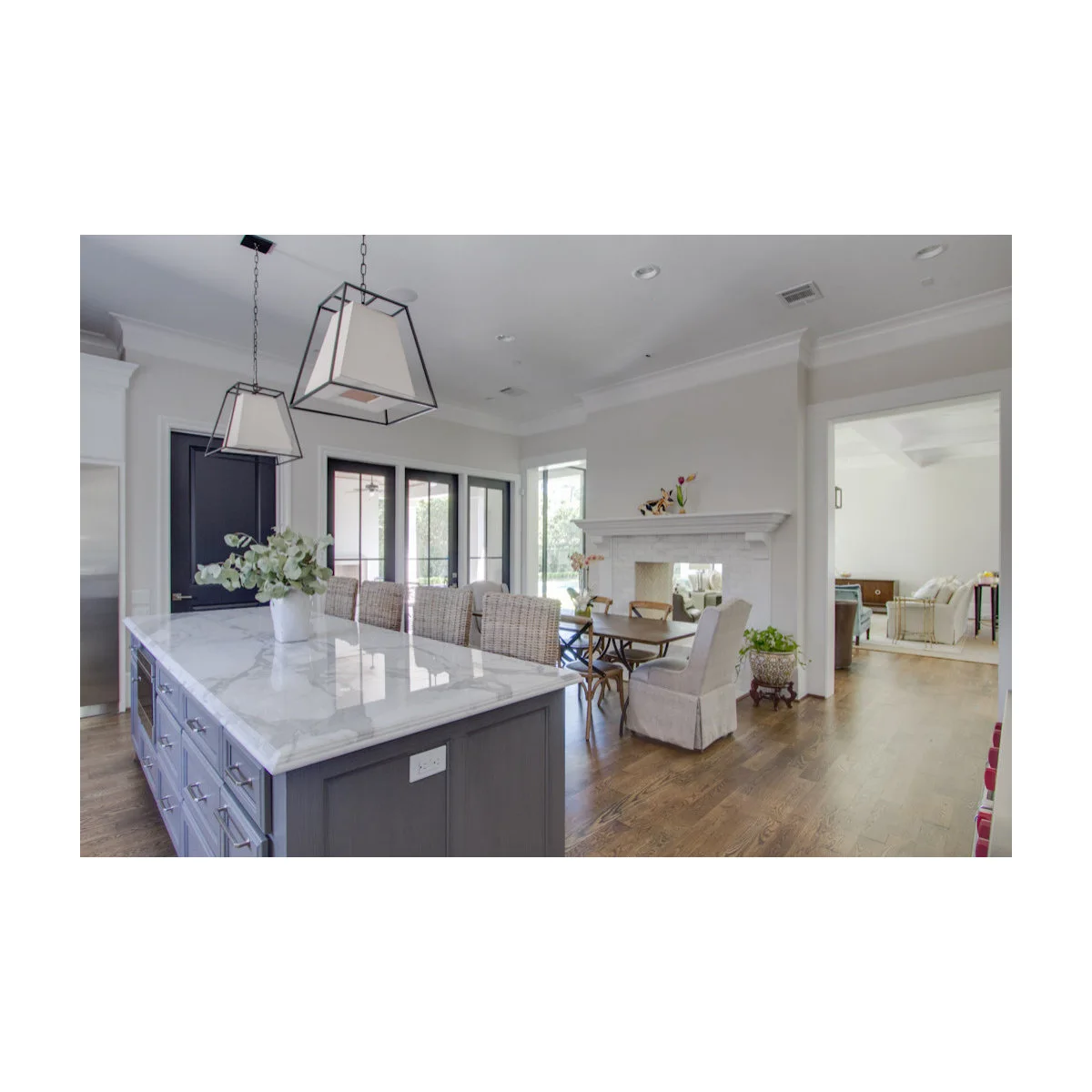
The fireplace wall provides a solid anchor beside the dining nook, while an opening at the right maintains a route to the living room. A view through the fireplace links the spaces visually. Pale finishes relate to the kitchen island, so the retained wall does not feel like a separate object.
As with living room office combinations, decide which activities need a fixed boundary and which benefit from an open connection. A fireplace requires its own professional design, ventilation and clearances. Use this room to consider the balance of solid and open areas rather than copying a fireplace installation from its appearance.
BRING IT ALL TOGETHER
Decide what the partition must do
Start by marking the routes between the kitchen, dining table and doors. Check appliance doors, drawers and chairs in use, not only when everything is closed. A beautiful divider becomes frustrating if someone has to squeeze past it every time the dishwasher opens.
Choose the amount of screening deliberately. Clear glass preserves a view but shows the work area; open shelves and slats offer visual separation without sealing in noise or smells. Compare cleaning access, hardware and installation requirements before deciding which arrangement will suit daily life.