A relaxing bedroom color is personal. Some people prefer a pale room, while others enjoy the enclosure of deeper walls. Start with shades you already like to live with, then compare them beside the bedding, flooring and furniture you are keeping.
The photos below illustrate color families and combinations, not exact paint matches. Screens, daylight and photography all affect color. Test a generous sample in your own room, including the wall you see from bed and the corners lit by your evening lamps.
PART 01
Begin with gentle neutrals
IDEA 01 / 20
Choose Cream Beside Gentle Pattern
 SaveSupport Non AI Creator
Image credit: Future / Emma Ainscough
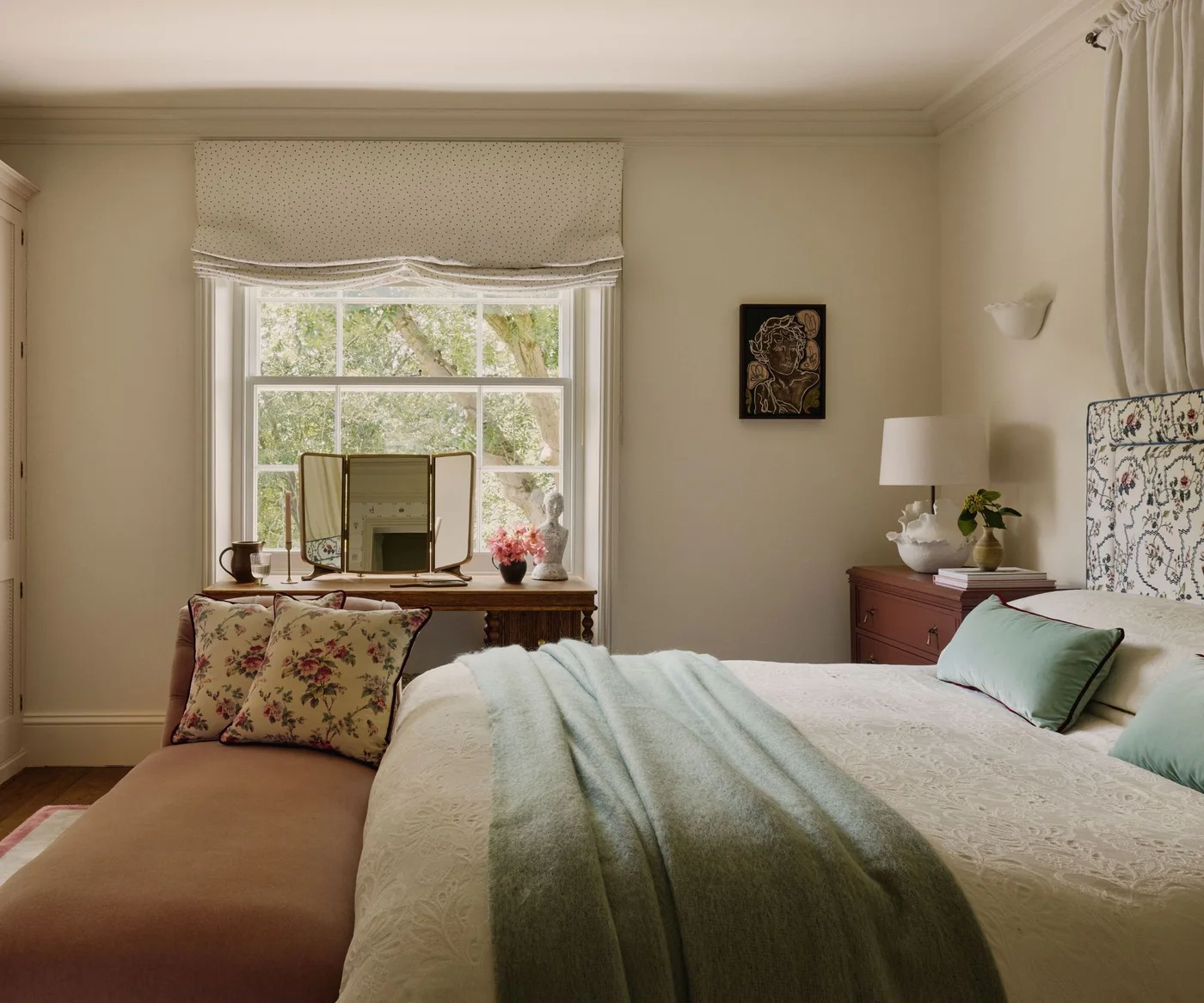
Cream walls give the floral headboard and pale green bedding a warm, quiet background. The wood dressing table and muted pink seating add other soft tones, while the window trim remains light. There is enough difference between the fabrics and walls to keep the room from looking flat.
Place a cream sample beside your white bedding before deciding. A noticeably yellow cream may be exactly what you want, but it can also make a cooler fabric look blue by comparison. Check the sample with curtains open and closed, using your usual bedside lamps.
IDEA 02 / 20
Use Warm White Around Richer Furniture
 SaveSupport Non AI Creator
Image credit: Marie Flanigan Interiors / Photography Julie Soefer
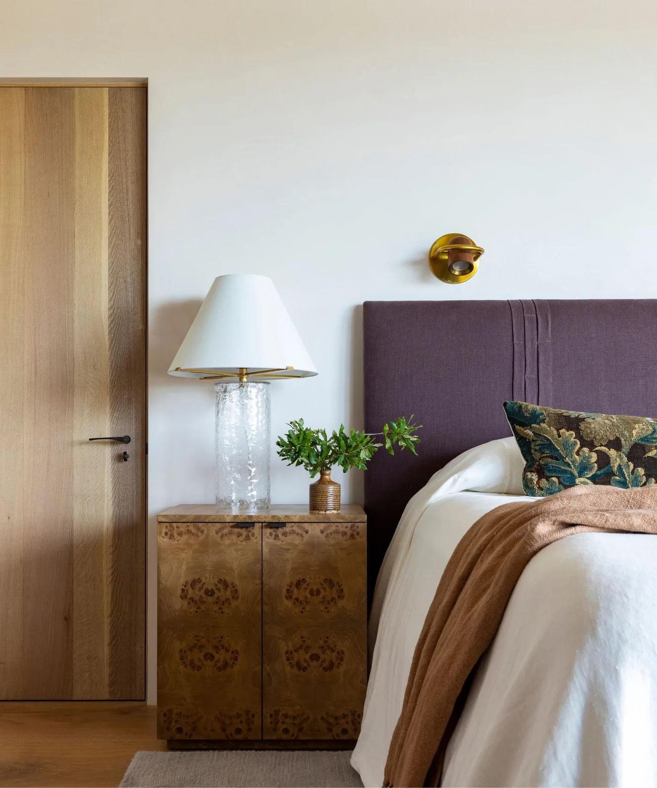
The warm white wall leaves the purple headboard and patterned wooden cabinet as the more noticeable pieces. White bedding and the lamp shade repeat the light background, while a brown throw adds warmth close to the bed. The room gets its variety from furniture rather than several wall colors.
Compare several whites directly with the wood and headboard fabric you already own. Give each sample enough surrounding space to judge it clearly. A small chip held against another colored wall can be misleading, especially when that wall casts its own color onto the sample.
IDEA 03 / 20
Try Soft Sand with Olive Upholstery
 SaveSupport Non AI Creator
Image credit: Studio Alexandra
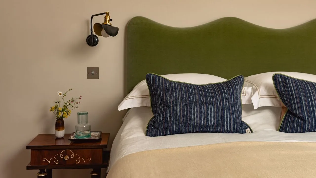
The sand-colored wall provides a warm background for the olive headboard without matching it exactly. White bedding separates the wall and cushions into clear layers, and the blue stripes supply a cooler contrast. A small wooden table keeps the bedside arrangement restrained.
Use the headboard fabric as a fixed reference when sampling sand and beige. Check whether the paint turns pink, yellow or gray beside it at different times. Keep at least one light textile in the comparison so you can judge how much contrast the finished room will have.
IDEA 04 / 20
Balance Warm Gray with Cream Trim
 SaveSupport Non AI Creator
Image credit: Project: Thompson Custom Homes (via Houzz)
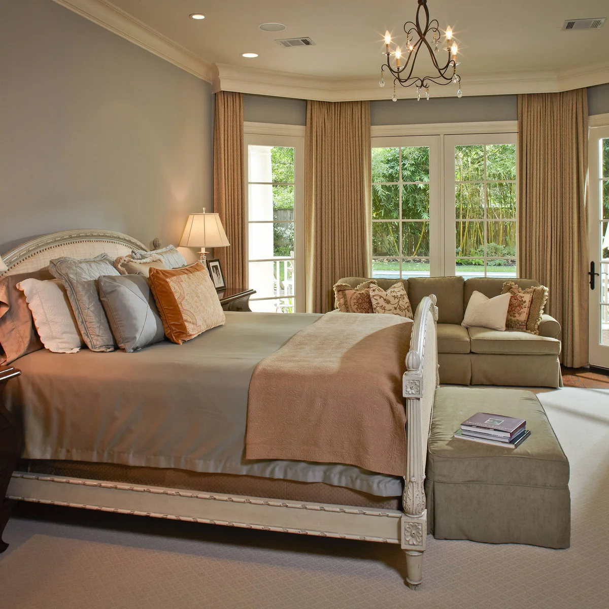
Warm gray walls sit beside cream curtains and trim, with muted pink bedding adding a gentle warmer note. The pale upholstered bed and small sofa occupy more visual space than the painted wall, so the gray acts as a background rather than a dramatic feature.
Sample gray beside the trim color as well as the bedding. The difference between them should look intentional in your room’s light. If the gray seems unexpectedly violet or green, compare a second sample rather than assuming the same effect will disappear after painting a larger area.
IDEA 05 / 20
Let Soft Stone Continue Overhead
 SaveSupport Non AI Creator
Image credit: Tim Lenz/Design by Molly Kidd Studio
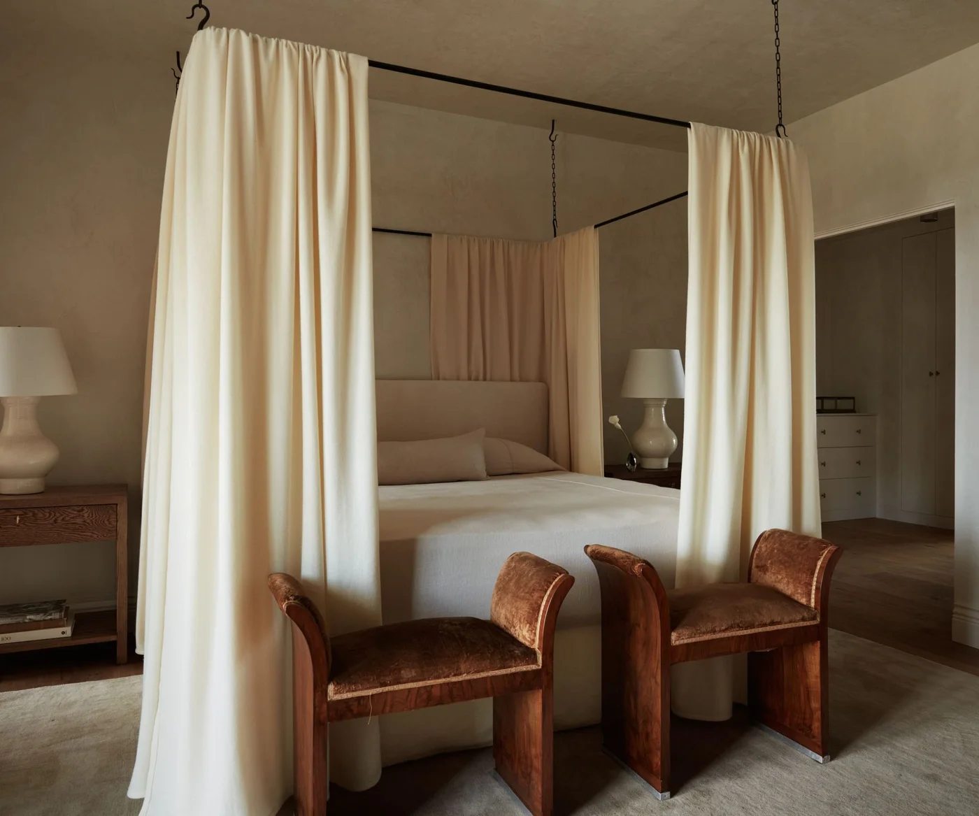
The soft stone color continues across the walls and ceiling, wrapping around a pale curtained canopy. Cream fabrics introduce a lighter layer, and the two brown stools bring warmth to the foot of the bed. The palette changes through texture more than strong color contrast.
Test a ceiling sample before extending a wall shade overhead. The same paint can look deeper on a surface that receives less direct light. If you prefer a lighter ceiling, compare a related pale shade rather than automatically choosing a stark white that may interrupt the softer palette.
PART 02
Explore quieter blues and greens
IDEA 06 / 20
Keep Blue-Gray Quiet Against Dark Trim
 SaveSupport Non AI Creator
Image credit: The Vaults / Photography Joey Kendal Brown
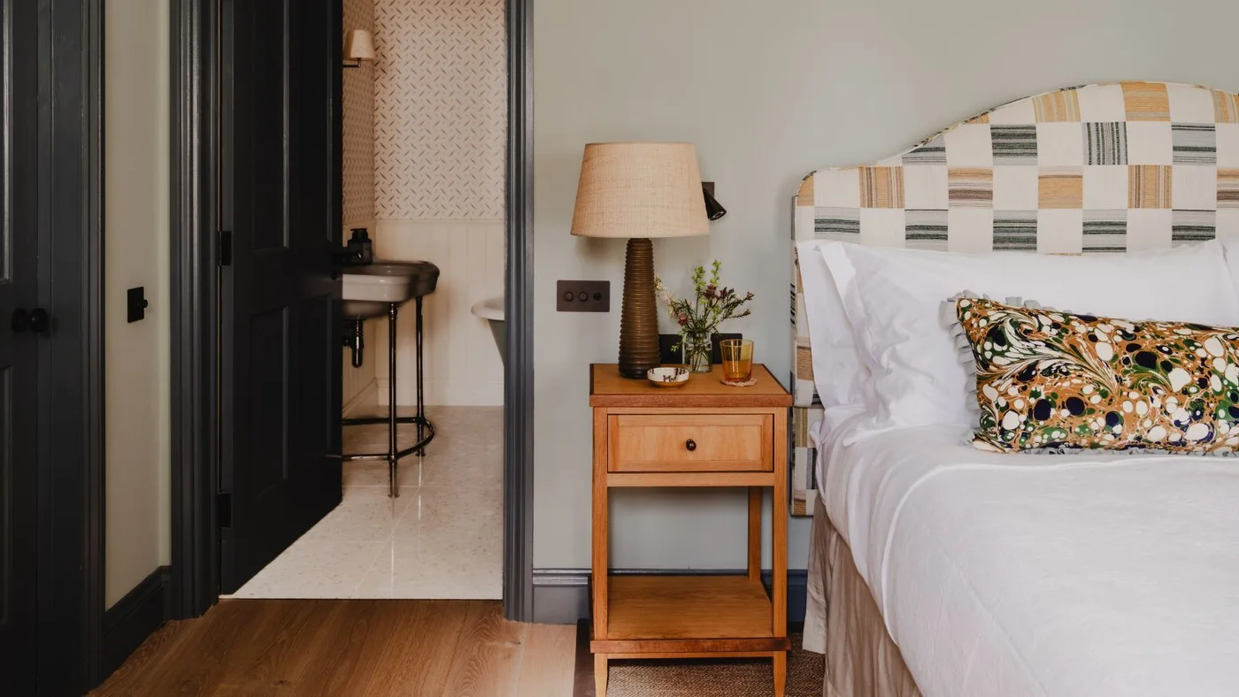
The pale blue-gray wall sits between dark painted trim and a light patterned headboard. Warm wood and a neutral lamp shade prevent the cooler wall from becoming the room’s only color influence. White bedding provides a clear reference against both the wall and the darker door.
Put a blue-gray sample beside your door or skirting finish before painting. Dark trim increases contrast and may make a pale color appear lighter than expected. Check whether the room still feels comfortable when daylight fades and the warmer bedside lamp becomes the main light source.
IDEA 07 / 20
Use Powder Blue Around a Patterned Headboard
 SaveSupport Non AI Creator
Image credit: Chris Wakefield
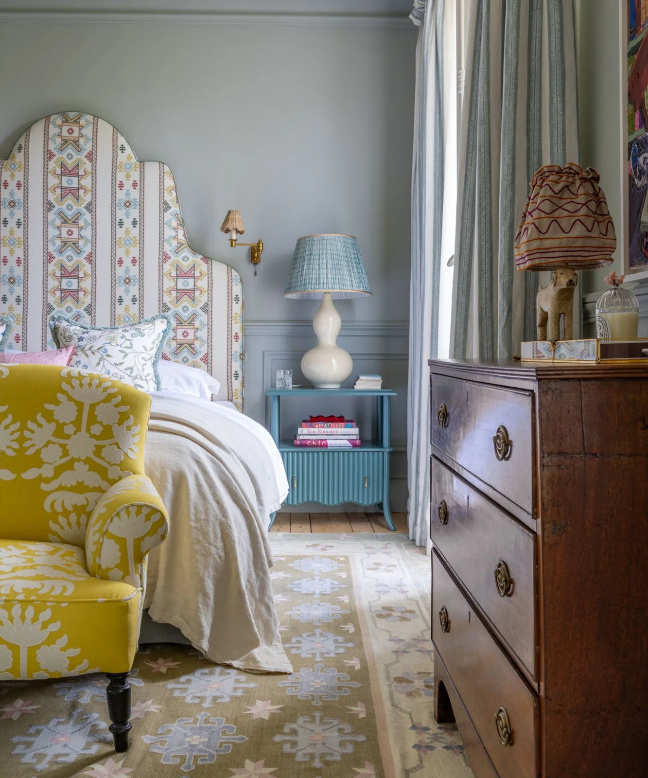
Powder blue covers the wall and lower paneling, giving the tall patterned headboard a consistent setting. A blue bedside cabinet repeats the color at a stronger depth, while white bedding keeps the middle of the room light. The yellow chair is a separate, brighter accent.
When a headboard already has several colors, sample a quieter version of one of them on the wall. Keep the fabric nearby while judging it. If you want a more restful overall arrangement, limit additional bright furniture to the amount of contrast you personally enjoy.
IDEA 08 / 20
Try a Muted Blue-Green with Warm Textiles
 SaveSupport Non AI Creator
Image credit: Carta Creatives / Photography Read McKendree / Styling Gina Ciotti
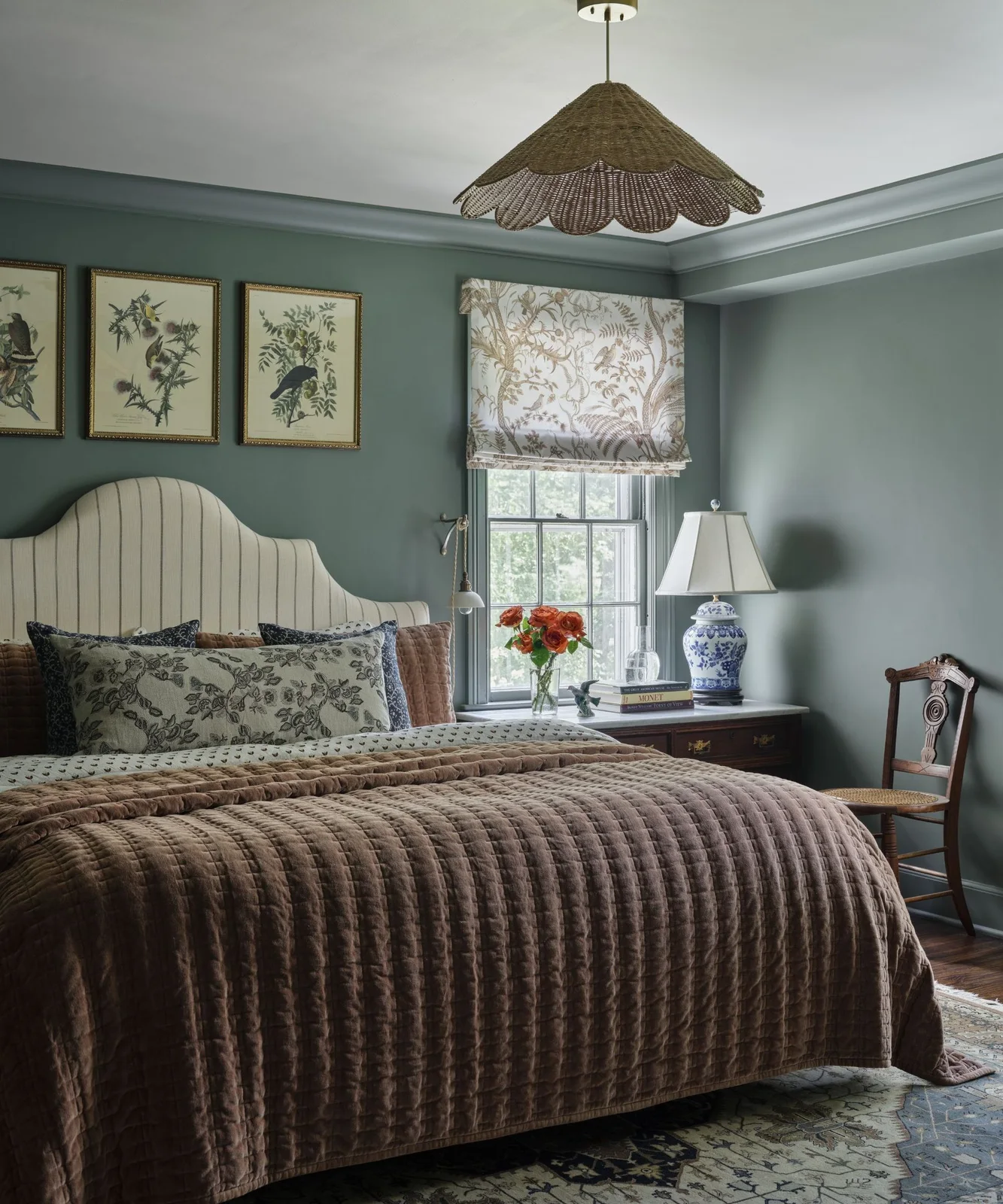
The muted blue-green walls offer a cool background for the brown quilt and wooden furniture. A pale striped headboard and botanical blind add pattern without covering the room in strong color. The ceiling stays lighter, separating the wall shade from the overhead plane.
Compare blue-green samples against your warmest textile first. Some lean visibly green under a warm lamp while others remain blue. Test the paint near the window and in a shaded corner so you can choose a balance that works beyond the brightest part of the room.
IDEA 09 / 20
Carry Gray-Green Across Doors and Paneling
 SaveSupport Non AI Creator
Image credit: Charlton Brown / Marion Lichtig / Chris Everard
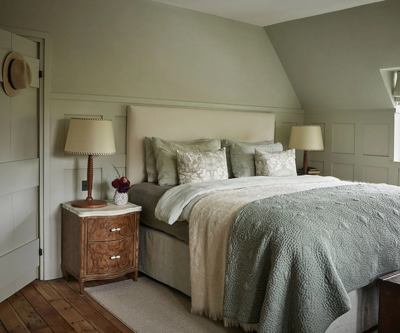
Gray-green continues across the walls, door and paneling, leaving the outlines visible through their shape rather than a contrasting paint color. The headboard is paler, and related bedding keeps the room’s larger surfaces close in tone. Wooden bedside furniture adds a warmer note.
Use suitable paint finishes for doors and walls even when choosing the same color. Different sheens may change the appearance, so compare those samples together. A consistent palette is easiest to judge with the everyday bedding in place rather than an empty room full of bare surfaces.
IDEA 10 / 20
Give Soft Green a Warm Companion
 SaveSupport Non AI Creator
Image credit: Vaughan Design & Development / Photography Chris Snook
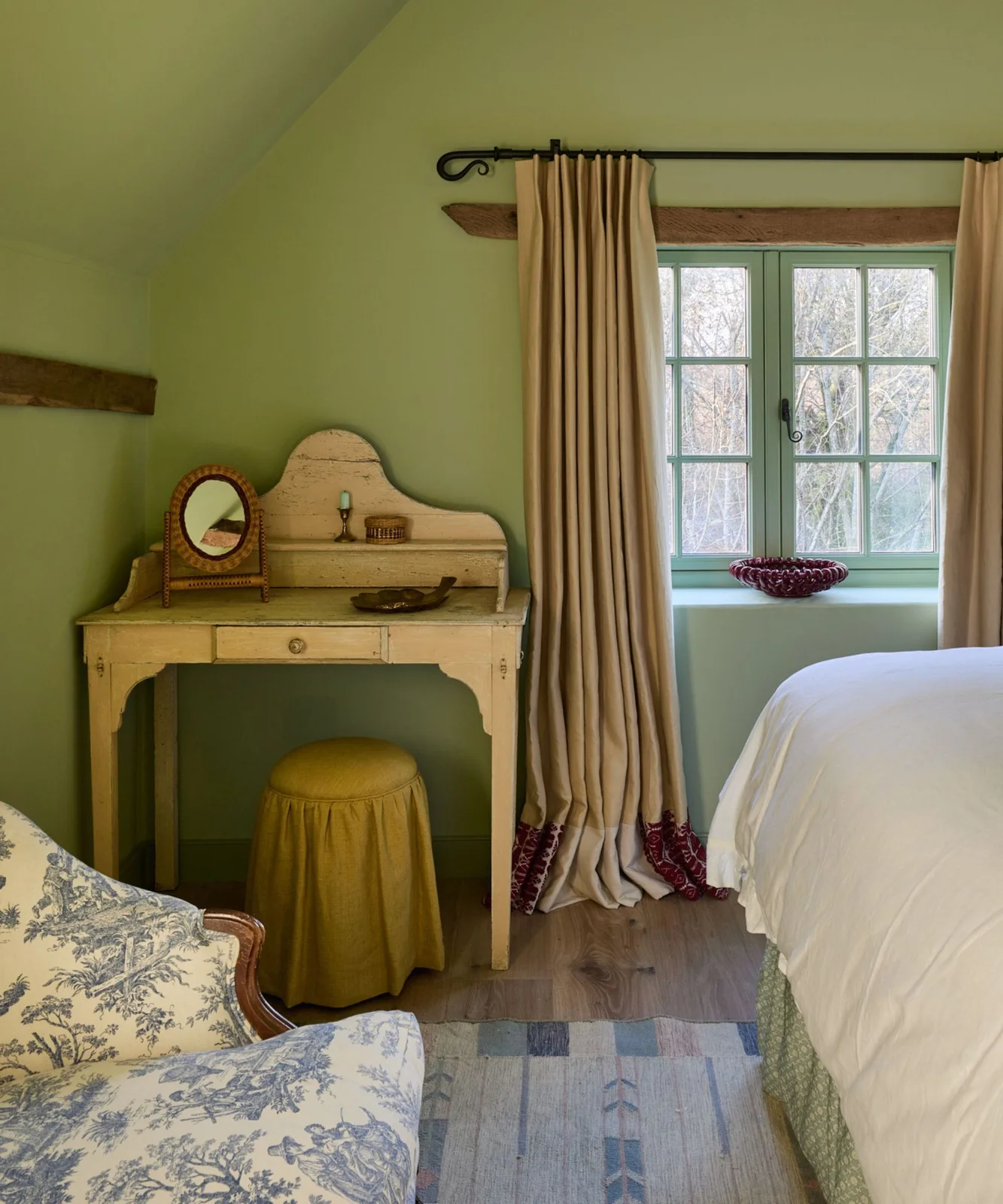
Soft green surrounds the dressing table and window, with beige curtains and a small ochre stool warming the combination. The white bedcover provides a lighter edge, while the exposed wood lintel adds a natural brown reference. The green is present across a broad wall area without needing matching bedding.
Check green samples beside both the curtains and the wood. A yellow-leaning green can feel very different from a gray-green even when the chips look similar. Move the sample around the room and let it dry fully before making a final comparison.
PART 03
Try a warmer soft color
IDEA 11 / 20
Pair Pale Blush with White Curtains
 SaveSupport Non AI Creator
Image credit: Project: Vincent Longo Custom Builders (via Houzz)
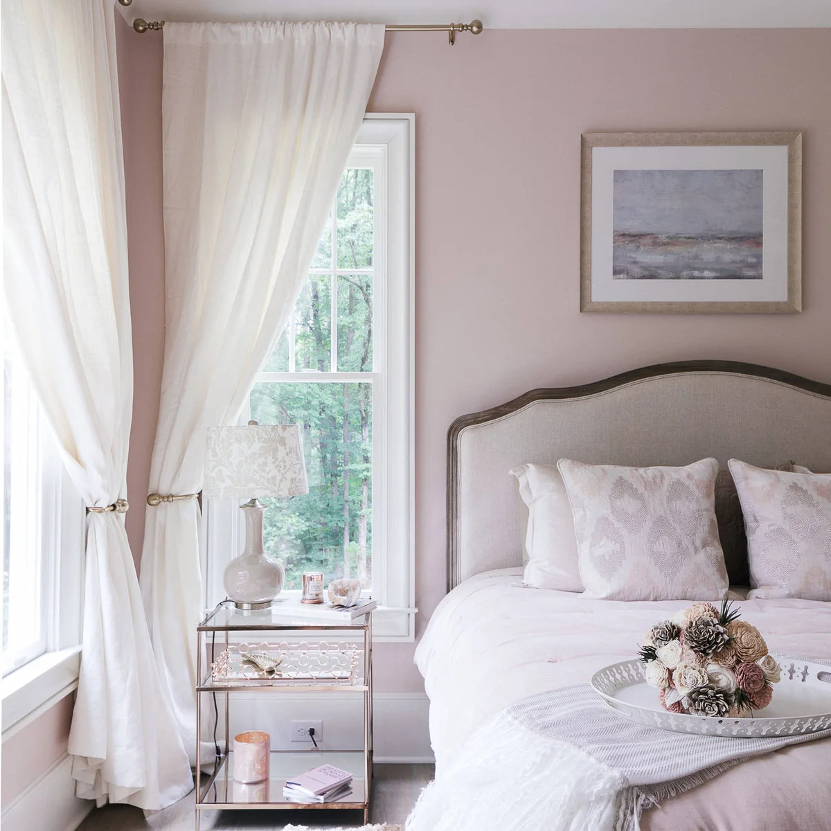
Pale blush walls sit behind a neutral upholstered headboard, with white curtains preserving a bright edge at the windows. The bedding repeats pink only lightly, so the room does not rely on a full matching set. A small reflective table adds another texture beside the bed.
Sample blush against white fabric and your existing floor. Some shades turn peach in warm light or appear cooler beside gray upholstery. Choose the version that still looks comfortable to you in the evening, since that is when a bedroom’s wall color is often most noticeable.
IDEA 12 / 20
Try Dusty Rose with Olive and White
 SaveSupport Non AI Creator
Image credit: Oho Interiors / Photography Judith Marilyn
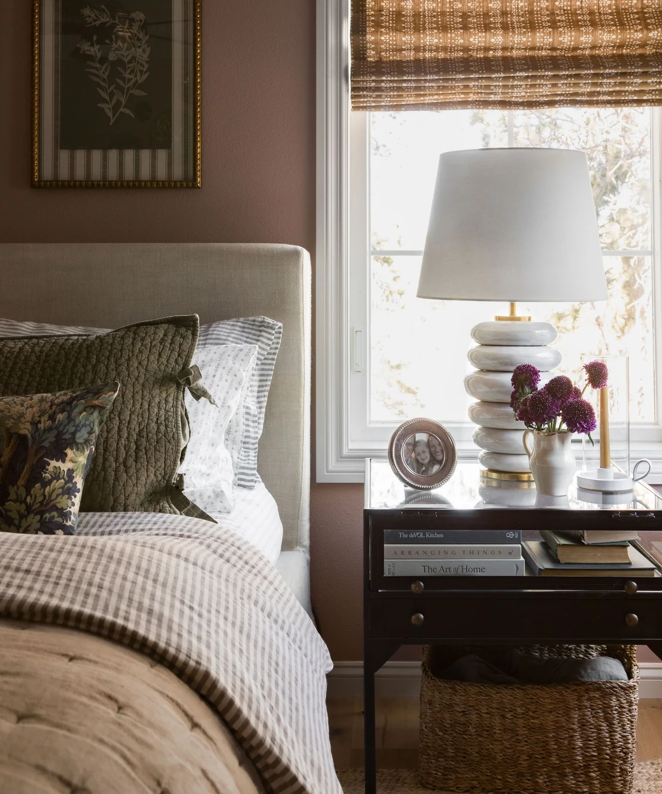
Dusty rose brings warmth to the wall while the olive cushions and white bedding keep the palette varied. The white window frame provides a crisp boundary, and the checked fabric introduces a small pattern. The pale headboard stops the darker cushions from blending directly into the painted background.
Compare dusty pink samples with any green textiles you plan to keep. A restrained pink can support those fabrics without becoming the room’s dominant statement. Check the paint behind both the lamp and the headboard, where shadows may make it look considerably deeper than near the window.
IDEA 13 / 20
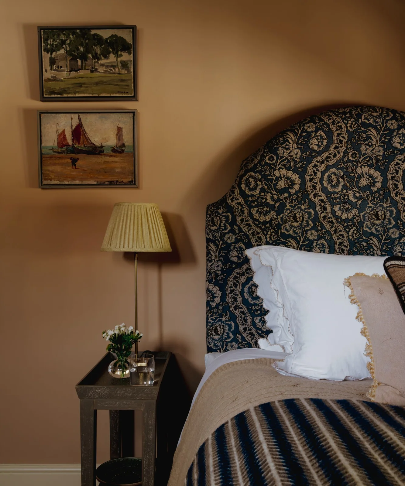
Soften Apricot with a Deep Blue Pattern
 SaveSupport Non AI Creator
Image credit: Danebury Design / Ben Stevens Photography
The muted apricot wall warms the space around a blue floral headboard. Pale bedding separates the detailed fabric from the larger painted surface, while the small bedside lamp uses another gentle warm tone. The room’s contrast comes mainly from blue against apricot rather than several bright accents.
Start with a less saturated apricot sample if you want a softer effect. Large walls can make warm colors feel stronger than a small chip suggests. Compare it with the actual blue fabric, then assess the pairing from the doorway and from your usual position in bed.
IDEA 14 / 20
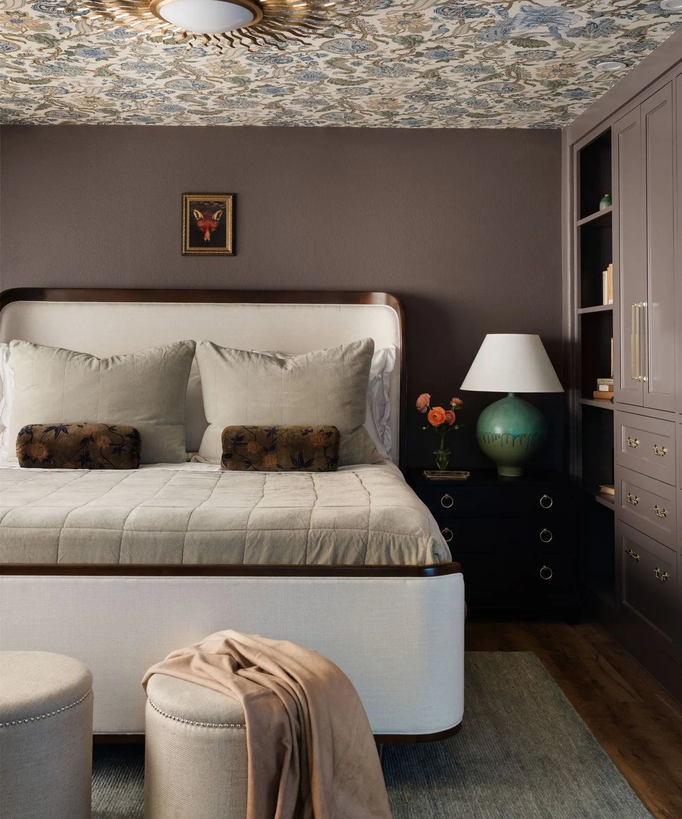
Use Mushroom Beside Pale Upholstery
 SaveSupport Non AI Creator
Image credit: Sherrell Design Studio
Mushroom tones connect the wall and fitted cupboards, creating a consistent background around the pale bed. The floral ceiling is the more detailed surface, while a green lamp adds a single stronger color beside the bedding. The paint keeps the storage from becoming a separate contrasting block.
If you are keeping a patterned surface, choose a wall sample that sits comfortably among its quieter tones. Check cupboard and wall finishes together before ordering paint. A low-contrast combination still needs some light fabric or furniture to make the bed’s outline easy to see.
IDEA 15 / 20
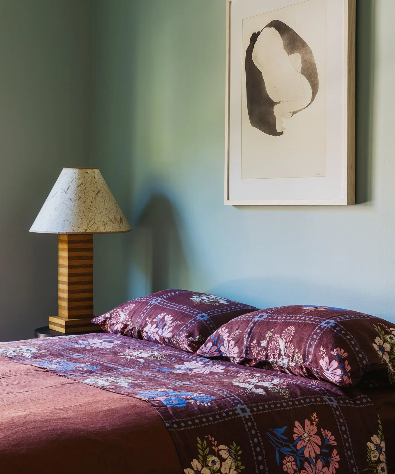
Let a Pale Green Support Colorful Bedding
 SaveSupport Non AI Creator
Image credit: Sucher Studios
The pale green wall is quieter than the burgundy floral bedding, giving the print room to be the main pattern. The light picture frame and lamp shade provide pale shapes above the bed. A wooden lamp base adds warmth without another bold painted surface.
Choose your bedding before the paint when it contains a color combination you already enjoy. Take a physical pillowcase or fabric sample to the paint comparison. A photograph can suggest a family of greens, but it cannot show how that exact shade will behave against your fabric.
PART 04
Adjust depth and painted details
IDEA 16 / 20
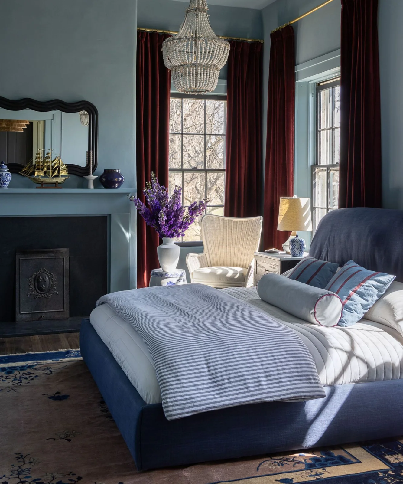
Keep a Dusty Blue Consistent Across the Fireplace
 SaveSupport Non AI Creator
Image credit: Bethany Adams Interiors
Dusty blue continues across the walls and fireplace surround, making the architectural feature part of one color field. Pale bedding creates a light center, while deeper red curtains frame the windows. The blue bed repeats the palette without requiring the upholstery and paint to match exactly.
Decide whether the fireplace should stand out or blend in before choosing its color. Any coating must suit the particular surface and use of the fireplace. Judge the blue with your curtains closed as well as open, since a large colored fabric changes the room’s overall balance.
IDEA 17 / 20
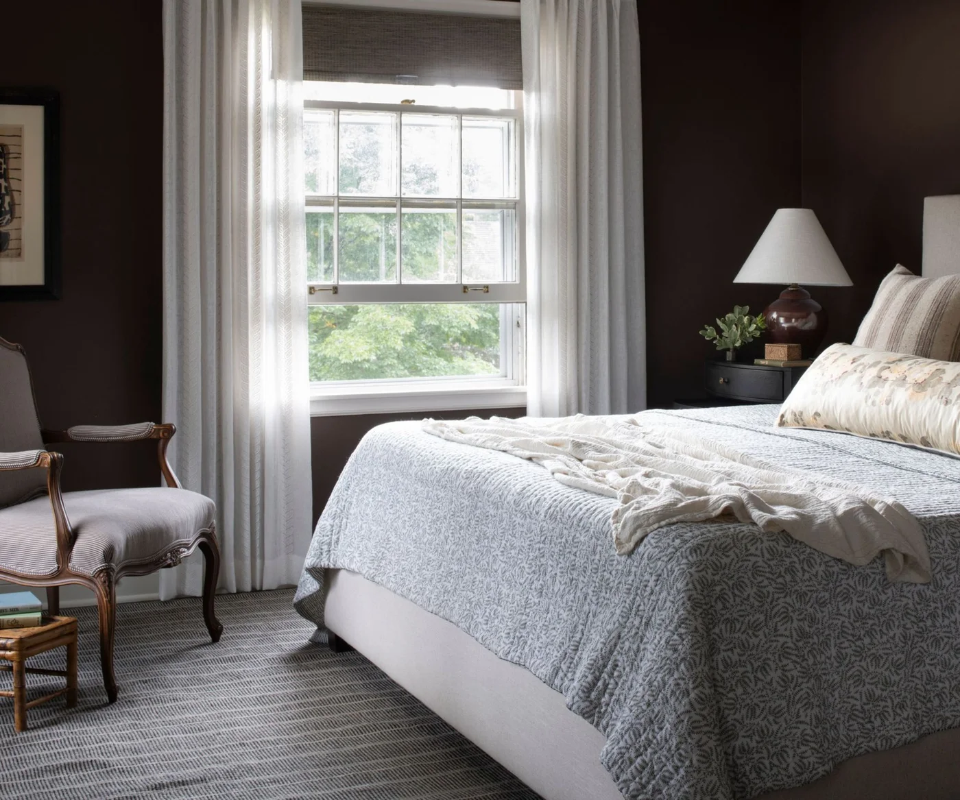
Consider Chocolate for a More Enclosed Feel
 SaveSupport Non AI Creator
Image credit: Heather Peterson Design / Photography Scott Admunson
Chocolate walls create a deeper enclosure around pale bedding and white curtains. The contrast keeps the bed and window easy to distinguish, while the wooden armchair repeats brown in a different texture. Smaller neutral patterns add detail without bringing in another strong wall color.
A deep color is a preference, not a requirement for a relaxing room. Try a large sample and sit beside it under your evening lamps before committing. Keep enough useful light around the bed and storage so the richer walls do not make everyday tasks inconvenient.
IDEA 18 / 20
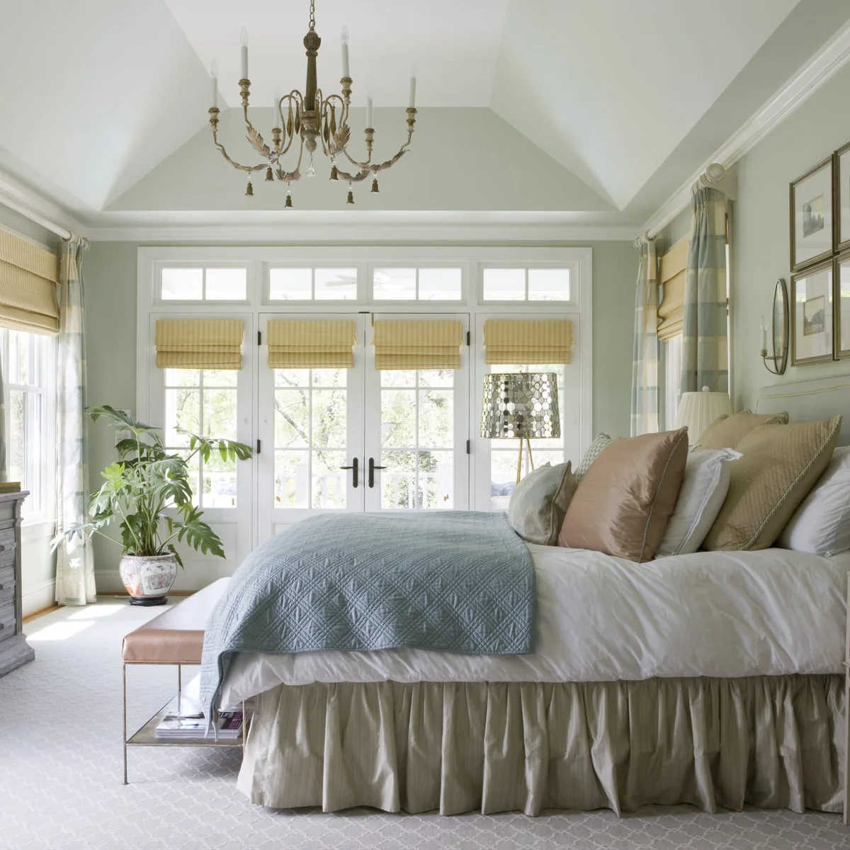
Use a Hint of Green Beside White Joinery
 SaveSupport Non AI Creator
Image credit: Project: Ivy Lane Living (via Houzz)
The very pale green-gray walls sit close to the white doors and ceiling in depth, so the room’s boundaries stay gentle. A blue quilt and soft yellow blinds provide clearer color. The broad areas of glazing make it especially important to compare the wall shade with the changing daylight.
Do not judge a very pale color only on a bright afternoon. Check it in the least sunny corner and after dusk, when the green undertone may become more obvious. Keep samples beside your white trim so you can see whether the difference is distinct enough for your preference.
IDEA 19 / 20
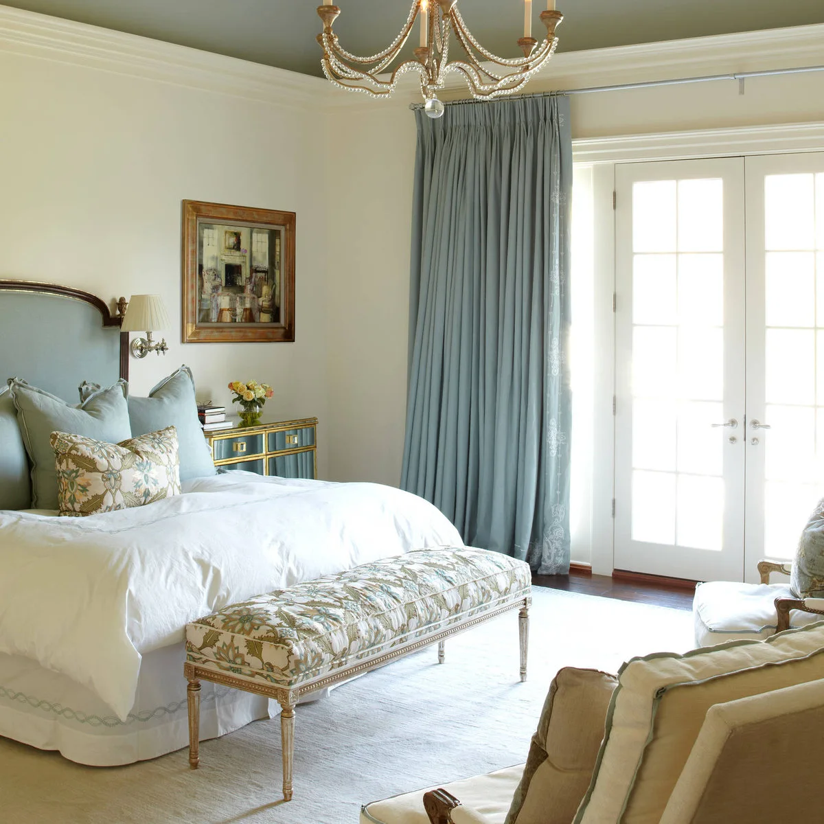
Put a Muted Green on the Ceiling
 SaveSupport Non AI Creator
Image credit: Project: Wright Building Company (via Houzz)
The muted green ceiling adds color above cream walls while pale blue curtains and upholstery keep the lower room light. White trim separates those painted areas. The ceiling becomes a deliberate part of the palette rather than simply the surface left over after the walls are chosen.
Test overhead color on a movable sample viewed from the bed before painting the ceiling. The angle and lighting change how deep it appears. Compare the green with both cream and blue fabrics, and keep the trim sample nearby so all four surfaces work together.
IDEA 20 / 20
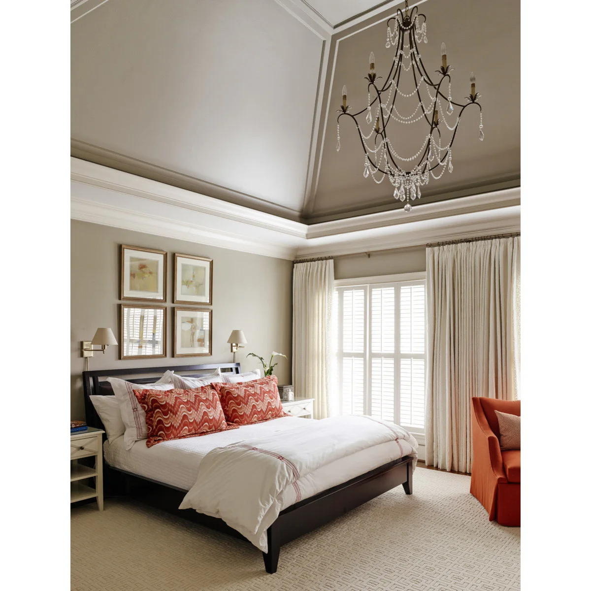
Repeat Greige Across Walls and a Tall Ceiling
 SaveSupport Non AI Creator
Source: www.houzz.com
Greige continues across the walls and tall ceiling, while white molding traces the room’s structure. White bedding gives the bed a light center, and coral pillows add a removable accent. The deeper ceiling area remains connected to the walls rather than becoming an unrelated color block.
Consider whether you want the molding emphasized before choosing contrasting trim. Test the wall color at more than one height if your ceiling is tall. For a quieter palette, start with neutral bedding and introduce colored pillows gradually instead of planning several accent colors at once.
BRING IT ALL TOGETHER
Choose the sample you enjoy at home
Narrow the choices to a few color families, then compare large, fully dried samples with the room’s fixed finishes. View them in daylight, shaded corners and your normal evening lighting before choosing the paint.
Your preferred depth and contrast matter more than a universal idea of a calming color. Keep the bed, lighting and window coverings comfortable, then let the walls support the way you actually use the room.