Warm-white kitchen cabinets range from a barely creamy white to a more visible ivory. They can soften a room with dark counters or sit quietly alongside timber, but the effect depends on the light, neighboring surfaces and the finish itself. An exact paint color cannot be established from a photograph.
These kitchens compare pale cabinet fronts with different appliances, floors, backsplashes and storage arrangements. A few lean further toward light cream, making them useful comparisons when deciding how warm you want to go. Start with samples in your room, then choose details around everyday cooking and upkeep.
PART 01
Compare soft whites with neighboring finishes
IDEA 01 / 16
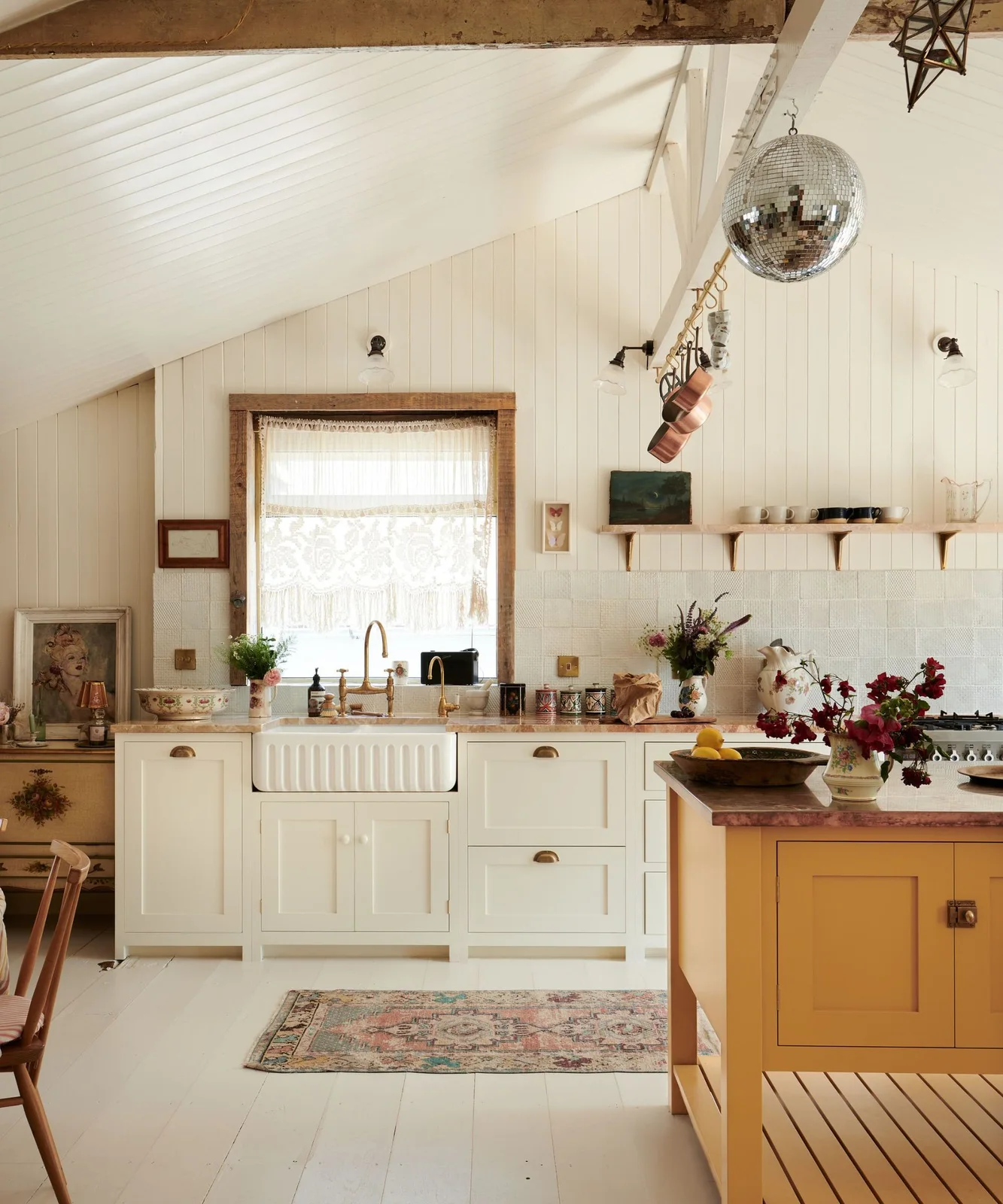
Warm a Pale Cabinet Run with a Yellow Island
 SaveSupport Non AI Creator
Image credit: deVOL Kitchens
The pale cabinet run stays quiet while the yellow island supplies a stronger warm note. A ribbed sink, cup handles and simple framed fronts give the kitchen detail without darkening the whole wall. Timber around the window and overhead adds another layer of warmth beside the soft ivory finish.
Compare the island color with a full cabinet-door sample before painting a large area. A bright yellow can make neighboring whites appear cooler or creamier, so check them together in daylight and evening light. Keep sink edges and cabinet joints easy to wipe, and choose hardware that feels comfortable with wet hands.
IDEA 02 / 16
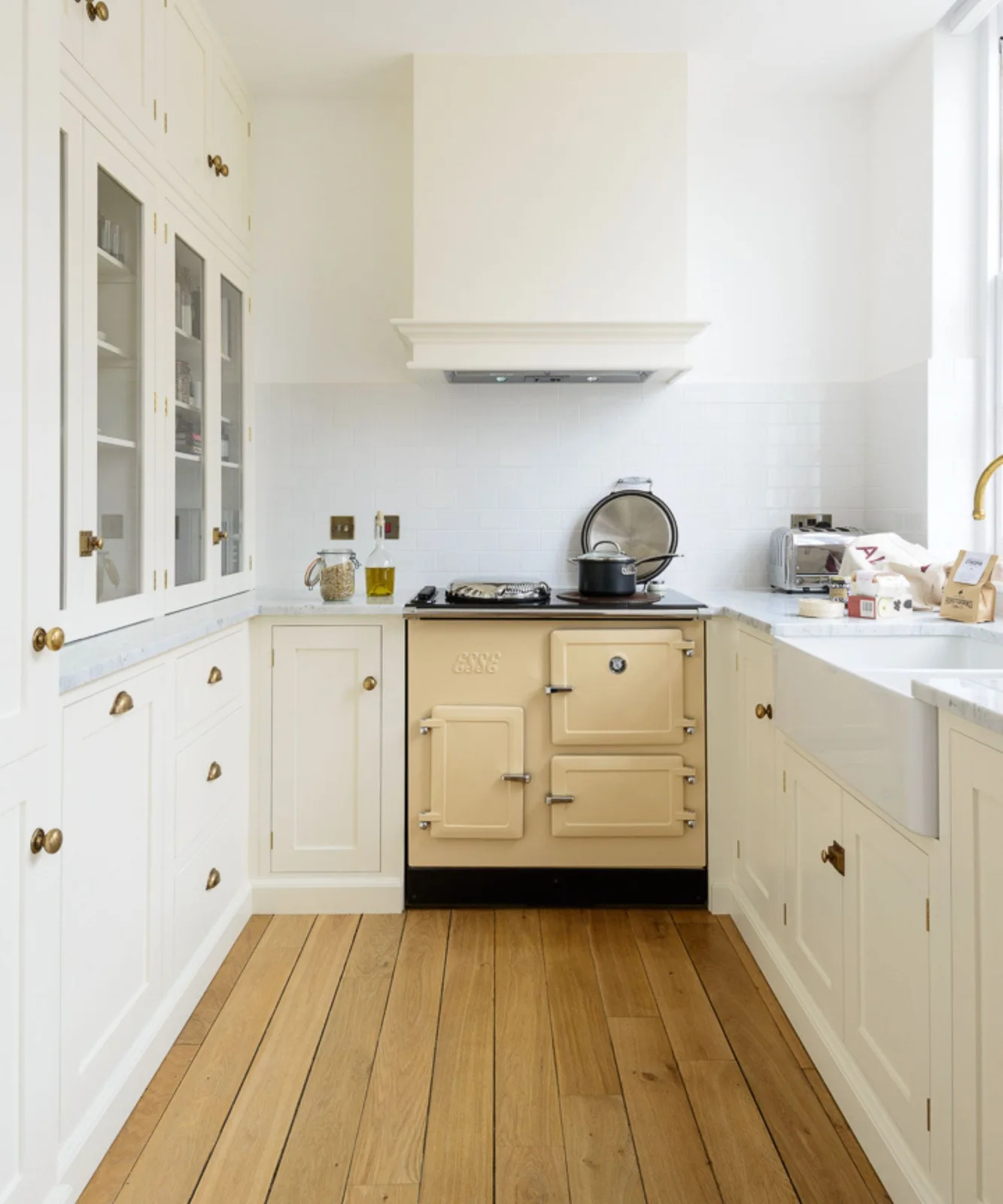
Pair Soft White Cabinets with a Deeper Cream Range
 SaveSupport Non AI Creator
Image credit: deVOL Kitchens
The range is a deeper cream than the surrounding cupboards, making the difference between related pale shades visible. Glass-front upper storage breaks up the solid doors, while timber flooring and warm metal handles connect the kitchen’s softer tones. The white tiled wall is a lighter layer behind the cooker.
You do not need every pale finish to match exactly, but intentional differences are easier to judge with samples placed together. Include the appliance finish in that comparison if it will remain on show. Check door swings and landing space around the range rather than assuming a compact photographed layout will suit every appliance.
IDEA 03 / 16
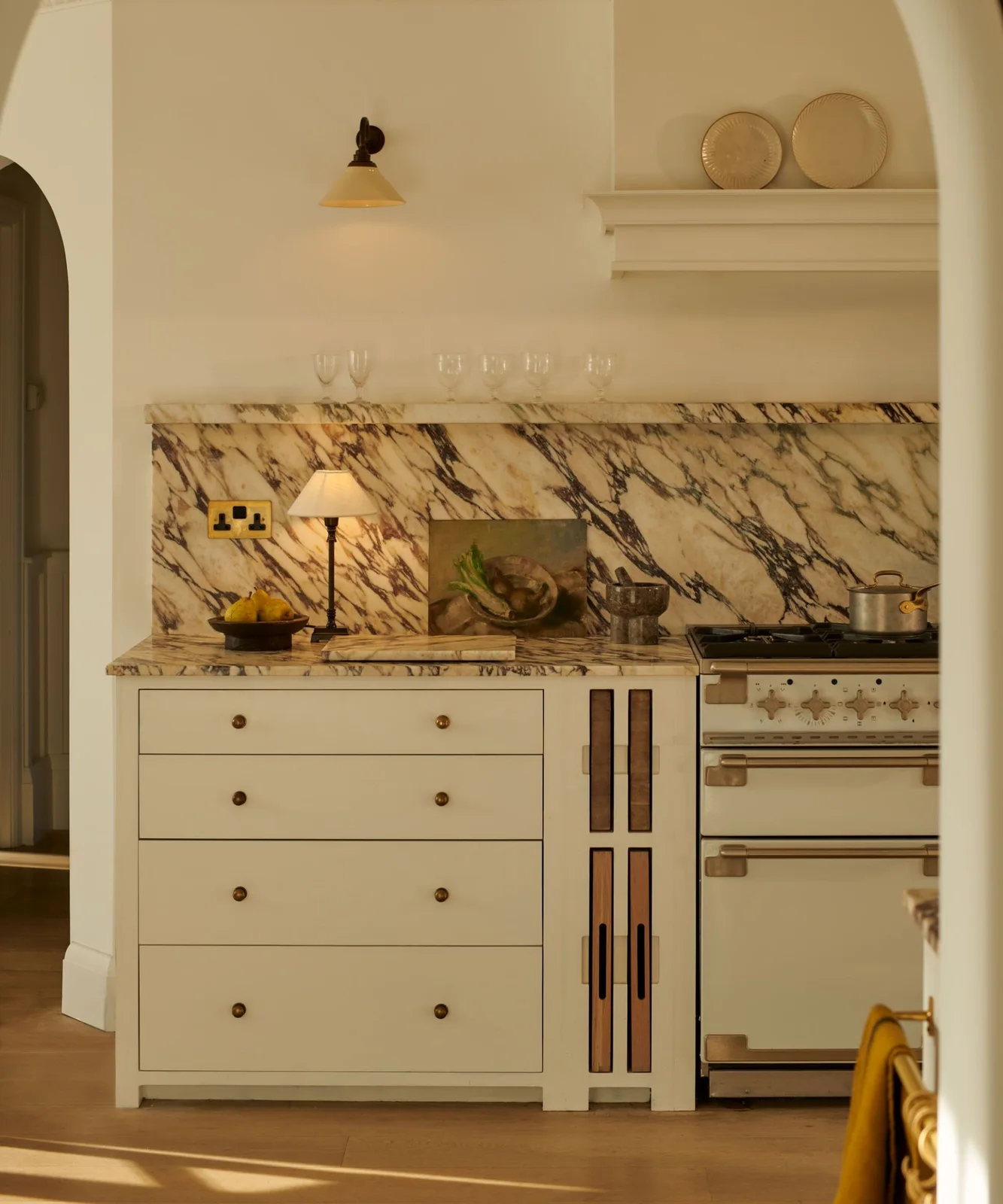
Let Pale Drawers Support a Dramatic Backsplash
 SaveSupport Non AI Creator
Image credit: Neptune
Simple pale drawer fronts leave the heavily veined backsplash as the most active surface. Small dark knobs add definition without creating a busy row of handles. The adjacent range and wall shelf repeat lighter warm tones, while the narrow timber-front storage detail adds a separate texture beside the drawers.
View the cabinet sample beside a representative section of the backsplash, including both light and dark veining. Ask how the chosen surfaces need to be cleaned around cooking splashes before ordering. Keep electrical fittings and loose countertop accessories appropriately located away from heat and water; decorative staging is not an installation guide.
IDEA 04 / 16
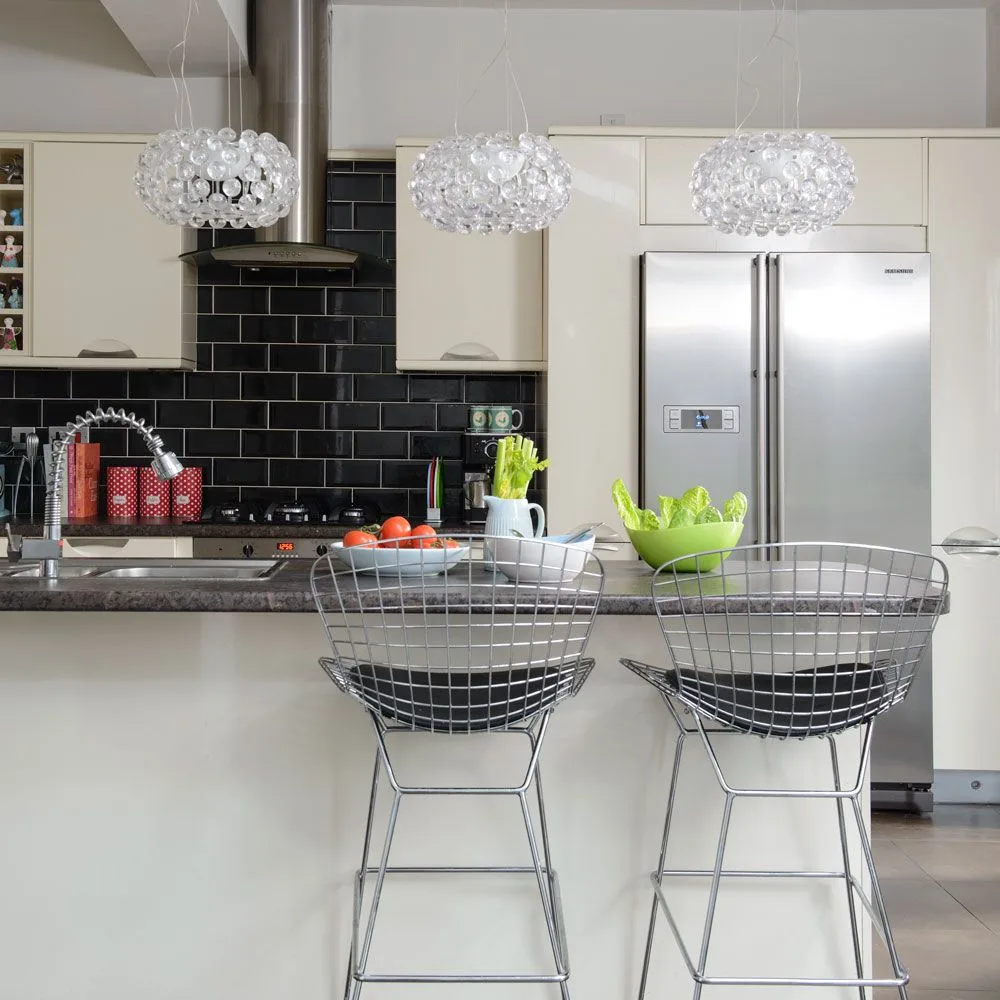
Use Black Tile to Sharpen Plain Ivory Fronts
 SaveSupport Non AI Creator
Image credit: Future PLC/Colin Poole
Glossy black tile gives the pale cupboard fronts a strong edge, while the gray counter connects them to the stainless appliances. Plain doors keep the contrast from becoming too busy. Glass pendant lights and open wire stools add lighter outlines in front of the heavier tiled wall.
A dark backsplash can make warm-white cabinets stand out, but check its appearance under the lighting you use for cooking. Include grout color and cleaning access in the decision. Our classic backsplash ideas compare other ways to balance the wall with cabinetry without relying on extra countertop decorations.
PART 02
Use simple fronts and contrasting surfaces
IDEA 05 / 16
Test Warm Whites beside Dark Counters
 SaveSupport Non AI Creator
Image credit: Mark Bolton/Future PLC
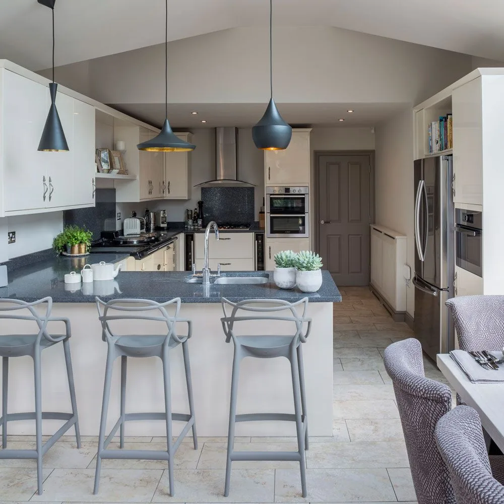
The cabinet color looks lighter near the left side and warmer deeper into this room, showing why a photograph cannot specify a paint match. Dark counters and pendants outline the working area. Tall appliance storage and a peninsula keep the cupboard treatment consistent despite the different cabinet heights.
Move a sample door around the kitchen before committing to a warm white, including the shaded corners and surfaces beneath pendant lights. Compare it with both the wall paint and counter. Check occupied stool positions against the path into the kitchen, especially where the peninsula shares a route with the dining area.
IDEA 06 / 16
Set Cream Cabinets below a Dark Upper Wall
 SaveSupport Non AI Creator
Image credit: Future PLC/Dominic Blackmore
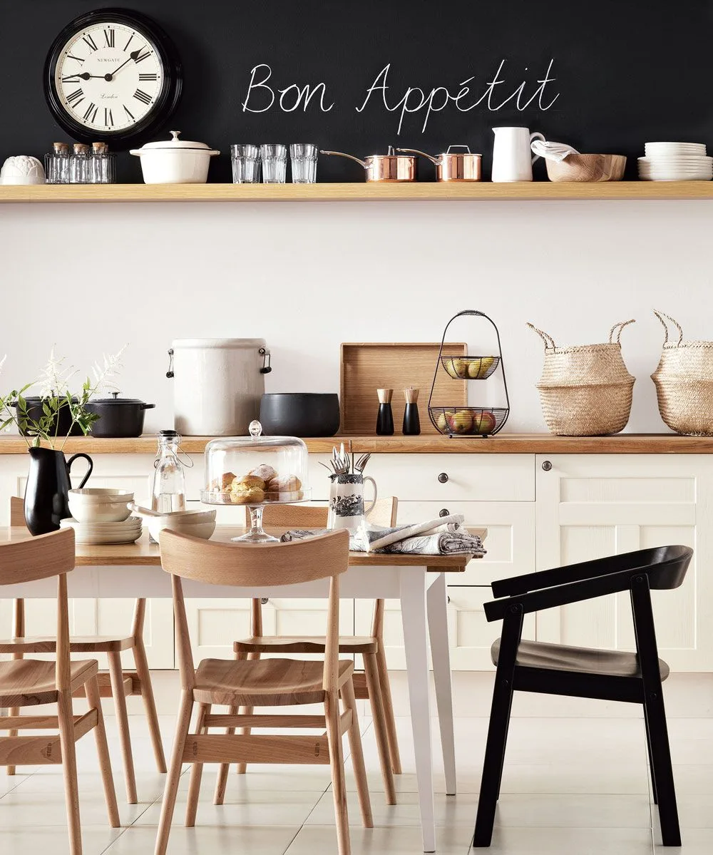
The dark upper wall makes the light cream cabinet run read clearly, while timber shelves and worktops soften the contrast. Round knobs keep the lower fronts simple. Mixed dining chairs repeat the room’s pale, timber and black tones without requiring a matching furniture set.
Use the upper-wall treatment where it will be easy to maintain, and think about dust if you intend to write on it regularly. Keep food preparation and storage practical before adding decorative lettering. Measure chair clearance against the cabinet doors, and keep everyday crockery on reachable shelves rather than relying on a high display ledge.
IDEA 07 / 16
Balance Pale Cabinets with a Timber Island
 SaveSupport Non AI Creator
Image credit: Photo: Courtney Lively Photography. From: Andrea Bazilus
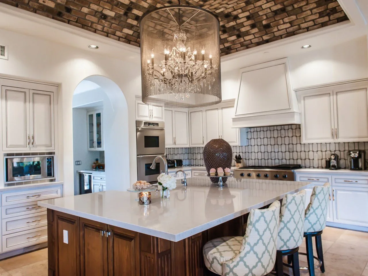
The cabinet fronts stay pale and relatively quiet beneath the patterned ceiling. A timber island gives the room a warmer center, while light counters connect it with the perimeter. Narrow dark lines in the backsplash and cabinet detailing provide definition without making the full cupboard run dark.
Where the ceiling already has a strong pattern, compare simpler door profiles before choosing ornate cabinetry. Look at the cupboard finish alongside the island timber and backsplash sample together. Keep pendant height and sightlines practical over the island, and allow for the cleaning needed by a large decorative light fitting.
IDEA 08 / 16
Choose Plain Fronts with Subtle Warm Variation
 SaveSupport Non AI Creator
Image credit: Photo: Douglas Friedman. From: Deborah Wecselman
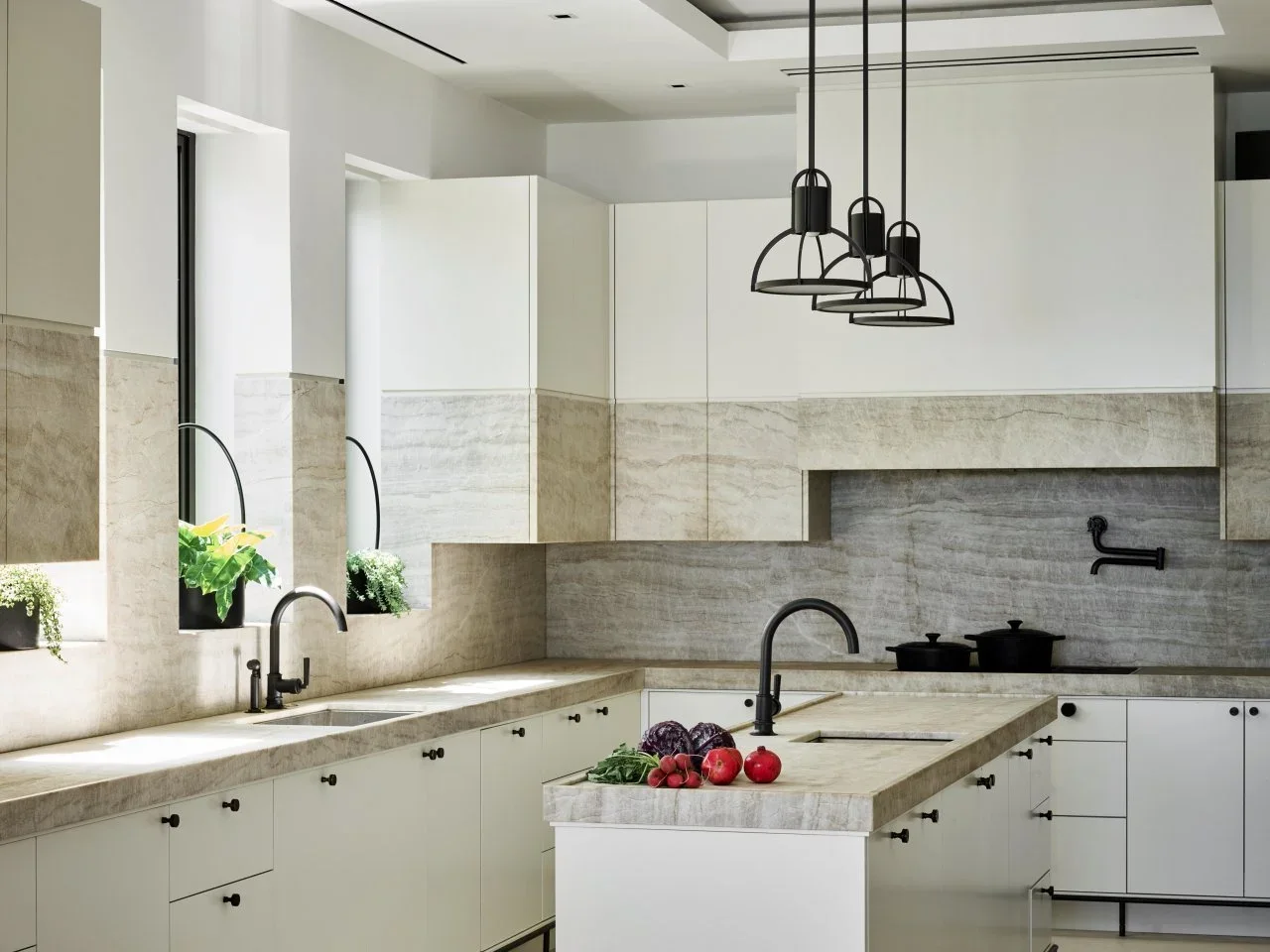
Plain cabinet fronts place the emphasis on the broad, softly varied backsplash panels. The lower cupboards read warmer in the shaded side of the room, while black knobs and taps supply small repeated outlines. A narrow island repeats the same simple fronts rather than adding another decorative treatment.
Ask to see a full door sample if a small paint card cannot show the finish or sheen clearly. View it beside the actual backsplash and counter, including their less obvious undertones. Simple flat fronts may reduce decorative grooves to clean, but hardware, edges and sink-side joints still need an appropriate maintenance routine.
PART 03
Consider light, texture and glazed storage
IDEA 09 / 16
Keep Tall Storage Plain beside a Patterned Wall
 SaveSupport Non AI Creator
Image credit: DesignSpace London
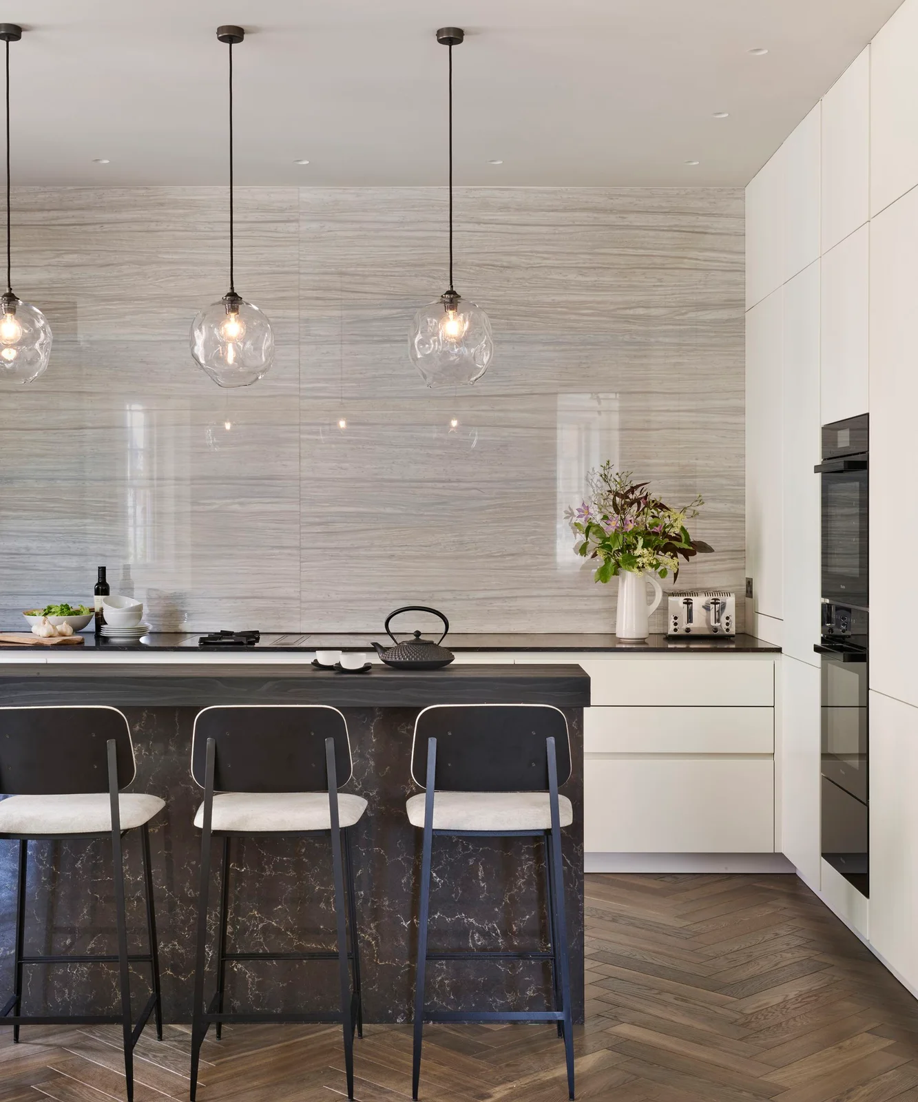
The tall cabinet wall uses simple pale fronts, leaving the broad backsplash and dark island as the more active surfaces. Recessed finger pulls keep the lower drawers quiet. Glass pendants introduce smaller shapes without interrupting the long vertical cupboard run or adding another strong cabinet color.
Compare the pale finish with a large backsplash sample so the quiet doors do not acquire an unwanted pink or yellow cast beside it. Check how finger pulls feel in use and how their recesses are cleaned. Plan tall storage around the items you need to reach, rather than treating every high shelf as everyday space.
IDEA 10 / 16
Use Slightly Different Pale Surfaces Deliberately
 SaveSupport Non AI Creator
Image credit: Quorn Stone
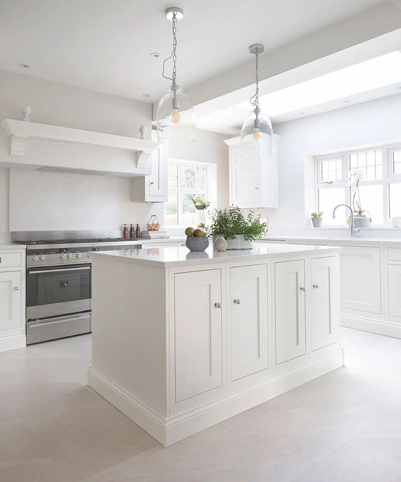
Soft-white cabinet fronts, lighter counters and a pale floor create a closely related group of finishes. Framed doors and the island’s panel details keep the cupboards visible within it. Glass pendants and a stainless range introduce contrast through reflection and outline rather than through another painted cabinet color.
Compare all the pale samples together instead of approving each one separately. A small difference can look intentional across a whole room, while two almost identical whites may appear mismatched side by side. Check the floor’s cleaning and slip guidance independently of the cabinetry, and leave a useful landing surface beside the cooking area.
IDEA 11 / 16
Frame the Range with Creamy Built-In Storage
 SaveSupport Non AI Creator
Image credit: The Misfit House/Kristin Benton Photography
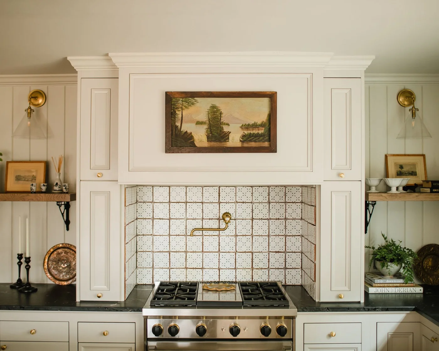
The creamy built-in surround gives the range a strong frame without using a dark cabinet finish. Small patterned tiles create detail inside the niche, while simple knobs repeat across the adjoining cupboards and drawers. Timber shelves and warm metal wall lights connect the pale fronts with the room’s warmer accessories.
Plan the range surround with the appliance and extraction requirements before deciding its decorative proportions. Keep shelves and combustible objects outside the specified clearances. Check that the cupboard doors remain useful at their intended height, and avoid filling the counter’s preparation space with objects chosen only to balance the photograph.
IDEA 12 / 16
Use Glazed Upper Doors to Break Up Off-White Storage
 SaveSupport Non AI Creator
Image credit: Harvey Jones/Darren Chung
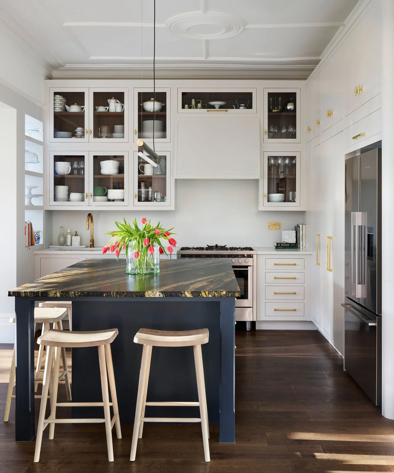
Glazed upper cupboards break the tall pale storage into smaller sections, revealing darker interiors and everyday dishes. Warm metal handles repeat across the plain drawers and doors. A dark blue island and boldly patterned top introduce contrast, while the surrounding cabinets remain a soft off-white backdrop.
Choose glazing for what you are comfortable keeping visible, including dishes you use rather than a permanent display arrangement. Check shelf access and the cleaning needed around narrow frames. Our white kitchen tile ideas offer backsplash comparisons if you want another pale surface without repeating the island counter’s stronger pattern.
PART 04
Keep pale cabinetry useful every day
IDEA 13 / 16
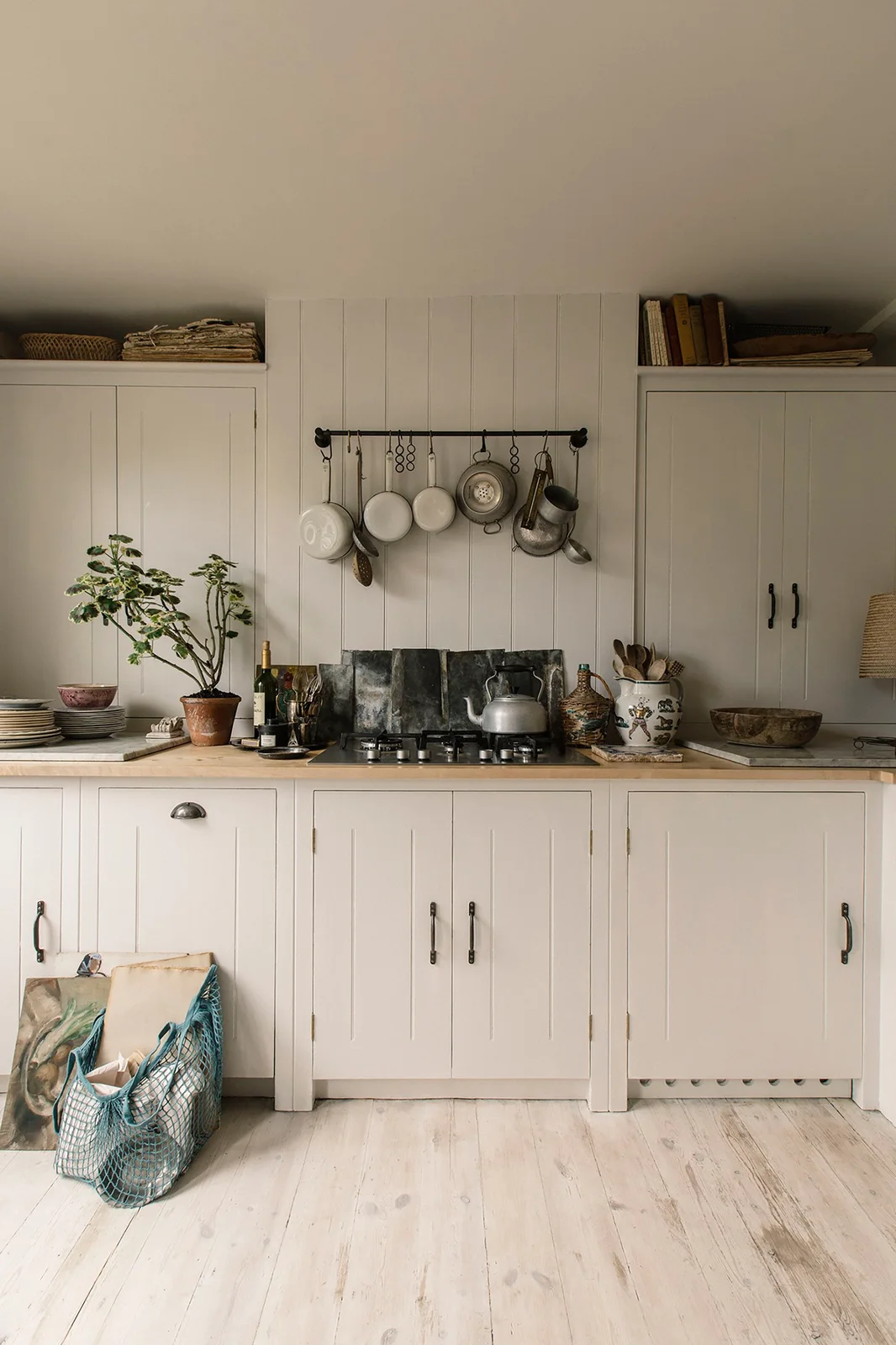
Keep Boarded Details Consistent with Pale Doors
 SaveSupport Non AI Creator
Image credit: British Standard
The warm pale cupboard fronts sit beside a similarly light boarded wall, keeping the small cooking run cohesive. A dark hanging rail and mixed pans provide contrast above the counter. Simple handles and a single cup pull connect the storage, while the timber work surface supplies another warmer layer.
Confirm any wall treatment is suitable for the cooking position and appliance clearances before copying the look. A rail needs secure fixings and enough space to remove pans without knocking neighboring items. Keep frequently used utensils within reach, but leave clear preparation space and avoid storing books or fabric immediately above heat sources.
IDEA 14 / 16
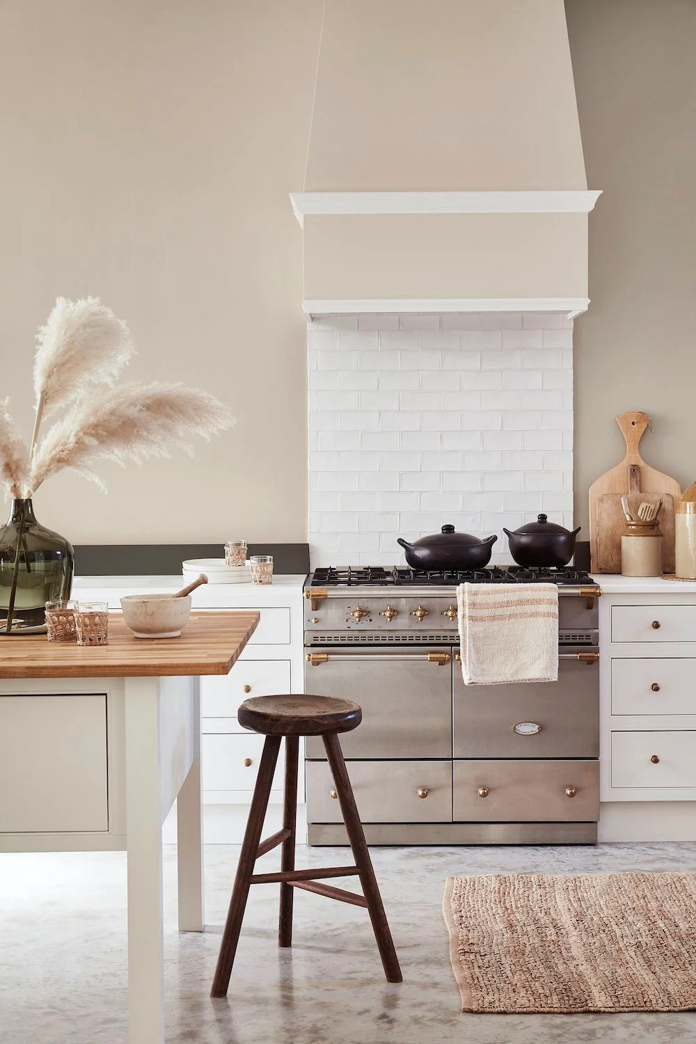
Let Warmer Walls Show a Subtle Cabinet White
 SaveSupport Non AI Creator
Image credit: Little Greene
The warmer beige wall and hood make the light cabinet fronts read closer to soft white. Small warm metal knobs connect them with the range details, while timber at the island and a dark stool add different tones. The white tiled section gives the cooking wall a lighter center.
Test wall and cabinet samples together if you want a slight difference rather than a pronounced cream scheme. Choose the backsplash and its cleaning requirements before finalizing the paint. Keep dried grasses, boards and fabric outside cooking clearances, and make sure a stool can be occupied without blocking access around the island.
IDEA 15 / 16
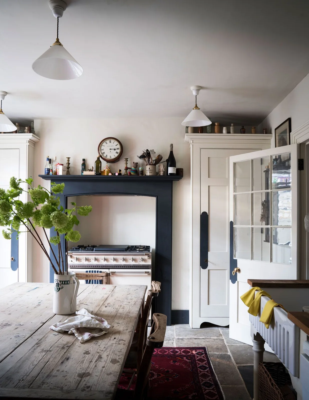
Keep Tall Cupboards Pale beside a Dark Range Niche
 SaveSupport Non AI Creator
Image credit: Farrow & Ball
The tall pale cupboards keep the sides of the room lighter around a dark blue range surround. A worn timber table introduces warmth in the center, while white pendant shades repeat the cupboard tone overhead. The darker cooking niche gives the room definition without turning every storage front dark.
Consider the view with tall cupboard doors open as well as closed, especially where they share space with a dining table. Choose a sample white with the existing timber and blue finish visible. Keep the range surround and shelf arrangement within appliance requirements, and leave a reliable place to set down hot dishes.
IDEA 16 / 16
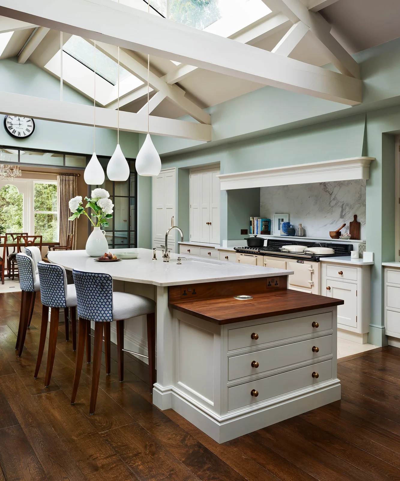
Mix Pale Cabinetry with a Timber Work Surface
 SaveSupport Non AI Creator
Image credit: Martin Moore
Pale framed fronts repeat across the tall cupboards, range run and island, while a timber-topped drawer section breaks up the central counter. Warm metal knobs and timber flooring connect that smaller surface with the wider room. Blue patterned stools provide a contained accent beside the mostly pale cabinetry.
Decide whether different counter heights suit your actual tasks before copying the island detail. Check drawer access, stool movement and the route between the island and range. Compare the cabinet finish with both countertop materials and the visible appliance white, since several similar pale surfaces can look different under roof glazing.
BRING IT ALL TOGETHER
Choose the white in the kitchen itself
Compare a cabinet-door sample with the counter, floor, backsplash and any visible appliance finish. Move the samples between daylight and shaded areas, then look again under the evening lighting. Decide whether you want the cupboard to read softly white or visibly creamy before ordering the full run.
Check storage and maintenance alongside the palette. Handles should suit daily use, drawers and appliances need room to open, and countertops need a care plan appropriate to their specification. Choose a few finishes that work together rather than expecting every white object to match exactly.