Scandi-inspired wallpaper can be quiet and geometric, but it can also use leafy drawings, playful color or softer traditional flowers. The useful starting point is the relationship between the pattern, simple furniture and the light in the room. A white wall is one option rather than a requirement.
These photographed arrangements range from restrained bedrooms to more colorful corners and collected interiors. Look at the visible scale of the print, the amount left uncovered and the colors repeated in furniture. Order samples for your own lighting, and check installation and care requirements before choosing a whole wall.
PART 01
Start With Light Geometry and Fine Lines
IDEA 01 / 20
Let Yellow Branches Brighten a Simple Console
 SaveSupport Non AI Creator
Image credit: Hygge & West via Hunker
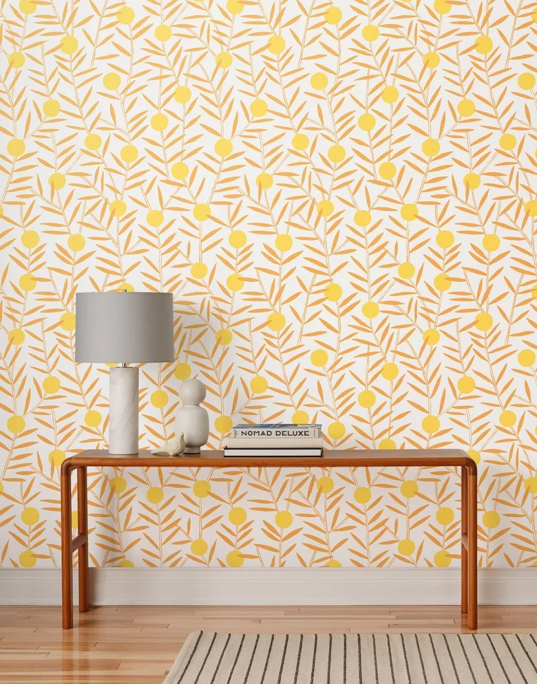
The yellow branches bring color to a wall furnished with only a slender console. A plain gray lampshade and pale objects keep the tabletop quieter than the pattern behind it. The wood frame and floor add warmth, while a narrow striped rug introduces a more regular line below.
Choose the wallpaper’s strongest color before selecting nearby accessories, then leave some surfaces plain. Check a full repeat behind the console rather than judging a small swatch alone. Keep enough tabletop free for keys or everyday objects if this arrangement belongs in an entrance rather than a purely decorative corner.
IDEA 02 / 20
Use a Pale Grid Behind Colorful Artwork
 SaveSupport Non AI Creator
Image credit: Chasing Paper via Hunker
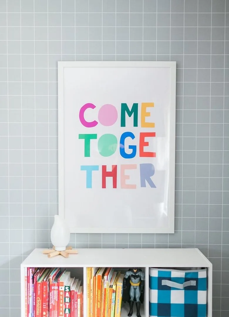
The fine white grid gives the gray wall structure without competing strongly with the colorful print. A white frame connects the artwork to the storage below. Books and a checked basket introduce color at a smaller scale, making the arrangement playful while the main furniture remains simple.
Align a geometric repeat carefully near a straight shelf or frame because small deviations become easier to notice there. Decide how much wall you want visible around the artwork before ordering. Secure storage appropriately and keep the cubbies useful, rather than adding objects solely to fill every square opening.
IDEA 03 / 20
Put a Loose Black Line Pattern Behind White Bedding
 SaveSupport Non AI Creator
Image credit: Livette’s Wallpaper via Hunker
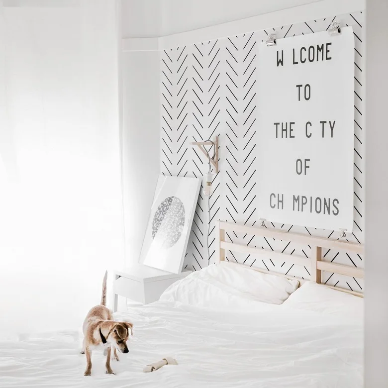
The loose herringbone marks give the white wall movement without turning it into a solid dark area. Pale wood and white bedding keep the larger forms simple. The oversized clipped artwork adds another graphic layer, but its mostly white background leaves the wall pattern visible around it.
Use a sample large enough to show several rows before deciding whether the spacing feels comfortable behind the bed. Hang artwork securely and position it for the bed’s actual height. Keep the adjoining walls simpler if you want the black lines to remain a detail rather than the room’s dominant contrast.
IDEA 04 / 20
Balance Fine Waves With Plain Lower Paneling
 SaveSupport Non AI Creator
Image credit: Future PLC
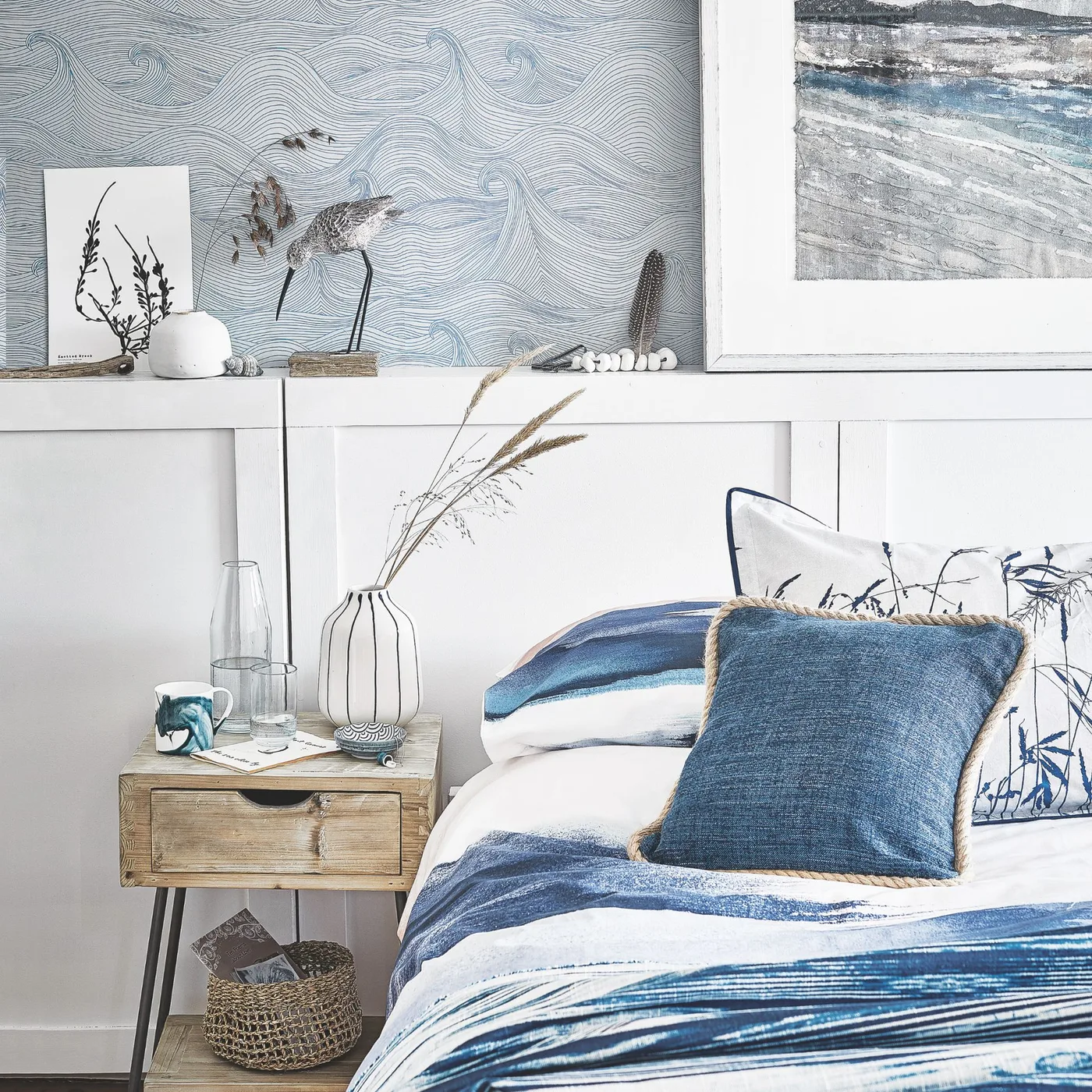
The fine wave lines add movement above the bed while the white paneling gives the lower wall a plain surface. Blue bedding repeats the paper’s tone with broader marks. A simple wood bedside drawer and small woven basket bring warmer texture without adding another large pattern.
Set the wallpaper boundary around the bed and any sockets rather than choosing an arbitrary height. A narrow ledge offers display space but also collects dust, so keep it manageable. Our bedrooms with paneling show other combinations; leave enough clear bedside surface for the items you actually use overnight.
IDEA 05 / 20
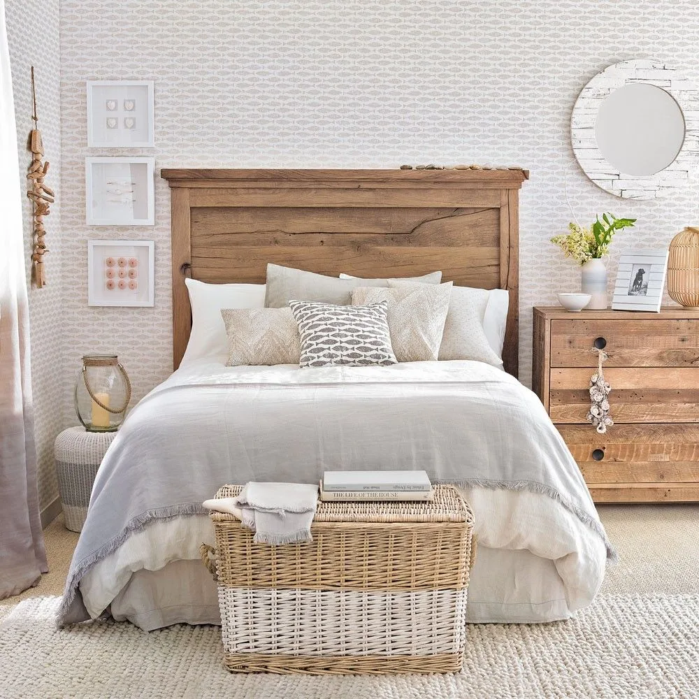
Repeat a Small Fish Motif Around Warm Wood
 SaveSupport Non AI Creator
Image credit: Future PLC/David Brittain
The small fish repeat reads as a gentle texture from a distance. Wood furniture gives the pale room a warmer center, while a round mirror breaks up the rectangular forms. White bedding and woven storage let the wallpaper provide interest without several strongly colored accessories.
A small repeat can cover more than one wall without requiring a dramatic feature panel, but check how it looks in your room’s daylight. Compare the paper against the furniture’s actual wood tone. Leave the storage trunk clear of the main walking route and avoid relying on bedside ornaments for essential lighting.
PART 02
Give Bedroom Patterns Room to Breathe
IDEA 06 / 20
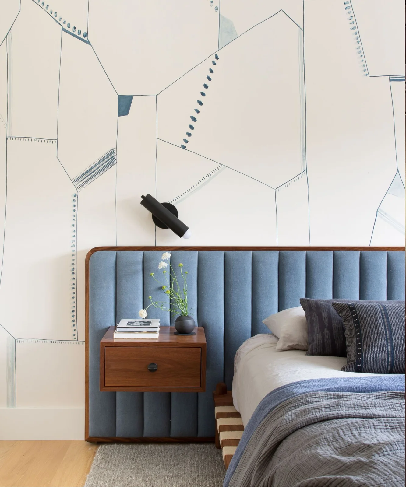
Choose Open Geometry Behind an Upholstered Bed
 SaveSupport Non AI Creator
Image credit: Regan Baker Design, Suzanna Scott
The large outlined shapes leave plenty of pale wall visible between the blue lines. A channeled headboard repeats the color with a stronger, more regular texture below. The wood bedside drawer and narrow black light provide useful contrast without introducing a second complicated wall treatment.
Plan where the large shapes will fall around the headboard before installation. A pattern with generous blank areas can look very different depending on its starting point. Test the reading-light position from the bed, and keep the bedside drawer easy to open rather than letting the wall arrangement determine every practical choice.
IDEA 07 / 20
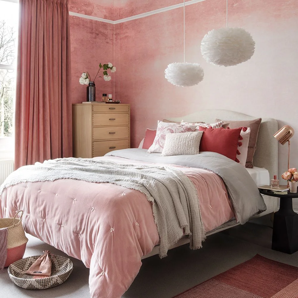
Use a Blush Wash for a Softer Pattern
 SaveSupport Non AI Creator
Image credit: Future PLC/Dominic Blackmore
The pink wash gives the wall variation without a sharply repeated motif. White pendant shades and pale bedding keep the room light, while the wood chest adds a practical warm surface. Several shades of pink provide depth without needing an additional high-contrast wallpaper pattern.
Look at a large sample in both daylight and evening light because mottled colors can become stronger across a full wall. Check how the pendants will be cleaned and whether they provide useful illumination. Keep bedside lighting within reach if decorative hanging shades do not cover reading or nighttime tasks.
IDEA 08 / 20
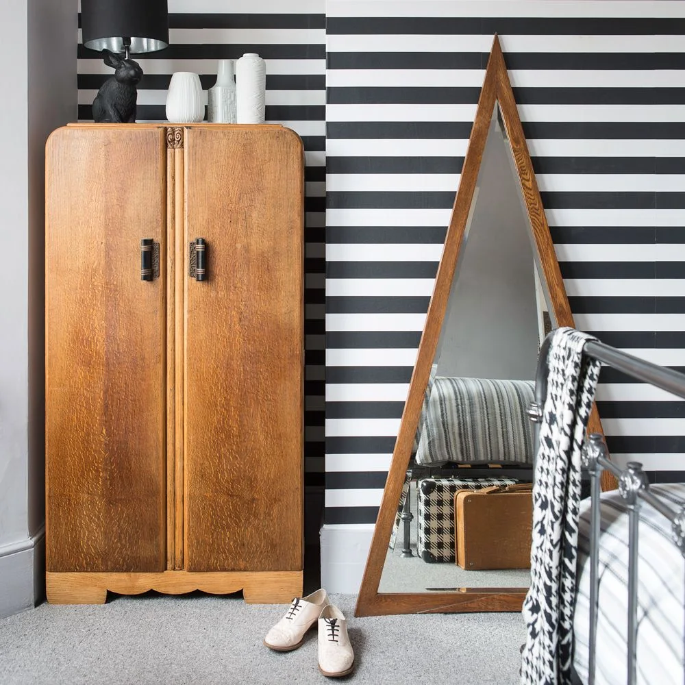
Set Bold Stripes Beside Older Wood Furniture
 SaveSupport Non AI Creator
Image credit: Future Publishing PLC/ Jo Bridges
The broad stripes give older wood furniture a sharper background. A triangular mirror adds a different outline while repeating the wardrobe’s warm color. The gray floor and pale surrounding surfaces keep the strong black-and-white wall from requiring equally bold color elsewhere in the room.
Check the horizontal alignment across the whole wall, especially where a wardrobe leaves only narrow strips visible. Place the mirror securely and allow the furniture doors to open fully. Use a quieter bedcover if you want the stripe pattern to remain clear rather than competing with another large graphic textile.
IDEA 09 / 20
Let Small Dots Support Personal Pictures
 SaveSupport Non AI Creator
Image credit: Future PLC/Claire Davies
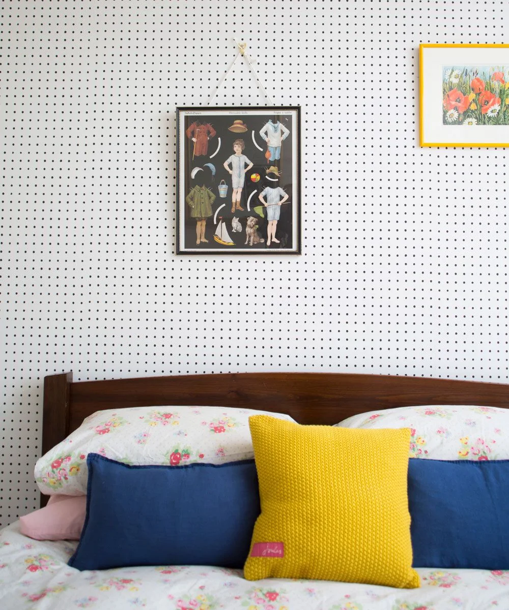
The small dots provide a regular background for personal pictures without creating a large competing motif. Navy and yellow cushions make the bed colorful, while the wood frame gives it a simple base. Floral bedding introduces a second pattern on a softer surface below the wall.
Repeat only a few colors when combining dots, artwork and patterned bedding. Compare the dot spacing from the doorway because a small sample can make it seem quieter than a full wall. Keep picture frames securely fixed and leave comfortable clearance above the pillows for the way the bed is actually used.
IDEA 10 / 20
Combine Bird Wallpaper With Plain Wood Storage
 SaveSupport Non AI Creator
Image credit: Future PLC/Matt Antrobus
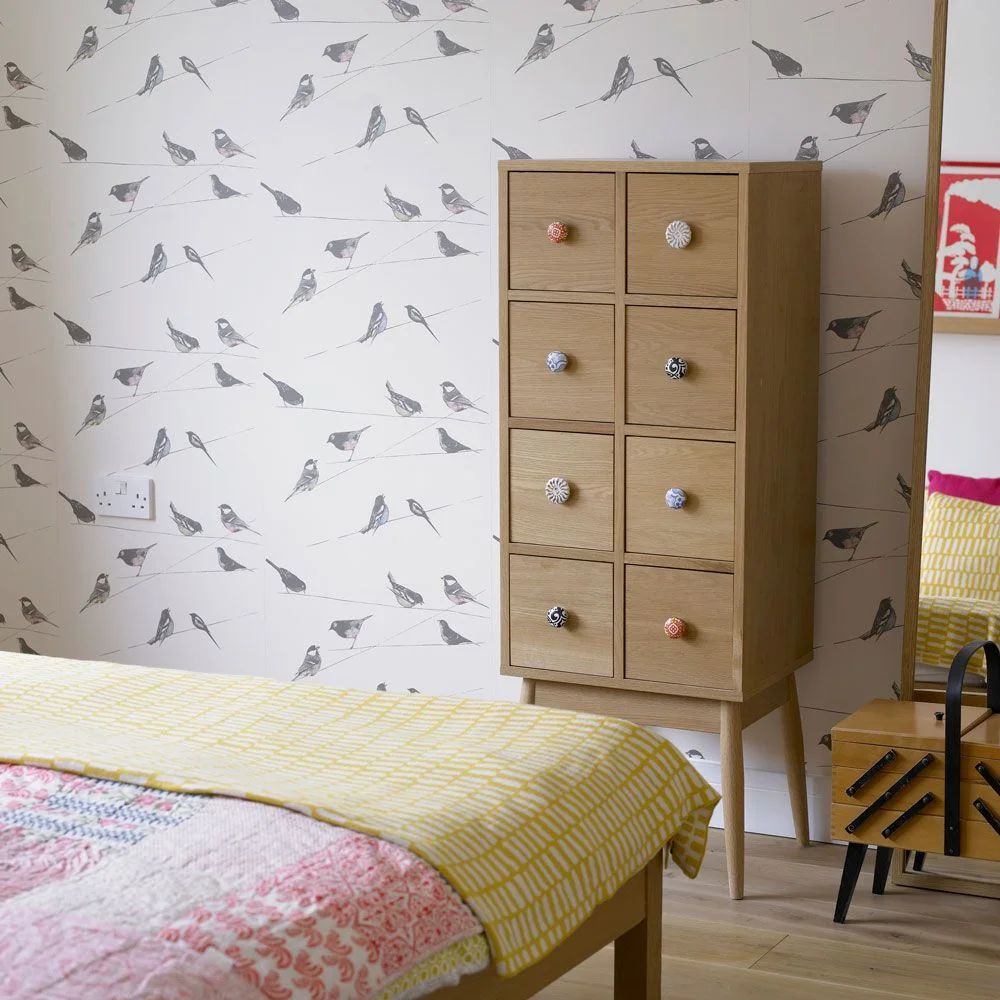
The bird pattern adds a light illustrative detail behind the plain wood cabinet. Its fine lines leave the wall mostly pale, making the colored drawer knobs easy to notice. Yellow and pink bedding supply brighter accents without requiring stronger color across the whole wall.
Choose furniture with simple fronts when the wallpaper already carries a recognizable subject. A tall cabinet needs suitable fixing and enough room for its drawers to open. Keep other wall decorations limited if they would interrupt the birds repeatedly, and use bedding as the easier surface to change when your preferred colors shift.
PART 03
Connect Pattern With Useful Corners
IDEA 11 / 20
Define a Desk Corner With Blue Geometry
 SaveSupport Non AI Creator
Image credit: Future PLC/Damian Russell
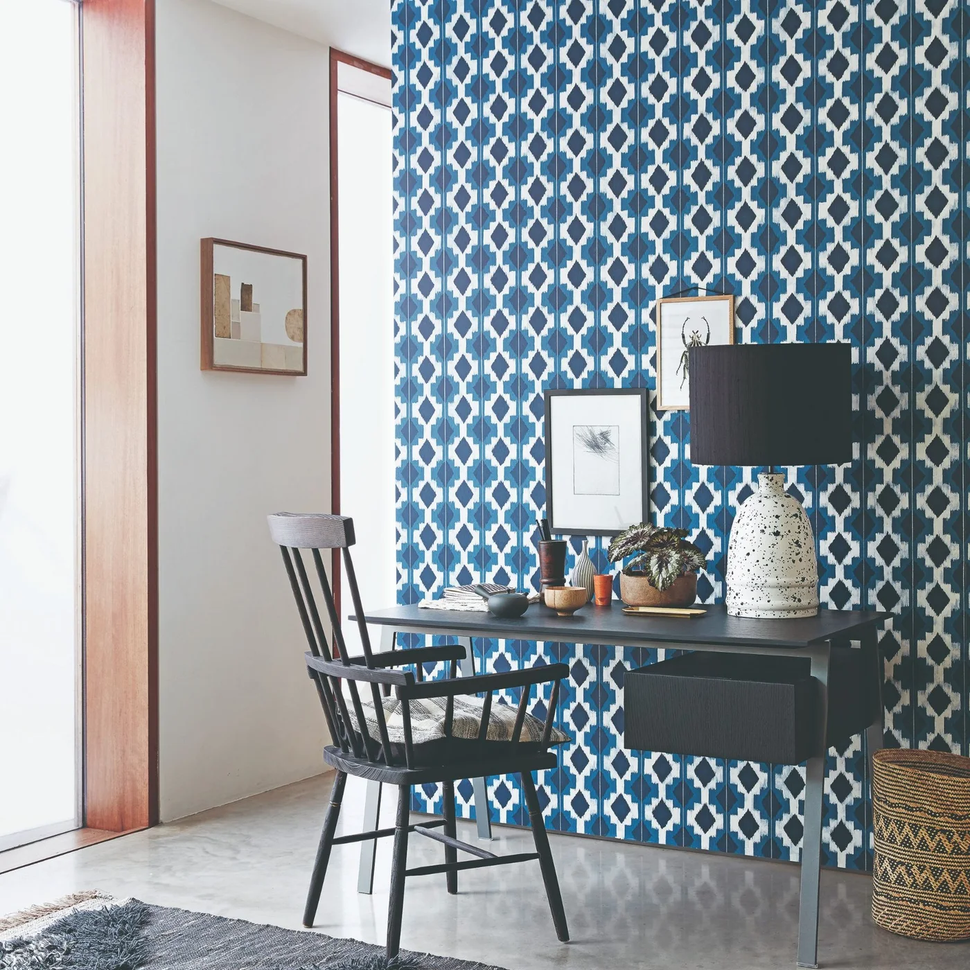
The geometric wall distinguishes the desk corner from the plain adjacent surface. A dark desk and chair give the bright blue pattern a clear foreground. Small framed pictures and a large pale lamp add character, while the nearby glazing brings light to the compact working position.
Check whether the pattern feels comfortable while you work, especially if a screen will sit against it. Keep the wall behind the monitor quieter if necessary. Our Scandi office ideas offer other desk arrangements; choose lighting, seat support and cable access around actual work before deciding how much wallpaper the corner needs.
IDEA 12 / 20
Bring Texture to a Nearly Neutral Bedroom
 SaveSupport Non AI Creator
Image credit: Arte
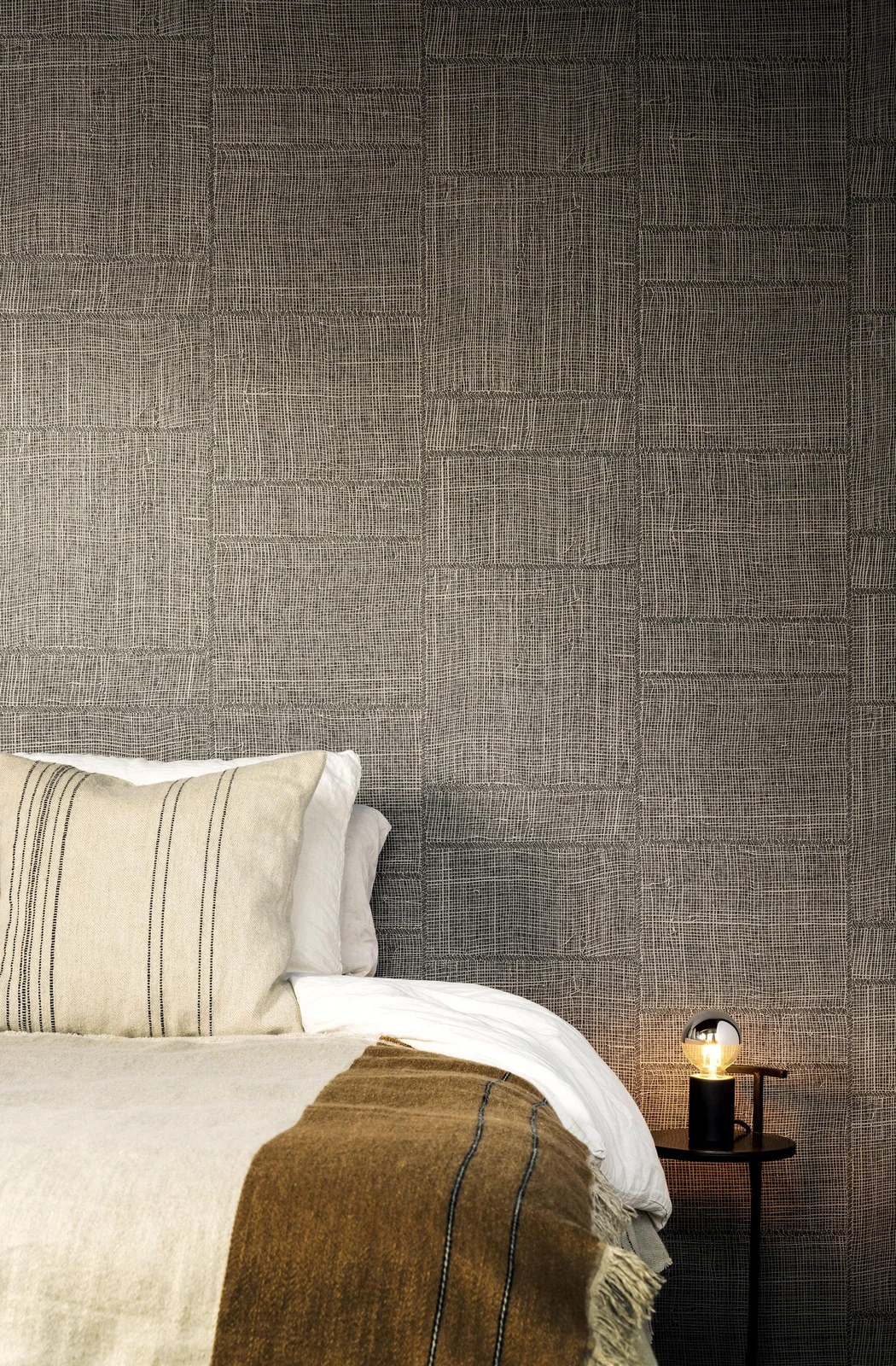
The wall’s woven-looking texture adds depth to a narrow group of neutral colors. Irregular rectangular sections create a pattern without flowers or a high-contrast print. Pale bedding stands out against the darker wall, and the ochre throw introduces warmth at the foot of the bed.
Check the wall covering’s actual composition and cleaning guidance rather than identifying it from appearance. Textured surfaces can show seams or marks differently from smooth paper, so inspect a sample closely. Test bedside lighting for comfort and keep any exposed bulb out of the direct view you use when lying down.
IDEA 13 / 20
Use Pale Botanical Shapes on a Dark Background
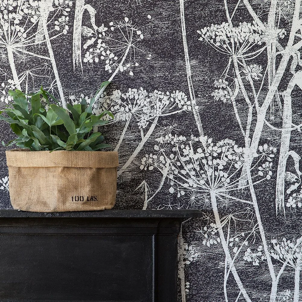 SaveSupport Non AI Creator
Image credit: Future PLC/James French
The pale stems give the dark wall an airy outline instead of a solid block of color. A real leafy plant adds a different scale of greenery in front, while the woven container warms the monochrome arrangement. The cabinet stays dark so the wall’s drawn lines remain visible.
Leave some of the pattern unobstructed when choosing the height of furniture and plants. Protect a cabinet top from watering with a suitable inner container. If you use the print on several walls, compare the light through the day before adding dark curtains or other large surfaces that may make the room feel heavier.
IDEA 14 / 20
Repeat a Yellow Leaf Motif Through a Doorway
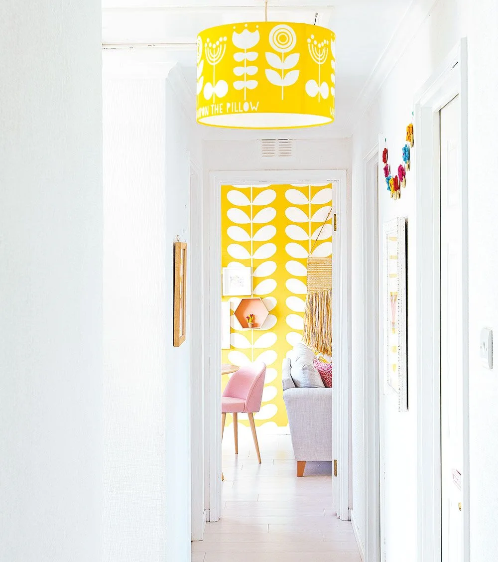 SaveSupport Non AI Creator
Image credit: Future PLC/Douglas Gibb
The yellow pendant introduces the color before the wallpapered room comes into view. White walls and pale flooring keep the connecting hallway simple. In the room beyond, gray seating and a pink chair soften the strong yellow pattern rather than repeating it on every piece of furniture.
Look through adjoining doorways before deciding where a patterned wall should go. A small repeated color can connect rooms without papering the whole route between them. Our Scandi living room ideas show furniture combinations for a similar balance; keep hallway lighting useful and doors easy to open around any hanging fittings.
IDEA 15 / 20
Continue a Small Leaf Print Across Media Doors
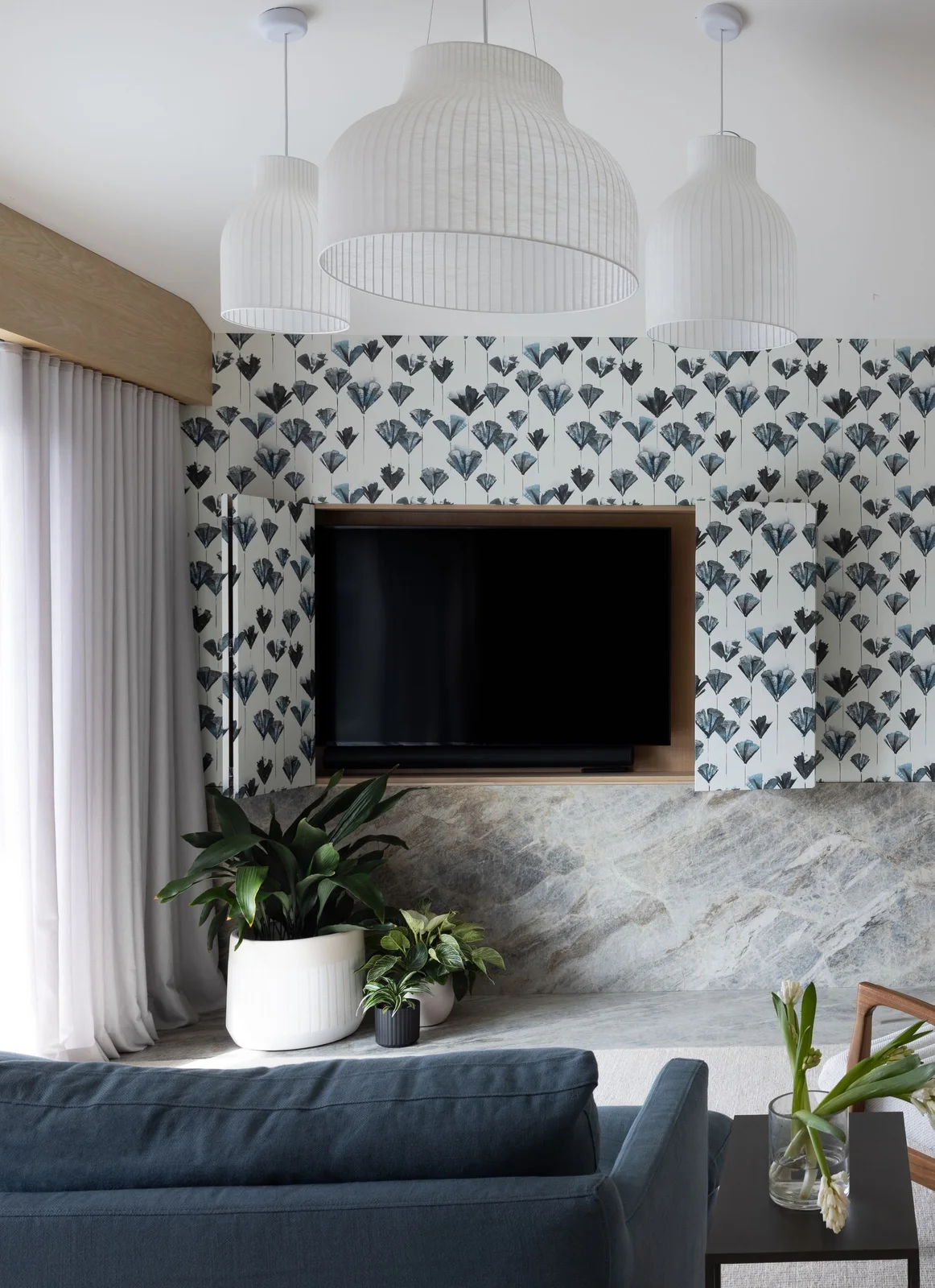 SaveSupport Non AI Creator
Image credit: Bess Friday
The small leaf motif continues across the wall and cupboard fronts, connecting useful storage with the room’s decoration. Wood trim defines the television recess. Large white pendant shades and a gray ledge provide broader quiet areas around the finer pattern, while blue seating repeats one of its colors.
Plan the wallpaper across moving doors before hanging it so the repeat works when the doors are closed. Check handles, hinges and ventilation rather than covering necessary openings. Leave the screen’s service access usable and consider whether a simpler wall treatment would suit you better if the cupboard fronts receive frequent handling.
PART 04
Explore Color, Leaves and Softer Florals
IDEA 16 / 20
Mix Florals With a Green Checked Splash Area
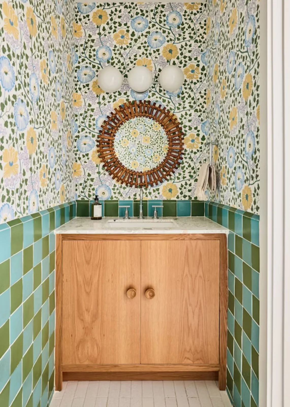 SaveSupport Non AI Creator
Image credit: Nicole Franzen. Design: Bunsa Studio
The floral print and checked tiles share greens and blues, giving two different patterns something in common. A plain wood vanity supplies warmth and a clear shape beneath them. The round mirror and globe lights soften the narrow room without requiring additional pictures on the papered walls.
Keep wallpaper away from areas of repeated direct water exposure and select products for the room’s actual humidity. Compare tile and paper samples together before ordering. The simple cabinet is useful here because it leaves the patterns to provide character while preserving enclosed space for spare towels and everyday supplies.
IDEA 17 / 20
Use Folk-Style Flowers With Warm Collected Furniture
 SaveSupport Non AI Creator
Source: Boråstapeter
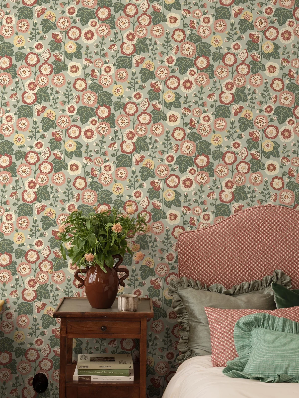
The red flowers and green leaves connect with the headboard and cushions, giving this more traditional room a coordinated palette. An older wood bedside table adds warmth without another painted color. The different textile scales show a softer, collected direction alongside the simpler geometric examples.
Use a few colors from the paper in bedding rather than matching every surface exactly. Compare the headboard print against the wall at full size to check that each remains readable. Keep practical bedside space clear and make sure the table has room for lighting as well as any flower arrangement.
IDEA 18 / 20
Choose Large Pale Leaves for a Quiet Bedside
 SaveSupport Non AI Creator
Source: Boråstapeter
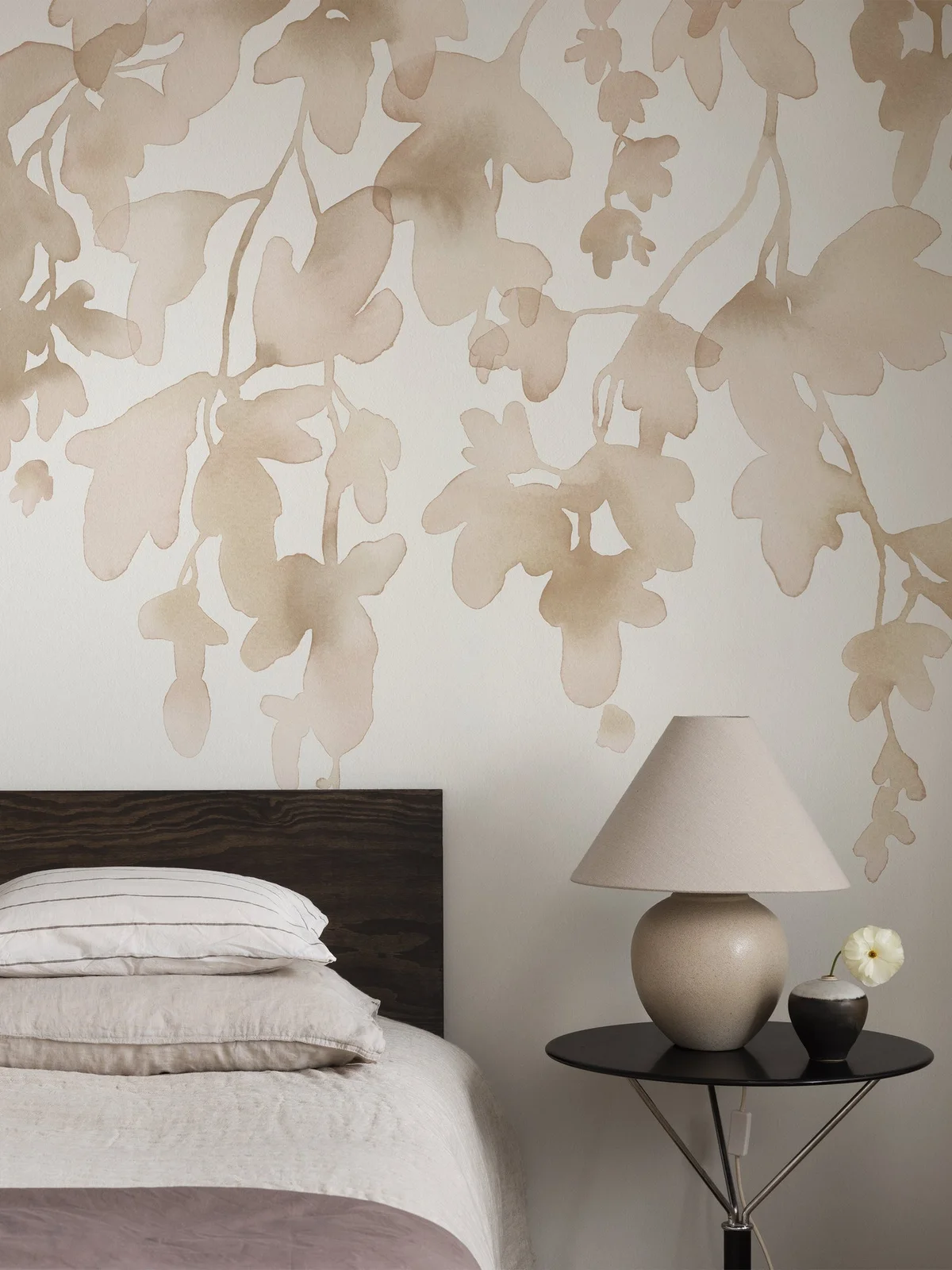
The oversized pale leaves give the wall movement while keeping the contrast gentle. A dark headboard and black round table provide simple foreground shapes. Neutral bedding and a plain shaded lamp leave the wallpaper’s scale visible rather than covering it with several smaller decorative patterns.
Check a full section of the mural against the bed height so the main leaves remain visible after furniture is in place. Choose the paper’s tone alongside your actual bedding and floor. Keep the bedside table large enough for everyday items, and test whether the lamp provides comfortable reading light rather than relying on its matching color.
IDEA 19 / 20
Warm a Small Corner With Broad Rust Stripes
 SaveSupport Non AI Creator
Source: Boråstapeter
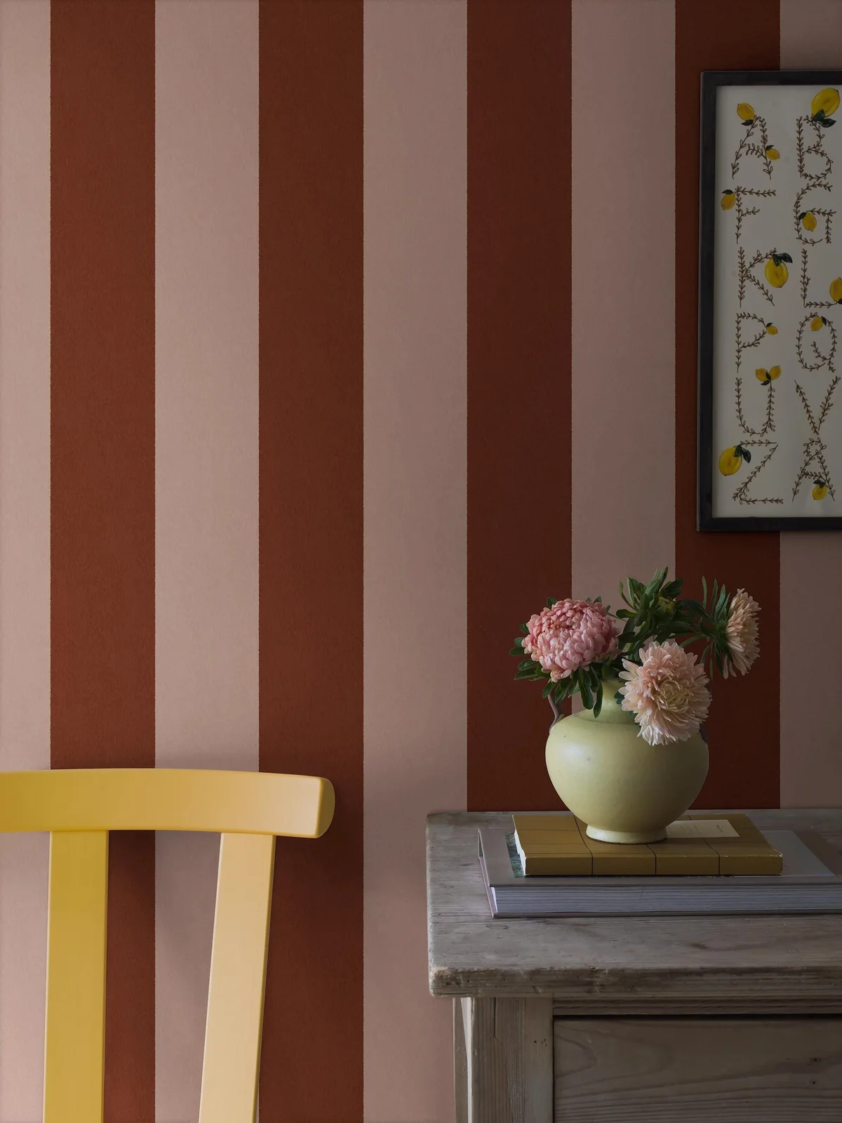
The broad stripes make the small corner colorful without an intricate repeat. Rust and pale pink form a warm background, while the yellow chair adds a brighter accent. A gray wood tabletop gives the arrangement a quieter surface beneath the framed print and small flower display.
Decide how the stripe will meet corners and openings before installation, especially on a short wall. Test the warm colors in the room’s evening lighting as well as daylight. Use a plain table or chair finish if you want to add framed artwork, rather than asking several large patterns to share the same small corner.
IDEA 20 / 20
Pair Muted Birds and Branches With Cane and Wood
 SaveSupport Non AI Creator
Source: Boråstapeter
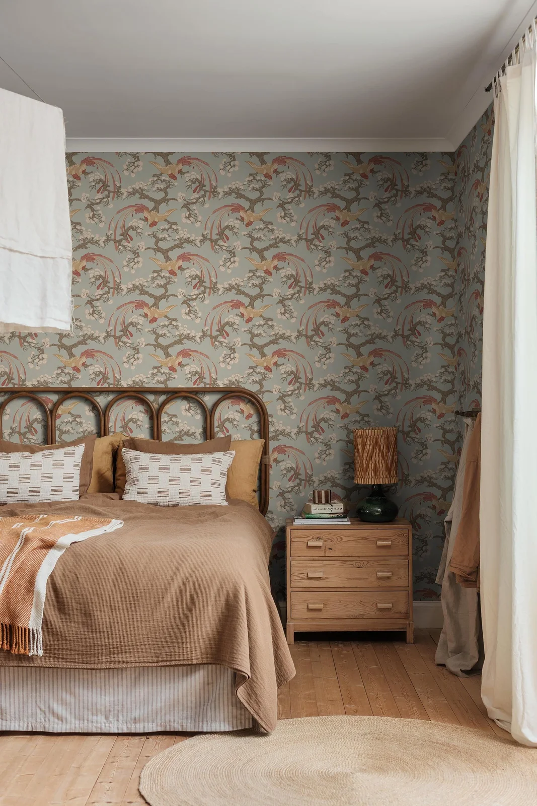
The muted birds and branches bring an illustrative pattern to walls that stay relatively soft in color. Cane, wood drawers and brown bedding repeat the warmer tones beneath it. Pale curtains and ceiling prevent the room from becoming entirely enclosed in the pattern, keeping the window edge lighter.
Let the paper’s muted colors guide the bedding before adding stronger accents. Check the repeat near the headboard and corners so large birds are not awkwardly hidden. Our Scandi bedroom ideas offer other balances of texture and storage; keep the lamp easy to reach and leave drawer clearance beside the bed.
BRING IT ALL TOGETHER
Choose the Pattern With the Furniture
Start with a large sample and the furniture that will actually sit in front of it. Check the repeat around the headboard, doorways, shelves and corners. A pattern that feels delicate on a small swatch can become much stronger across a full room, while a large pale motif may remain surprisingly quiet.
Keep some useful surfaces simple so the room does not depend on matching every object. Repeat a few colors in textiles, lamps or chairs, then check the wallpaper’s care instructions and suitability for the location. Save spare material and product details for future repairs rather than assuming an identical match will always be available.