One wallpapered wall can change the character of a living room without asking every surface to compete. The most useful starting point is the view from your main seat: decide whether you want a patterned backdrop behind the sofa, a quieter TV wall or a small accent inside shelving.
These examples focus on that relationship between paper and furniture. Compare the size of the repeat, the amount of wall left visible and the colors already in the room. A sample that looks lovely in your hand still needs to work across a much larger surface.
PART 01
Backdrops for the Seating Area
IDEA 01 / 15
Give the Sofa a Landscape Backdrop
 SaveSupport Non AI Creator
Image credit: Future / Simon Bevan
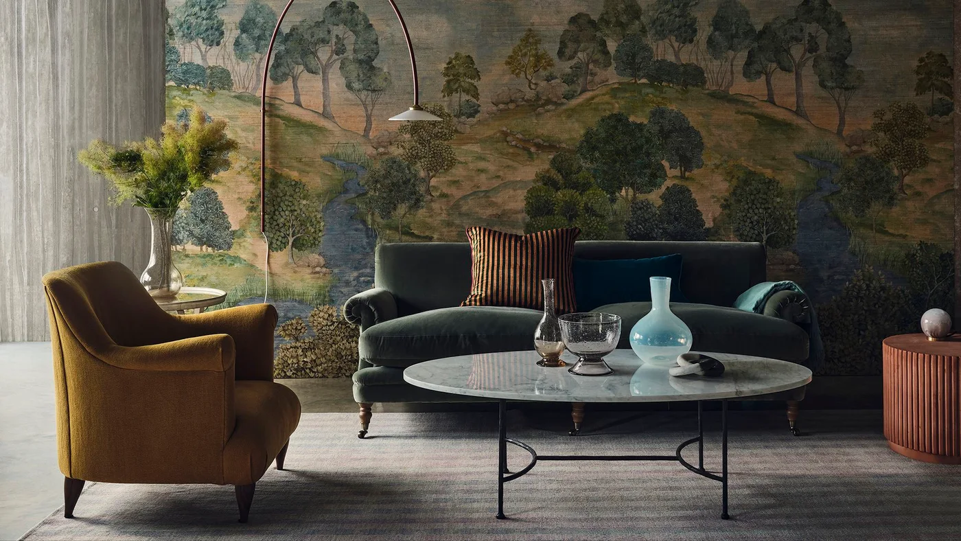
A landscape mural spreads behind the dark green sofa, with trees and a winding river forming a complete scene across the wall. The furniture stays low enough to reveal much of the illustration, while the mustard chair picks up the warmer colors in the landscape.
Map the mural against the position of your sofa before ordering its size. Important details can disappear behind a high back or a large lamp. Keep nearby accessories selective so the scene remains easy to enjoy, and check where panel joins will fall across the image.
IDEA 02 / 15
Keep a Floral Window Wall Light
 SaveSupport Non AI Creator
Image credit: Zeke Rueles / Murphy Deesign
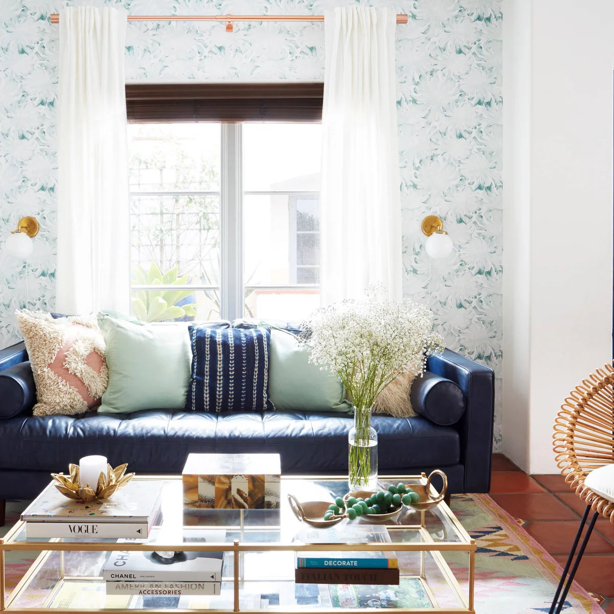
Pale floral wallpaper surrounds the window behind this dark blue sofa. The soft pattern adds interest to the narrow strips of wall without competing heavily with the daylight, while mint pillows draw one of its quieter colors into the seating.
A window wall can be a useful place for a gentle repeat because the opening breaks up the amount of pattern. Compare a sample with both your shade and curtain fabric. Plan the repeat above and beside the window before hanging so the remaining sections feel related.
IDEA 03 / 15
Try an Architectural Drawing at Large Scale
 SaveSupport Non AI Creator
Image credit: Future
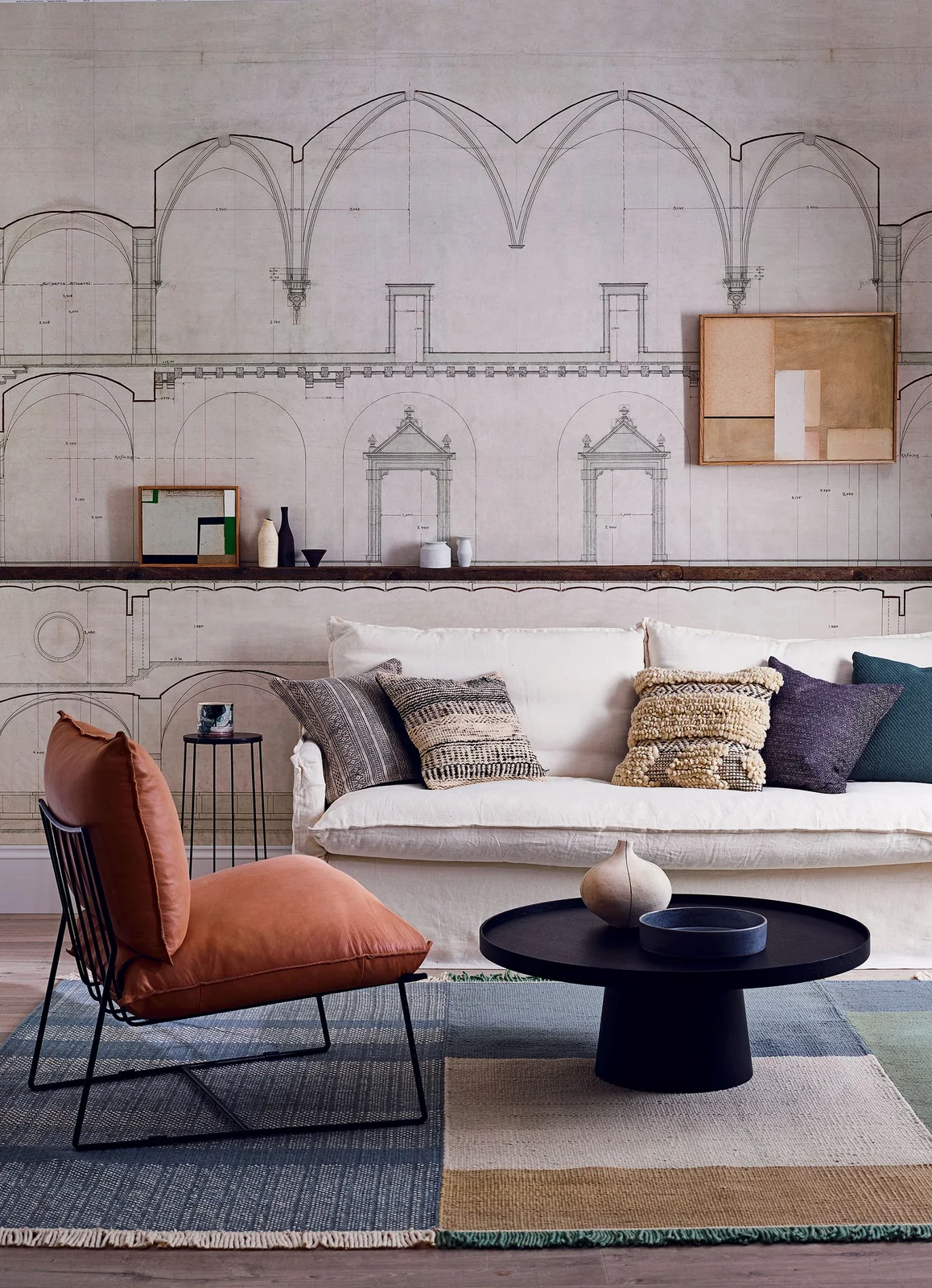
Fine architectural lines spread across the wall behind the white sofa, turning a drawing into a room-sized backdrop. A dark picture ledge follows one horizontal line through the composition, while the orange chair supplies color without adding another detailed print.
Check the full image layout if the paper comes as a mural rather than a repeating roll. A ledge can cover part of the drawing, so position it deliberately. For a tall room, compare high ceiling living room ideas before deciding how much blank wall to leave above the seating.
IDEA 04 / 15
Hang a Wallpaper Panel Above the Sofa
 SaveSupport Non AI Creator
Image credit: Future
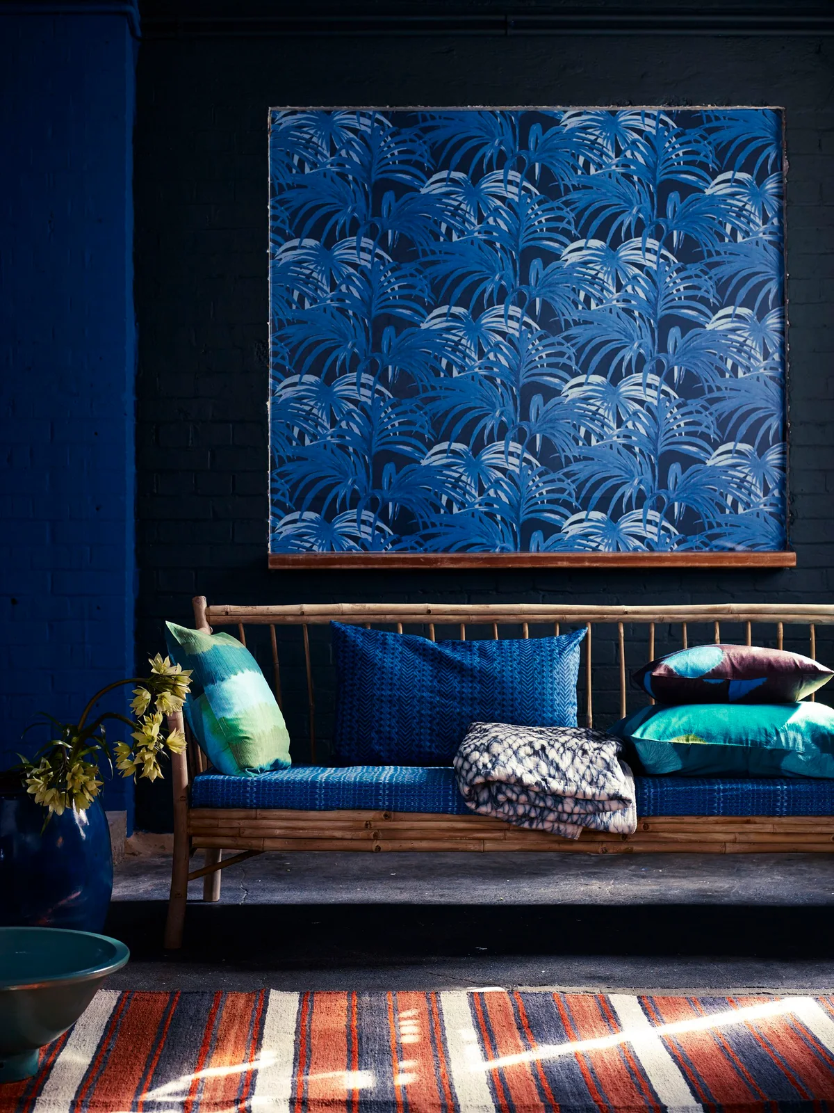
A rectangular panel of blue leaf-patterned paper hangs above the sofa instead of covering the entire wall. The dark painted background frames its edges, while the seating and pillows repeat several blues at a smaller scale below the display.
This is a useful option when you want to enjoy a bold print in a clearly bounded area. Make the panel large enough to relate to the sofa rather than looking like a leftover sample. Check the backing, hanging method and weight before placing it above seating.
PART 02
Color and Pattern Scale
IDEA 05 / 15
Pair Leaf Wallpaper With Green Lower Walls
 SaveSupport Non AI Creator
Image credit: Paper & Paint Library Tropicane Chelsea green II
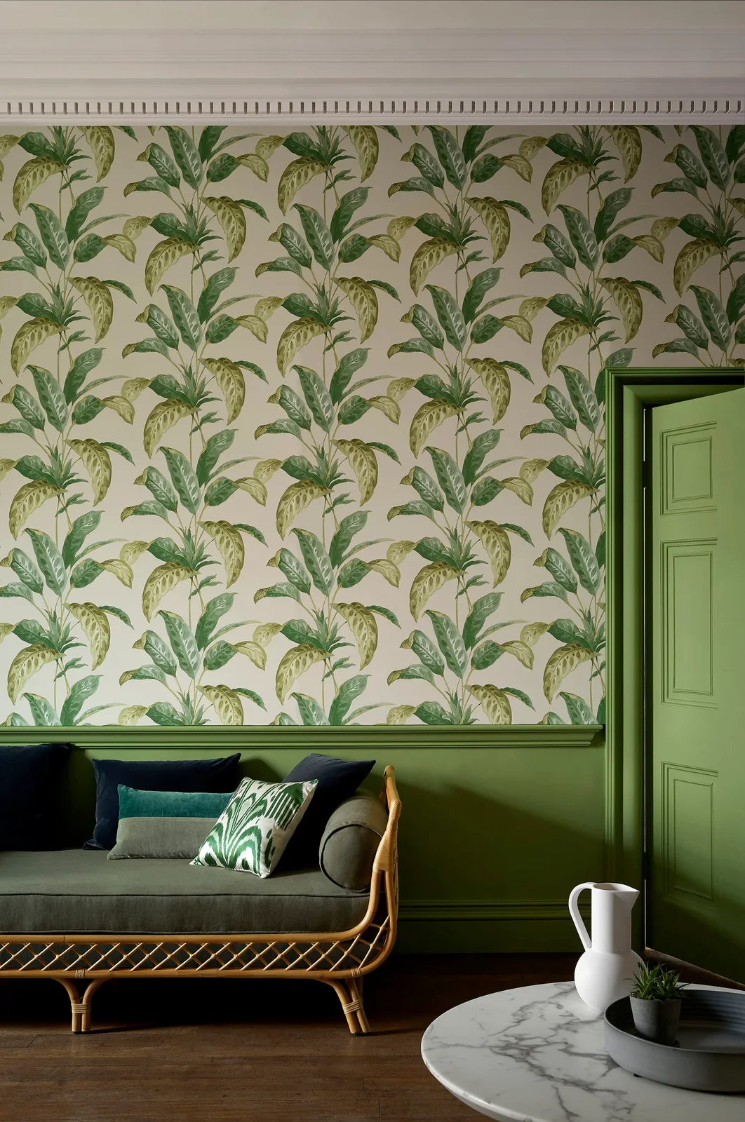
Leafy wallpaper fills the upper wall, with green paint continuing across the lower paneling and nearby door. The gray sofa stays relatively quiet in front, allowing the leaf shapes and their pale background to remain the main decorative feature.
Choose the paint with the actual paper sample in the room rather than matching from a screen. A related green can connect the two surfaces without copying every shade exactly. Check how the paper meets the panel cap and door trim before you begin hanging.
IDEA 06 / 15
Repeat Warm Colors Around a Pink Pattern
 SaveSupport Non AI Creator
Image credit: Future
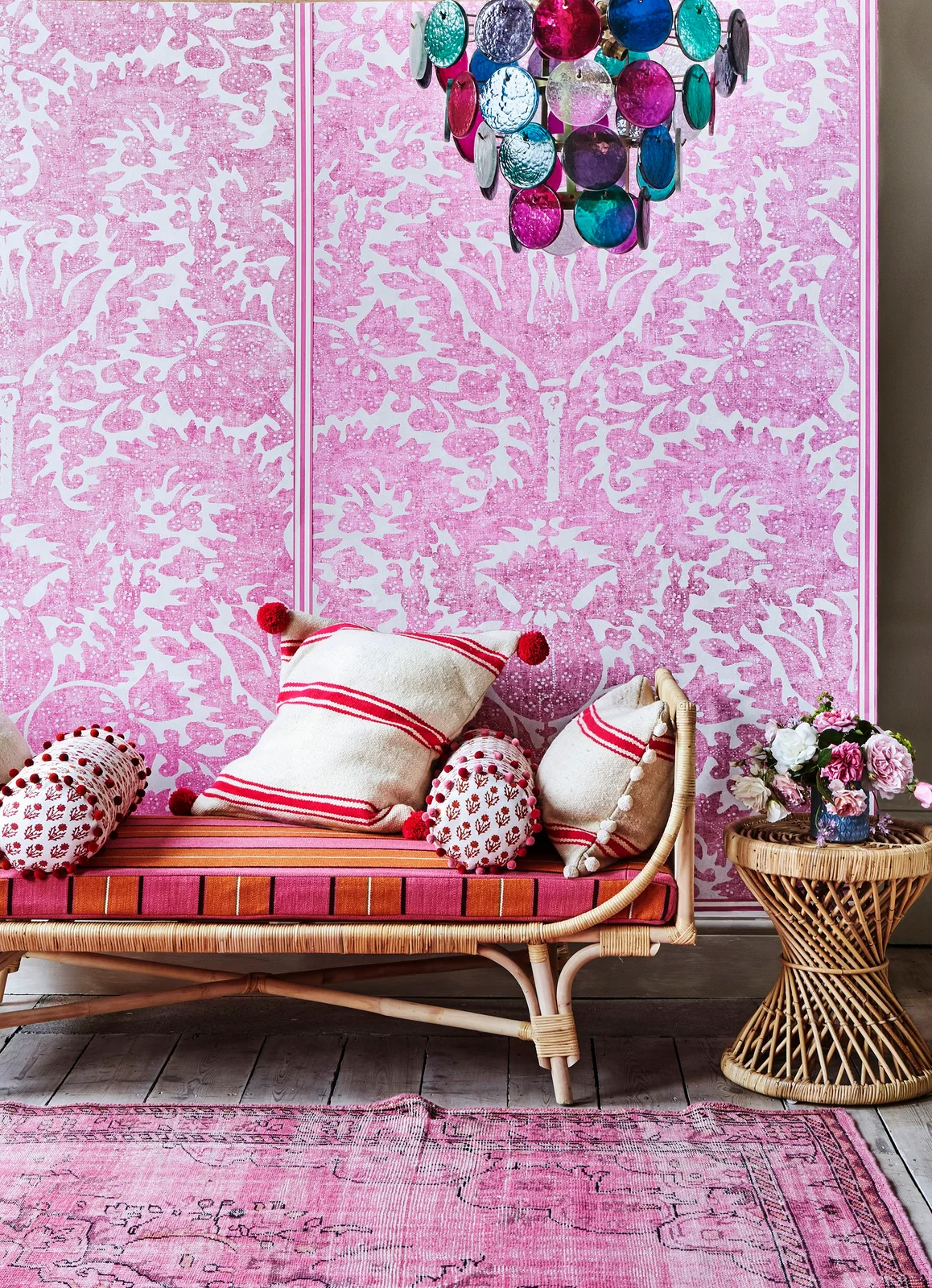
Pink patterned paper creates a lively backdrop for a woven sofa with striped seating and cushions. Slim pink borders define the panels, while the warm upholstery colors connect the wall to the furniture without requiring every item to carry the same pattern.
Balance a strong pink wall with the colors already present in the room before adding new accessories. Large samples help you see whether the white parts of the print feel bright or subdued. Leave some simpler shapes in the seating arrangement so the different patterns remain distinguishable.
IDEA 07 / 15
Use a Blue-and-White Print Under a Sloping Roof
 SaveSupport Non AI Creator
Image credit: Morris & Co Simply Severn wallpaper in Woad
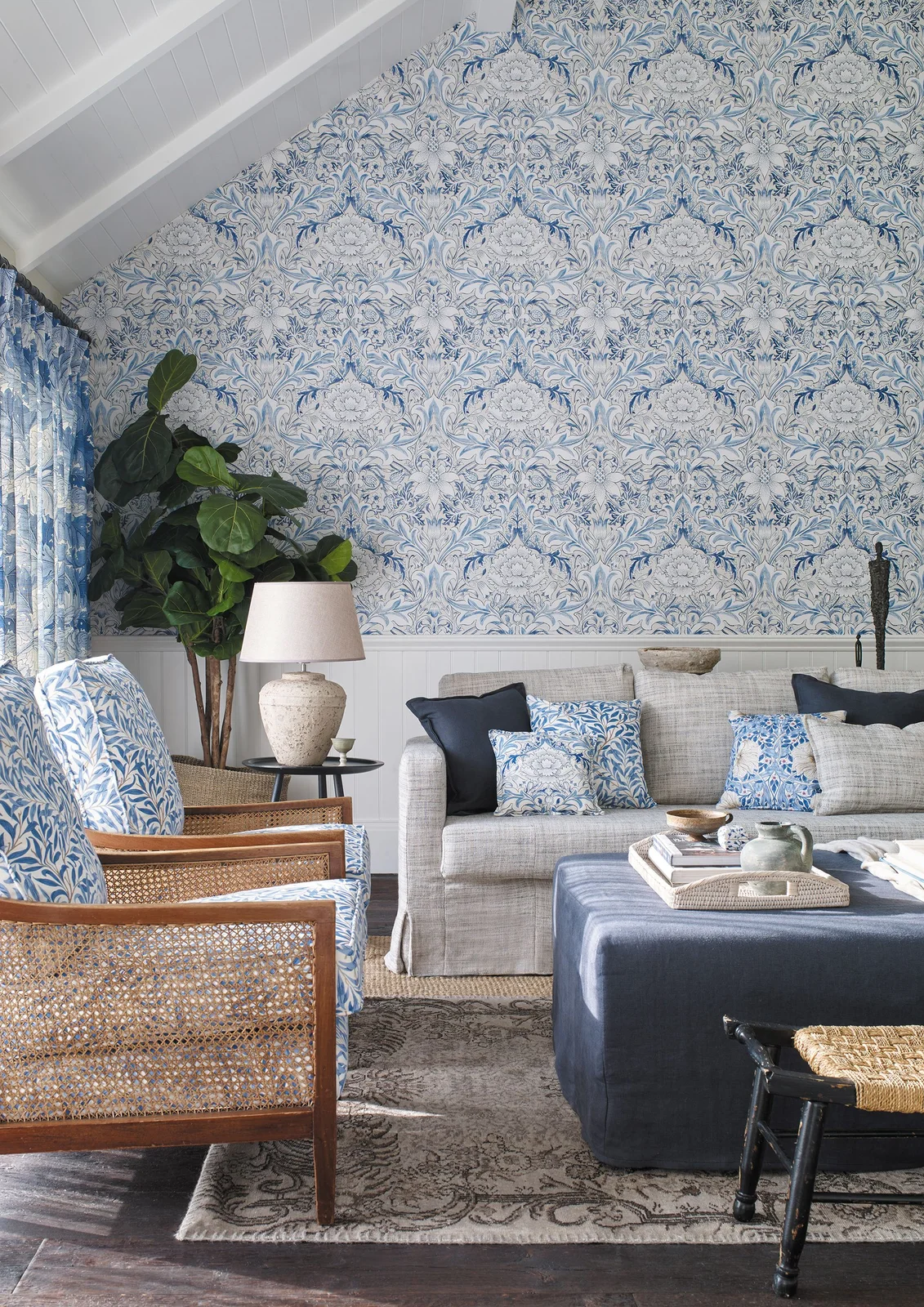
A blue-and-white scrolling pattern fills the wall beneath the sloping roof, with white paneling creating a clear lower boundary. The pale sofa and darker blue ottoman keep the palette consistent, while matching patterned cushions echo the paper at a smaller scale.
Lay out the repeat on the full wall shape before choosing a starting point. A pitched edge can cut through prominent motifs, so decide which part of the pattern should sit above the sofa. Keep the ceiling finish quieter if you want the wallpaper to define the room.
IDEA 08 / 15
Match the Sofa Print for a Softer Outline
 SaveSupport Non AI Creator
Image credit: Colefax & Fowler
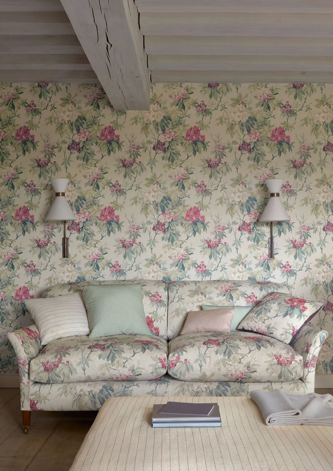
The floral print continues from the wall onto the sofa, softening the outline between furniture and backdrop. Pale cushions and a lightly striped ottoman interrupt the repetition just enough to give the eye a place to rest within the arrangement.
Matching patterns works best when you enjoy the print enough to see it across a large area. Compare the fabric and wallpaper samples together because their colors and scales may differ. Include a few plain or subtly striped pieces to keep the seating comfortable to look at.
PART 03
Shelves and Media Walls
IDEA 09 / 15
Turn Two Recesses Into a Balanced Accent
 SaveSupport Non AI Creator
Image credit: Katie Mueller / Laura Potter Designs
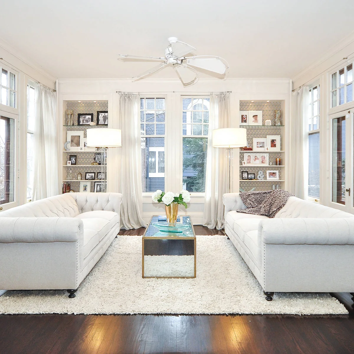
Two wallpaper-backed recesses flank the central window, creating a balanced accent at the far end of the seating area. The pale sofas and curtains keep the larger surfaces quiet, while photographs and glass shelves sit in front of the repeated geometric pattern.
Measure each recess separately instead of assuming the openings are identical. Consider the pattern position across both before cutting, particularly if you want them to read as a pair. Keep the display objects spaced apart so enough of the backing remains visible from the sofas.
IDEA 10 / 15
Put a Small Repeat Behind Open Shelves
 SaveSupport Non AI Creator
Image credit: WUNDERGROUND architecture + design (via Houzz)
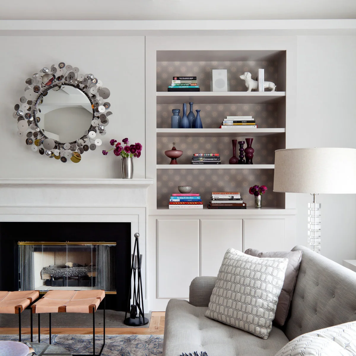
Soft circular-patterned wallpaper backs the open shelves beside this fireplace. The small repeat adds depth behind the books and colored vessels, while the white shelves and cupboards create a crisp frame that prevents the accent from spreading across the whole wall.
Choose a scale that still reads through the spaces between objects. A large motif can become unrecognizable when every shelf cuts across it. Remove everything before papering and check how the finish meets shelf edges, then leave a few open areas when you put the display back.
IDEA 11 / 15
Connect the TV and Shelves With One Pattern
 SaveSupport Non AI Creator
Image credit: Mia Baxter / Sarah Wittenbraker Interiors
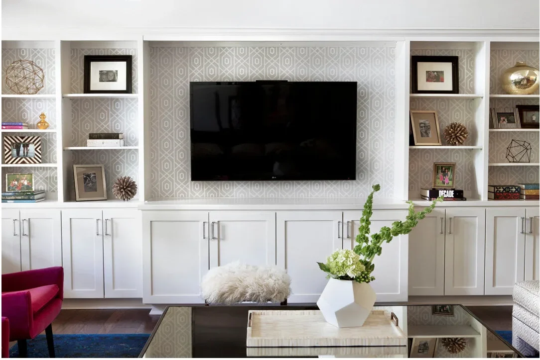
A pale geometric print runs continuously behind the television and the shelves on either side. White dividers break the pattern into manageable sections, while the closed cupboards below keep everyday items from adding another layer of visual detail to the media wall.
Try the sample beside the screen with the television switched on as well as off. Fine, low-contrast lines are easier to balance with moving pictures than a very bold print. Use under TV decor ideas sparingly here so accessories do not hide the paper or crowd the equipment.
IDEA 12 / 15
Give a TV Niche a Textured Background
 SaveSupport Non AI Creator
Image credit: Matthew Niemann / Paper Moon Painting
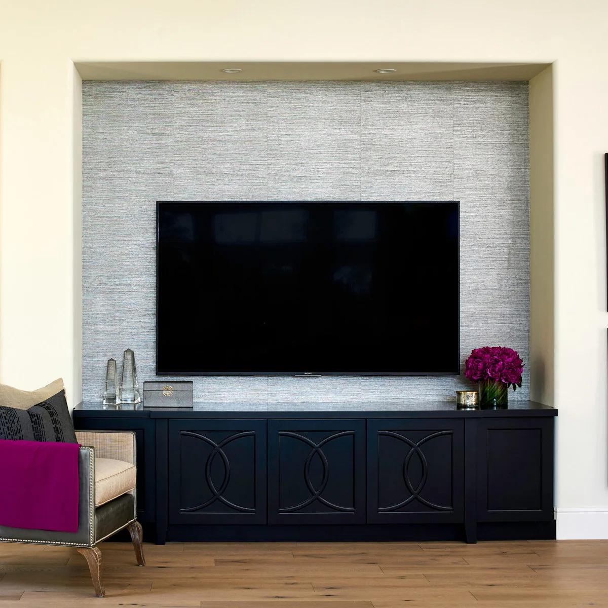
Silver-gray wallpaper covers the back of this TV niche, adding fine horizontal texture around the dark screen. The cabinet below has stronger curved details, so the wall finish supplies a quieter layer rather than introducing a second large decorative motif.
Look at a textured sample under your actual lamps because highlights can change as you move around the room. Keep access to connections and any required ventilation clear when planning the installation. A subtle background can still feel distinct when the surrounding wall and trim are plain.
PART 04
Work With the Room Shape
IDEA 13 / 15
Keep the Furniture Shapes Clear Against a Busy Print
 SaveSupport Non AI Creator
Image credit: Tony Soluri Photography / Mitchell Channon Design
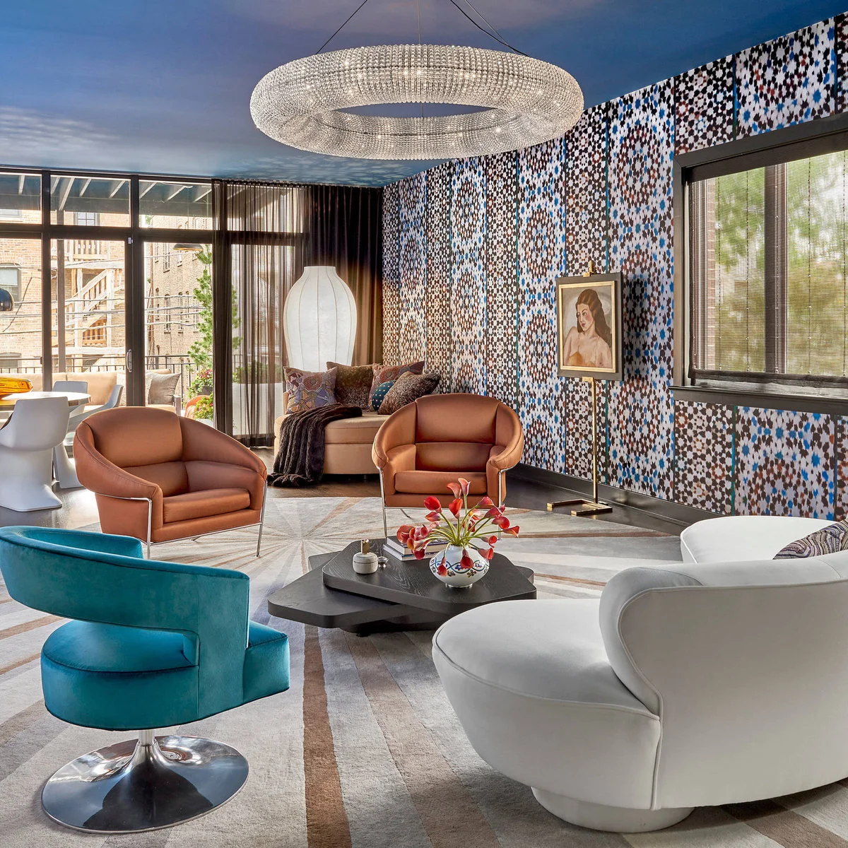
A dense multicolored pattern covers the long wall behind the seating, with blue and copper tones appearing again in the chairs and ceiling. The furniture has clear curved outlines, helping each piece remain readable against the many small marks in the wallpaper.
Choose a few colors from the print for the larger furniture instead of matching every accent in it. Test the paper beside the floor and rug as well as the sofa. A busy backdrop benefits from confident, simple furniture shapes and some open floor between them.
IDEA 14 / 15
Combine a Tree Print With a Wood Lower Wall
 SaveSupport Non AI Creator
Image credit: kPd Studios | Kristine Pivarnik Design (via Houzz)
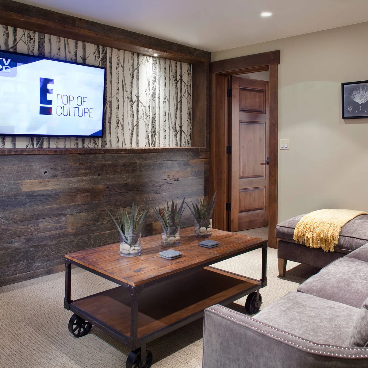
A black-and-white tree print fills the upper section of the TV wall, while wood cladding gives the lower section a warmer, heavier appearance. The horizontal division limits the amount of pattern and relates to the wood door and table elsewhere in the sitting area.
Plan the dividing line alongside the TV position before adding trim. You want the paper to remain visible without forcing the screen into an uncomfortable spot. Check the wallpaper instructions for the actual wall surface, and preserve access to cables rather than sealing them behind decorative layers.
IDEA 15 / 15
Let a Floral Wall Mark the Living Area
 SaveSupport Non AI Creator
Image credit: JAC Interiors (via Houzz)
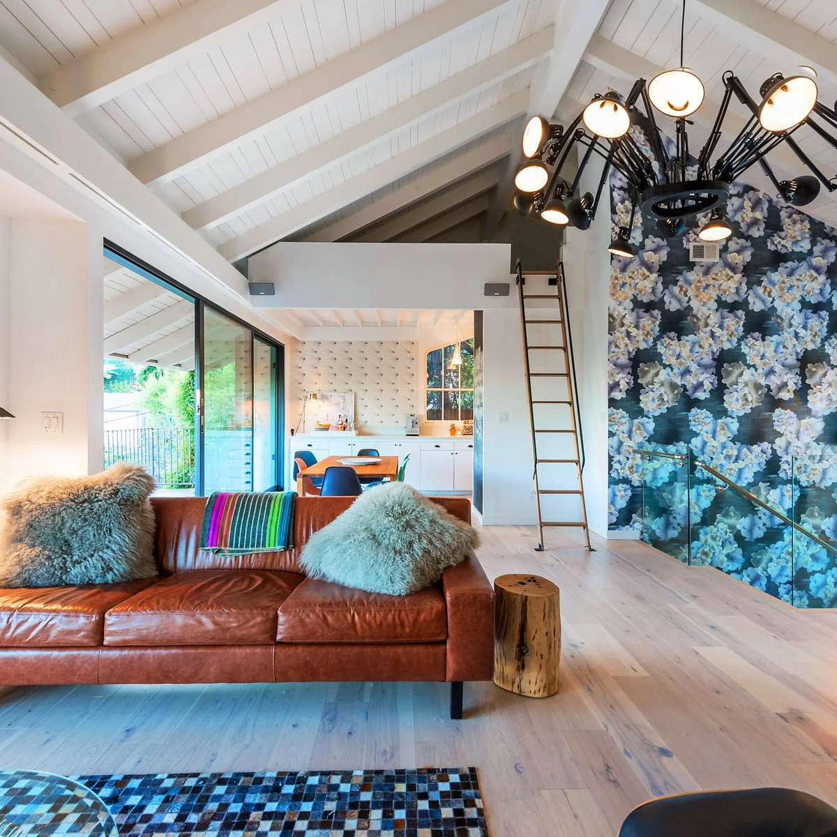
Large blue flowers cover a tall wall beside the brown sofa, giving the living area a recognizable backdrop within the open plan. The adjacent kitchen and ceiling stay mostly pale, so the floral surface provides a clear decorative focus without filling every visible wall.
Check the pattern from the adjoining kitchen or dining area before choosing its scale. What feels dramatic beside the sofa may read differently across the room. If you are comparing several finishes, living room accent wall ideas can help you decide whether wallpaper or a simpler surface suits that main view.
BRING IT ALL TOGETHER
Choose the Wall You Want to Notice
Pick the wall before picking the print. A mural needs a stretch of visible surface, while a small repeat can work behind open shelves or around a television. Furniture placement should reveal the part of the pattern you enjoy most.
Order a sample and look at it with your actual upholstery, curtains and evening lamps. Check the product instructions for preparation, hanging and cleaning, and plan seams and edges before buying rolls. Matching colors is useful; understanding how the pattern will sit in the room matters just as much.