Cream kitchen cabinets sit between bright white and deeper beige, but their warmth varies considerably. Some lean toward yellow, while others read as a soft off-white. The right choice depends on the flooring, counter, wall color and light already in your kitchen, rather than a paint name viewed on its own.
These ideas explore cream in both familiar country kitchens and simpler contemporary settings. Look for a combination that suits your existing surfaces, then compare full samples at home. A well-chosen cream can connect wood, dark accents and brighter colors while leaving room for practical storage and everyday cooking.
PART 01
Color and contrast
IDEA 01 / 17
Give Cream a Crisp Black Backdrop
 SaveSupport Non AI Creator
Image credit: Future PLC/Colin Poole
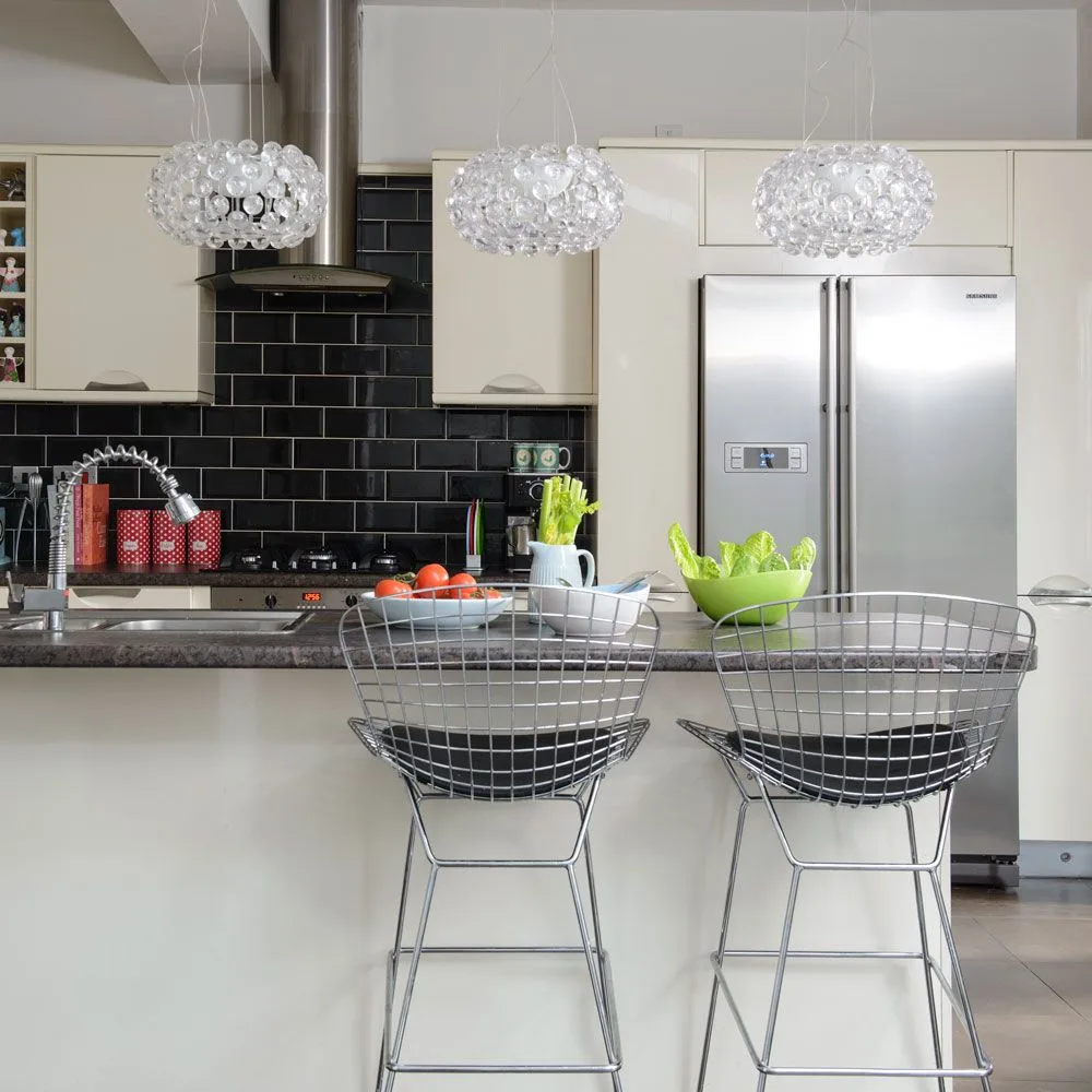
The warm off-white cabinet fronts stand out against glossy black tiles, while a pale breakfast counter keeps the foreground light. Silver-colored appliances and wire-backed stools repeat a cooler finish without making the whole room feel gray. The three glass pendants add sparkle above the seating and leave the cabinet color easy to read.
If cream feels too gentle beside your existing appliances, try a dark backsplash sample before changing the doors. Compare it with the cabinet finish in daylight and under the evening lights. Glossy dark tiles can reveal water spots and cooking splashes, so choose a surface and grout combination you are comfortable wiping regularly.
IDEA 02 / 17
Pair Cream Boarded Doors with a Patterned Floor
 SaveSupport Non AI Creator
Image credit: Carpetright
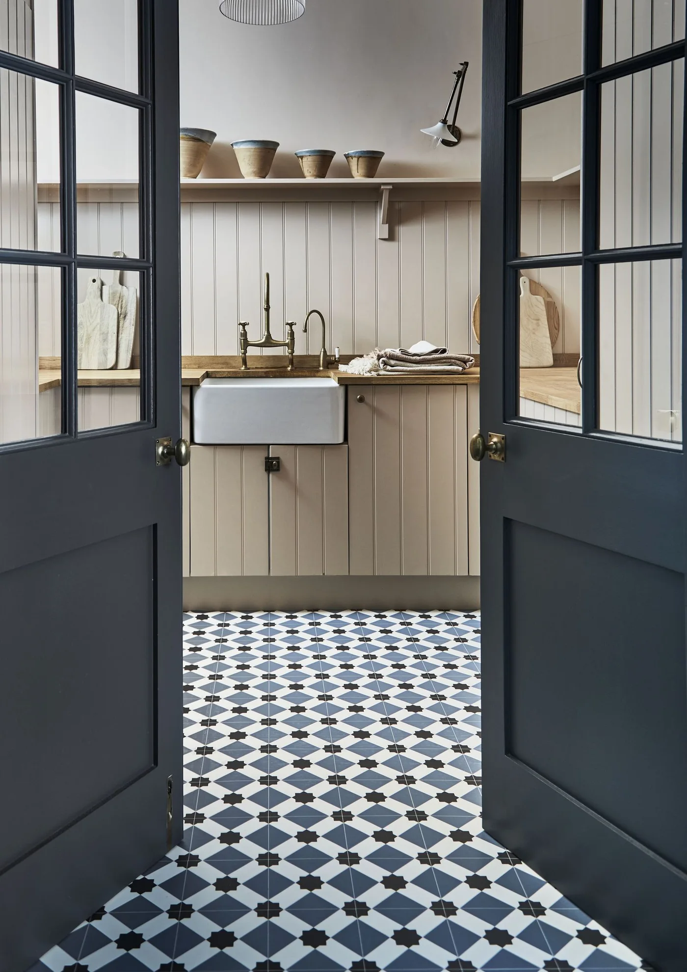
Warm cream boards cover the lower cupboards and wall behind a white apron-front sink. A wooden counter and shelf soften the vertical lines, while dark glazed doors frame the view. The blue, black and white floor pattern supplies contrast without adding another cabinet color.
Compare cream samples beside the floor before repainting a sink run, since a cooler white may make the boards look more yellow. Protect timber edges around water according to the counter’s care guidance. Use the shelf for a limited number of easy-to-clean objects so the patterned floor remains the strongest accent. Classic kitchen backsplash ideas offer other ways to balance warm cabinetry and a patterned surface.
IDEA 03 / 17
Add Color Through the Pendant Lights
 SaveSupport Non AI Creator
Image credit: Mark Bolton/Future PLC
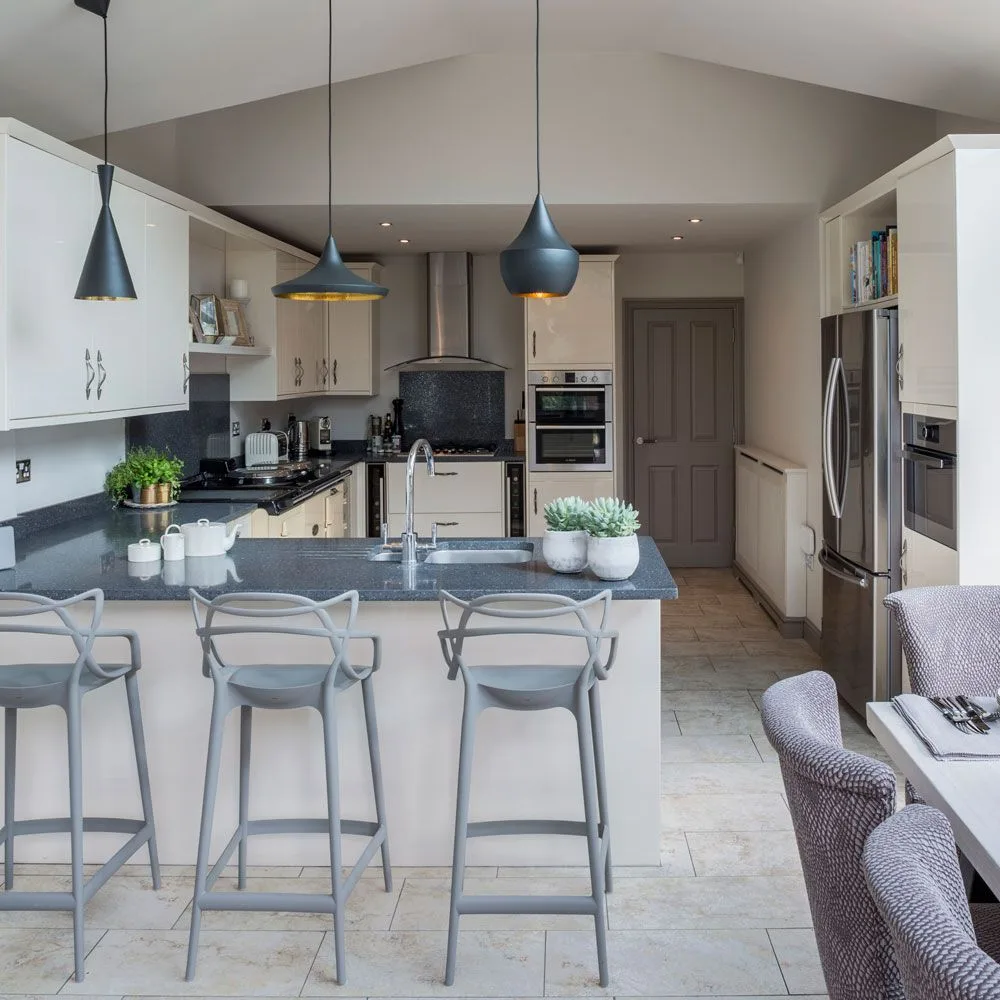
Three blue pendants bring a concentrated accent to the cream cabinetry and dark worktops in this open kitchen. The light cabinet fronts continue around the room, allowing the fixtures to stand out without several competing wall colors. Pale stools repeat the cabinet tone and keep the breakfast edge from becoming a heavy band.
A pendant is a useful place to introduce a stronger color if you prefer neutral cabinet doors. Repeat its tone in a small accessory rather than painting every nearby surface to match. Before purchasing, check the shade width, light spread and sightline from the adjoining seating area; an attractive fixture still needs to illuminate the counter comfortably.
IDEA 04 / 17
Connect Pale Cabinetry to a Painted Dining Table
 SaveSupport Non AI Creator
Image credit: Neptune
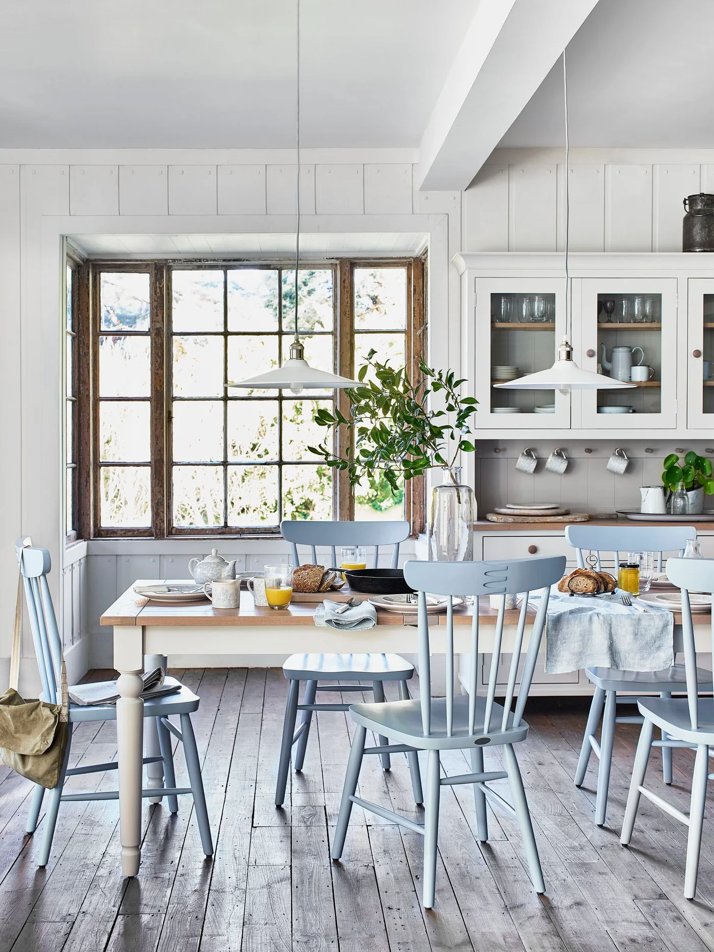
Pale cabinetry and a cream-painted table share the same light background beneath white pendants. Blue chairs bring gentle contrast around the wooden tabletop, while glazed cupboard doors reveal everyday dishes. The old window frame supplies a darker, less polished edge to the otherwise soft kitchen.
Use a chair color that looks comfortable beside both the cabinet finish and the table, testing it under your own daylight. Keep table paint suitable for repeated handling and wipeable surfaces. A glass-front cupboard needs enough everyday storage elsewhere so the visible shelves do not become the only place for bulky supplies.
PART 02
Shelves, seating and everyday use
IDEA 05 / 17
Use Open Shelves to Lighten the Wall
 SaveSupport Non AI Creator
Image credit: Future PLC/Dominic Blackmore
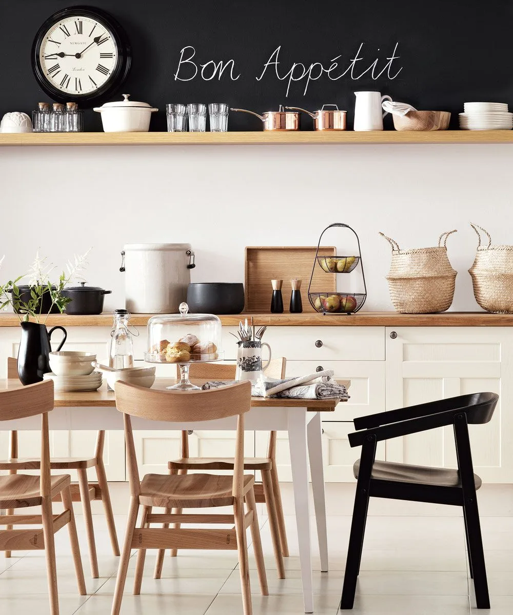
Cream base cabinets keep this dining kitchen light, while two long wooden shelves replace a solid wall of upper doors. The black strip above the higher shelf gives the dishes and clock a defined backdrop. A black chair repeats that accent at table height, connecting the eating area to the storage wall without changing the cabinet color.
Open shelving works best when its contents are useful and easy to maintain. Store everyday bowls and glasses where you can reach them, leaving heavier pieces lower down. Have the shelf fixings specified for the wall and intended load. If cooking grease reaches this area, enclosed upper cabinets may suit your routine better than a large exposed display.
IDEA 06 / 17
Give Flat Cream Doors a Dark Counterpoint
 SaveSupport Non AI Creator
Image credit: Future / Jonathan Gooch
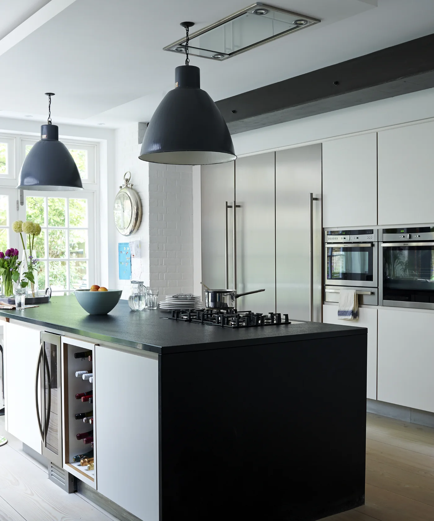
Flat pale cream doors surround built-in ovens behind an island with a black counter and dark end panel. Large dark pendants repeat that contrast overhead, while the pale floor keeps the lower view light. This is a cleaner-lined use of cream than ornate or distressed cabinetry.
Check handle placement on the tall doors before choosing a long pull, especially beside opening oven fronts. Sample the cream next to the actual appliance finish so it does not look unintentionally yellow. Keep the island’s seating and preparation areas clear of hot pans when the cooktop is in use. Beige kitchen cabinets provide a useful comparison if you want a deeper neutral finish.
IDEA 07 / 17
Use Cream to Frame a Working Pantry
 SaveSupport Non AI Creator
Image credit: Neptune
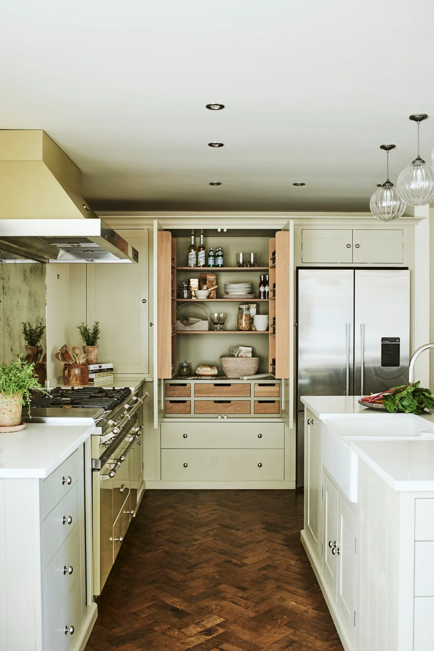
Cream framed doors surround an open pantry with wooden racks and drawers. A broad stainless range and refrigerator sit on either side, while the darker herringbone floor adds warmth below. The pale cabinet finish connects the cooking, food storage and island surfaces without making the pantry interior disappear.
Measure pantry shelves for your usual jars, plates and small appliances before copying the layout. Leave enough space for both doors to open and for someone to reach inside without blocking the range. Choose shelves and drawer fittings for their actual load, keeping heavier supplies low and everyday items easy to see.
IDEA 08 / 17
Set a Cream Island Against Deep Green Storage
 SaveSupport Non AI Creator
Image credit: The Expert / Jean Stoffer Design
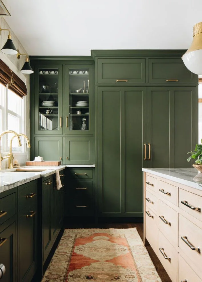
A pale cream drawer island stands opposite deep green cabinets with warm-metal hardware. The sink wall and glass-fronted upper storage continue the green, while a patterned runner softens the narrow floor space. Cream works here as a contrasting furniture color rather than covering every cabinet.
Choose the cream and green together, checking them beside the countertop and under evening lighting. Keep the runner stable and away from door or drawer travel. If your kitchen is narrow, use the lighter finish on the piece nearest the main route so the stronger color stays mostly around the perimeter. Green kitchen cabinet ideas explore the darker half of this contrasting palette.
PART 03
Islands and traditional character
IDEA 09 / 17
Bring Reflective Texture Behind Cream Sink Cabinets
 SaveSupport Non AI Creator
Image credit: Future / © James Merrell
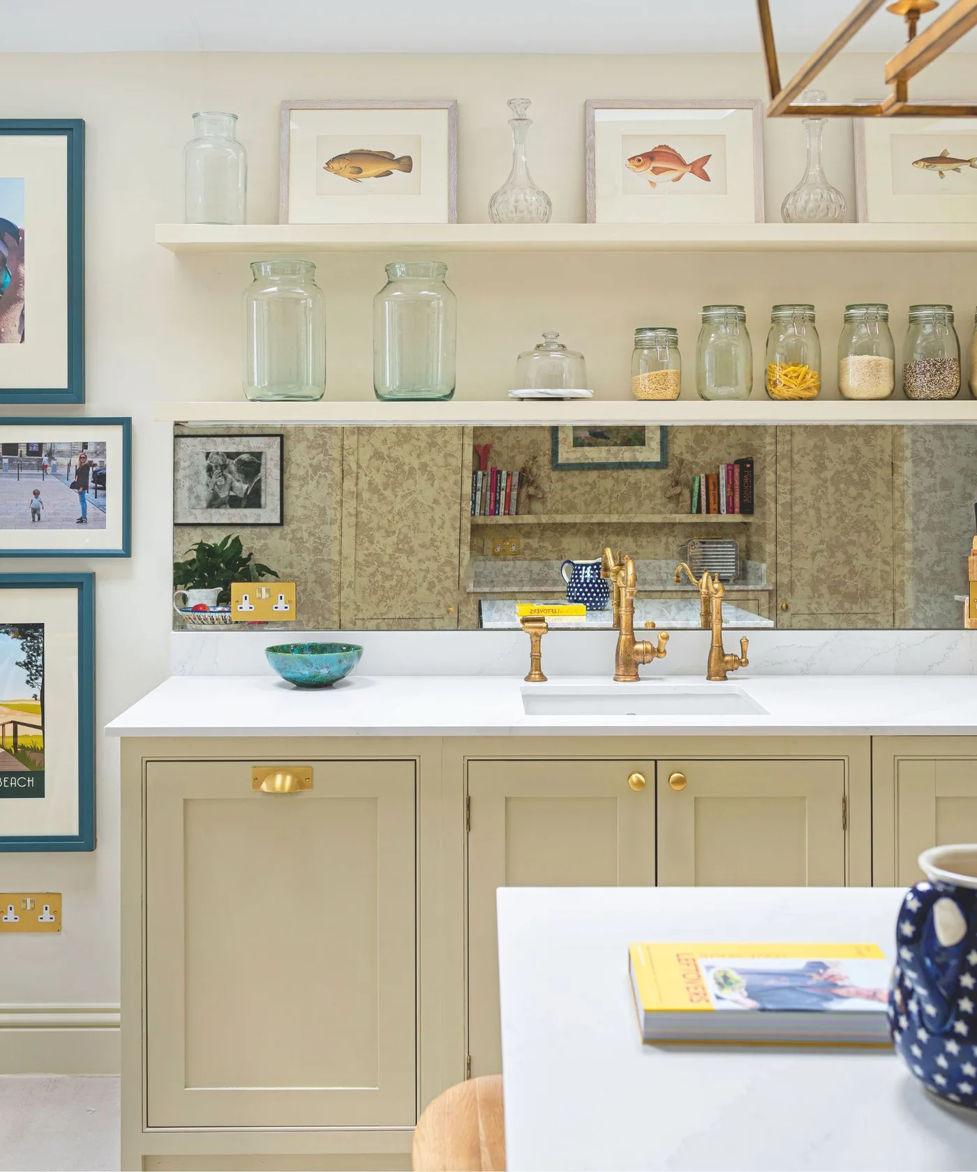
Cream framed doors sit below a white sink and an antiqued-looking reflective backsplash. Open shelves hold glass jars and framed fish illustrations, with warm-metal taps linking the cabinet hardware to the sink area. The reflective panel adds depth without introducing another large block of paint.
Ask a qualified supplier about a splashback’s suitability around water and sockets before choosing a reflective finish. Test the reflection from normal standing positions so it does not emphasize unwanted clutter. Keep frequently handled jars lower and leave useful counter space rather than copying every item on the shelves.
IDEA 10 / 17
Frame a Patterned Cooking Recess with Cream
 SaveSupport Non AI Creator
Image credit: The Misfit House/Kristin Benton Photography
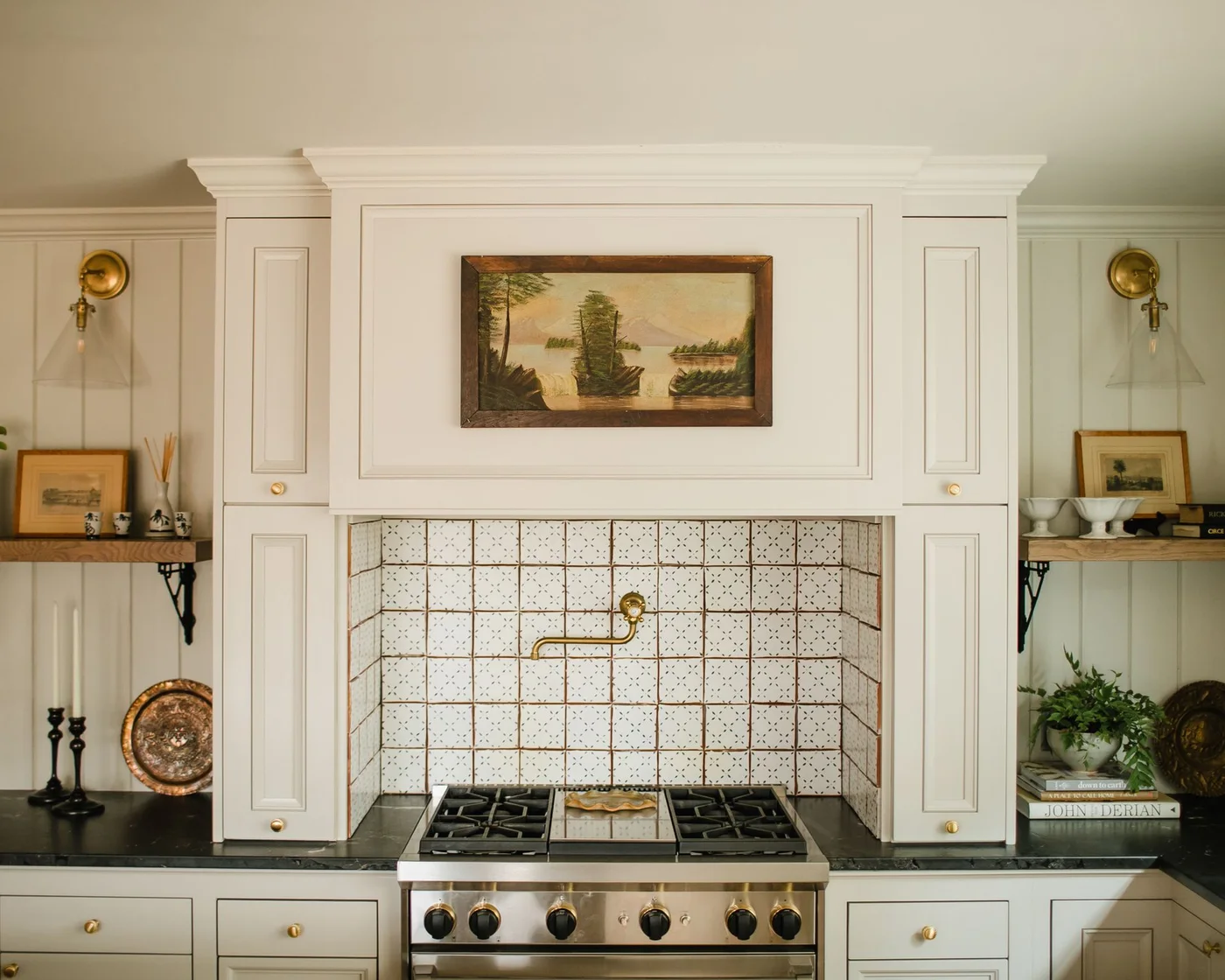
Cream cupboards and a broad matching hood frame a tiled cooking recess. Small repeated tile motifs, a warm-metal pot filler and a landscape picture add traditional detail above the range. Dark counters and plain lower doors keep the decorated center from spreading across every surface.
Decide whether tile pattern or cabinet detail will lead, then keep the other quieter. Check the hood’s ventilation and appliance clearances before planning a decorative surround. Position artwork and shelf contents away from heat and splashes, and select a backsplash with cleaning guidance suited to regular cooking. For a more decorative cabinet treatment, compare antique cream kitchen cabinets.
IDEA 11 / 17
Frame the Living Room View with an Arch
 SaveSupport Non AI Creator
Image credit: Larry Malvin Photography / Sterling Wilson Design
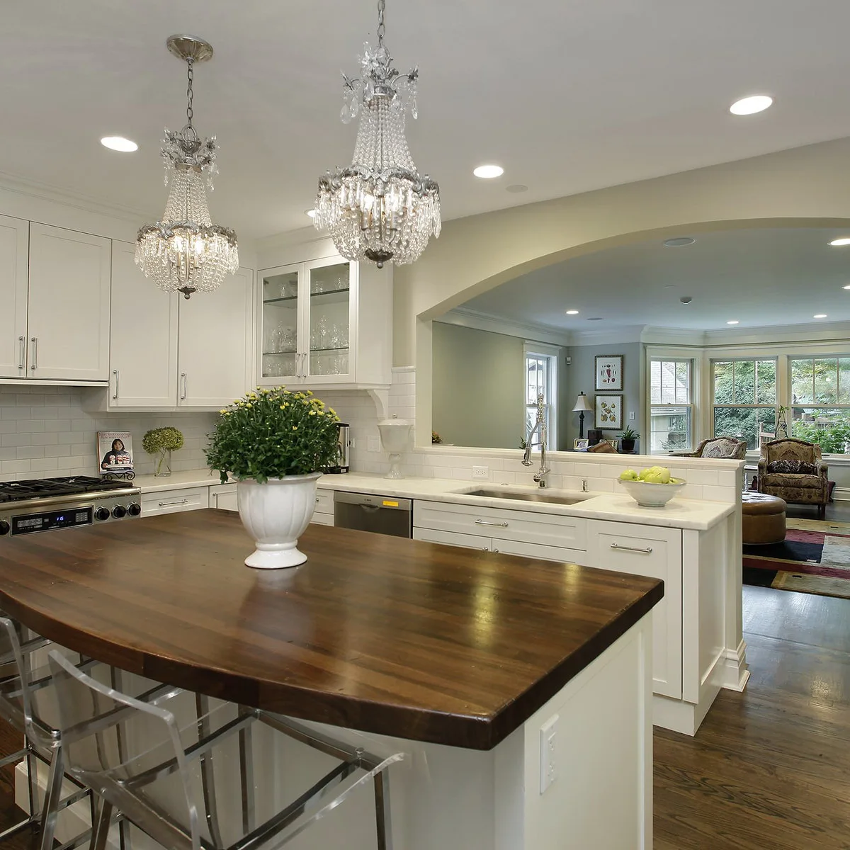
Cream cabinets wrap around a kitchen with a broad arched opening toward the living room. Two decorative pendants sit over a dark wooden island top, while simpler cabinet fronts keep the perimeter calm. The warm floor helps the kitchen furniture relate to the sitting area beyond.
Compare the cabinet color with the adjoining room as well as the kitchen counter. An opening this broad makes both spaces visible together, so repeating one wood tone can be more useful than adding matching ornaments. Check glare and task lighting separately; decorative pendants still need to leave the preparation surfaces well lit.
IDEA 12 / 17
Bring Cream into a Warm Brick-Floor Palette
 SaveSupport Non AI Creator
Image credit: Timeless Kitchen Cabinetry
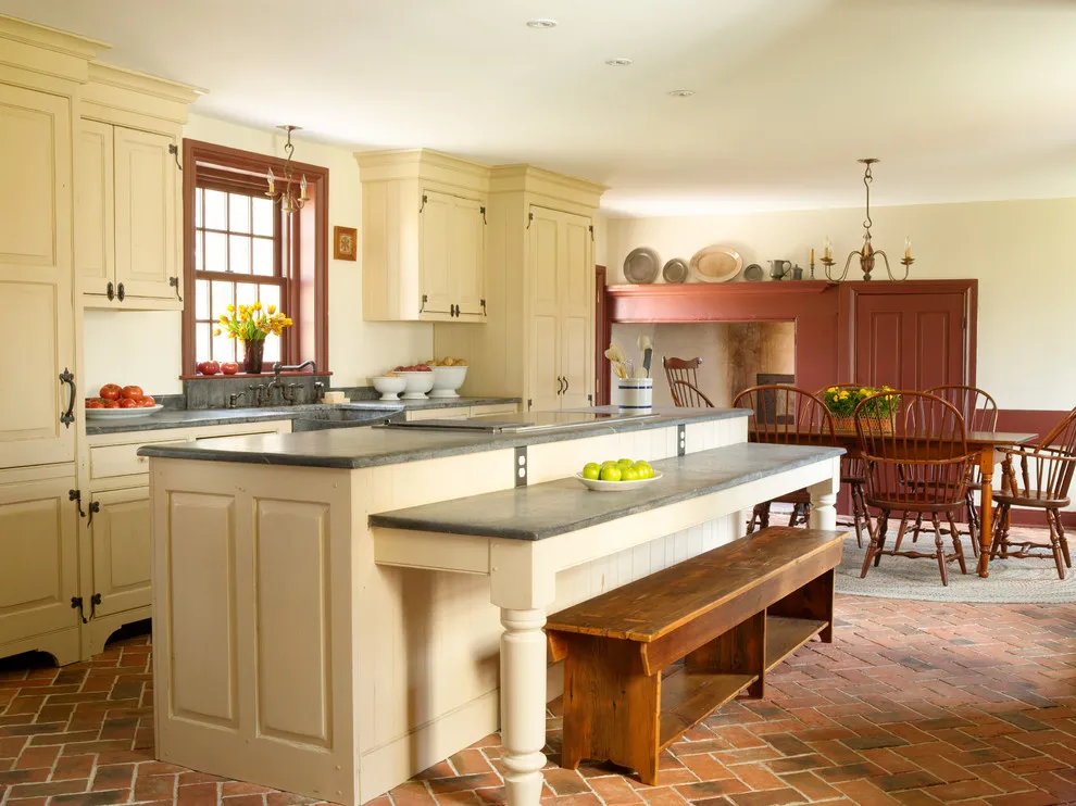
Cream doors sit comfortably with the warm brick-patterned floor, timber window trim and wooden seating in this kitchen. A darker counter defines the island’s edges, and a raised ledge separates the seating side from the main worktop. The combination shows how light painted cabinetry can soften a room with several strong earthy surfaces.
With warm flooring, choose cabinet samples in the room rather than assuming any off-white will work. A strongly yellow cream may intensify the floor’s orange notes. Test the height and reach of a raised eating ledge with the intended seats, and keep the bench useful for movement and comfort rather than choosing it solely because its wood finish matches.
PART 04
Counters, texture and open rooms
IDEA 13 / 17
Let the Countertop Tie Cream Doors Together
 SaveSupport Non AI Creator
Image credit: Michael Nash Design, Build & Homes
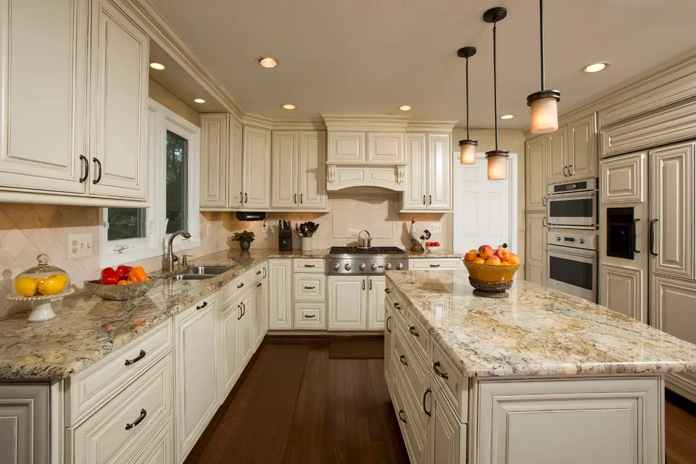
The speckled countertop combines light and warm tones that link the cream doors with the darker floor. Paneled cabinet fronts and a shaped hood introduce traditional detail, while the small pendants stay visually lighter above the island. The counter has enough pattern to become a feature without another strong wall color competing beside it.
Choose your cream after seeing a substantial counter sample, especially when the surface contains several colors. Small chips can hide the pattern’s overall effect. If the counter is the main feature, use quieter backsplash and cabinet finishes, then ask the supplier for the correct cleaning and sealing guidance; a photograph cannot identify a surface’s maintenance requirements.
IDEA 14 / 17
Add Texture with Woven Counter Seats
 SaveSupport Non AI Creator
Image credit: Robert Thomas Homes
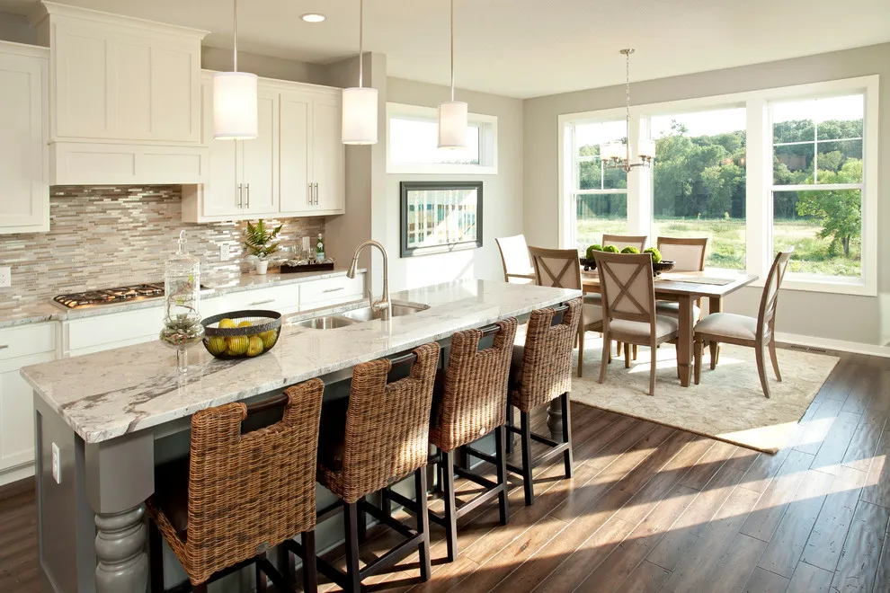
Woven stool backs bring texture to the otherwise smooth cabinet fronts and pale island counter. Their darker legs connect with the wood-toned floor, while the cream perimeter keeps the room bright beside the windows. The patterned backsplash adds another layer, but its restrained colors allow the woven seating to remain noticeable.
Use textured seats when cream cabinetry needs more character without another paint color. Check seat height, knee room and how far the backs project when the stools are tucked away. Woven surfaces can catch crumbs and snag, so consider the cleaning routine and household wear before choosing them for the busiest eating spot in the kitchen.
IDEA 15 / 17
Keep the Window Wall Light
 SaveSupport Non AI Creator
Image credit: Connecticut Stone
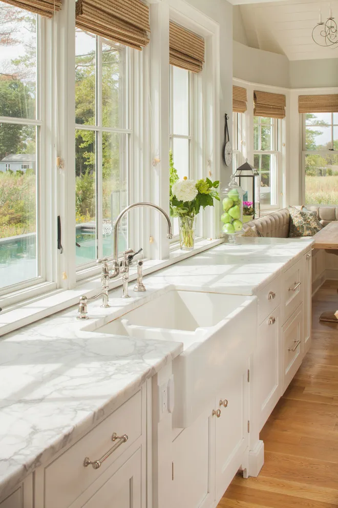
Pale cream lower cabinets leave the tall windows as the strongest feature of this kitchen wall. The light veined counter and apron-front sink reinforce the airy appearance, while woven shades introduce warmer color above eye level. The arrangement avoids a full row of upper cupboards across the brightest part of the room.
If you remove upper cabinets to emphasize windows, plan where the displaced dishes and food will go before starting work. Compare cream with the window trim so the contrast looks intentional. Specify a counter, sink installation and window treatment suitable for the wet area, and keep any operating handles accessible rather than filling the sill with permanent display pieces.
IDEA 16 / 17
Mix Flat Cream Doors with Wood Frames
 SaveSupport Non AI Creator
Image credit: Stephen Kent Johnson
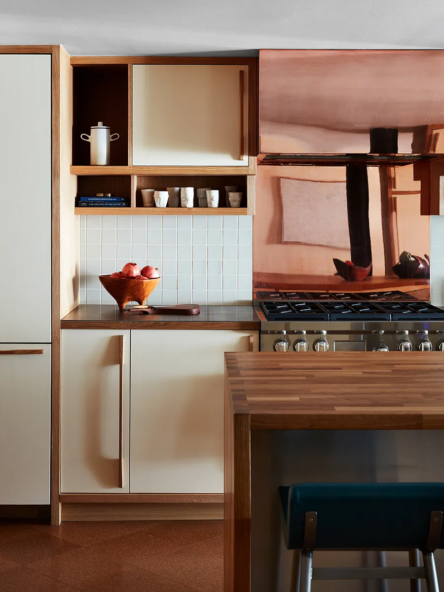
Flat cream door panels sit inside visible wooden frames, giving this kitchen a different character from conventional painted panel doors. Open cubbies interrupt the upper storage, and a copper-colored backsplash adds a warmer reflective surface near the cooker. Long wooden handles echo the surrounding frame and keep the pale panels visually simple.
For a contemporary cream kitchen, consider how the cabinet construction creates contrast before adding decorative hardware. Flat fronts can work well with visible wood edges, but request a complete sample showing the junctions and handles. Check the actual backsplash specification for heat suitability and care; a copper-colored appearance alone does not establish its material or how it will age.
IDEA 17 / 17
Connect Cream Cabinetry to an Open Living Area
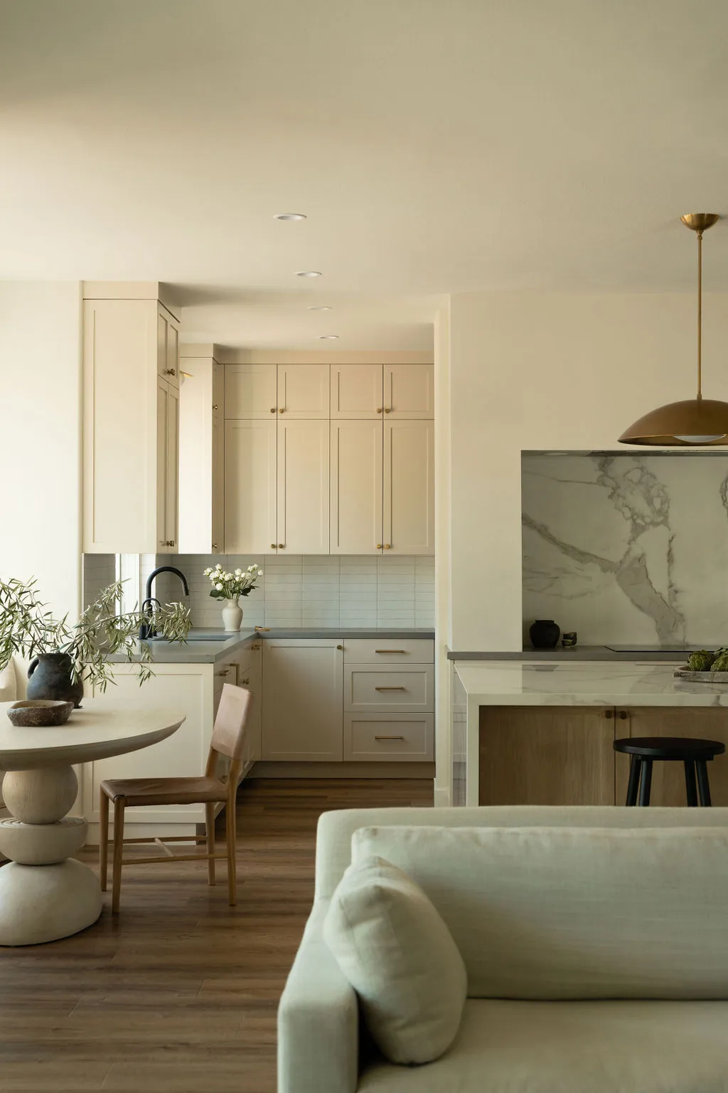 SaveSupport Non AI Creator
Image credit: Sarah Button. Design: KH Interiors
Pale cream-toned cabinet doors help the kitchen sit quietly behind the adjoining sofa and round dining table. A veined pale backsplash gives the cooking zone detail, while wood flooring connects it with the other furniture. The restrained cupboard color matters here because the kitchen remains visible from the places used for relaxing and gathering.
In an open room, view the cabinet sample from the sofa as well as from the kitchen doorway. Compare it with upholstery, wall paint and flooring, since the finishes share one sightline. Choose storage that can conceal everyday appliances where practical, and avoid filling every counter with decorative objects when the kitchen is also part of your living-room view.
BRING IT ALL TOGETHER
Choose cream beside your existing finishes
Start with the surfaces you are keeping. Hold cabinet samples upright beside the counter, floor, wall and window trim, then check them during the day and with your usual lights on. A cream that works with warm wood may look too yellow beside a cooler white tile; the whole combination matters more than the individual swatch.
Decide where contrast will come from before adding more finishes. A dark counter, wooden table or colored pendant may supply enough character. Preserve usable worktop space, accessible storage and comfortable movement around any island, so the finished kitchen supports the way you cook and spend time together.