A kitchen color combination includes more than cabinet paint. The floor, counter, tile, appliances and furniture all affect how a color reads, and the largest surfaces usually deserve attention first. A small warm accent can change the balance without adding another painted cabinet run.
These photographed kitchens offer different ways to divide color across the room. Compare where each shade appears and how much of it is visible. Treat the photographs as starting points, then test actual samples beside the finishes you plan to keep, in your own daylight and evening lighting.
PART 01
Start with Pale Surfaces and Measured Contrast
IDEA 01 / 20
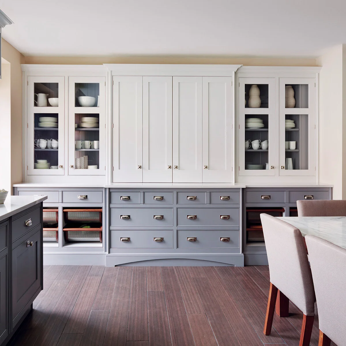
Pair Pale Upper Cabinets with Gray and Dusty Rose
 SaveSupport Non AI Creator
Image credit: Mylands / Smallbone of Devizes
Pale upper doors and gray lower drawers divide this tall cabinet display into two clear bands. Dark interiors behind the glass keep the displayed white dishes visible, while dusty rose chairs add a softer third color at the edge. The narrow metal pulls connect the different cabinet sections.
Compare the lower cabinet sample with any upholstered seating that will remain nearby. A gray that looks neutral alone may appear cooler beside rose fabric or warm flooring. Keep glass-front cabinet contents in mind too, because a busy mixture of dishes can become another visible layer of color.
IDEA 02 / 20
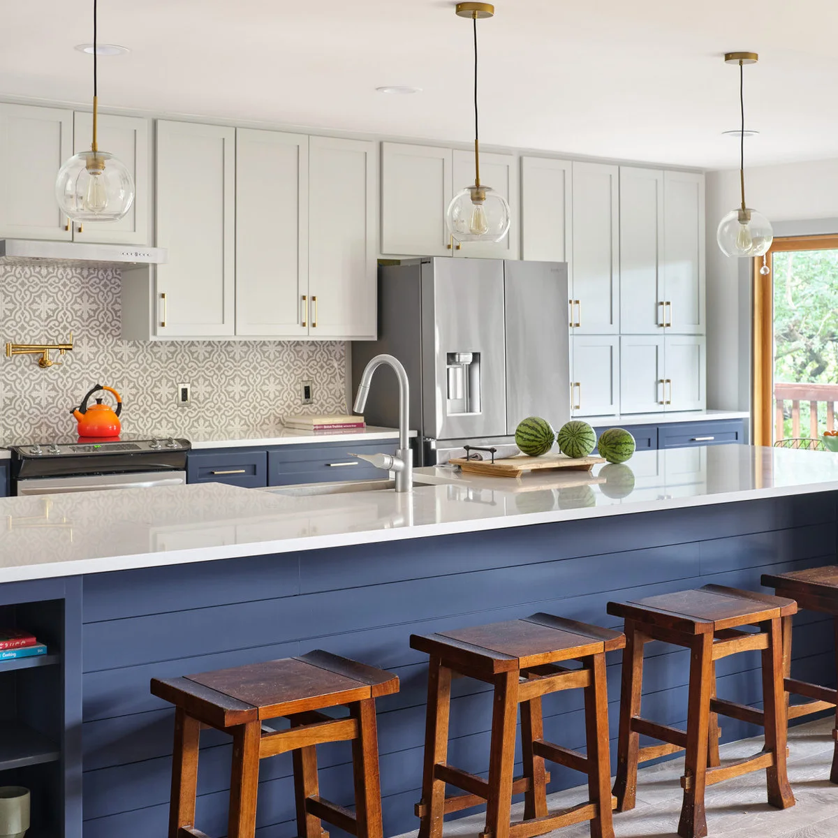
Balance Navy Bases with Pale Gray Upper Cabinets
 SaveSupport Non AI Creator
Image credit: Project: Paper Moon Painting (via Houzz)
Navy covers the lower cabinets and the peninsula, while pale gray upper doors keep the taller surfaces quieter. Warm metal fittings and wood stools soften the strong blue band. The patterned backsplash introduces detail between the cabinet colors without taking over the large pale counter.
Compare more two-tone kitchen cabinet ideas before deciding where the color change should stop. Include tall appliance cabinets in the plan rather than treating them as an afterthought. Test both paints against the patterned tile so its lighter and darker marks support the combination in your own lighting.
IDEA 03 / 20
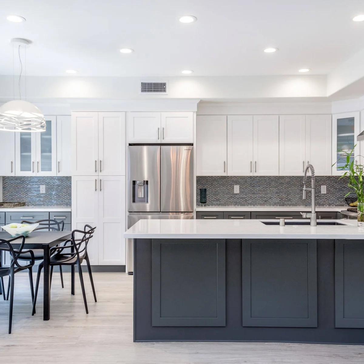
Use Charcoal Below White and Small-Scale Tile
 SaveSupport Non AI Creator
Image credit: Project: Battres Construction (via Houzz)
The charcoal peninsula anchors the foreground, while white upper cupboards form a lighter band across the back wall. A narrow mosaic backsplash bridges the two with smaller dark and pale marks. Black dining chairs repeat the strongest outline without introducing another large block of painted cabinetry.
Check the dark cabinet sample beside the appliances and dining furniture before choosing its undertone. Keep the counter edge visible so the pale surface clearly separates it from the bases. If the tile already has dense pattern, compare a quiet cabinet finish rather than adding another textured treatment.
IDEA 04 / 20
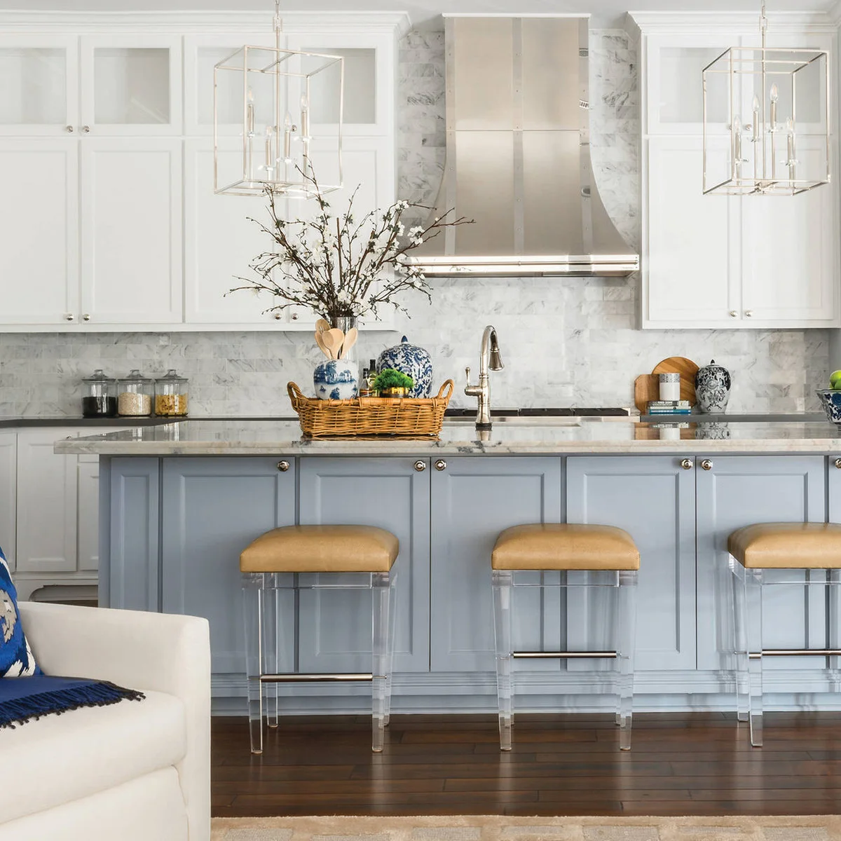
Warm a Pale Blue Island with Ochre Seats
 SaveSupport Non AI Creator
Image credit: Project: MMI Design (via Houzz)
The pale blue island gives this mostly white kitchen a gentle color change at seating level. Ochre stool cushions add warmth, while blue and white accessories repeat the island’s family of colors in smaller pieces. The pale veined wall and counter keep the main background connected.
Check the stool fabric beside the cabinet sample rather than choosing both from separate photographs. Upholstery can make a cool cabinet color feel warmer without repainting another surface. Leave enough plain counter visible so accessories remain accents, and compare fabric care requirements with how often the seats will be used.
IDEA 05 / 20
Set Turquoise Bases Against Creamy Upper Cabinets
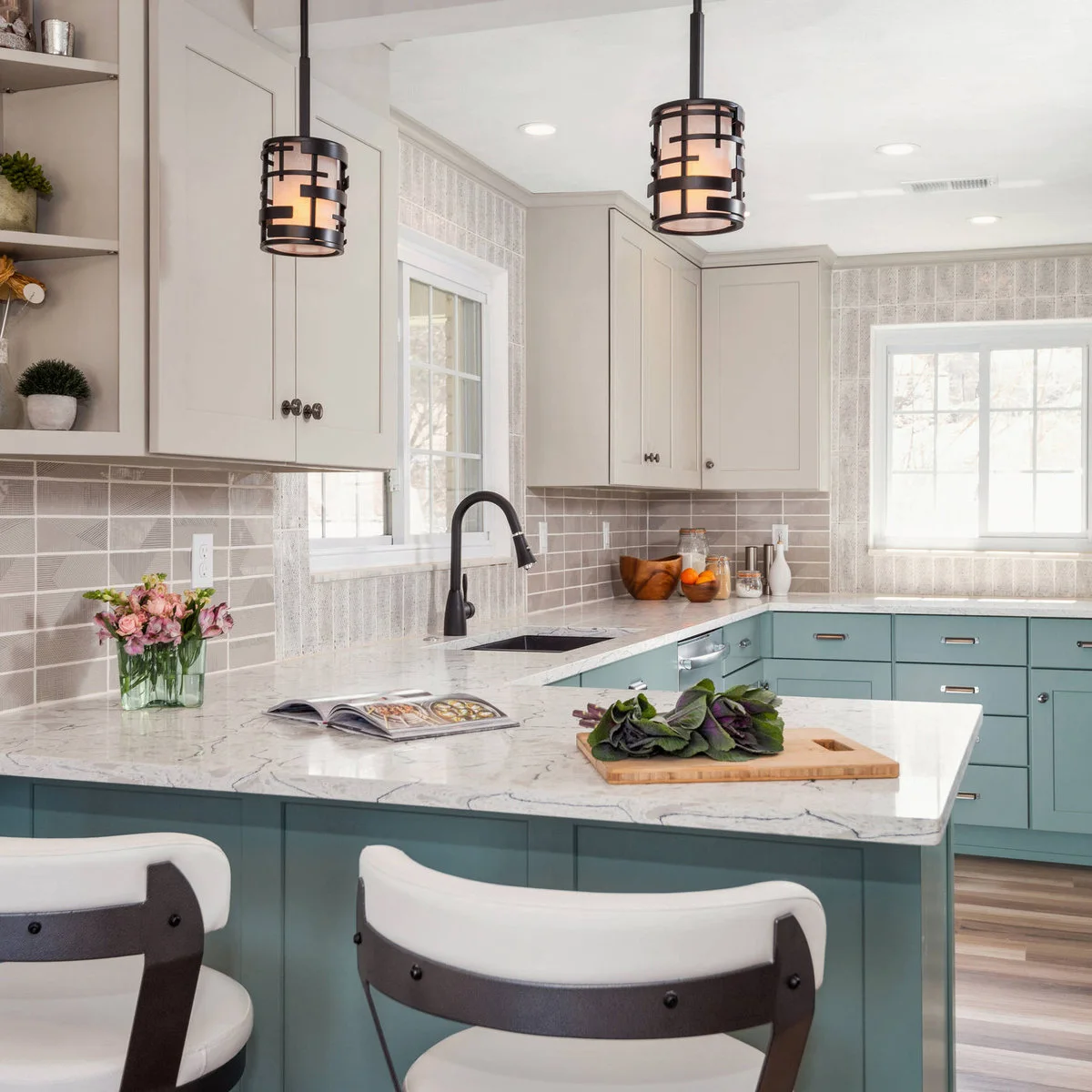 SaveSupport Non AI Creator
Image credit: Project: Prime 1 Builders (via Houzz)
Muted turquoise gives the lower cabinets and peninsula a clear identity beneath the creamy pale cupboards. Gray tile provides a quieter middle layer, while the dark faucet and pendant frames add firm outlines. Pale counters keep the change between the cabinet colors visually distinct.
Use blue kitchen cabinets to compare quieter and stronger versions of this color family before approving a sample. Test the turquoise against the gray tile and warm upper finish together. A small swatch viewed alone will not show how much color a long peninsula adds to an open room.
PART 02
Let Wood Supply Part of the Palette
IDEA 06 / 20
Set Aqua Tile Against Wood and Orange Seats
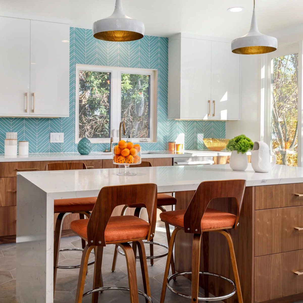 SaveSupport Non AI Creator
Image credit: Project: Savvy Kitchens (via Houzz)
Aqua tile fills the wall around the window, giving the white upper cabinets a colored backdrop. Wood lower cabinets and orange padded seats add a warmer layer below. Pale counters connect the working surfaces, while the warm-colored pendant interiors repeat a small part of the stools’ brightness overhead.
Compare the tile and upholstery as large samples before committing to both strong accents. Keep the wood sample alongside them so its undertone becomes part of the decision. If orange seating feels too permanent, consider whether a smaller movable textile could provide the warmth you want before ordering several stools.
IDEA 07 / 20
Combine Warm Wood Cabinets with a Dark Island
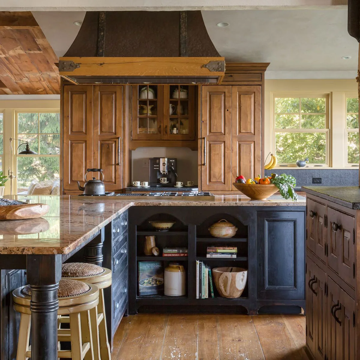 SaveSupport Non AI Creator
Image credit: Project: Denise Stringer Interior Design (via Houzz)
Warm wood fills much of this kitchen, from the tall cabinet fronts to the ceiling boards. The dark island creates a separate lower band, while a pale patterned counter links its seating and working surfaces. Light stools keep the visible furniture from becoming another heavy dark block.
Compare the dark paint with the wood in both direct and shaded light before making it the island color. The counter pattern already contributes several tones, so bring its sample into the decision. Keep smaller accessories restrained if the wood grain and ceiling treatment are meant to remain the room’s strongest details.
IDEA 08 / 20
Keep Navy Strong and the Working Surfaces Pale
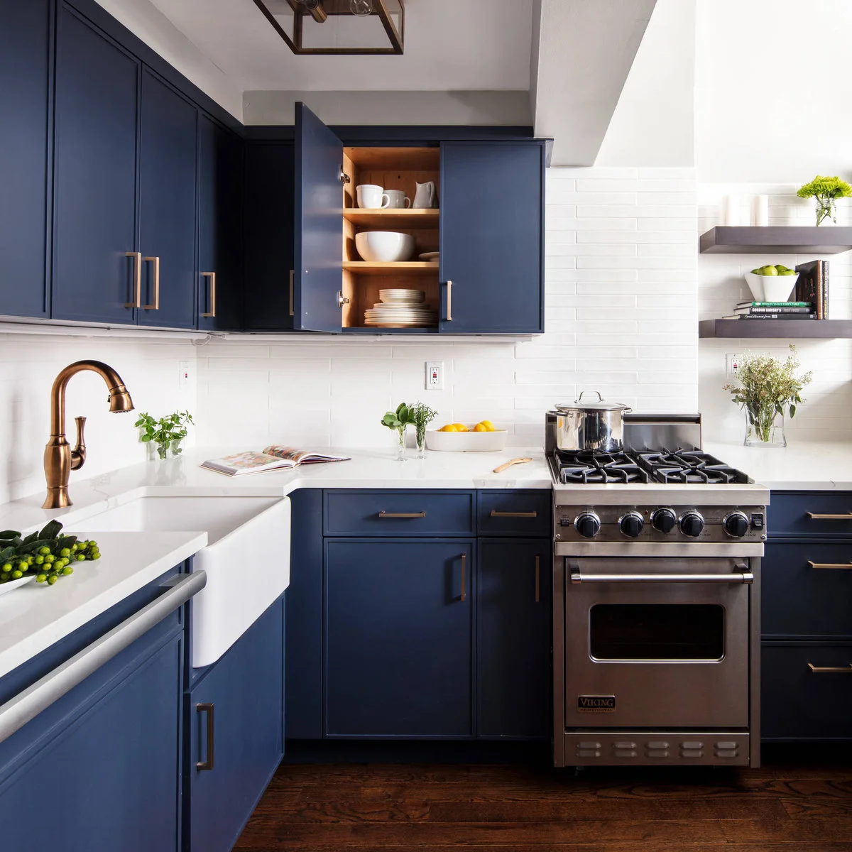 SaveSupport Non AI Creator
Image credit: Project: Palette Pro Painting & Renovation (via Houzz)
Navy wraps both the upper and lower cabinet runs, while the white sink, counter and backsplash keep the working area clearly defined. Warm metal pulls and the faucet stand out against the blue. Dark flooring supplies another deep tone without copying the cabinet color exactly.
Compare navy blue kitchen cabinets with your actual floor before choosing a full-height blue scheme. Check the paint at the darkest corner as well as beside the window. Pale working surfaces can provide useful visual separation, but their material and care requirements should suit daily use as well as the palette.
IDEA 09 / 20
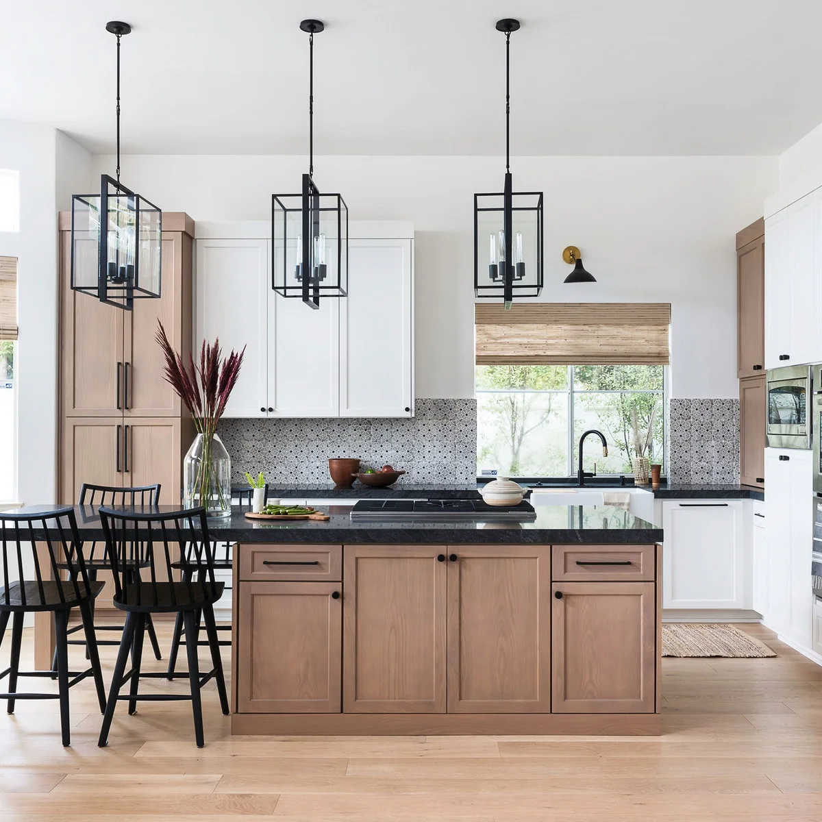
Use Black to Connect Pale Wood and White
 SaveSupport Non AI Creator
Image credit: Samantha Goh / Jula Cole Design
Pale wood appears on the island and tall cabinets, while white keeps the remaining doors and walls light. Black counters, stools and lantern frames repeat a clear dark outline throughout the room. The small patterned backsplash adds detail without introducing a separate strong color.
Compare the wood sample with the floor before assuming two pale woods will look alike. A slight difference can be attractive when it is deliberate. Check the black counter beside the hardware and stool finish, and keep the backsplash sample visible while deciding how much pattern the room needs.
IDEA 10 / 20
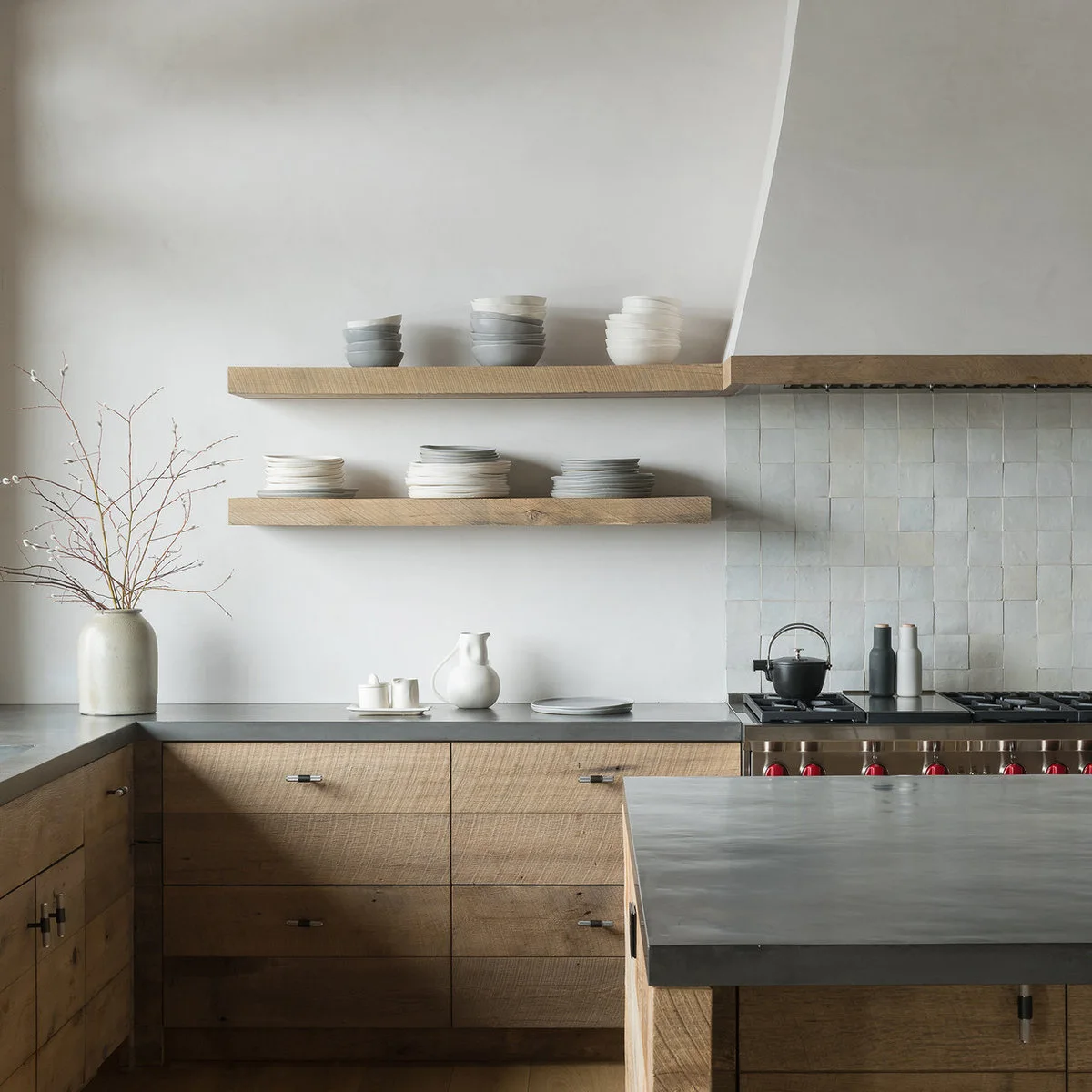
Let Pale Wood and Gray Stay Quiet Together
 SaveSupport Non AI Creator
Image credit: Project: Pearson Design Group (via Houzz)
The pale wood drawers and shelves give this kitchen warmth without a strongly colored painted cabinet. Gray counters add a cooler horizontal layer, while pale tile and the broad hood keep the upper wall restrained. The simple fronts let the wood’s visible texture supply much of the detail.
Compare the gray counter with the wood in a larger sample arrangement, including the tile joints. Keep in mind that a material’s texture can affect the palette as much as its color. Choose shelf contents deliberately if you want the restrained background to remain the main impression.
PART 03
Bring Color into Smaller Kitchens and Corners
IDEA 11 / 20
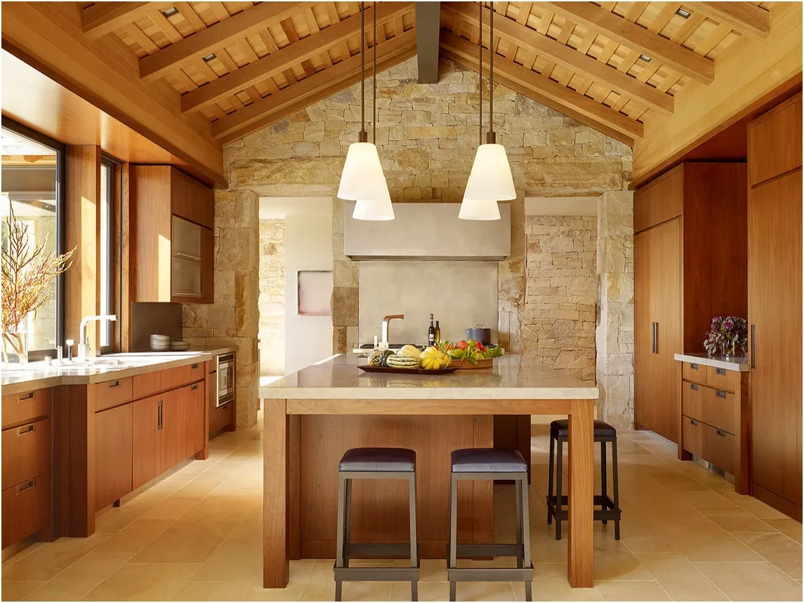
Keep Honey-Toned Wood Close to Warm Pale Stone
 SaveSupport Non AI Creator
Image credit: Matthew Millman / Walker Warner Architects
Honey-toned wood covers the cabinet fronts and ceiling framing, giving the room a continuous warm character. Pale stone at the back wall and floor keeps the palette close in tone while changing the texture. Dark stool seats provide small points of contrast around the wood island.
Test the stone and wood side by side before choosing a finish that appears similarly warm in photographs. A more yellow stone and a redder wood may read differently together. Keep an actual sample of the floor in the comparison, since it occupies a much larger area than the backsplash.
IDEA 12 / 20
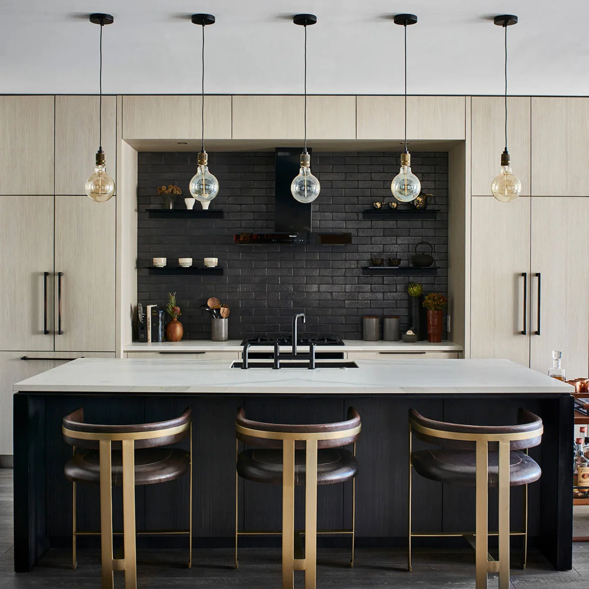
Frame a Black Cooking Wall with Pale Wood
 SaveSupport Non AI Creator
Image credit: Marc Mauldin Photography / Michael Habachy
Pale wood cabinets frame the dark cooking wall, giving the black brick pattern a clear boundary. The island repeats the black below a pale counter. Warm metal stool frames add a smaller contrasting finish, while the simple hanging lamps leave the strong cabinet and wall shapes visible.
Decide how much black you want visible from adjoining rooms before repeating it on both wall and island. Compare the backsplash texture with the cabinet grain, including how each catches light. Use actual hardware and stool samples where possible so their warm finishes do not become unrelated shades.
IDEA 13 / 20
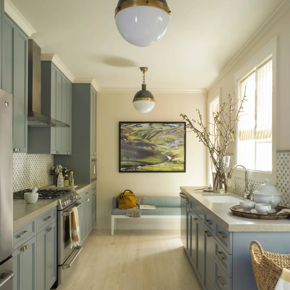
Soften Gray Cabinets with Cream Walls
 SaveSupport Non AI Creator
Image credit: Project: Angela Free Design (via Houzz)
Gray cabinets line both sides of the narrow kitchen, while cream walls and pale flooring make the central space quieter. The small mosaic backsplash brings the gray and cream into one surface. A pale bench at the far end repeats the softer tones below the framed landscape.
Check a gray cabinet sample directly against the cream wall color rather than selecting a gray from its name. Include the counter and mosaic pieces in the same test. If the room has limited daylight, view the samples with the evening lights on before committing to the full cabinet run.
IDEA 14 / 20
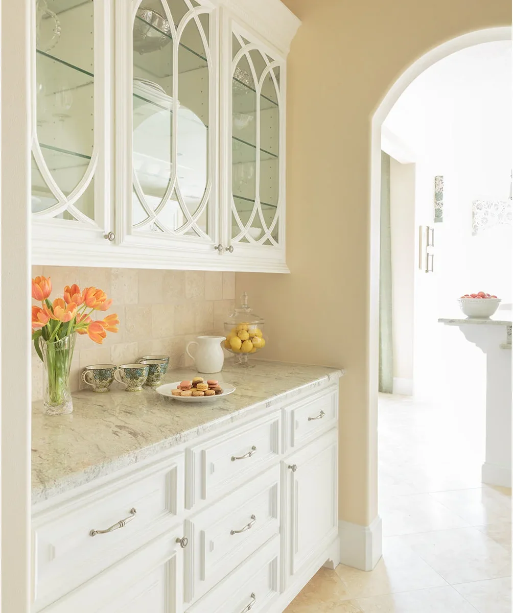
Keep Warm Pale Walls Beside White Display Cabinets
 SaveSupport Non AI Creator
Source: Houzz
White display cabinets stand out gently against the warm pale yellow wall. Curved decorative door frames supply detail without a stronger paint color, while the pale patterned counter relates to the tiled wall below. Orange flowers provide a small accent within the otherwise light arrangement.
Compare the wall color with both the white cabinet and the counter sample before approving it. Warm pale shades can look much stronger across a whole wall than on a card. Keep displayed dishes in the decision too, particularly when glass fronts expose several shelves at eye level.
IDEA 15 / 20
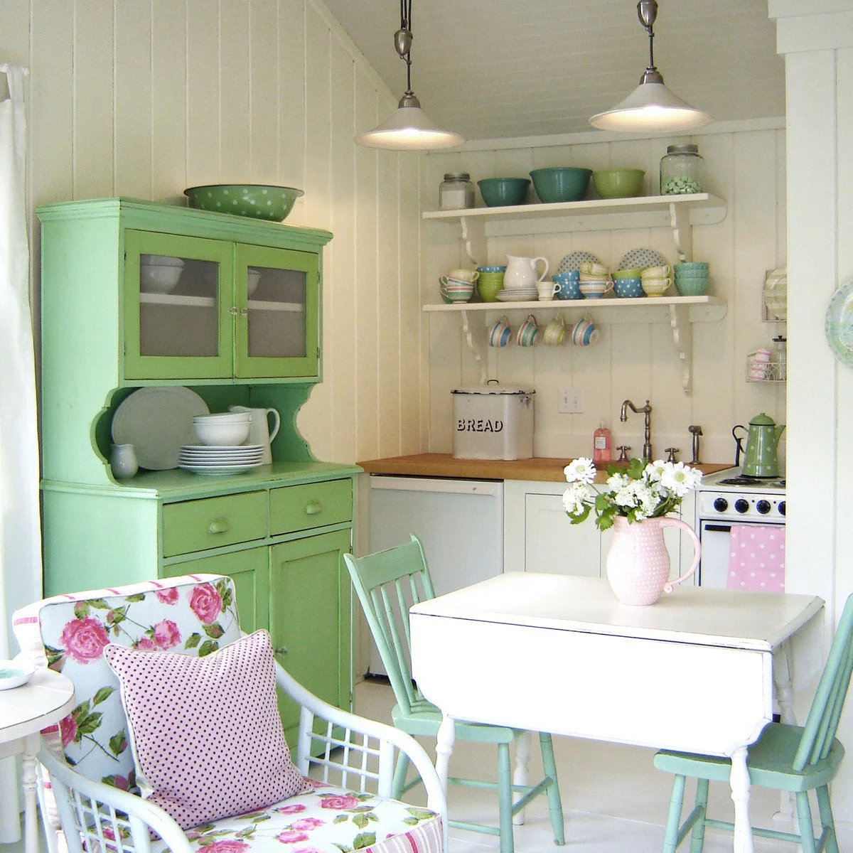
Add Pink Accents to Green and Cream
 SaveSupport Non AI Creator
Image credit: Project: Tracey Rapisardi Design (via Houzz)
The green hutch gives this small kitchen a clear colored focal point, while mint chairs repeat the family of colors around the white table. Pink appears in the pitcher, textiles and floral upholstery. Cream wall boards give the varied furniture and dishes a quieter background.
Start with one green furniture piece if you want to try this combination without changing every cabinet. Repeat pink in a few useful items rather than covering every surface. Check that the hutch doors, chairs and table still work comfortably together before adding more decorative pieces to the small room.
PART 04
Give Strong Colors a Clear Place in the Room
IDEA 16 / 20
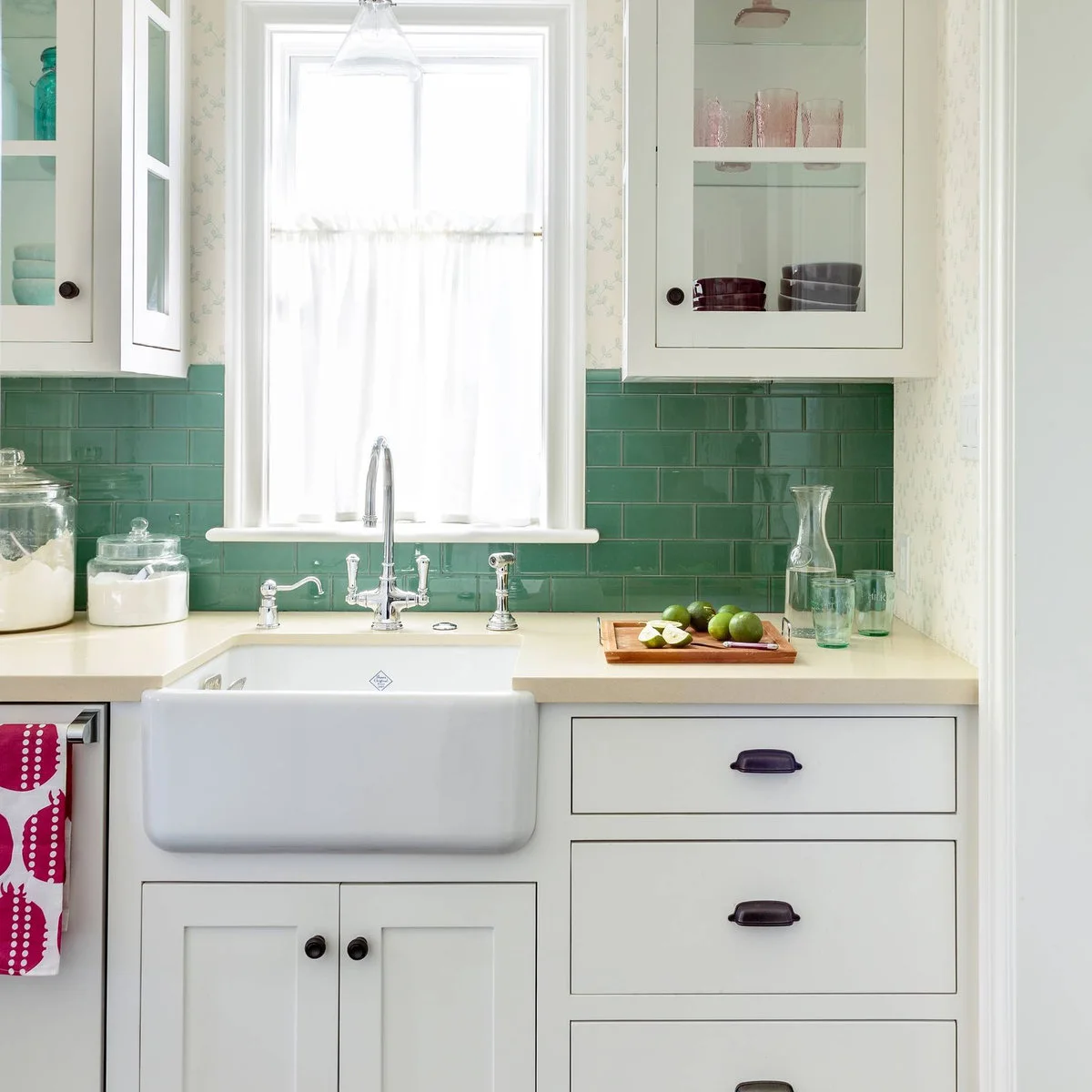
Use Green Tile with Cream Counters and White Cabinets
 SaveSupport Non AI Creator
Image credit: Mark Lohman for HGTV Magazine / Alison Kandler Interior Design
Green tile supplies a concentrated band of color around the sink, between white cabinets and the cream counter. Dark cup pulls provide small outlines on the drawers, while pale dishes and clear glass keep the displayed items relatively quiet. The patterned upper wall adds a finer layer of detail.
Check the tile sample against the counter rather than assuming any green will suit a warm cream surface. Include grout in the comparison, because its contrast changes how strongly the tile grid appears. Keep fabric and wallpaper samples nearby if they will remain visible beside the sink wall.
IDEA 17 / 20
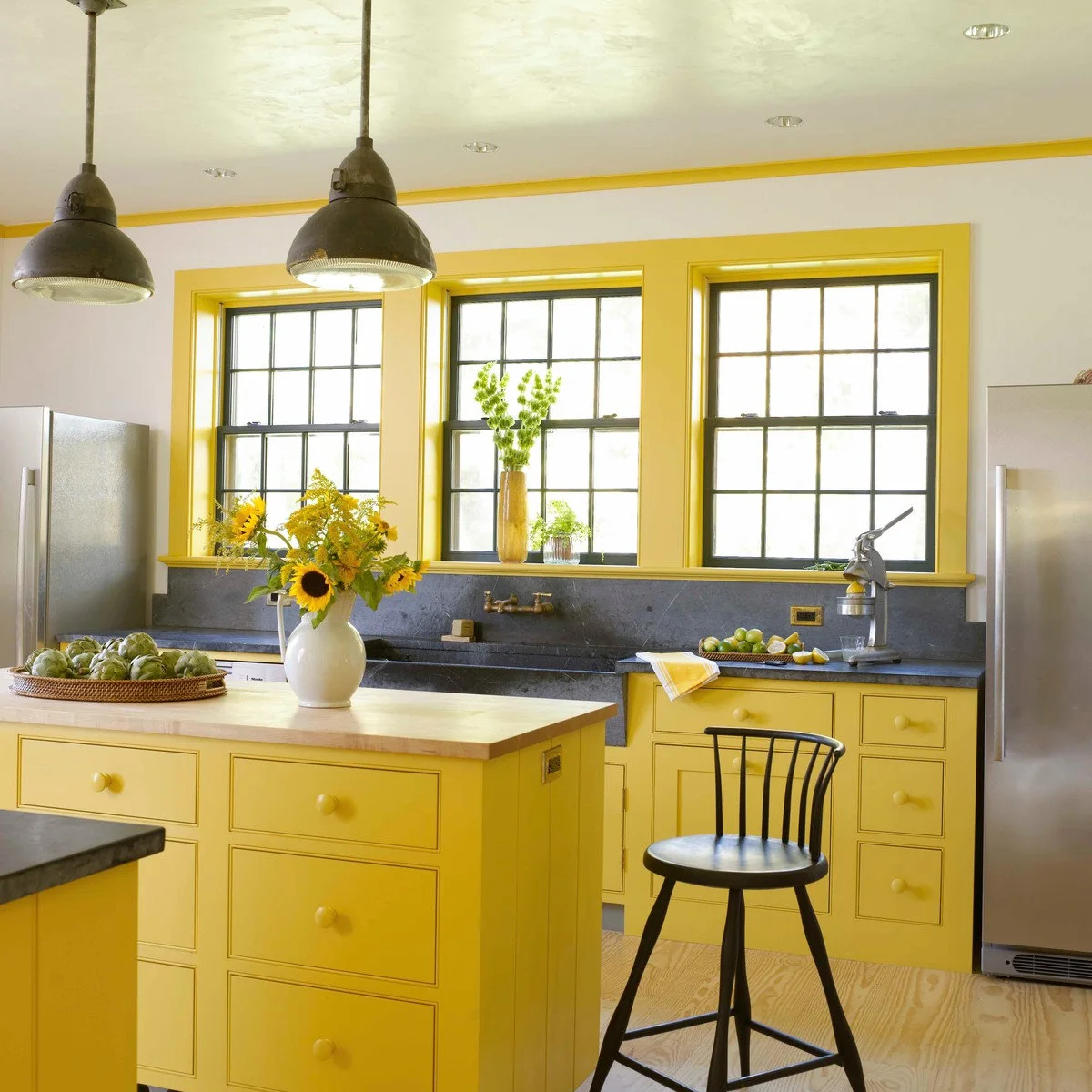
Give Yellow Cabinets a Dark Counterpart
 SaveSupport Non AI Creator
Source: Houzz
Yellow covers the lower cabinets and window trim, turning several separate parts of the room into one repeated accent. Dark counters and window frames give that yellow a firm outline. Pale walls keep the upper background simple, while the wood-topped island introduces a warmer natural tone.
Decide which trim elements should join the cabinet color before painting, rather than extending yellow onto every edge as you go. Test the shade beside the dark counter in daylight. Keep the floor and island top in the sample comparison so the warm elements work together without becoming visually crowded.
IDEA 18 / 20
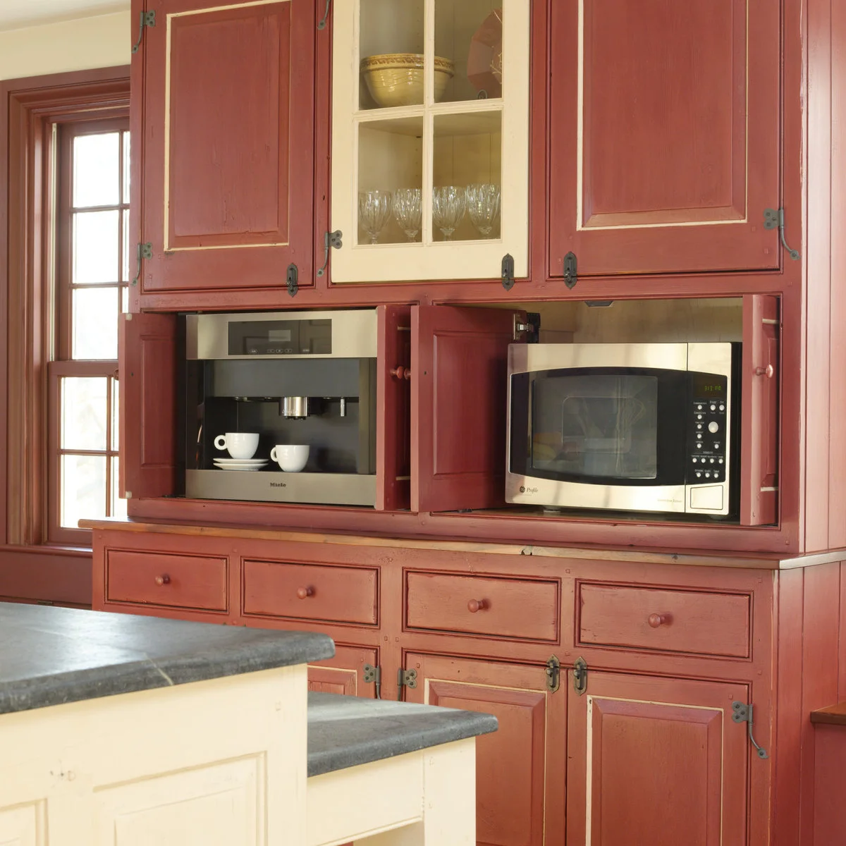
Pair Muted Red Cabinetry with Cream Details
 SaveSupport Non AI Creator
Image credit: Gridley + Graves Photographers / Timeless Kitchen Cabinetry
Muted red covers the large cabinet face, with cream trim and a cream glass-front door breaking up the color. Dark hinges and latches emphasize the traditional door shapes. Cream island fronts and gray tops give the foreground a lighter counterpart to the substantial red cabinetry.
Compare the red with the cream in a large enough sample to judge their contrast. Keep hardware finish consistent where you want the cabinet shapes to feel connected. Plan appliance openings around the selected products’ installation requirements; a color combination does not establish whether an enclosed appliance arrangement is suitable.
IDEA 19 / 20
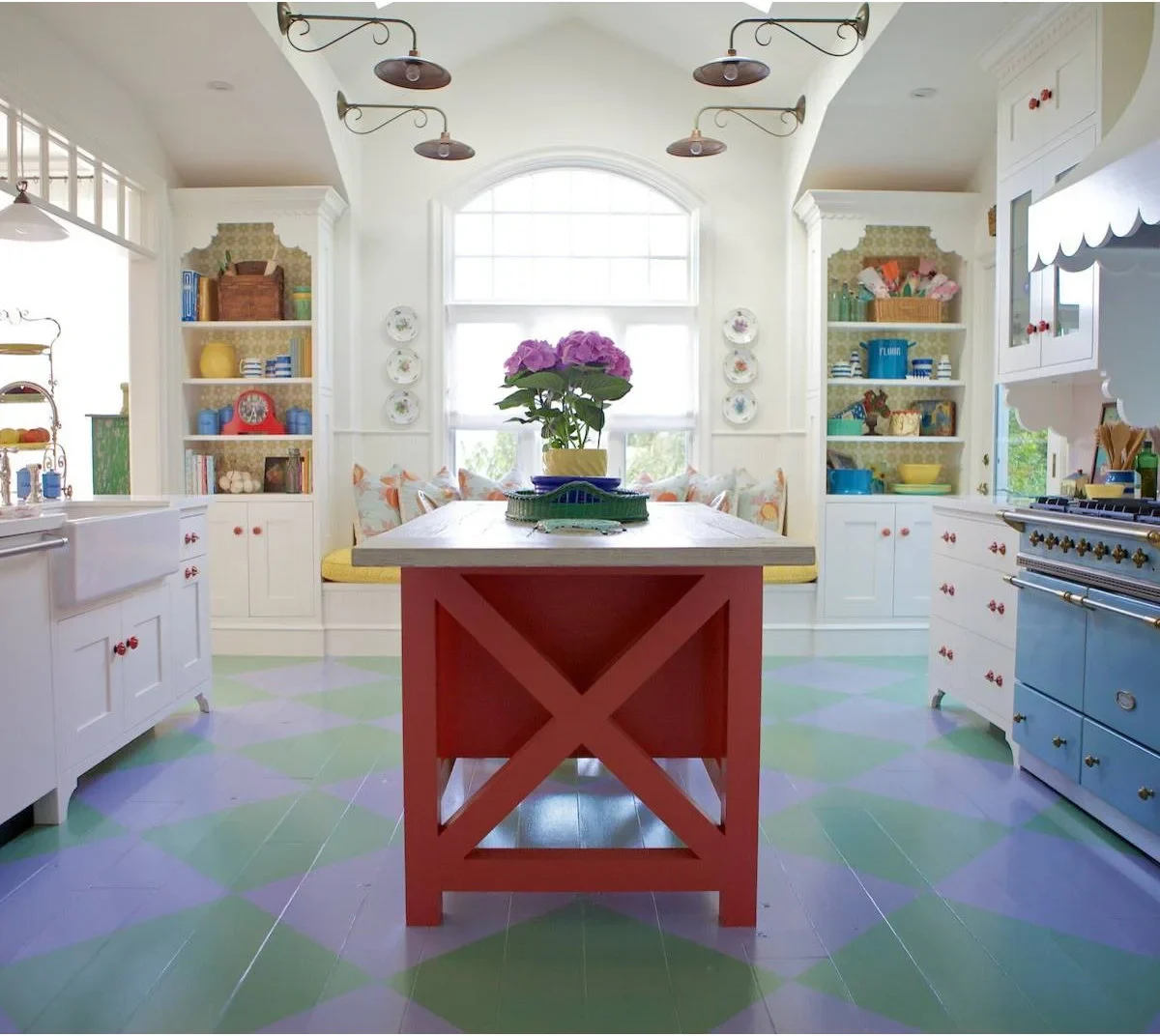
Keep a Colorful Island Clear Against White Cabinets
 SaveSupport Non AI Creator
Image credit: Project: Alison Kandler Interior Design (via Houzz)
The red island supplies a strong central block within the white kitchen, while the pale blue range adds another distinct color at the side. A green and lavender diamond floor connects the open area beneath them. Colorful dishes and shelf backs continue the playful treatment on a smaller scale.
Choose a small group of colors to repeat if you want a similarly varied room, then keep some large surfaces plain. Test the floor pattern with the island and appliance colors before committing. This approach needs a deliberate whole-room plan, especially if several existing finishes already carry strong colors.
IDEA 20 / 20
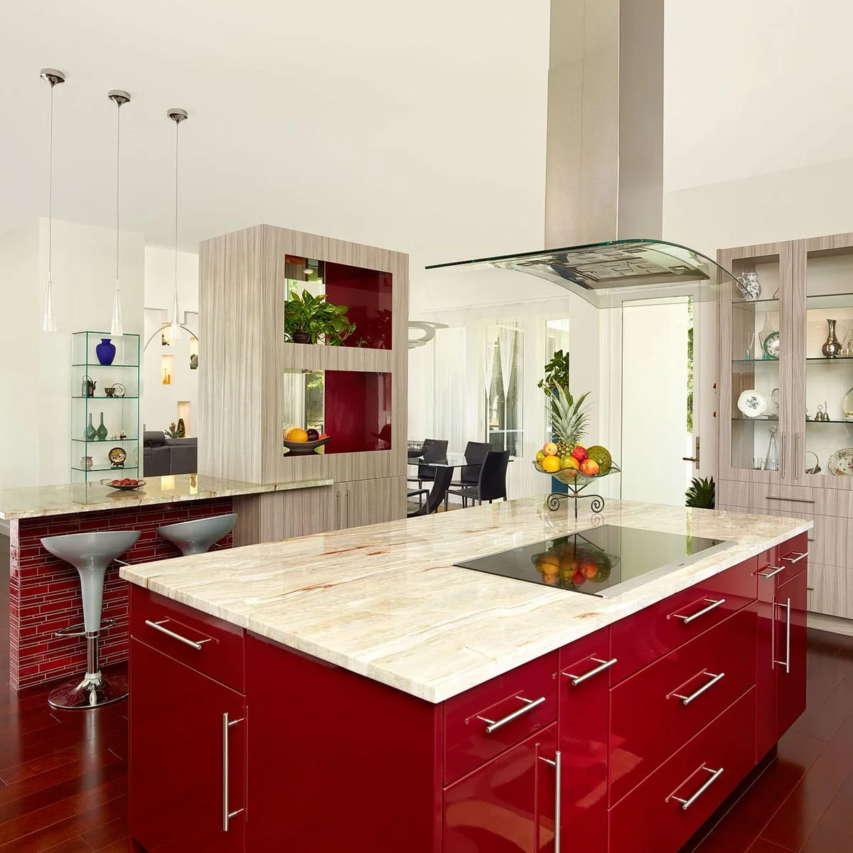
Use Glossy Red with Pale Gray-Brown Cabinetry
 SaveSupport Non AI Creator
Image credit: Project: DLB Custom Home Design (via Houzz)
Glossy red gives the island a strong reflective surface, while pale gray-brown cabinetry keeps the taller storage quieter. The breakfast bar repeats red in a smaller tile pattern. Pale patterned counters link the working areas, and silvery fittings add another light-reflecting finish without a separate paint color.
Look at a large gloss sample under the actual lights before choosing red for a prominent island. Check reflections and the finish maker’s cleaning guidance as well as the color. Compare the pale cabinet sample with the counter’s warm and cool marks so the surrounding surfaces support the red.
BRING IT ALL TOGETHER
Compare All the Fixed Finishes Together
Put cabinet, counter, tile and floor samples beside one another before approving a color. View them vertically and horizontally where they will be installed, then check them under the lights you actually use. A photograph cannot reliably identify the exact shade or finish in your room.
Decide which surface should carry the strongest contrast and keep the rest deliberate. If the floor or counter already has strong pattern, a simpler cabinet color may be easier to live with. Use movable items for accents you may want to change, and follow the finish maker’s preparation and care instructions.