Dark blue can give a bathroom character through one painted door, a navy vanity or an entire tiled wall. The best approach depends on what you are keeping: a white bath, gray tiles or warm wood can each suggest a different balance of blue and lighter surfaces.
These ideas focus on bathrooms with a visible deep-blue feature. Some use blue throughout the room, while others keep it to storage, paneling or the bath itself. Look at the finish, pattern and amount of contrast together, then check samples under your own lighting before making a permanent change.
PART 01
Walls, paneling and shower tile
IDEA 01 / 20
Wrap the Doors in Deep Blue
 SaveSupport Non AI Creator
Image credit: Farrow and Ball
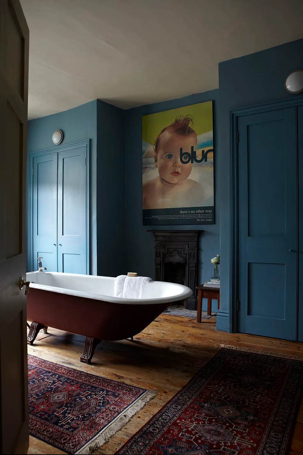
Deep blue extends across the paneled walls and doors, giving the bath a continuous backdrop rather than a single painted accent. The pale ceiling keeps the upper part of the room lighter, and a dark red bath exterior adds a second rich tone. A patterned rug and large framed print bring softer, more personal detail.
Painting doors and paneling together can reduce visual interruptions, especially when several openings share one wall. Check the finish against the ceiling and floor before committing. Use a coating suited to each surface and the room’s moisture exposure, and keep rugs away from persistent splashes; a styled photograph does not establish that every textile is practical beside a bath.
IDEA 02 / 20
Make Navy Tile the Shower Feature
 SaveSupport Non AI Creator
Image credit: Fired Earth
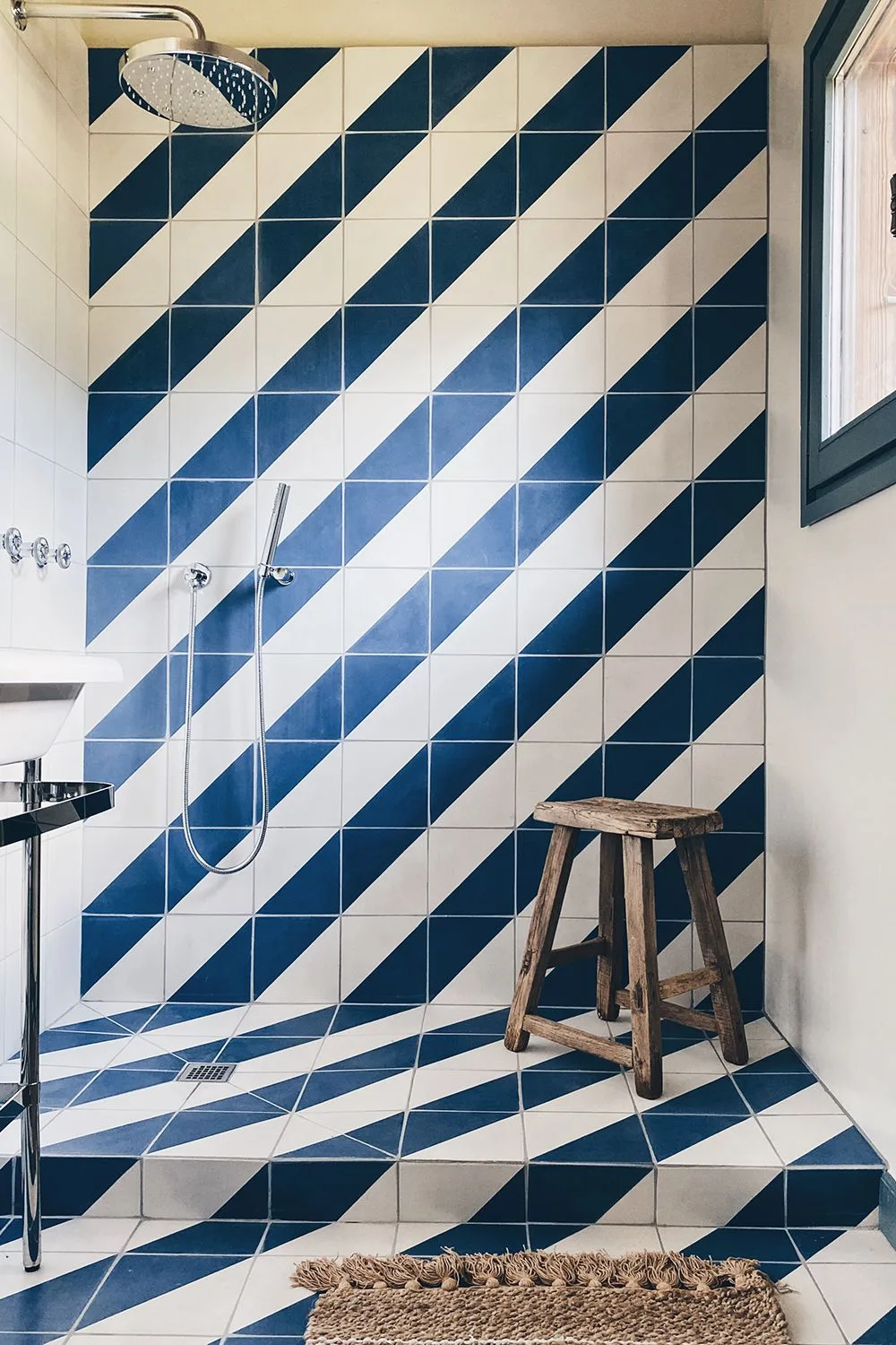
Navy and white tiles create diagonal stripes that run through the shower wall and across the floor. The pattern supplies the room’s main color, leaving the surrounding surfaces comparatively quiet. A dark window frame repeats the blue at the edge, while the simple shower fittings allow the strong tile arrangement to remain clearly visible.
Lay out a full pattern sample before ordering, including how the stripes meet corners, drains and doorways. A diagonal scheme can require more cutting than a straightforward grid. Specify floor tiles suitable for wet use and a complete waterproofing system with your installer; visual continuity between wall and floor is less important than safe footing and reliable drainage.
IDEA 03 / 20
Use a Dark Botanical Backdrop
 SaveSupport Non AI Creator
Image credit: Graham and Brown
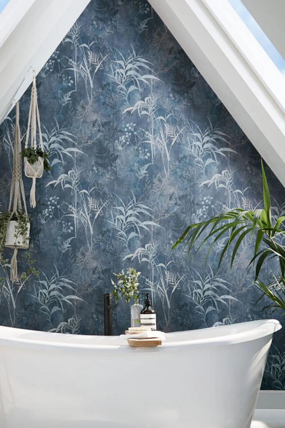
Dark blue botanical wallpaper turns the wall behind the white bath into the main feature of this attic bathroom. Pale plant motifs keep the surface detailed rather than uniformly dark, while the white ceiling and bath create a clear contrast. Hanging greenery repeats the leaf theme without introducing a completely different pattern into the room.
Before using wallpaper near a bath, check its bathroom suitability and the manufacturer’s installation requirements for the actual location. Keep it outside direct spray where appropriate and address ventilation first. Test a large repeat against the sloping ceiling, because the pattern may be cut differently on each side and can look crowded around a narrow apex.
IDEA 04 / 20
Combine Blue Tile and Ribbed Paneling
 SaveSupport Non AI Creator
Image credit: Future/Kirsty Noble
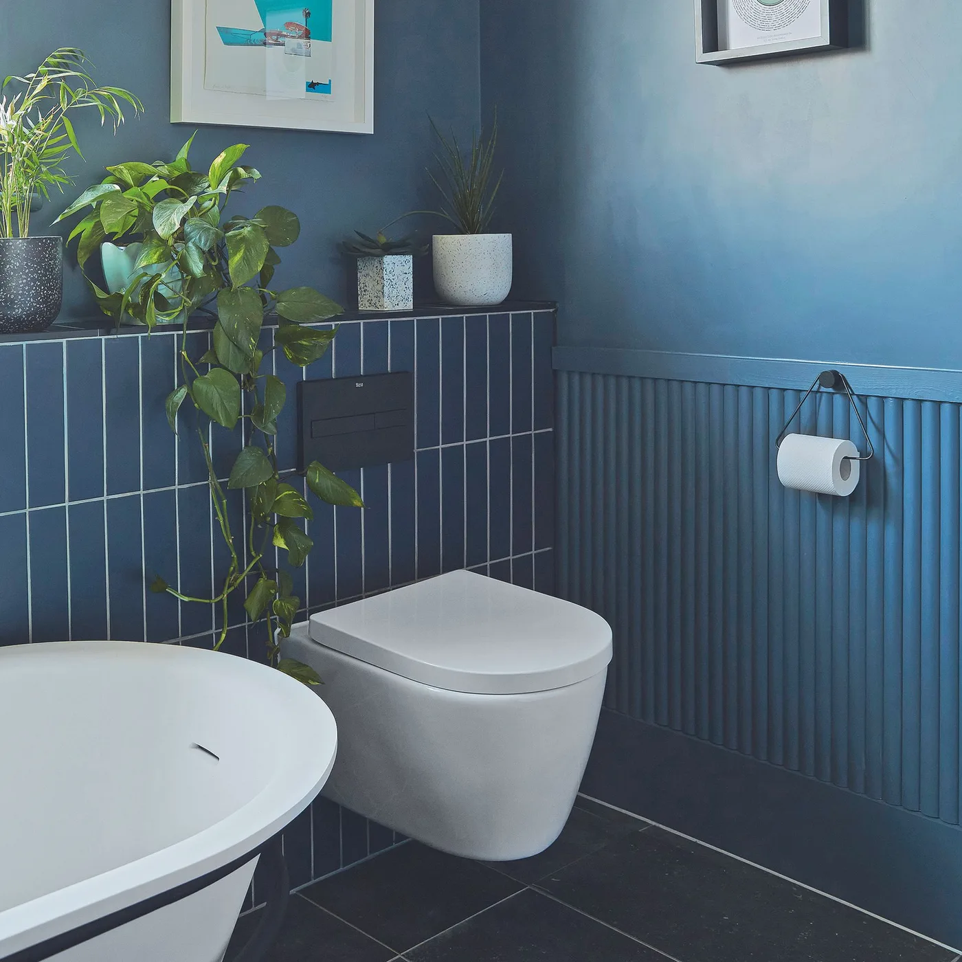
The blue tile and ribbed paneling share a similar tone but bring different textures to this compact bathroom. Pale grout makes the tile grid visible, while the vertical ribs add a finer rhythm beside the white toilet. Framed pictures and greenery sit above the tiled ledge, keeping the lower part of the room relatively uncluttered.
Using two textures in one color can add interest without several competing finishes. Plan where they meet, including any trims and the height of the ledge, before installation. Choose paneling and coatings specified for the location’s moisture exposure. Keep the toilet’s service access reachable and avoid treating the narrow ledge as storage for every bathroom product.
IDEA 05 / 20
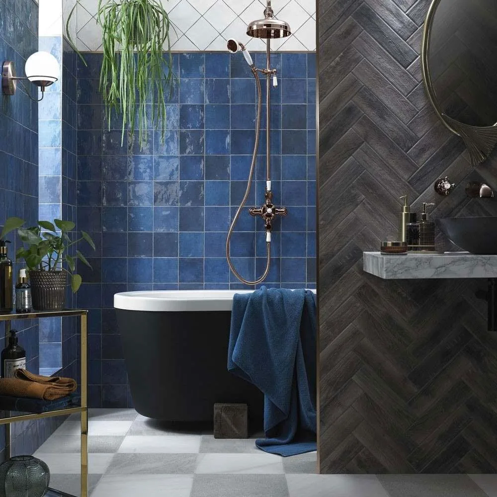
Pair Deep Blue Tiles with a Black Bath
 SaveSupport Non AI Creator
Image credit: Wallandfloors.co.uk
Deep blue square tiles provide a rich background for the black bath and darker partition. Their varied surface catches light, so the blue is more noticeable than a flat painted wall would be beside the same fittings. White tiles higher up and the lighter floor interrupt the dark surfaces, preventing every plane from merging together.
When combining navy with black, compare generous samples under your planned lighting to make sure both colors remain distinguishable. Keep at least one lighter surface if you prefer clear contrast. Ask about cleaning the tile finish and grout, particularly where soap and water collect, and leave comfortable access around the bath rather than filling the gap with accessories.
PART 02
Baths, windows and shared sinks
IDEA 06 / 20
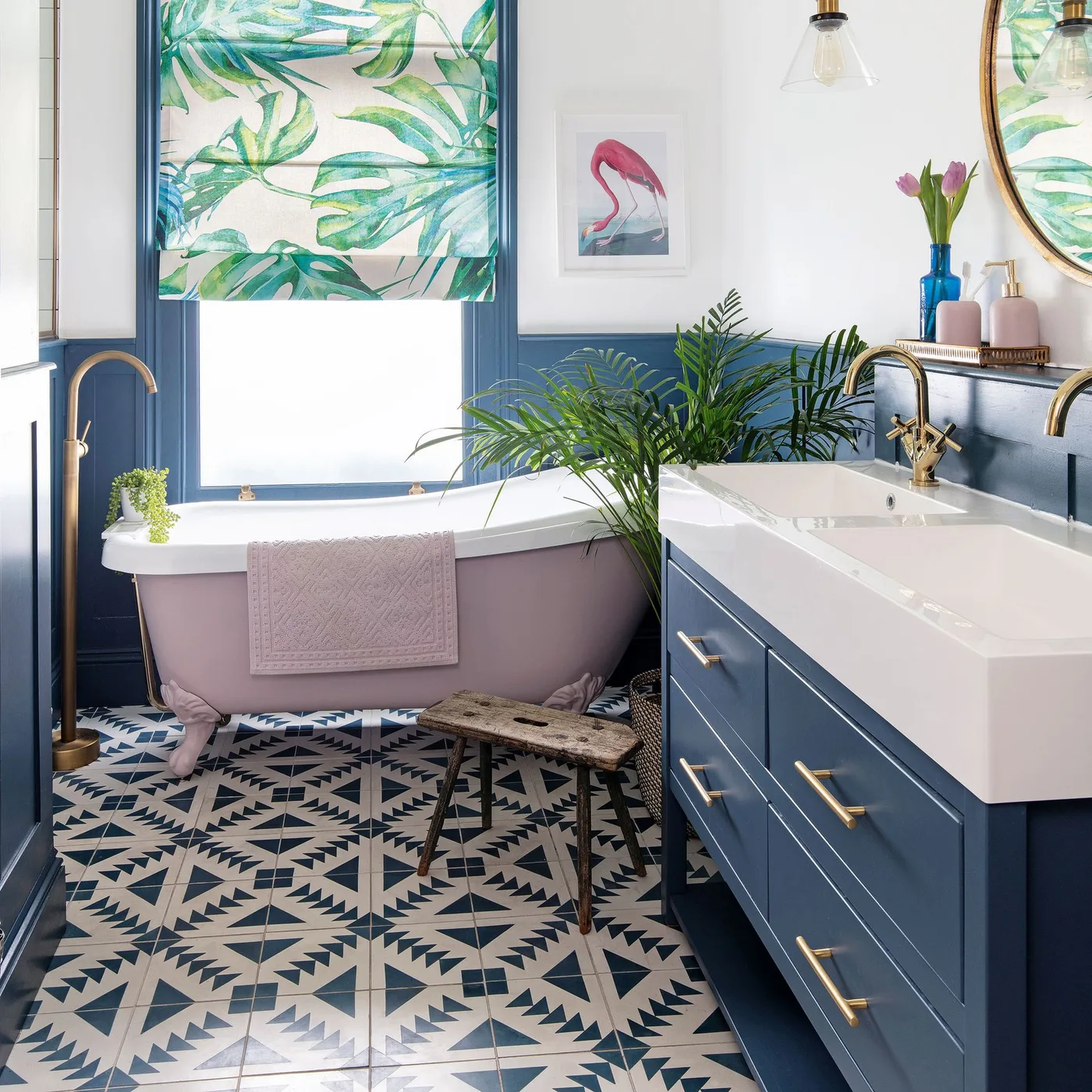
Balance a Blue Vanity with a Pink Bath
 SaveSupport Non AI Creator
Image credit: Future
The blue vanity and lower walls establish the room’s darker color, while a pink bath introduces a gentler contrast. Pale walls above the paneling and a white sink counter keep the combination from becoming too heavy. The patterned floor repeats blue and white, tying the vanity to the rest of the bathroom rather than leaving it isolated.
If you want two strong fixture colors, choose one to repeat elsewhere and let the other remain a smaller feature. Compare the pink and blue together before repainting a bath or ordering furniture. Check that any bath coating is suitable for its actual substrate, and keep the vanity’s drawer and door movement clear of the tub and nearby seating.
IDEA 07 / 20
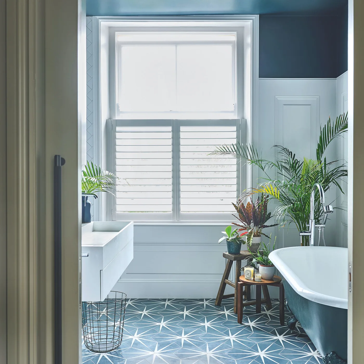
Keep the Window Trim Bright
 SaveSupport Non AI Creator
Image credit: Future PLC
Dark blue above the paneling frames the white window and gives this bathroom a clear light-dark division. The pale lower walls make the bath and vanity easier to distinguish, while a blue patterned floor connects with the color overhead. Plants add softer shapes around the window, where the strongest daylight enters the room.
Use white trim deliberately when you want navy walls to retain a crisp edge. Compare the trim white with the bath and sink so several near-whites do not look unintentionally mismatched. Keep plants and stools clear of the route to the bath, and choose a window treatment that provides the privacy you need without blocking its operating hardware.
IDEA 08 / 20
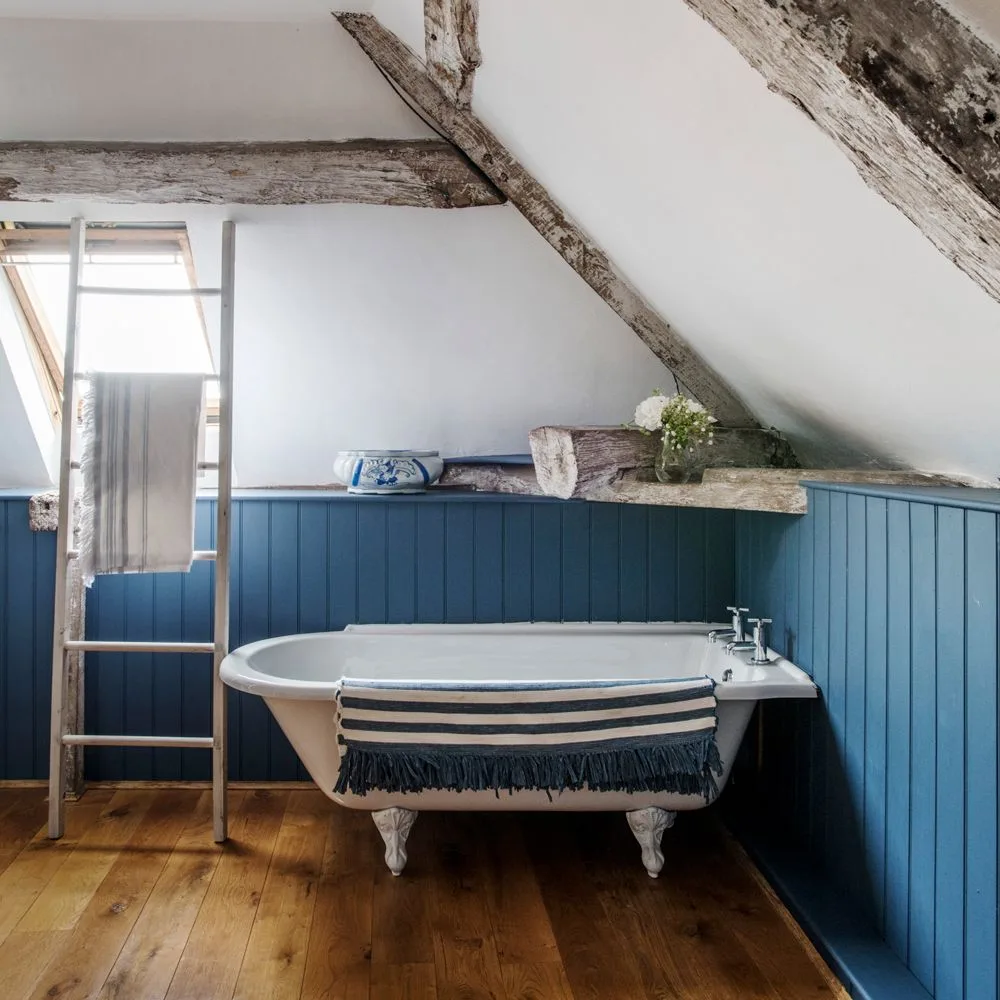
Paint the Lower Wall Beneath Exposed Beams
 SaveSupport Non AI Creator
Image credit: Future PLC/Polly Eltes
Blue lower paneling brings a darker band to this attic bathroom without painting the sloping ceiling. The white bath stands out against it, while exposed beams and a wood-toned floor give the room warmer texture. A simple towel ladder uses the taller part of the wall, leaving the space immediately above the bath relatively open.
In an attic, test the paneling height against both the lower eaves and the tallest wall before choosing a finish. A consistent blue line can connect uneven architecture, but it should not conceal access points. Check standing headroom and towel reach in person, and specify wall and floor finishes for the moisture conditions rather than copying the photograph’s appearance alone.
IDEA 09 / 20
Frame a Shared Sink Area with Blue
 SaveSupport Non AI Creator
Image credit: Future PLC/ Polly Eltes
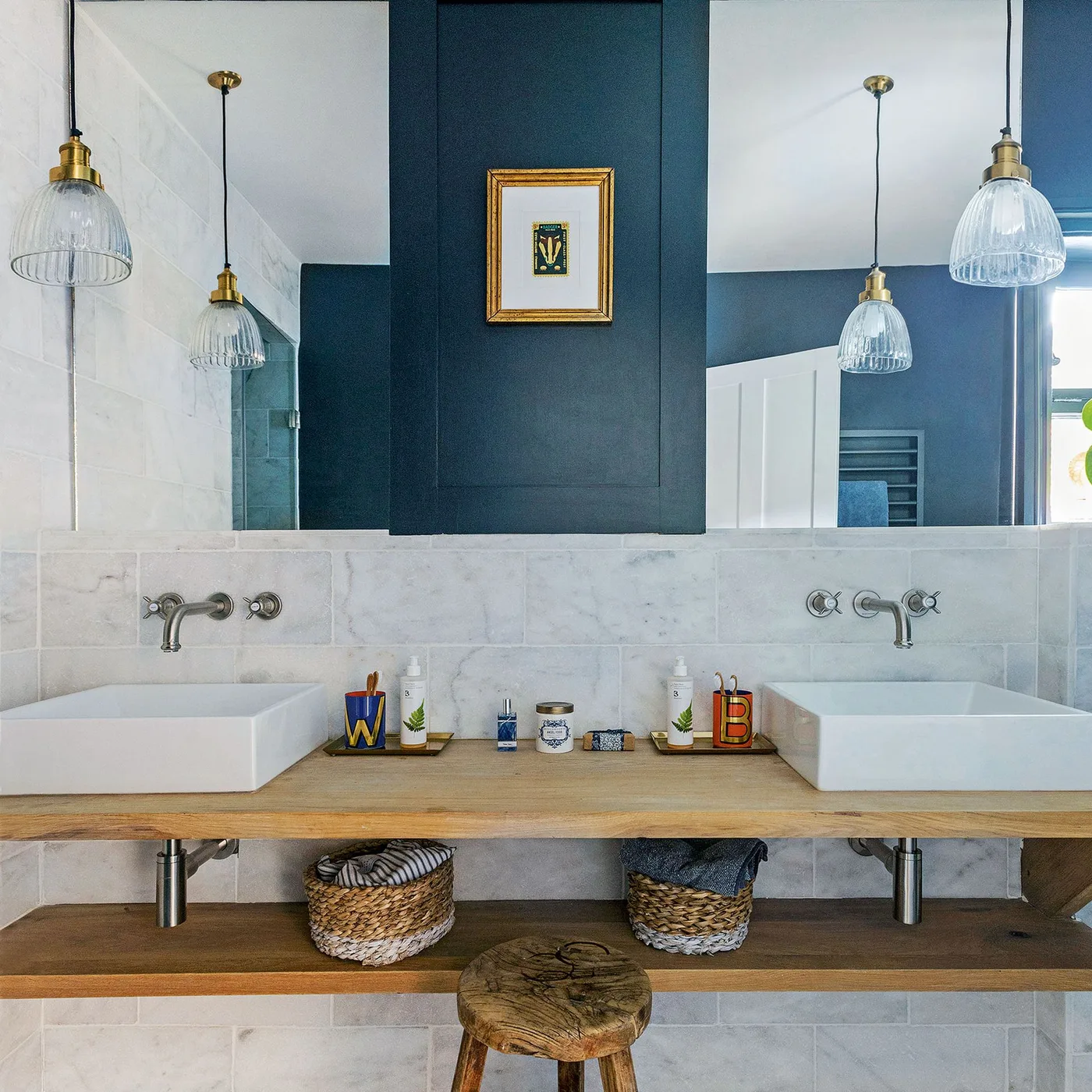
A deep blue central wall introduces color between the mirrored sections above this shared sink counter. White basins and pale wall tiles keep the washing area bright, while the wooden shelves supply warmth and open storage. The mirrors extend the view, making the blue feature visible from more than one angle rather than hiding it behind a single cabinet.
A shared vanity needs useful space around each basin as well as an attractive color arrangement. Check elbow room, mirror placement and where everyday toiletries will sit before deciding on vessel sinks. Protect any timber surface as its supplier recommends, and account for the additional cleaning around basin bases and exposed shelves when comparing this approach with enclosed storage.
IDEA 10 / 20
Let Glossy Navy Tiles Catch the Light
 SaveSupport Non AI Creator
Image credit: Tile Giant
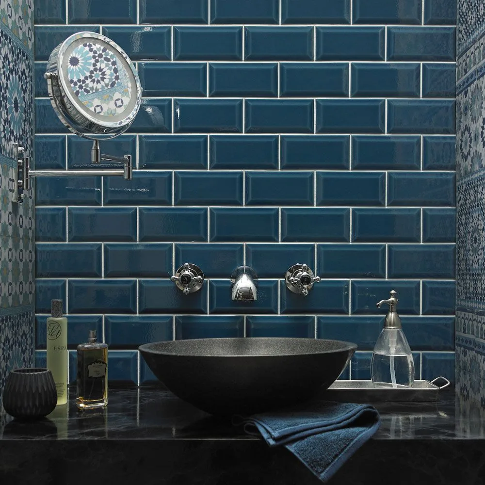
Glossy dark blue tiles create a defined background for the wall-mounted tap and dark vessel sink. Their edges and reflections make the tile arrangement visible even though the palette is deep. Patterned surfaces at the sides introduce lighter details, while the counter remains restrained enough to give the sink and blue wall a clear focus.
Gloss can make a dark wall more lively, but it may also emphasize limescale and water spots around the sink. View the tile sample under a light positioned similarly to your planned fixture. Keep the counter easy to wipe, choose compatible grout, and check the tap’s reach with the selected basin so water falls where it should.
PART 03
Color combinations and personal detail
IDEA 11 / 20
Soften Navy Storage with Peach Walls
 SaveSupport Non AI Creator
Image credit: James French
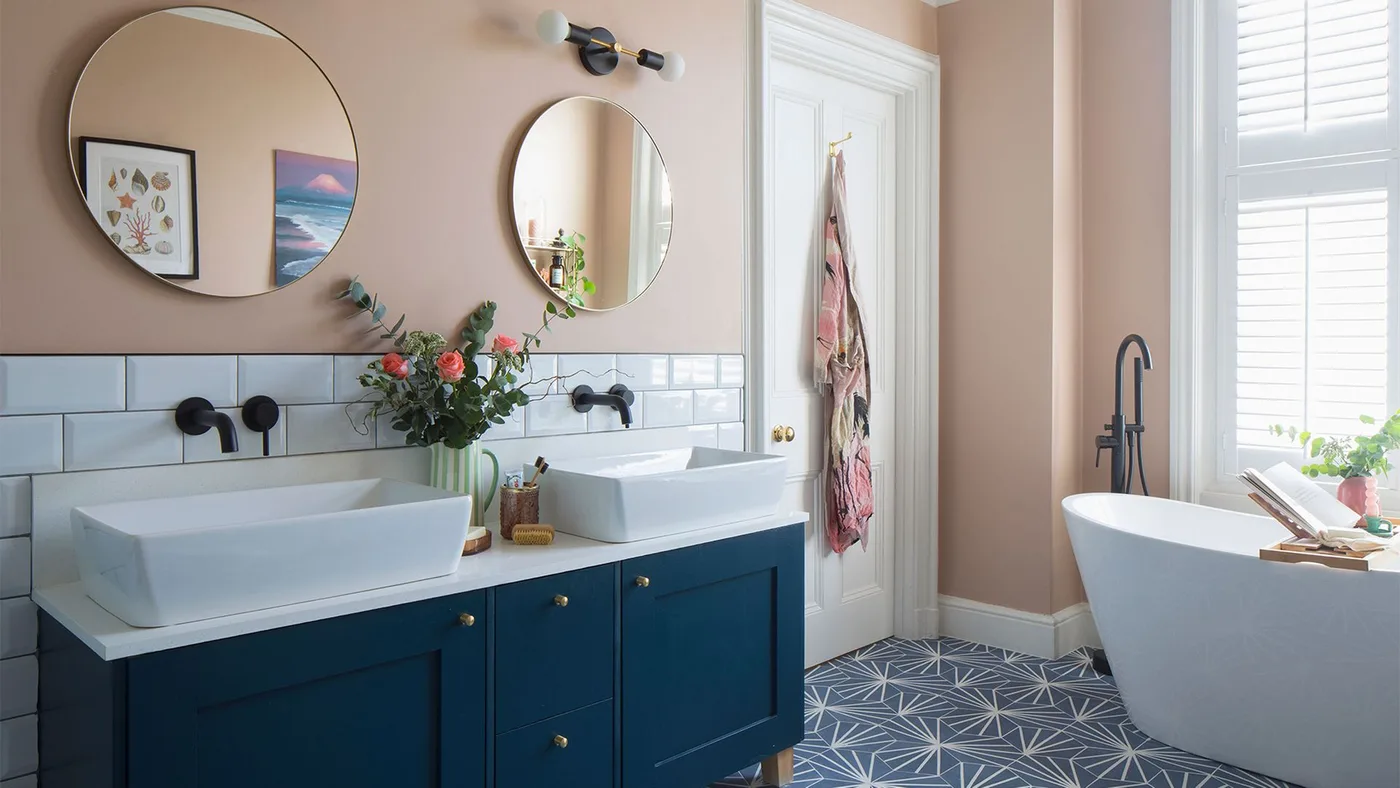
The navy double vanity grounds a bathroom otherwise finished with peach walls, white tiles and a white bath. Round mirrors soften the horizontal row of drawers and doors, while the patterned floor repeats a cooler blue tone. The warm wall color is concentrated above the backsplash, giving the sink area a clear boundary without painting every surface navy.
Peach and navy work best when their undertones are checked together in the room. Start with the vanity color if it is fixed, then test wall samples beside the tiles. Make sure both mirrors suit the people using the sinks and provide useful face-level lighting; a soft palette cannot make an awkwardly lit morning routine comfortable.
IDEA 12 / 20
Keep White Tile Below an Inky Wall
 SaveSupport Non AI Creator
Image credit: Future PLC/ Chris Snook
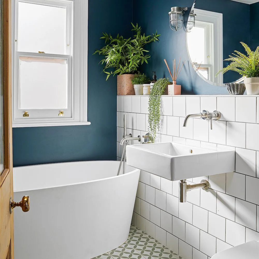
The inky blue upper wall makes the window and white tile band stand out clearly. A wall-mounted sink leaves more of the tiled surface visible, while small plants on the ledge add detail without several new colors. The bath remains white, showing how dark blue can transform an existing pale fixture combination through the wall finish.
If your white tiles are staying, paint is a practical way to try a darker scheme without replacing the whole room. Check the existing wall condition, prepare it properly and use a finish recommended for the location. Keep the ledge accessible for cleaning, and select plants for the room’s actual daylight rather than assuming every bathroom plant will thrive.
IDEA 13 / 20
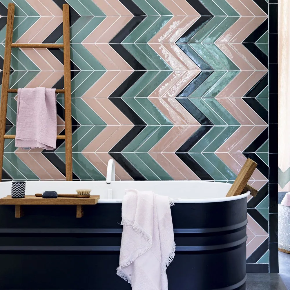
Make the Bath the Navy Accent
 SaveSupport Non AI Creator
Image credit: Future PLC/ Simon Brown
The navy bath supplies a broad dark accent beneath a colorful chevron wall. Pink and muted green tiles keep the background varied, while narrow dark stripes connect the pattern with the bath exterior. Pale towels and a wooden ladder introduce quieter elements, allowing the combination to feel layered without adding another large painted surface.
When the wall pattern already contains several colors, choose a bath finish from one of its darker tones instead of introducing a new shade. Plan the tile layout around the tub’s position so the pattern reads clearly above it. Keep towels and freestanding storage clear of wet walking routes, and verify that decorative bath finishes meet the manufacturer’s care requirements.
IDEA 14 / 20
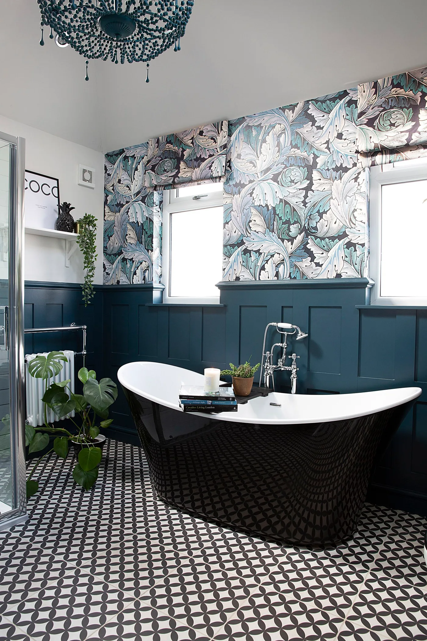
Ground Floral Wallpaper with Dark Blue Panels
 SaveSupport Non AI Creator
Image credit: Katie Lee © Future
Dark blue paneling gives the floral wallpaper a steady base, while the white window frames divide the busier upper wall. A black bath and a small-scale patterned floor add depth without introducing another bright color. The plain blue band is useful here because it separates two decorative patterns that would otherwise meet across the whole room.
Choose one pattern to lead and give the other a smaller scale or quieter palette. Try wallpaper and floor samples together before ordering, then check the blue paint against both. Select finishes suitable for the bathroom’s moisture exposure and keep the bath area easy to clean; a richly decorated room still benefits from practical space around its fixtures.
IDEA 15 / 20
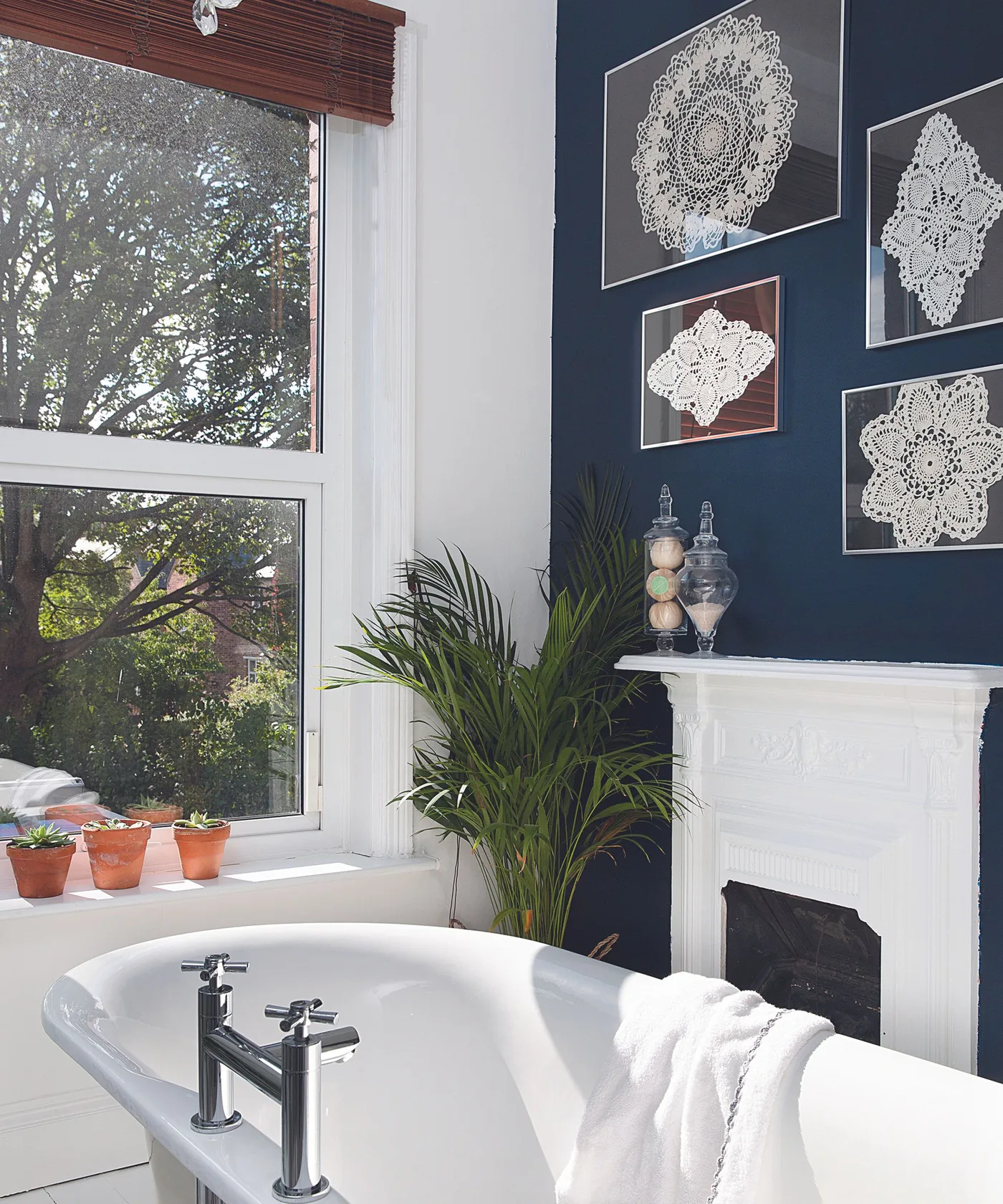
Use a Navy Wall to Display Pale Artwork
 SaveSupport Non AI Creator
Image credit: Future
The navy wall provides strong contrast for a group of pale framed pieces above the white fireplace surround. White window trim and the bath repeat that lighter tone, while a tall plant softens the corner between them. The arrangement uses dark blue as a backdrop for personal decoration rather than making every fixture dark as well.
Choose artwork that can tolerate the room’s humidity, and use securely fixed frames rather than loose pieces balanced beside the bath. Check reflections from the window before deciding on glazing. Treat the fireplace in this photograph as a visual feature only: if yours is operational, keep combustible decorations outside the appliance’s specified clearances and have its condition assessed appropriately.
PART 04
Doors, fixtures and patterned accents
IDEA 16 / 20
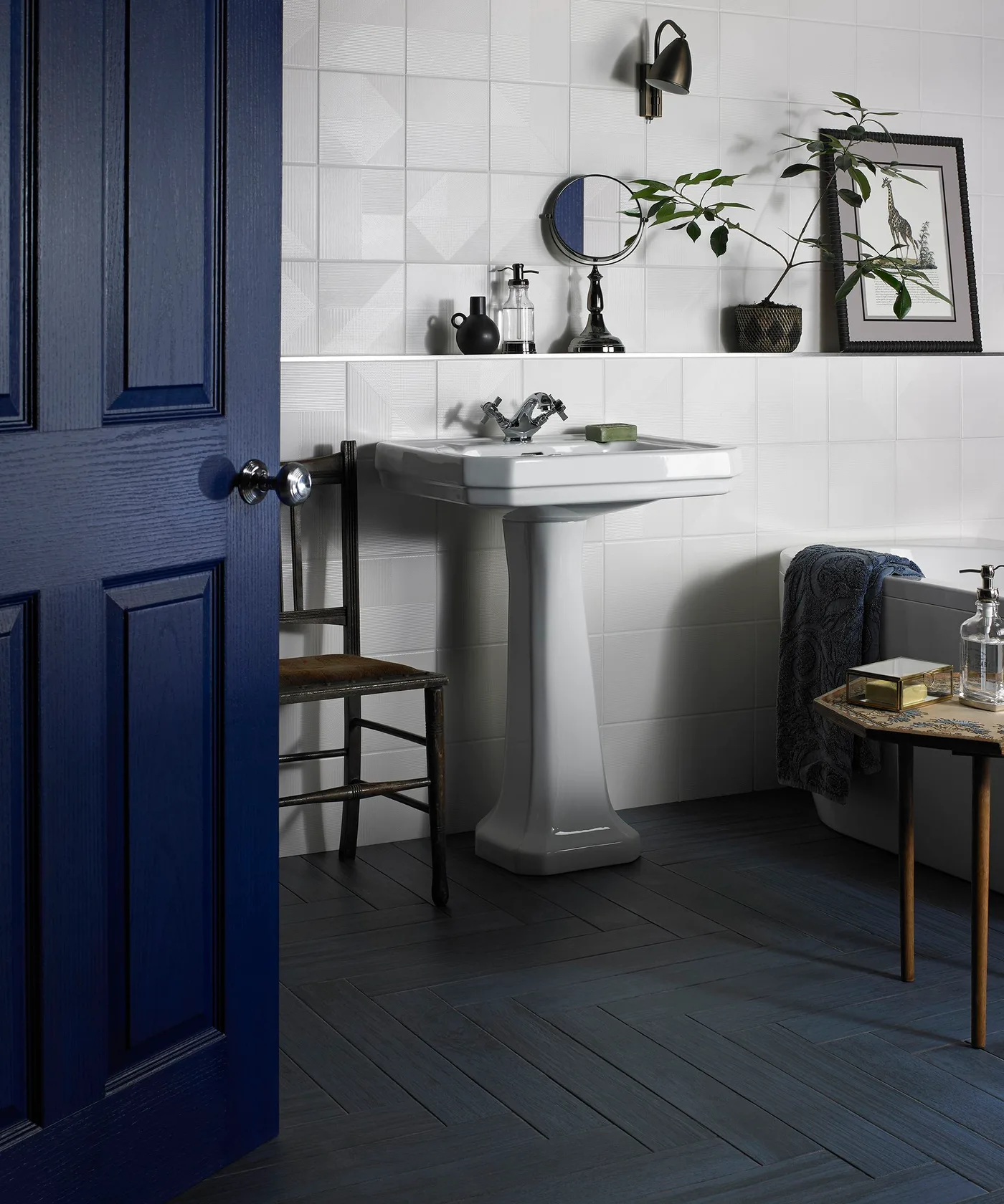
Start with a Navy Bathroom Door
 SaveSupport Non AI Creator
Image credit: Walls and Floors
A navy door introduces a clear dark-blue element to this mostly white bathroom. The dark floor and small black accessories connect with it, while the white pedestal sink and tile wall keep the interior light. The door’s panels add detail without needing a large patterned wall, making the color noticeable from the adjoining room as well.
Painting the door is a manageable way to test navy if you are undecided about covering the walls. Compare its appearance from both sides and choose a finish suitable for the door surface. Keep hinges, latch operation and ventilation provisions working properly, and check how much clearance the open door leaves around a stool or other freestanding furniture.
IDEA 17 / 20
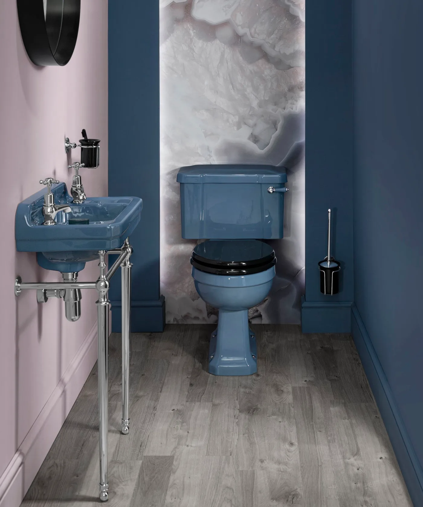
Repeat Blue Around Colored Fixtures
 SaveSupport Non AI Creator
Image credit: Original Style
The blue toilet and basin are set against related blue wall sections, creating a coordinated corner rather than two isolated colored fixtures. Pale pink and veined white surfaces provide lighter contrast beside them. Exposed silver-colored fittings and the dark toilet seat add small sharp details, while the blue background keeps the fixture colors visually connected.
When retaining colored sanitaryware, take its actual shade as your starting point and compare wall samples directly beside it. A close match may work, but a deliberate darker or lighter blue can be easier than chasing an exact one. Check replacement parts and maintenance requirements before committing to unusual fixtures, and keep access to fittings practical for future servicing.
IDEA 18 / 20
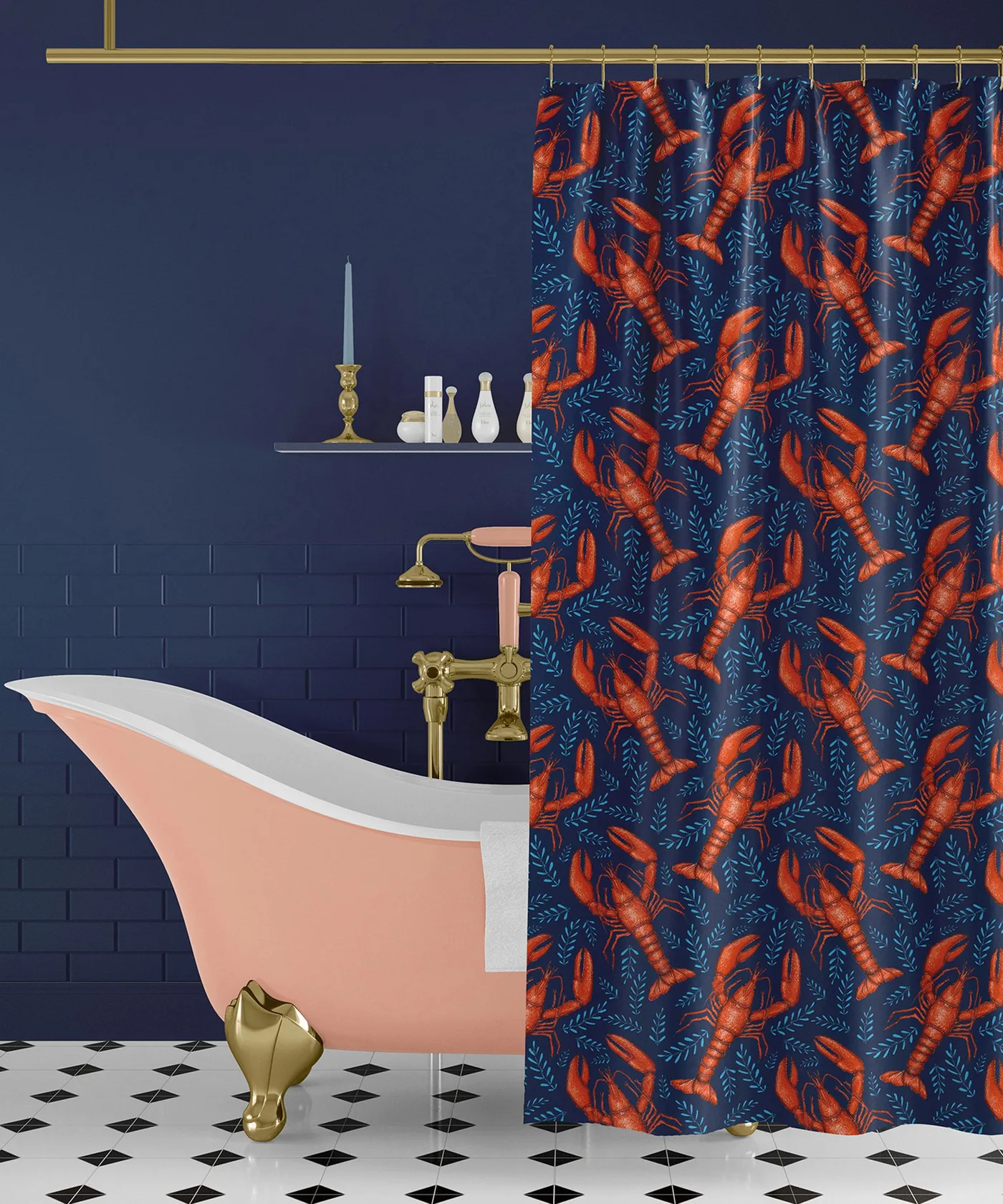
Add a Playful Curtain Against Navy
 SaveSupport Non AI Creator
Image credit: Rockport riches
Navy walls create a steady backdrop for the lobster-patterned shower curtain and pale pink bath. The curtain repeats dark blue while adding orange, making it the liveliest part of the combination. Gold-colored fittings provide a warmer accent, and the pale floor prevents the lower part of the room from becoming another large dark surface.
A shower curtain can introduce pattern without the commitment of a tiled feature wall. Choose one with the right dimensions and care instructions for your shower arrangement, including a suitable liner where required. Let it dry after use and keep the hem positioned to contain splashes; the decorative fabric and wall color should support a workable bathing setup.
IDEA 19 / 20
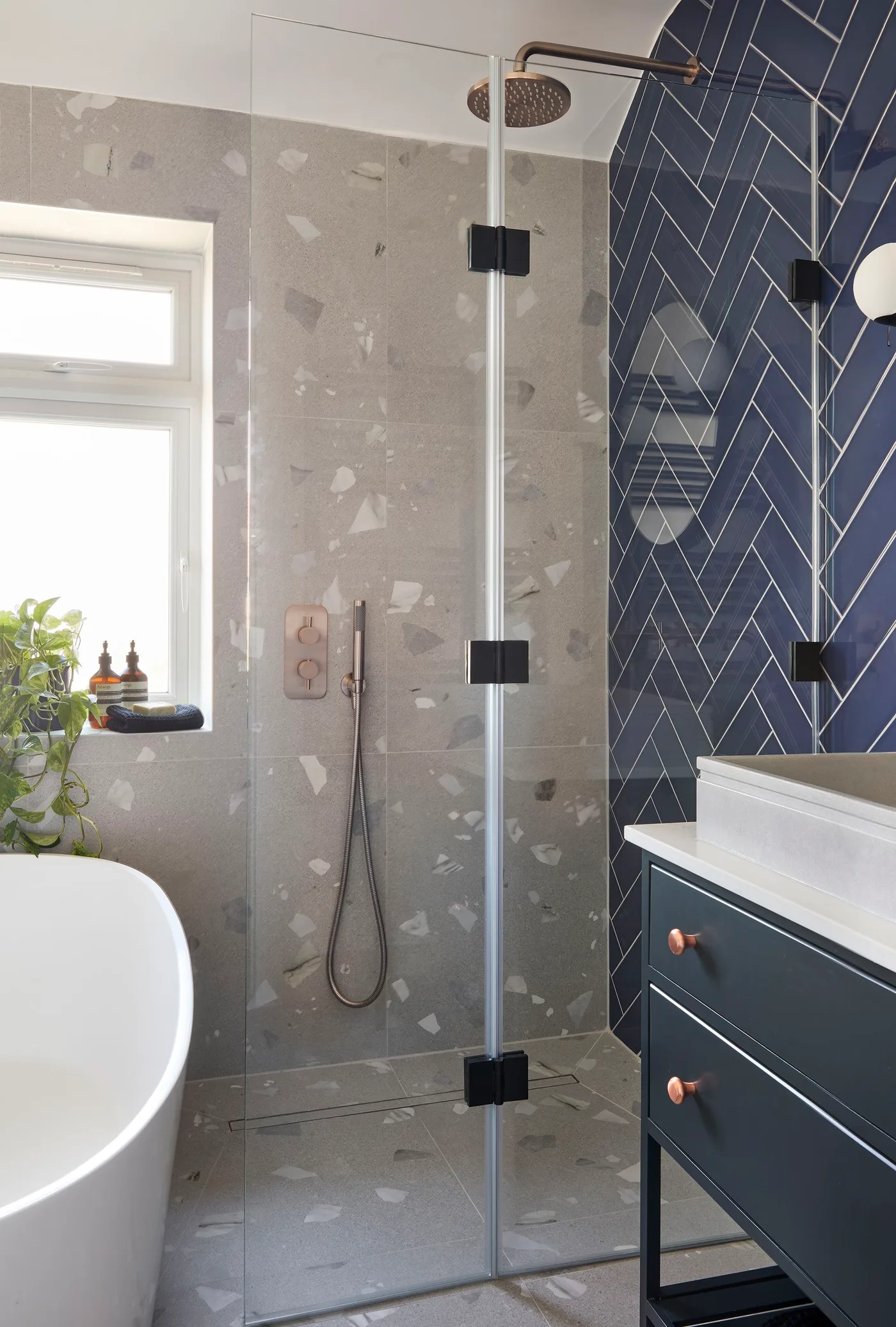
Contrast Navy Herringbone with a Pale Shower Wall
 SaveSupport Non AI Creator
Image credit: Simply bathrooms / BC Designs
Navy herringbone tiles create a patterned feature beside the paler shower wall, with a dark vanity carrying the color below. Light grout outlines the diagonal layout, while the glass enclosure allows both finishes to remain visible. Small warm-colored handles add a restrained accent, giving the navy wall detail without another strongly patterned surface nearby.
Use a sample board to judge the herringbone pattern and grout color at more than arm’s length. Pale grout makes every joint noticeable, so layout and edge cuts deserve planning. Confirm waterproofing, fixture positions and service access with the installer before tile work begins; glass makes a finish visible but does not reduce the need for careful construction behind it.
IDEA 20 / 20
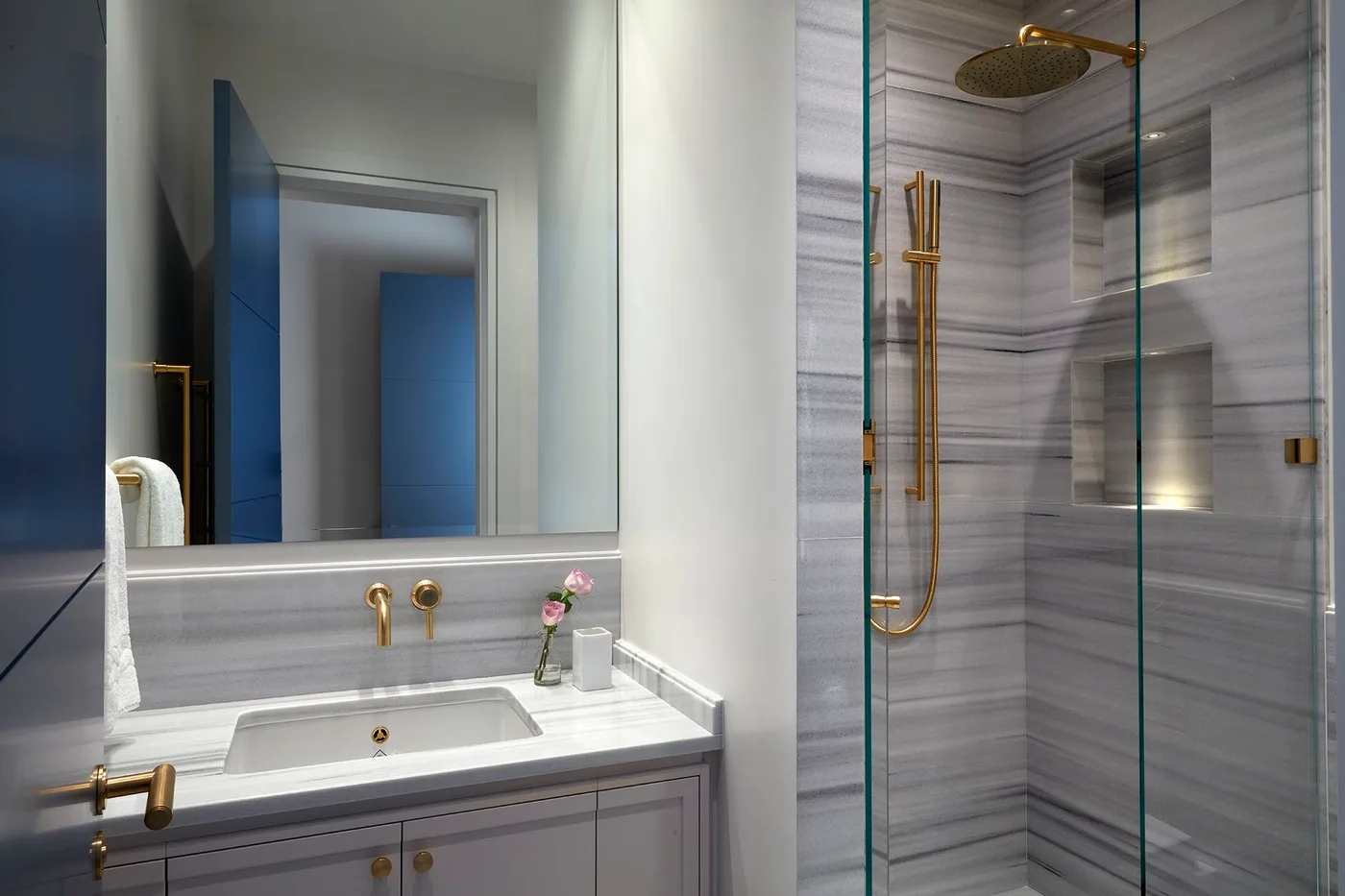
Use Navy as an Accent Beside Gray Tile
 SaveSupport Non AI Creator
Image credit: K&H Design
The navy door provides a concentrated blue accent within a bathroom dominated by gray veined tiles and a pale vanity. Its reflection repeats the color above the sink, so the accent is visible from more than one position. Warm-colored taps and shower fittings add another small contrast without changing the room’s largely restrained surfaces.
If your bathroom already has extensive gray tile, a navy door or other painted element can add depth while keeping the existing surfaces. Test the blue against the tile’s undertone and view it in the mirror as well as directly. Coordinate any replacement hardware by function and compatibility first, using its finish to connect the room once the practical choices are settled.
BRING IT ALL TOGETHER
Choose where the dark blue belongs
Decide whether blue will be the backdrop or the accent before buying fixtures and finishes. A painted door can update an otherwise pale room, while navy tile or paneling makes a more substantial commitment. Compare the blue with the actual whites, grays and warm finishes you plan to keep, including how they appear in the mirror.
Plan everyday use alongside the palette. Keep useful face-level lighting, accessible storage and clear movement around the bath. Confirm that wall coverings, paint, flooring and fittings are appropriate for their location and moisture exposure, then follow their installation and care instructions rather than assuming every attractive photographed arrangement will suit your bathroom.