Boho wallpaper can give a room a starting palette as well as a pattern. Leafy shapes, small florals, loose abstract lines or a mural can sit beside woven furniture and personal artwork, but their scale matters as much as the colors. Compare the paper with the furniture you intend to keep before choosing a wall to cover.
These bedroom and sitting-room photographs show different ways to place pattern around useful furniture. Some use a stronger feature behind the bed or sofa, while others repeat smaller motifs around the room. Test samples in daylight and evening light, check the actual wall condition and product instructions, and keep the furniture arrangement comfortable before adding further fabric patterns.
PART 01
Use leaves to establish a warmer palette
IDEA 01 / 20
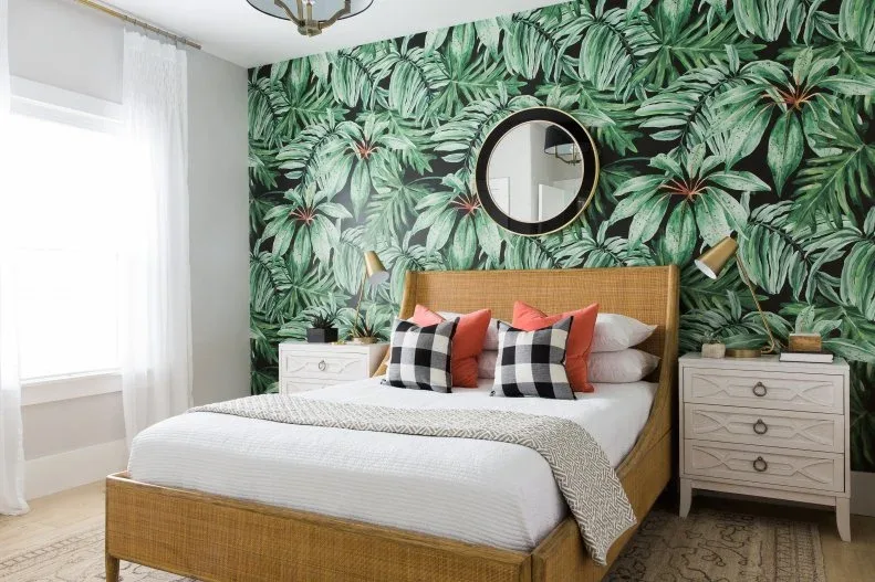
Make dense leaves the bed wall’s main feature
 SaveSupport Non AI Creator
Image credit: Photo: Travis J Photography. From: Mollie Openshaw
Dense green foliage fills the bed wall, with its overlapping leaves providing most of the room’s pattern. The warm woven headboard sits clearly in front, while white bedding gives the eye a simpler area below. Red and checked pillows are smaller contrasting details, showing how a leafy paper can set the room’s character without covering every surrounding fabric in another botanical print.
View several repeats together before ordering a dense leaf design, checking what the headboard and bedside furniture will hide. Compare its green tones with the actual bedding rather than matching from a screen. Keep enough simpler fabric visible for the leaves to remain readable, and use product-specific measuring and preparation instructions when planning the patterned wall behind the bed.
IDEA 02 / 20
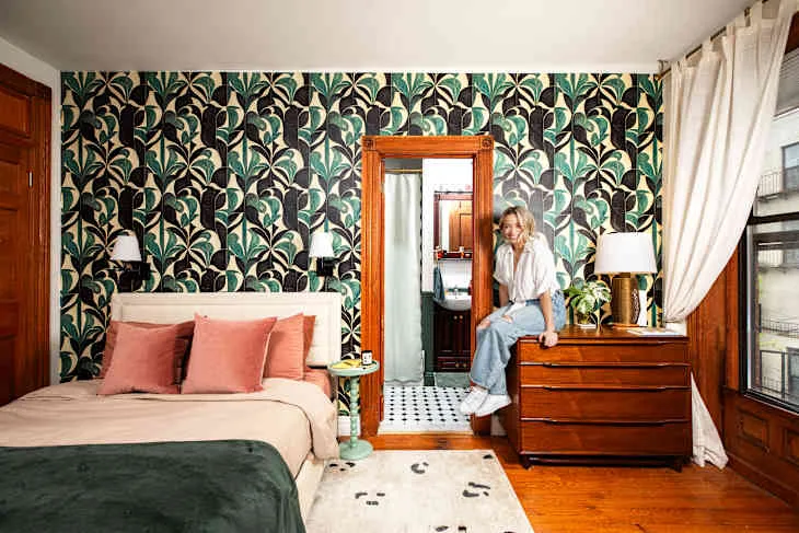
Connect a dark botanical repeat with warm wooden storage
 SaveSupport Non AI Creator
Image credit: Kiritin
A dark botanical repeat gives the bedroom a continuous patterned background around both the bed and dresser. Warm wooden storage stands clearly against it, while pink cushions introduce a larger softer color block below. The green throw connects with the leaves without repeating their shape, giving the paper a stronger role than another matching fabric would provide across the whole bed.
Compare a sample beside the actual dresser and mirror frame to see whether the darker background helps their outlines show. Check how the pattern continues around a doorway or corner before deciding the wall coverage. Retain simpler bedding when the repeat is already busy, and choose the paper according to its cleaning guidance as well as the color relationship you prefer.
IDEA 03 / 20
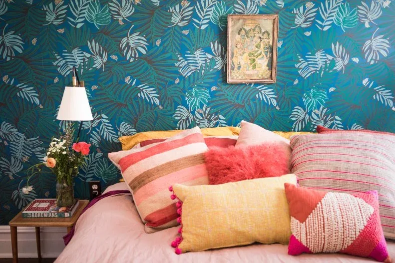
Choose a cooler leaf background for warmer fabric colors
 SaveSupport Non AI Creator
Image credit: Photo: Faith Blakeney. From: Faith Blakeney
Blue and green leaves provide a cooler backdrop for the warmer pink and yellow bedding. The paper’s overlapping foliage is finer than the larger pillow colors, while the white lampshade keeps a clear bedside outline against the print. The wooden table adds warmth without another large pattern, letting the wallpaper connect the room’s colors while the fabrics remain separately visible.
Place the sample beside the pink or yellow fabrics you already own and assess it under the bedside lamp as well as daylight. Check the repeat around the headboard and table before calculating coverage. Reduce smaller bedding patterns if they compete with the leaves, and retain a useful lamp and bedside surface rather than letting the paper determine an impractical furniture position.
IDEA 04 / 20
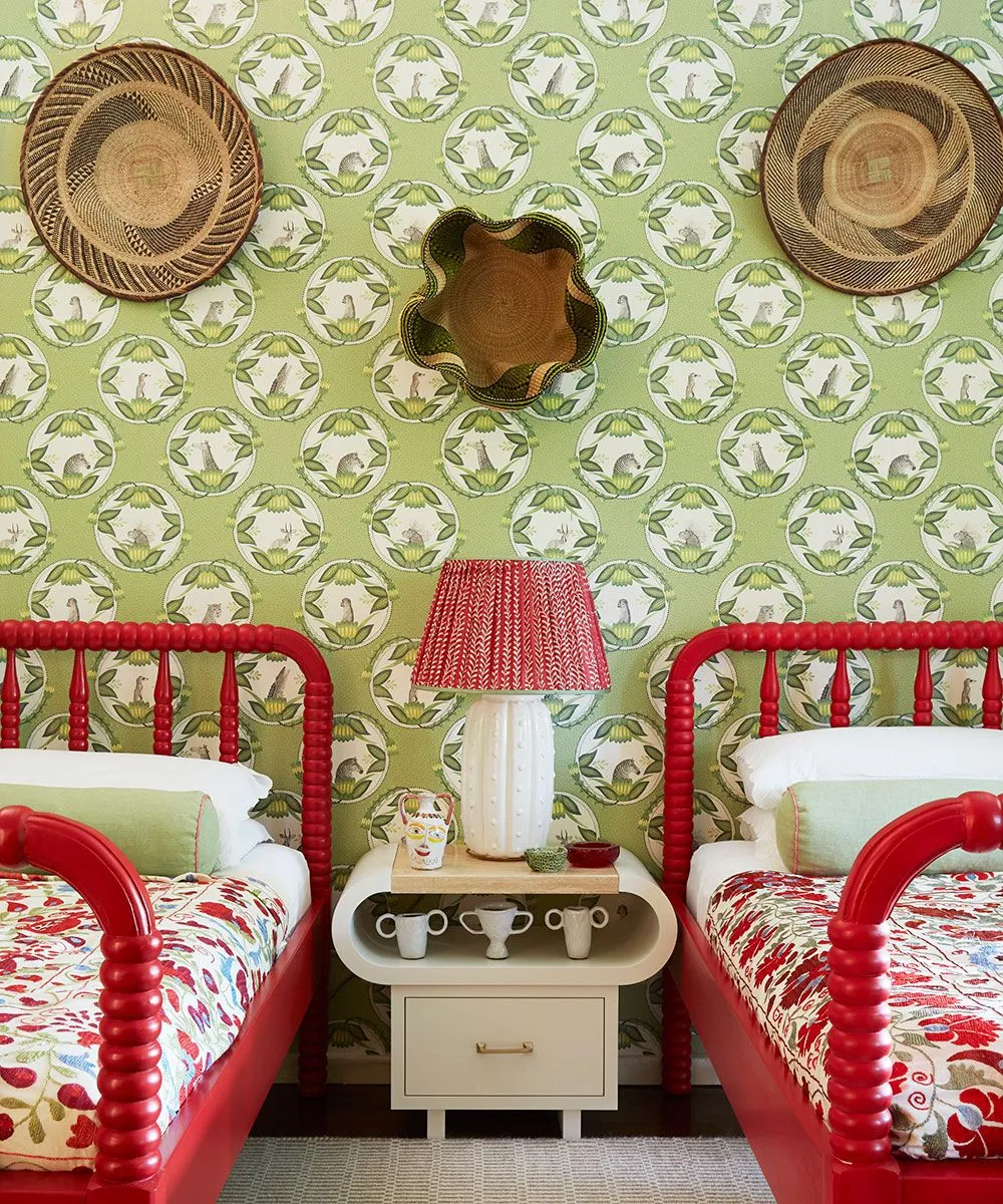
Use smaller botanical loops behind brighter bed frames
 SaveSupport Non AI Creator
Image credit: Alecia Neo
Smaller botanical loops create a repeating green background behind the brighter red bed frames. The furniture remains easy to distinguish because its red outlines are broader than the wall motifs. Woven hats and a compact mirror introduce different shapes above, while the pale central cabinet gives the wall and bedding a quieter dividing area within the mixed pattern arrangement.
Compare the small repeat with the width of both beds and the shared furniture before choosing wall coverage. Test red paint or fabric beside the paper to check how strong the contrast becomes in your room. Keep the wall display securely fitted and leave some print visible between objects, rather than filling the background until its smaller botanical shape is lost.
IDEA 05 / 20
Give a lighter leafy panel a clear framed position
 SaveSupport Non AI Creator
Image credit: Future / Chris Everard / Alyce Taylor
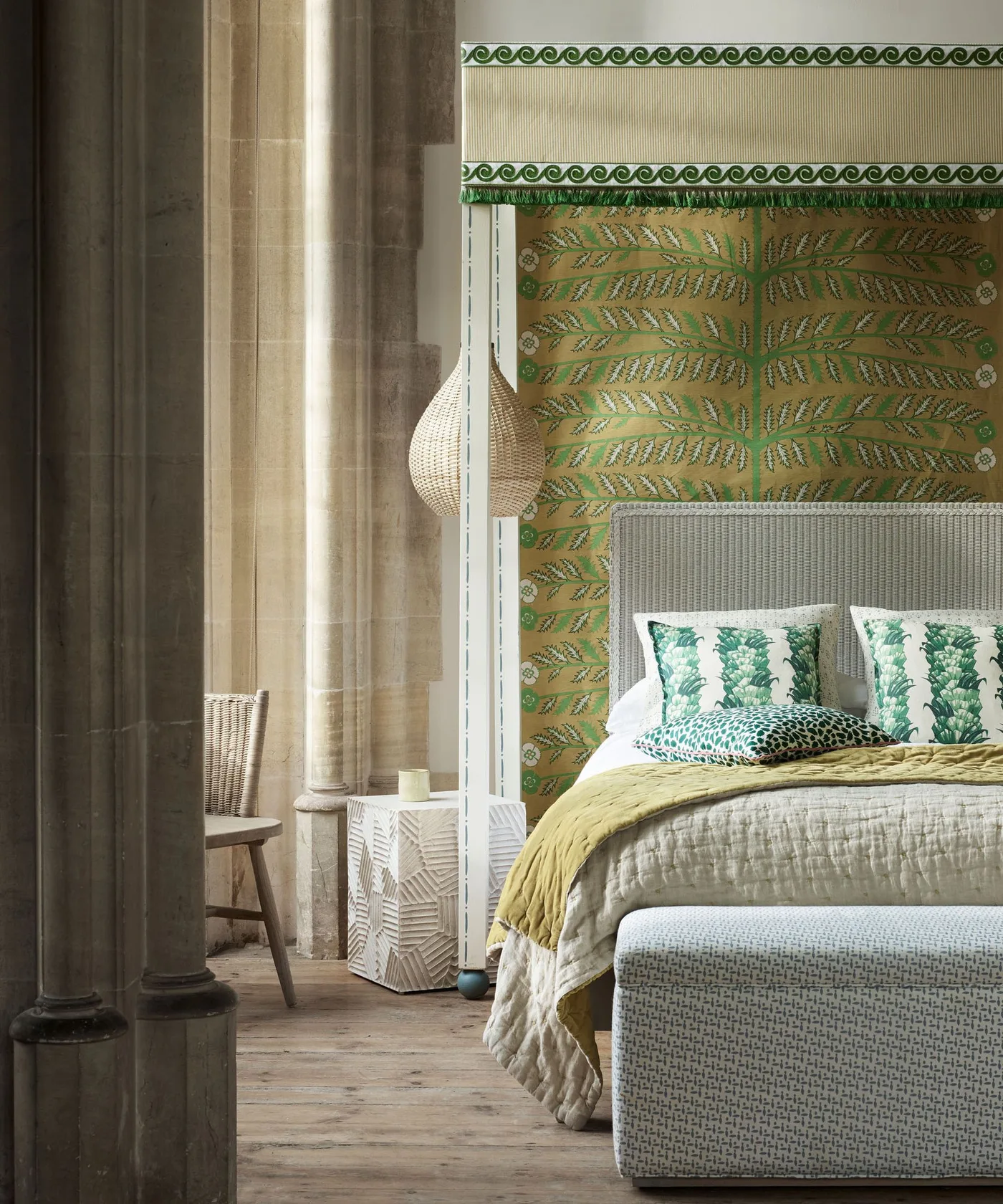
A green-and-gold leafy panel forms a defined backdrop behind the pale headboard. The larger surrounding fabric areas remain softer, with green pillow details carrying a selected color down to the bed. A mustard cover adds warmth below, showing how a bounded botanical feature can provide boho character without placing the same busy leaf repeat across every visible wall surface.
Plan the panel’s width and edges around the actual headboard and nearby fittings before ordering. Compare the gold and green tones with fabrics under your room’s light, keeping the surrounding surfaces quieter when the panel has strong detail. Check the wall and product instructions for the installation you intend, and avoid treating a framed appearance as evidence that a simpler fixing method will suffice.
PART 02
Compare floral repeats with the furniture
IDEA 06 / 20
Try larger roses beside a finer headboard print
 SaveSupport Non AI Creator
Image credit: Future
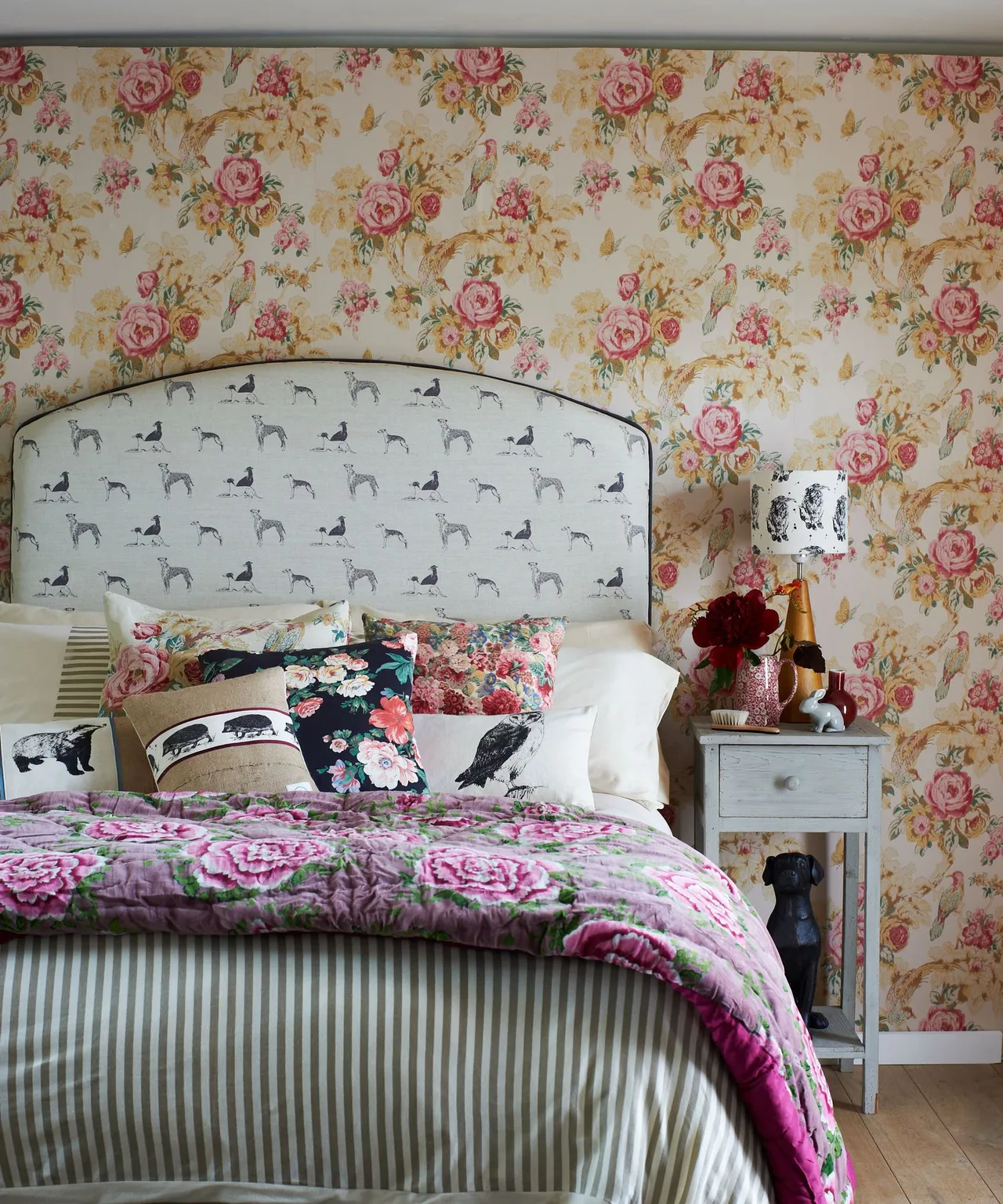
Larger roses cover the wall while finer animal motifs sit within the curved headboard. The patterns remain separately visible because their scale and backgrounds differ, with pink carried through several lower fabric layers. Stripes at the bed’s base introduce a clearer directional repeat, making the wallpaper part of a mixed room rather than requiring every fabric to show the same rose design.
Compare the actual wallpaper and upholstery repeats together before adding a floral bedcover. Leave a simpler sheet or pillow area if the combined prints become difficult to read. Check where large roses land around the headboard and corners, accounting for the product’s repeat in your quantity calculation rather than assuming every strip can begin wherever the wall leaves space.
IDEA 07 / 20
Use a dark floral paper around a lighter dressing area
 SaveSupport Non AI Creator
Image credit: Future / Jan Baldwin
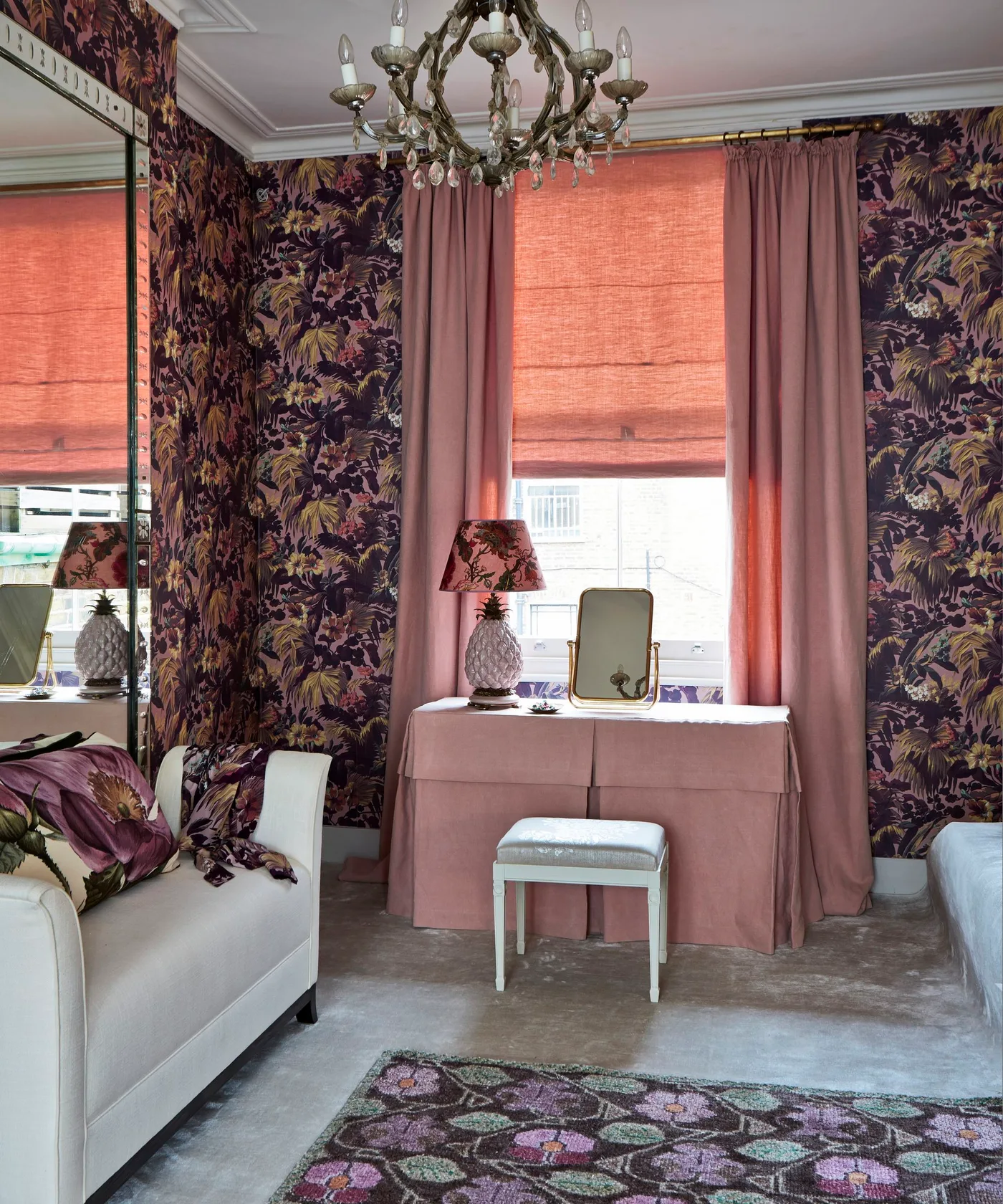
Dark floral pattern surrounds the lighter pink dressing area, making the table and stool easier to distinguish from the walls. Pink curtains repeat a selected tone on a broader fabric surface, while the mirror introduces a quieter reflective area beside the print. The wallpaper provides most of the botanical detail, leaving the table’s simpler outline visible within the more elaborate surrounding room.
View the sample near the window and mirror to assess its reflected appearance as well as its direct color. Keep useful light at the dressing surface and compare darker tones under evening lighting. Plan seams around openings according to the paper’s instructions, retaining access to the curtains and table so the stronger floral background supports a practical dressing corner.
IDEA 08 / 20
Let a softer floral background surround woven texture
 SaveSupport Non AI Creator
Image credit: Future
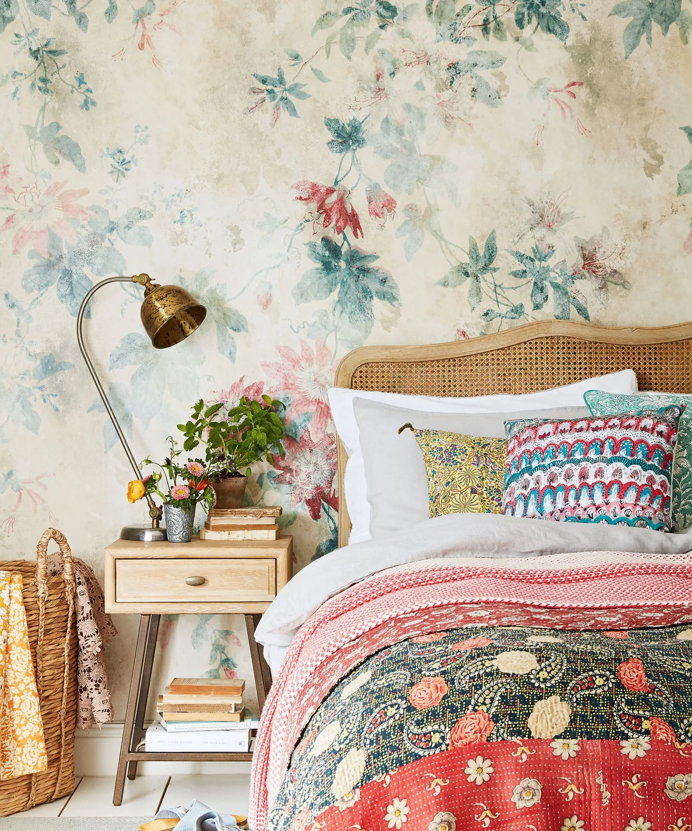
A softer floral background gives this bedroom color without turning the wall into a dark solid feature. The woven headboard keeps a warm textured outline in front, while smaller fabric patterns carry related tones across the bed. The wooden nightstand and curved lamp provide clearer neighboring shapes, leaving the paper’s flowers visible above rather than covering the entire wall with additional objects.
Compare a large sample with the bedding you plan to retain, checking whether the paler flowers remain visible under your actual lighting. Choose which fabric will carry the stronger repeat and keep some simpler areas between them. Follow the paper’s preparation and care guidance, and leave the reading light positioned for use instead of moving it solely to reveal another section of wallpaper.
IDEA 09 / 20
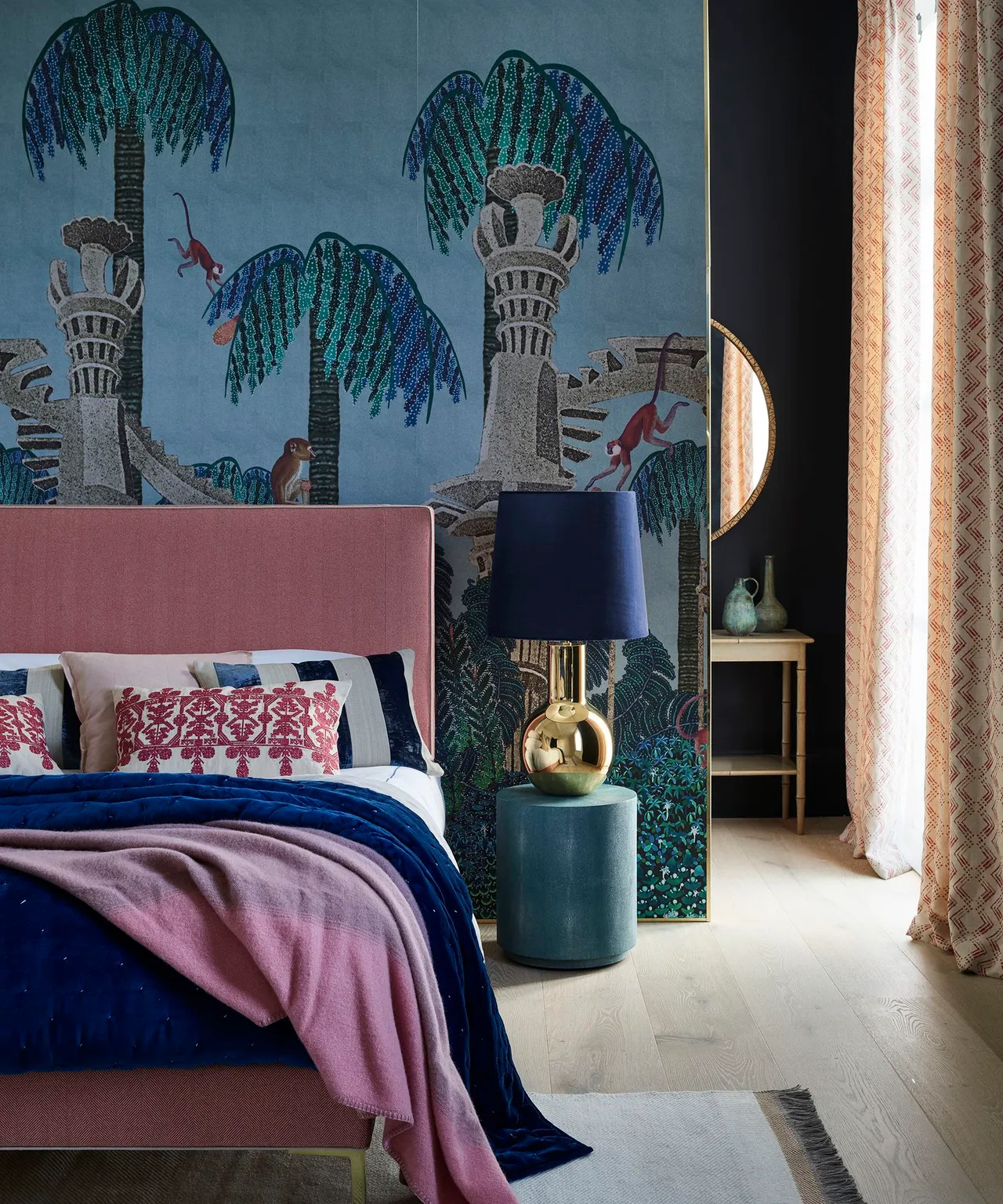
Place a larger tree mural around a simpler headboard
 SaveSupport Non AI Creator
Image credit: Future / Jake Curtis
Oversized trees turn the wall into a larger picture behind the simpler pink headboard. Blue bedding repeats the mural background below, while the teal table adds another related color at the side. The curtain’s finer print gives a different pattern scale near the window, showing how a mural can provide the main room feature while the furniture keeps clear surrounding outlines.
Plan the mural dimensions with the real headboard, door and corner positions so important parts of the picture do not disappear unintentionally. Compare a sample or accurate layout with the curtain before ordering. Check whether the product is supplied as fixed panels and follow its sequencing instructions, retaining useful bedside lighting and access rather than arranging furniture only around the picture.
IDEA 10 / 20
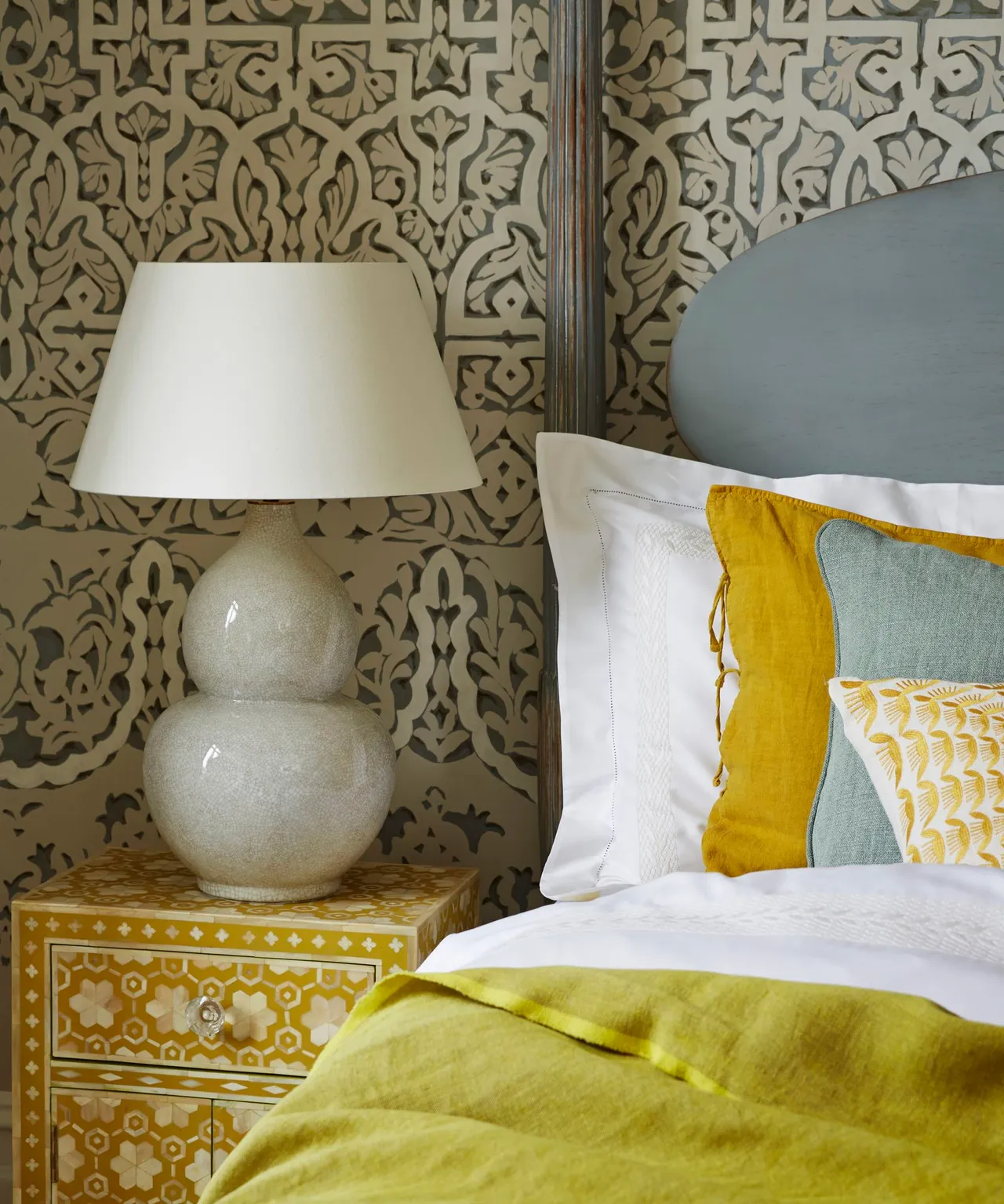
Keep a scrolling pattern quieter through restrained colors
 SaveSupport Non AI Creator
Image credit: Future / Jan Baldwin
A scrolling repeat brings detailed pattern behind the quieter gray headboard and lamp. The pale wall background stops the darker motifs from becoming a solid block, while yellow furniture and fabric add warmer accents below. Different pillow colors remain broad and simple beside the finer wallpaper, giving the room a layered character without requiring several equally detailed fabric designs.
Compare the scrolling repeat with the headboard curve at normal viewing distance before committing to the wall. Test the yellow and gray together under the lamps you use at night. Leave some fabric areas simpler and check the paper’s recommended cleaning method, especially near bedside surfaces where regular handling or furniture movement can affect the finish over time.
PART 03
Try smaller repeats and clear pattern directions
IDEA 11 / 20
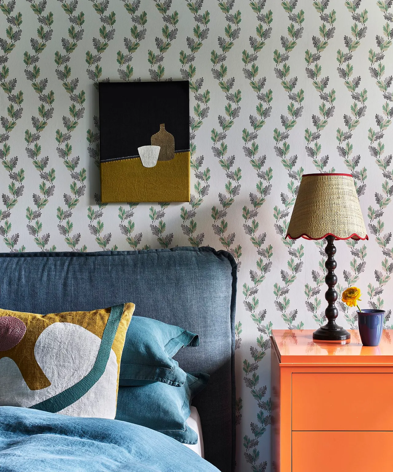
Use a small botanical repeat behind stronger furniture colors
 SaveSupport Non AI Creator
Image credit: Future / Polly Wreford
Small botanical sprigs provide a finer background behind the darker blue bed and orange cabinet. The furniture colors are larger and easier to read than the wall motifs, while the abstract picture introduces a different shape above. The paper connects the bedside area with a softer plant theme without needing a dense jungle wall or a second strongly patterned bedcover.
Try a sample beside the actual cabinet and headboard, checking whether the smaller motifs remain visible from the doorway. Keep the picture securely hung and compare its frame color with the paper before adding more artwork. Plan the repeat and seams around bedside fittings, following the product instructions and leaving the lamp and storage positioned for comfortable everyday use.
IDEA 12 / 20
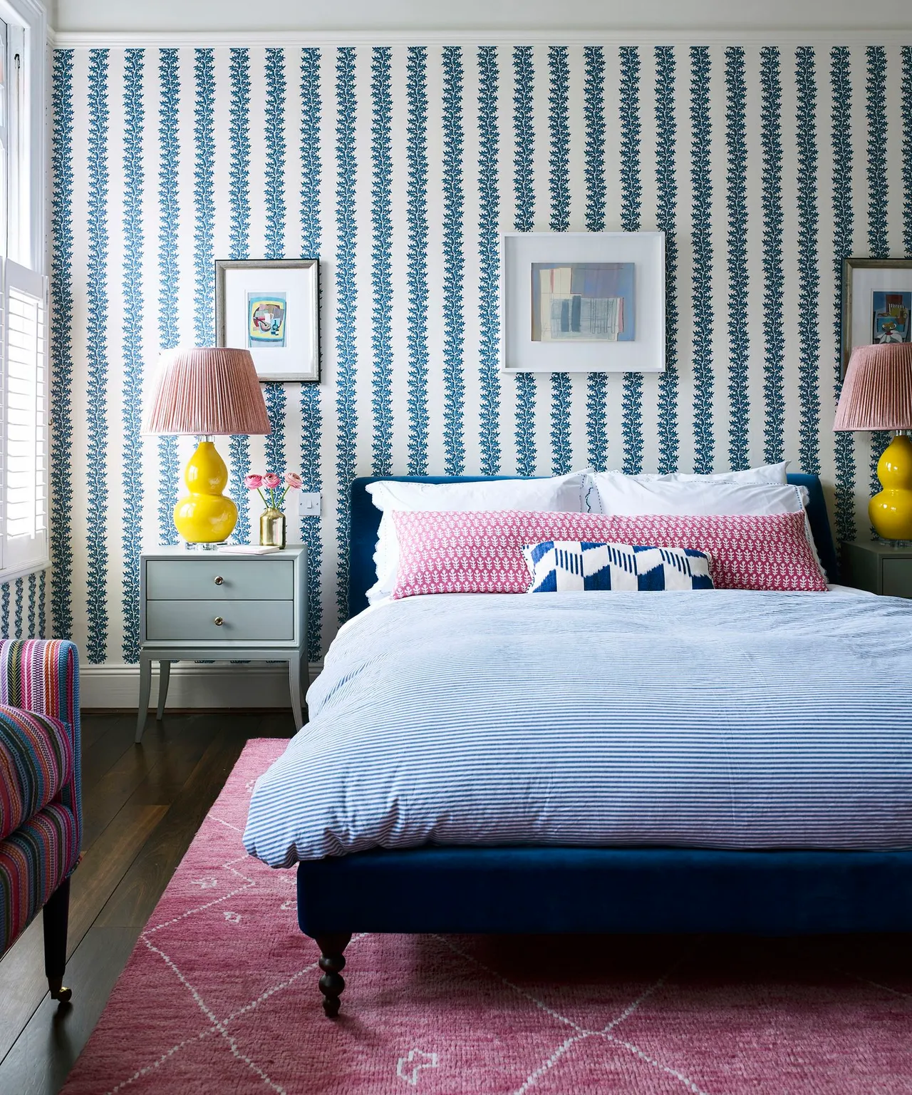
Give repeated blue motifs a vertical rhythm
 SaveSupport Non AI Creator
Image credit: Future / Mary Wadsworth
Blue motifs run vertically behind the darker blue bed, giving the wall a regular rhythm around the paired lamps. Pale bedding leaves those lines visible, while pink and yellow provide warmer accents on broader surfaces. The gray-green cabinets introduce a quieter furniture tone, showing how a repeated wall direction can organize several different colors without requiring a matching bedroom set.
Check alignment across the full bed wall and around openings before installation, using the paper’s hanging instructions rather than assuming the room edges are square. Compare the blue repeat with the headboard and lamps under actual room lighting. Keep extra fabric patterns limited when the wall already has a clear rhythm, retaining practical cabinet access and reachable bedside surfaces.
IDEA 13 / 20
Try narrow pink stripes beside a shaped fabric headboard
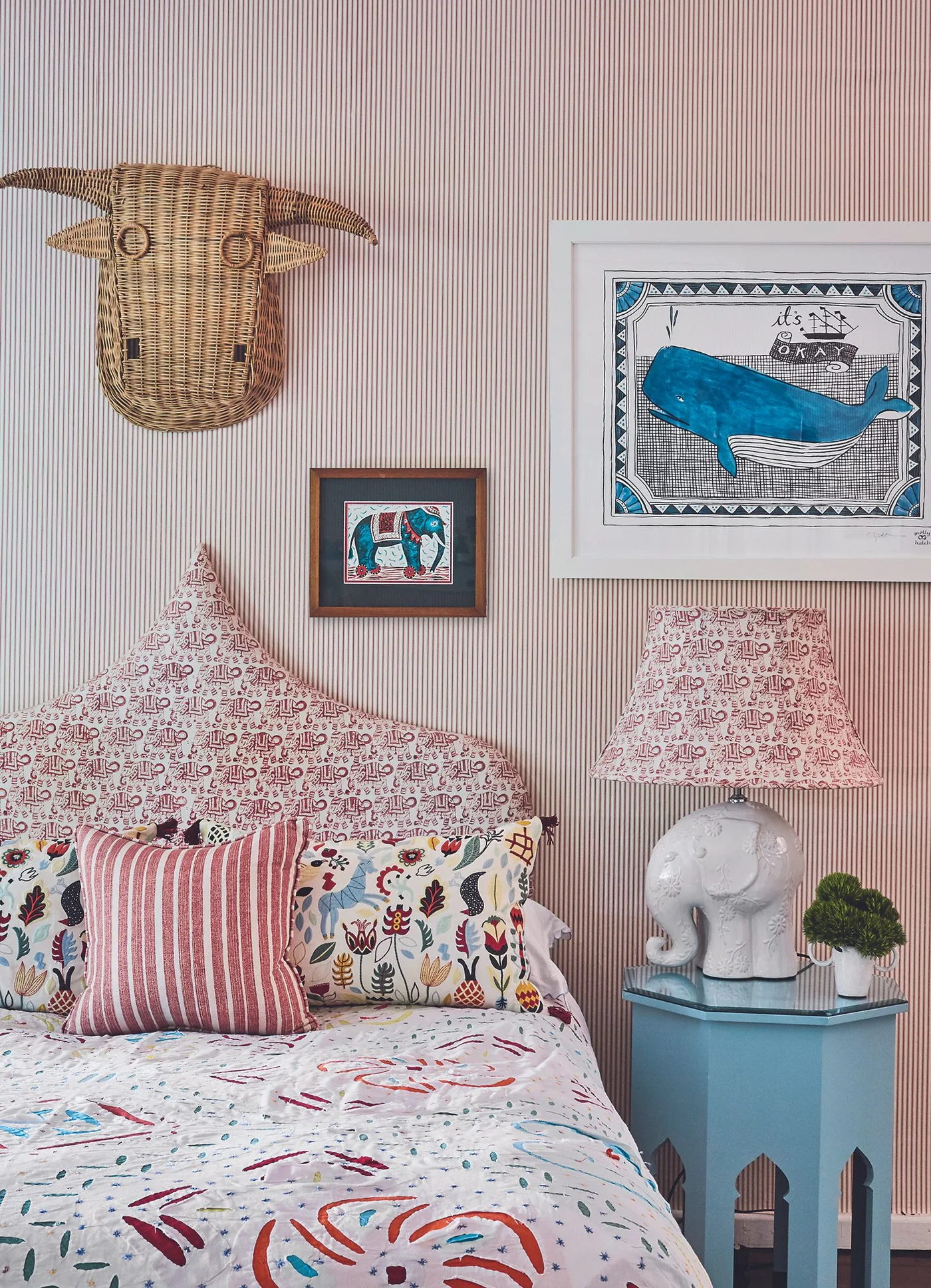 SaveSupport Non AI Creator
Image credit: Future
Narrow pink stripes make a regular background for the more decorative pointed headboard. The fabric print has a larger, less directional pattern, while the blue bedside table supplies a simpler contrasting block. A playful lamp introduces another distinct outline beside the bed, showing how a striped wall treatment can sit behind mixed boho details without making every object carry the same repeat.
For a similar striped wallpaper, view several repeats together and compare their direction with the actual wall height and headboard. Keep fabric samples beside the stripes before adding another print. Use appropriate fixings for decorative objects and retain useful lighting and table space, choosing the wall product for its care and installation needs rather than its pattern alone.
IDEA 14 / 20
Keep a small pink repeat around pale living room seats
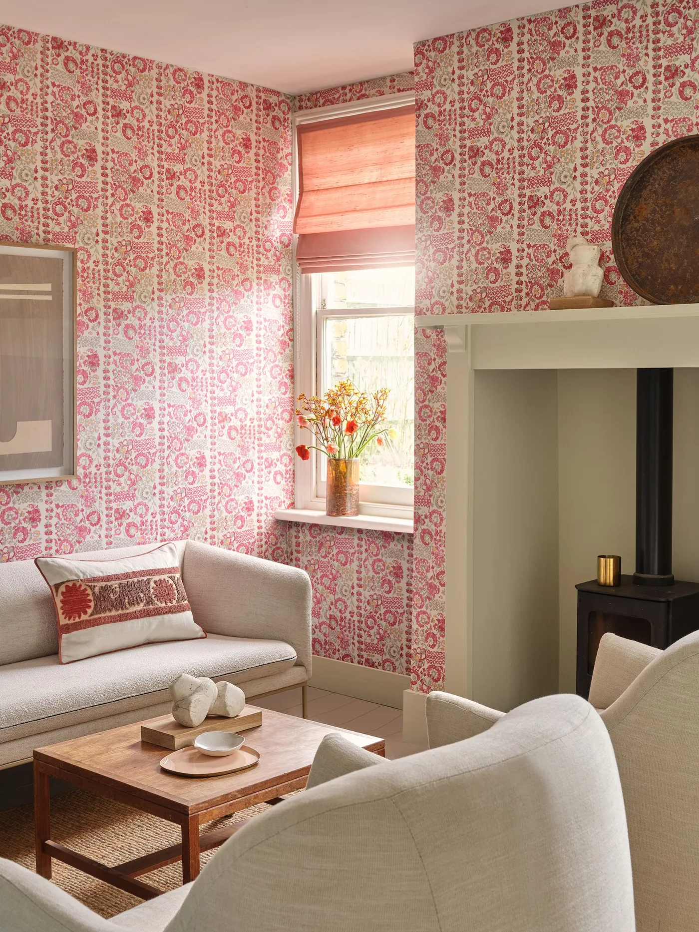 SaveSupport Non AI Creator
Image credit: Dado Atelier Kazbek wallpaper
Small pink motifs provide a continuous wall pattern around the pale seating, leaving the sofa and chair as larger quieter shapes. The wooden table adds warmth near the floor, while the pink blind repeats a related color above. A simpler fireplace surround interrupts the patterned surface, giving the room several readable boundaries instead of covering every architectural detail with the same print.
Compare the repeat with all the visible walls if you plan to use it around the room rather than only behind a seat. Check its relationship with the blind under daylight and evening lamps. Follow fireplace-specific requirements around any heated surfaces, and retain the table and seating clearances you need before deciding how much patterned wall coverage the room can comfortably carry.
IDEA 15 / 20
Let bright yellow foliage define a smaller bedside wall
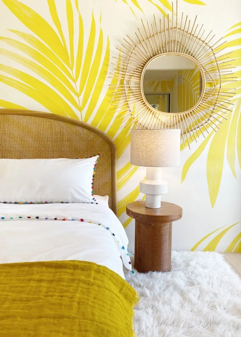 SaveSupport Non AI Creator
Image credit: From: Bells & Whistles
Yellow foliage gives the bedside wall a brighter botanical character around the warm woven headboard. White bedding leaves a calmer area below the larger leaf shapes, while the throw repeats yellow at a lower level. The mirror and table add rounded outlines beside the print, making the wallpaper’s stronger color the main connection between several different furniture and decorative details.
Try a large yellow sample in the room before ordering, assessing it beside the actual wood tones and white fabrics. Check which leaves will remain visible around the headboard and mirror, securing the latter with suitable fittings. Keep the lamp and table useful for nightly routines, and choose additional color accents only after the bright wall pattern feels comfortable under evening light.
PART 04
Bring wallpaper around living room seating
IDEA 16 / 20
Choose loose abstract lines around a solid-colored seat
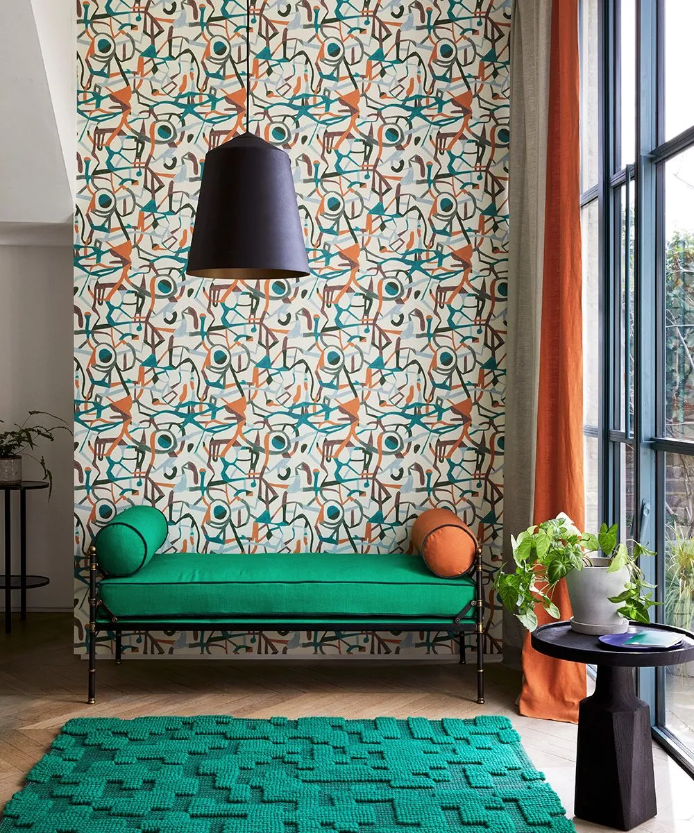 SaveSupport Non AI Creator
Image credit: Future / Davide Lovatti
Loose abstract lines make the wall busier than the solid green seat below it. The orange bolster picks up one smaller warmer color from the pattern, while the green rug repeats the seat’s broader tone on the floor. A dark pendant provides a simpler shape above, showing how abstract wallpaper can connect a mixed boho corner through selected colors without making all the furniture patterned.
Look at a larger joined sample before choosing an abstract repeat, since a small section may not show its full movement or color balance. Compare it with the seat fabric and rug in your room. Retain practical reading light and side-table reach, checking the paper’s seam and repeat instructions so the wall looks continuous rather than relying on furniture to hide awkward joins.
IDEA 17 / 20
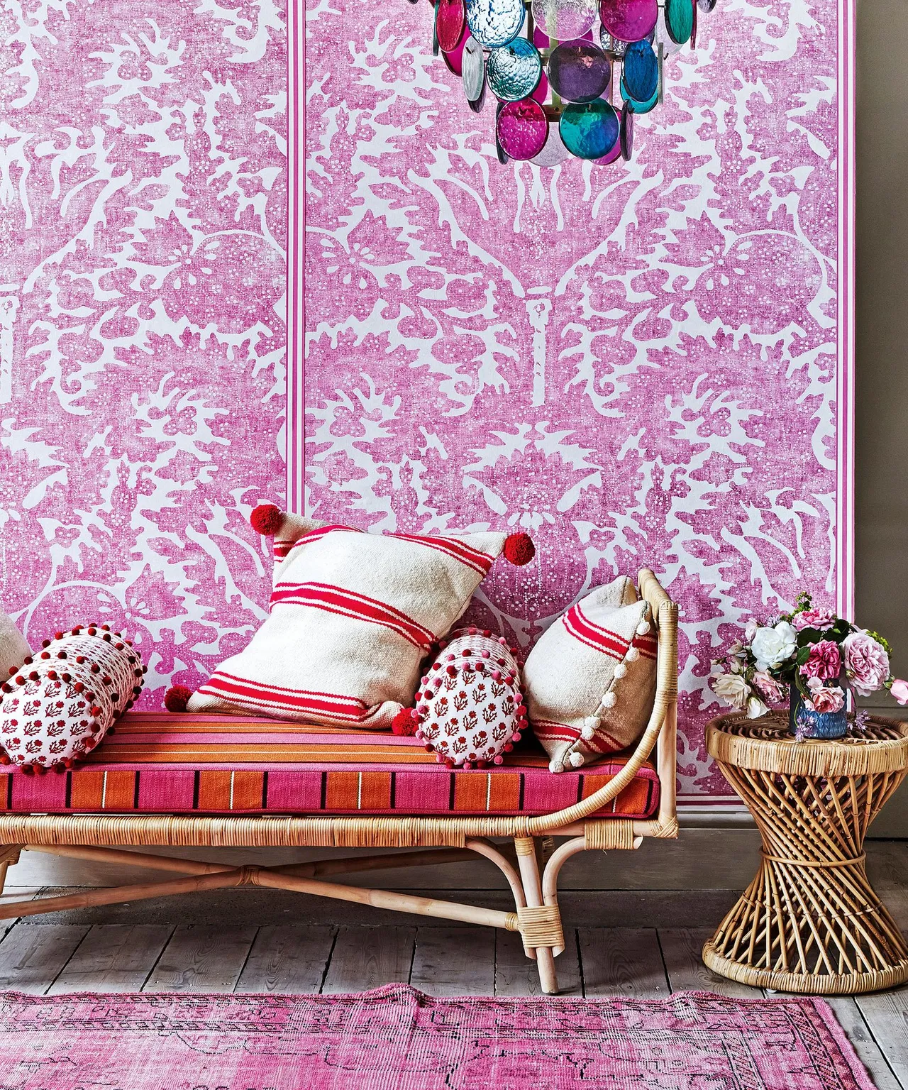
Repeat pink around an open woven sofa
 SaveSupport Non AI Creator
Image credit: Future / Jan Baldwin
A larger pink wall pattern gives the woven sofa a decorative backdrop while its open frame remains visible in front. Smaller stripes and red-and-white pillows introduce different fabric repeats, with the rug carrying pink onto the floor. The side table repeats the furniture texture rather than the wallpaper pattern, giving the corner a connected color relationship across several individually readable surfaces.
Compare the wall repeat with the cushion stripes before selecting another patterned fabric. Keep enough simpler seat surface visible and choose furniture cushions that support comfortable sitting. Check where the wallpaper pattern lands behind the sofa and at nearby corners, following the product’s measuring instructions rather than assuming the visible space above the seat is the only area that needs planning.
IDEA 18 / 20
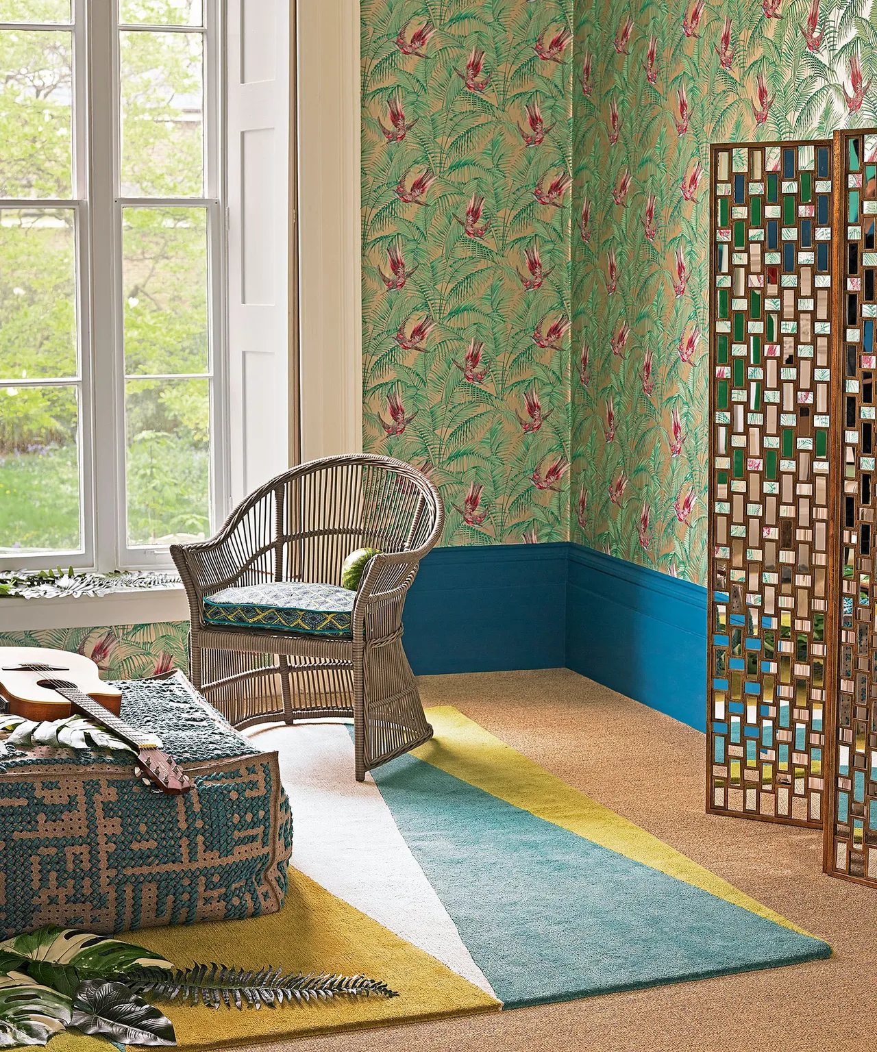
Let green botanical paper sit above a stronger lower color
 SaveSupport Non AI Creator
Image credit: Future / Neil Mersh
Green foliage and smaller bird shapes fill the upper wall, while teal creates a stronger lower boundary beneath the paper. The woven chair provides a warmer open outline in front, with the decorative screen adding smaller reflective details at the side. A green-and-yellow rug connects with the wallpaper colors below, allowing the wall to guide the palette without repeating the same pattern everywhere.
Check the height and edge of a proposed lower painted section before planning paper coverage above it. Compare the green print with a teal sample and the existing floor. Leave the screen and chair safely positioned outside regular routes, and check how reflections affect the patterned wall before adding further mirrors or metallic objects beside an already detailed botanical background.
IDEA 19 / 20
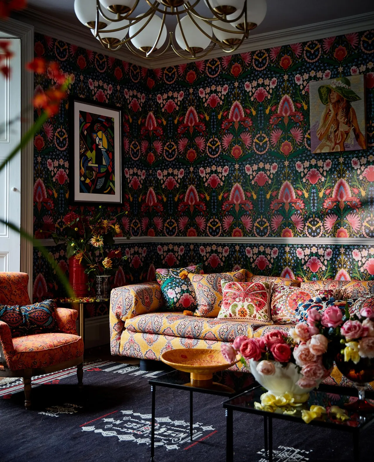
Make dark floral wallpaper the sitting room’s larger feature
 SaveSupport Non AI Creator
Image credit: Mind the Gap
Large floral motifs cover the darker sitting-room wall, with brighter furniture fabrics providing contrasting shapes in front. The sofa’s finer pattern remains different from the wall repeat, while the orange chair picks up a warmer accent. Smaller tables offer quieter surfaces below, giving the wallpaper a stronger surrounding role without requiring every furniture piece to match its flowers or background color.
Compare both pattern scales at the room’s usual viewing distance before combining floral paper with patterned upholstery. Test the darker background under evening lighting and keep useful light near the seats. Plan the repeat across the full wall and around corners, following the paper’s product guidance and leaving table surfaces simpler when the wall and furniture already carry considerable detail.
IDEA 20 / 20
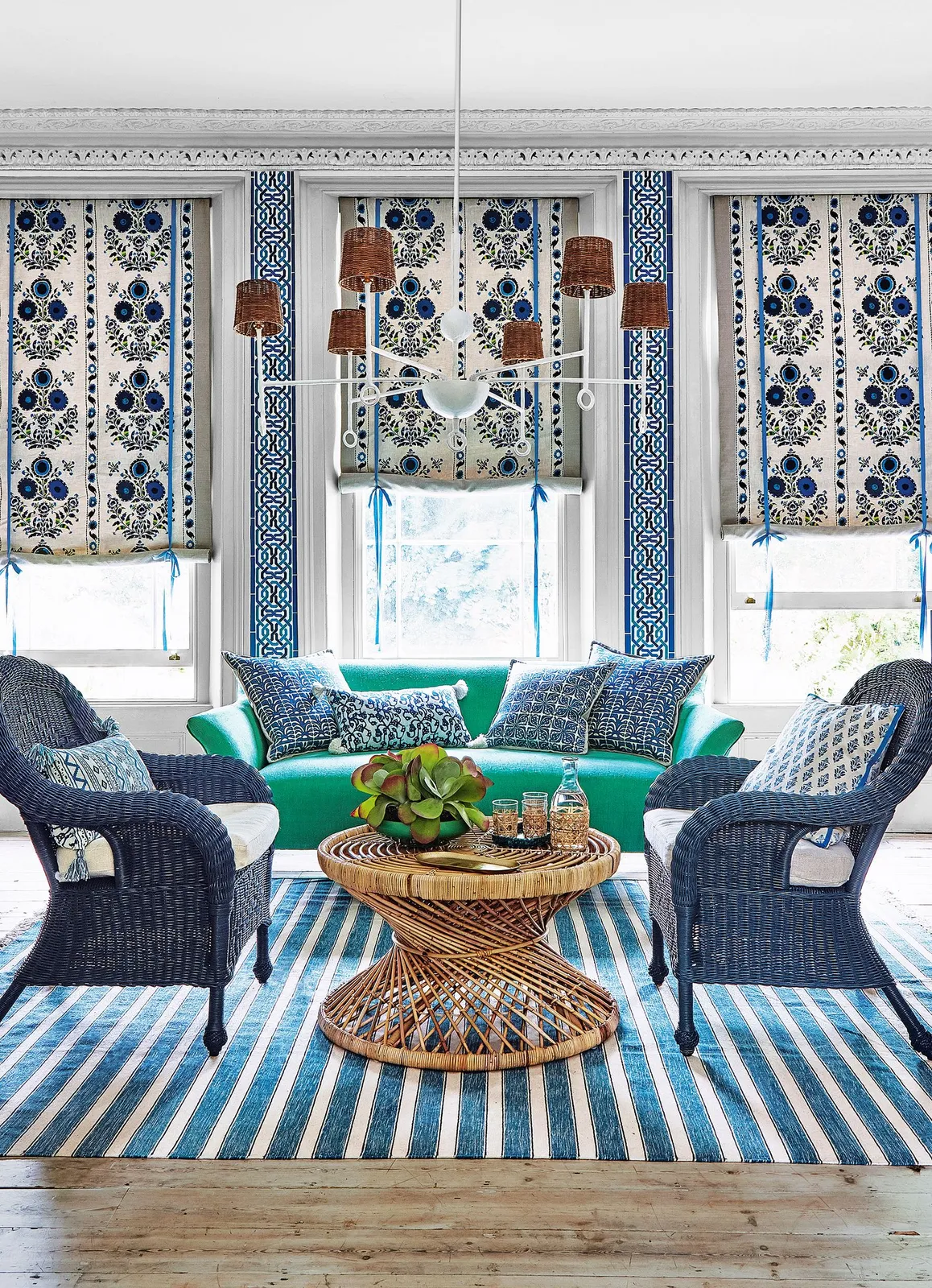
Connect vertical blue patterns with woven seating
 SaveSupport Non AI Creator
Image credit: Jan Baldwin
Vertical blue-and-white patterns connect the wall and window areas behind the woven seating. Blue chair frames and the striped rug repeat the cooler tone below, while the green sofa creates a different larger color block. The round table supplies another woven outline at the center, showing how a patterned room can stay connected through selected colors and texture rather than identical prints on every surface.
Compare the wall pattern and window fabrics together before ordering, checking their scale and alignment around the openings. Keep blinds easy to operate and leave enough simpler upholstery for the different repeats to show. Follow the wall product’s preparation and hanging guidance, retaining clear seating routes and a usable central table so coordinated patterns do not dictate an uncomfortable furniture arrangement.
BRING IT ALL TOGETHER
Choose the wall pattern in the actual room
Put a sample beside the furniture and fabrics you plan to keep, then view it at the usual distance from the bed or sofa. Consider where the repeat will fall around windows, doors and the headboard. Choose one stronger patterned surface first, adding cushions and artwork only after the larger color relationship feels comfortable.
Measure the walls and account for the product’s pattern repeat when calculating quantities. Follow the wall preparation, paste and care instructions for the particular paper. Check removal guidance and permission if you rent; a removable label alone does not guarantee a product will leave every wall finish unaffected.